Latest Blog
17 Captivating Logo Design Combinations (The Color Psychology)
Color is powerful. It’s a universal language that has the potential to influence emotion, evokes memories, and engage viewers – no matter their cultural background. While the interpretation of many colors and color combinations is universal; cultural differences, context, and individual differences are the things that you should never overlook! But did you know that color also plays a crucial role in how brands communicate? Whether it’s bold oranges or calming blues, using just the right hues can be the difference between getting your brand noticed or forgotten. In this blog post, we’ll explain what creative professionals mean by “color psychology” and explore how every color combination holds a significant meaning in developing a distinct brand identity. We’ll also take you through 17 of the most effective and meaningful color combinations businesses can use to give their logo design an advantage over the competition. So, if you want to discover more about which colors could take your business to greater heights – let’s dive into color psychology!
The Color Theory
Color theory is an essential tool for logo design, helping create a resonant image that stands out against competitors. Every single color has a different psychological significance and effect, depending on the context. Blue is often used in logos to make a calm, modern aesthetic statement, and sense of security. This is one of the reasons behind the famous logos of giant companies like VISA, Venmo, and PayPal. Green can provide a sense of peace, harmony, and balance, which is seen in famous logos like Spotify. Moreover, orange conveys confidence and enthusiasm. Red, however, creates feelings of love, passion, and boldness. The red color is used by famous companies like Coca-Cola, Netflix, YouTube, and Nintendo. In regard to social media, a recent study showed that colors can predict the number of likes on Instagram posts (Yu et al., 2020). Another study has shown that logos help build customer self-identity and expressiveness, represent a brand’s functional benefits, and offer aesthetic appeal (Park et al., 2013). By appreciating the influence of color theory on logos, designers can create a powerful visual representation of a very distinct brand identity.
Types of Color Combinations
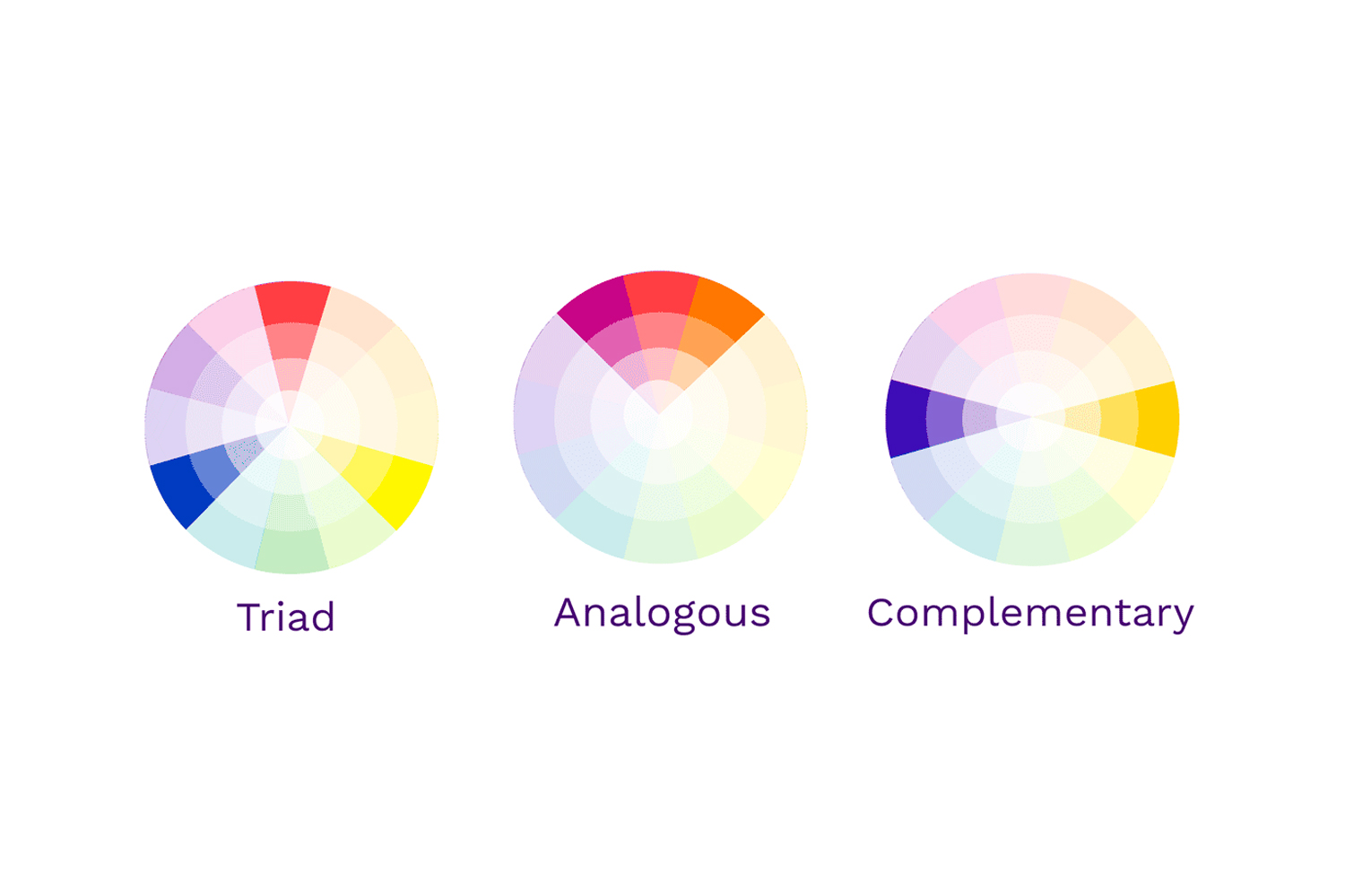
Choosing an effective color combination can be a daunting task if you start picking random colors from the RGB spectrum. To choose meaningful color combinations, a color wheel is used. Opposite ends of the color wheel consist of opposite hues so the relationship between various colors in the entire spectrum becomes clearly visible even if you’re not a designer.Using the color wheel, colors can be picked in the following combinations:
Complimentary Color Combinations
Complimentary colors are basically the opposite colors. Pick one point on the color wheel and the opposite side of the color wheel would have its opposite color. For example; the opposite of blue would be orange.Analogous Color Combinations
Analogous colors are adjacent to each other on the color wheel. As these colors are found in nature, they create a sense of harmony and safety. In these combinations, one color is used as the primary color whilst others contribute to the depth and accents.Triadic Color Combinations
Triadic colors are three totally opposite colors on the color wheel. To get triadic colors, you’ll draw a triangle on the color wheel and every color at the corners would be taken in the palette. Triadic colors are mostly used for the energetic, funky, and sometimes cyberpunk-looking vibes. To make things simpler for you, we have chosen some of the most effective color combination inspirations from the business that established its identity globally. These combinations will surely inspire your custom logo design.1. Black & Yellow
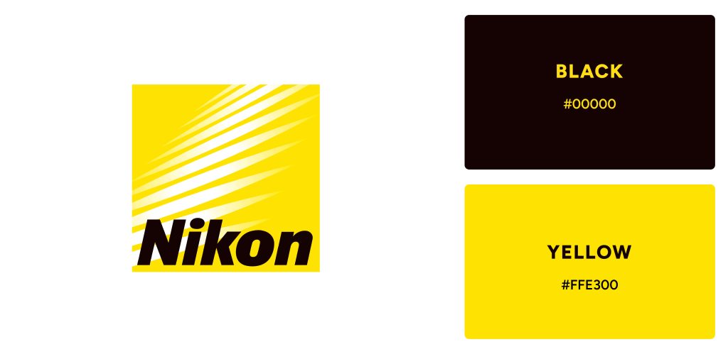
Yellow color is used to express happiness, hope, and spontaneity. Yellow on black is considered the color combination of warning and danger. For these reasons, heavy manufacturing companies like Caterpillar and JCB have used the combination of Black and Yellow for their logo designs.
2. Black & Red
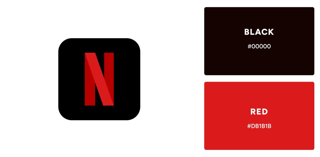
The combination of black and red is nothing but dominating and energetic! In this color combination, black acts as the perfect element to immediately draw attention toward the red – making the logo design intelligible even at the faintest glance. As red is the color of passion, love, ambition, and even danger, it can be used to excite as well as draw the attention of your audience – as companies like Netflix have done it effectively.
3. Black & Gold
Gold has always been the color of luxury, wealth, royalty, and sophistication, therefore, it’s one of the best choices for logo design as it depicts wealth. Pair that with black or dark gray, and it’ll instantly draw the audience’s attention and evoke feelings of richness! Use of this intricate and royal combination is seen in Lamborghini’s logo among many others.
4. Blue & White
Blue is associated with the feeling of security, trust, calmness, and confidence, therefore, it’s one of the most used colors for logos along with white when it comes to health, non-profit, and banking industry. Common health companies include Pfizer, P&G, and Oral-B, whereas common banking companies include VISA, Venmo, PayPal, and American Express.
5. Red & Blue
While it seems like an odd color combination for logo design, it is actually one of the most recognizable ones! This combination holds significance because red is the color of passion and enthusiasm whereas blue is the color of trust and confidence. Multinational companies like Pepsi and Domino’s have utilized the color psychology behind this color combination most effectively.
6. Red & Yellow
The powerful combination of red and yellow creates strong emotional connections with your customers. Red symbolizes ambition, while the vibrancy of yellow expresses joy – together forming a successful pairing for companies wanting to create positive experiences. Multinational firms such as Lays, Lipton, and DHL have adopted this combo in their branding efforts to energize relationships with their clientele.
7. Orange & Blue
This is an unusual but powerful color combination that can be used to create strong logos. By combining these two colors, you will give customers a sense of energy and confidence! It can be seen in Fanta’s bold orange and blue logo which reflects an energetic, confident vibe that resonates with customers.
8. Black & Orange
Similar to Black and Yellow, this color combination makes up for logos that are enthusiastic and energetic while being professional. This combination is one of the best choices for brands who want to present themselves as joyful as well as formal.
9. Brown & Yellow
This subtly earthy combination of brown and yellow is a nostalgic favorite for any logo design. Its success extends beyond the boundaries of graphic design, making it the perfect choice to grace restaurants and food businesses.
10. Blue & Pink
Companies who wish to stand out with unorthodox designs can utilize the perfect duo of colors: Blue and Pink. While blue radiates a calmness, pink brings vibrant energy – making them an ideal combination for businesses looking to make their mark. We see this combination come alive in corporate identities like Baskin-Robbins’ ice cream parlor atmosphere or Taco Bell’s fun Mexican flavors!
11. Green & White
Green and white is a powerful color combination that resonates with many – representing renewal, freshness, nature’s bounty, and purity. Its connection with nature has made it the go-to choice for popular brands such as Whatsapp, Spotify, and Starbucks when designing their logos – providing immediate recognition of these iconic companies to customers around the world.
12. Red & White
Red is a hue of passion and power, the perfect choice for any logo design that needs to capture attention. Combined with white – another primary color symbolic of purity and innocence – it makes an iconic combination sure to be remembered. Examples of Red and White logos include Adobe, Lenovo, Levi’s, and Target.
13. Purple & White
Throughout history, purple has been seen as a symbol of status and wealth. Its rarity in nature made it an exclusive color to be associated with royalty, luxury, and great wealth. Due to this, modern-day luxury brands such as Hallmark and Premier League have truly embraced it combined with white for their branding.
15. Purple & Orange
Combining the luxury of purple with the joyfulness of orange gives a bold and confident brand identity. FedEx is one such example, who has made expert use of these colors in their logo – perfect for those looking to make an impactful statement!
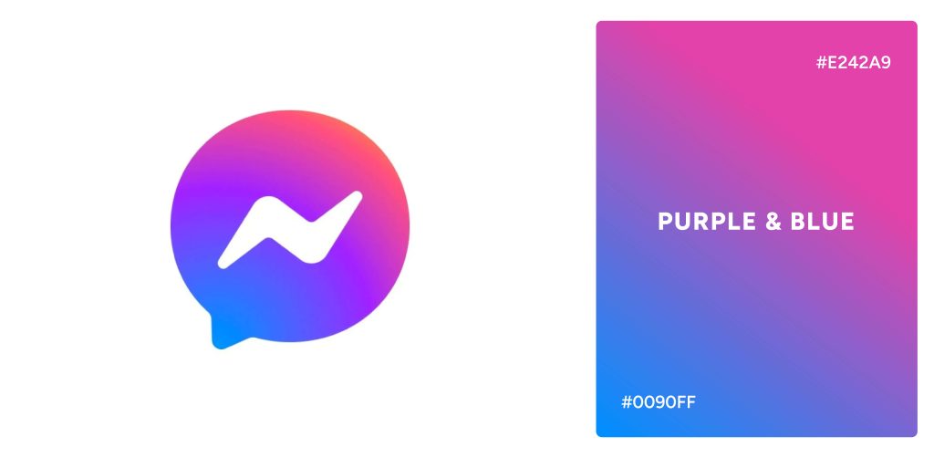
16. Purple-Blue Gradient
Gradients are also one of the effective ways to utilize colors in logos. The purple and blue gradient signifies the luxury and power associated with purple as well as the depth and calmness associated with blue – making it a worthwhile choice for brands with a more dynamic personality. Examples of purple-blue gradients include the Facebook Messenger logo.
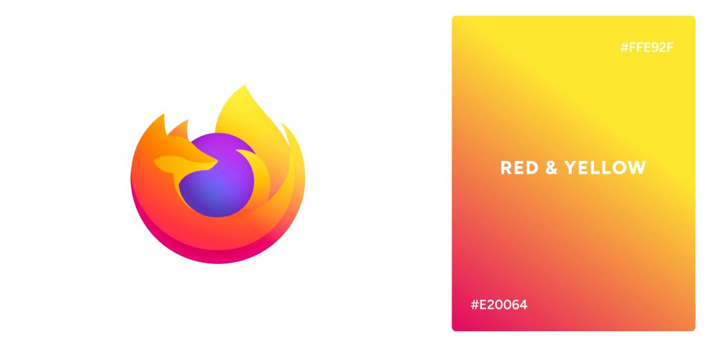
17. Red-Yellow Gradient
Red and yellow are paired to create an exciting, dynamic expression of love, passion, and joy – the perfect combination for any project looking to convey a bright message. This color scheme is seen in FireFox’s logo.
How to Choose the Right Color Combination for Your logo?
Color should be given careful consideration when creating a logo. Using color psychology, the color combination should be chosen to tell a story that resonates with the target audience and reflects your brand. As colors carry powerful subconscious meanings, it is important to study color theory and draw inspiration from it when making decisions. Also, it should be kept in mind that the meanings behind colors may vary from culture to culture and context to context, as well as individual experience. Knowing your target audience and thoroughly researching color psychology will ensure that your colors are appropriate for your target audience and target culture.References
- Park, C. W., Eisingerich, A. B., Pol, G., & Park, J. W. (2013). The role of brand logos in firm performance. Journal of Business Research, 66(2), 180–187. https://doi.org/10.1016/j.jbusres.2012.07.011
- Yu, C.-E., Xie, S. Y., & Wen, J. (2020). Coloring the destination: The role of color psychology on Instagram. Tourism Management, 80(104110), 104110. https://doi.org/10.1016/j.tourman.2020.104110
Get the latest updates on new technology, services and many more by subscribing to this Newsletter.

