Melanin
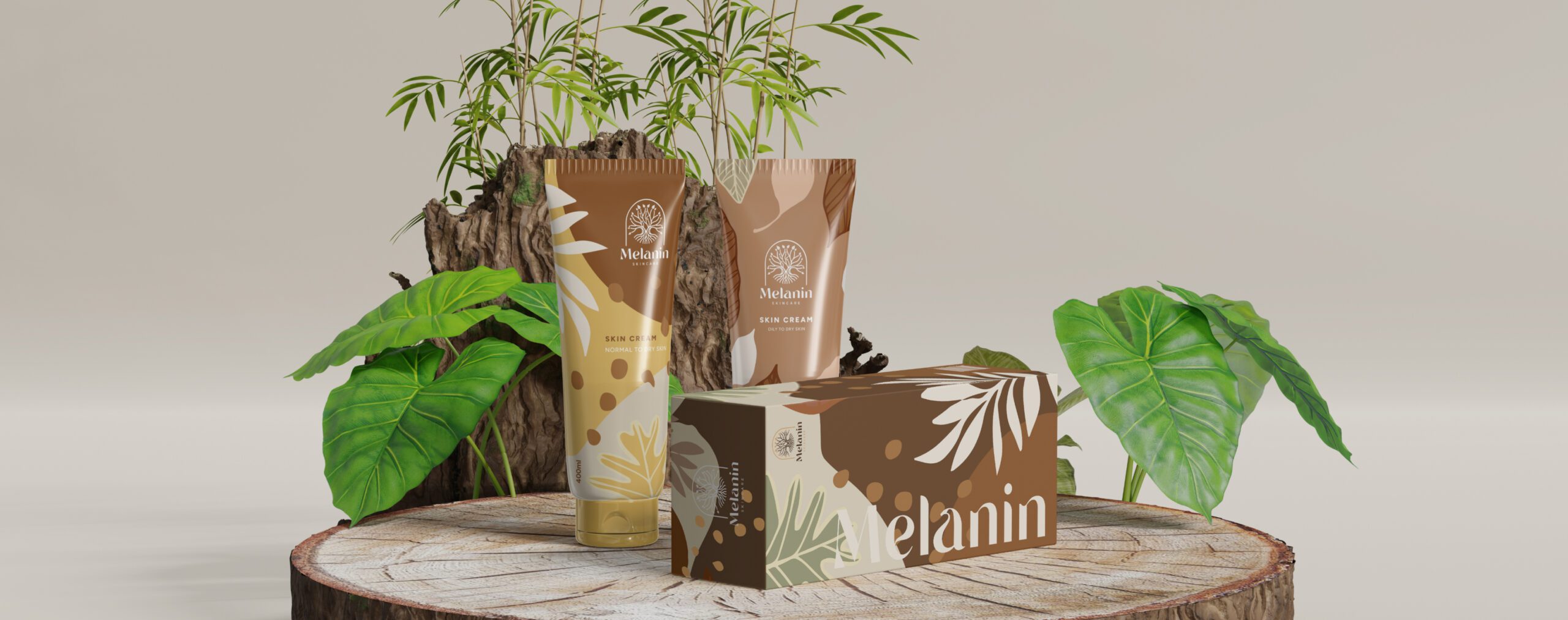
Melanin is an organic skincare line that roots in Morocco and focuses on decreasing spots and pigmentation on the skin. We incorporated their vision of a luxury, organic, and unisex brand into the design visuals by giving it a Mediterranean vibe.
Challenge we face
The client approached for the branding of a newly launched business for skin enhancement formulas and other cosmetics. Since there is a massive market for cosmetics, which makes it difficult to stand out in the industry and with a product-specific brand, we took the challenge and initiated the process by drafting a logo and brand identity.

our strategy
After thorough research on the product’s target audience, locality, and potential, we suggested a chemical-specific name Melanin which means a dark brown to black pigment occurring in the hair, skin, and iris of the eye in people. It is responsible for the tanning of skin exposed to sunlight.
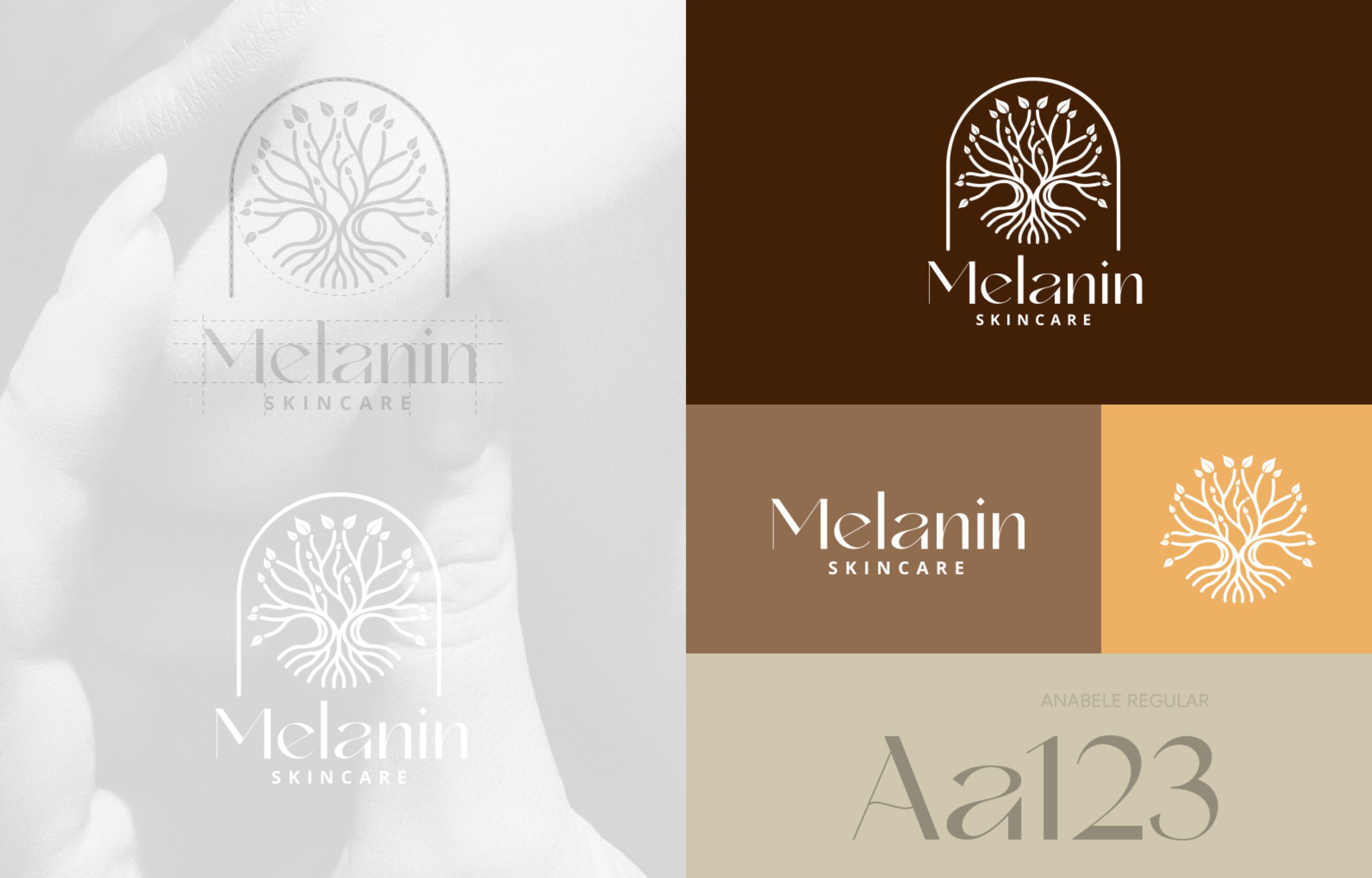
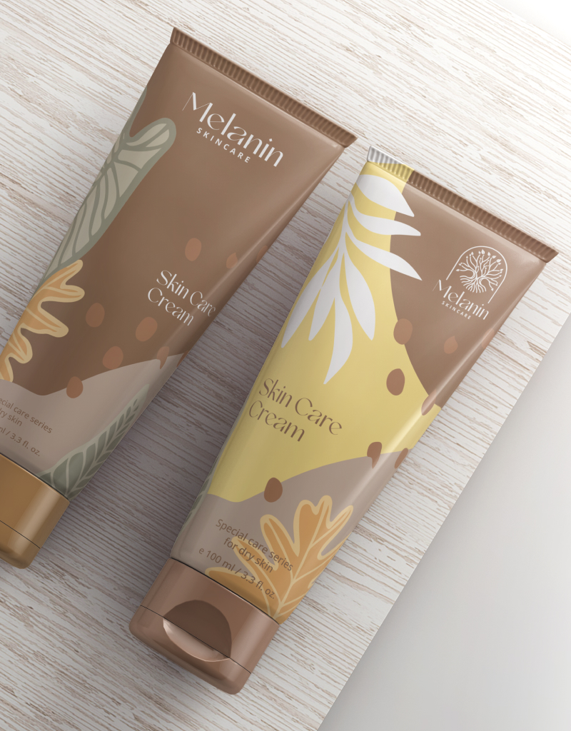
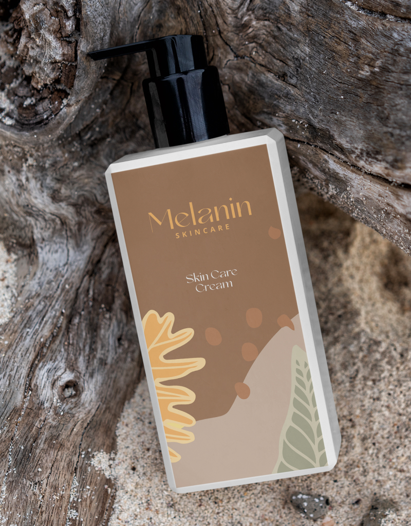
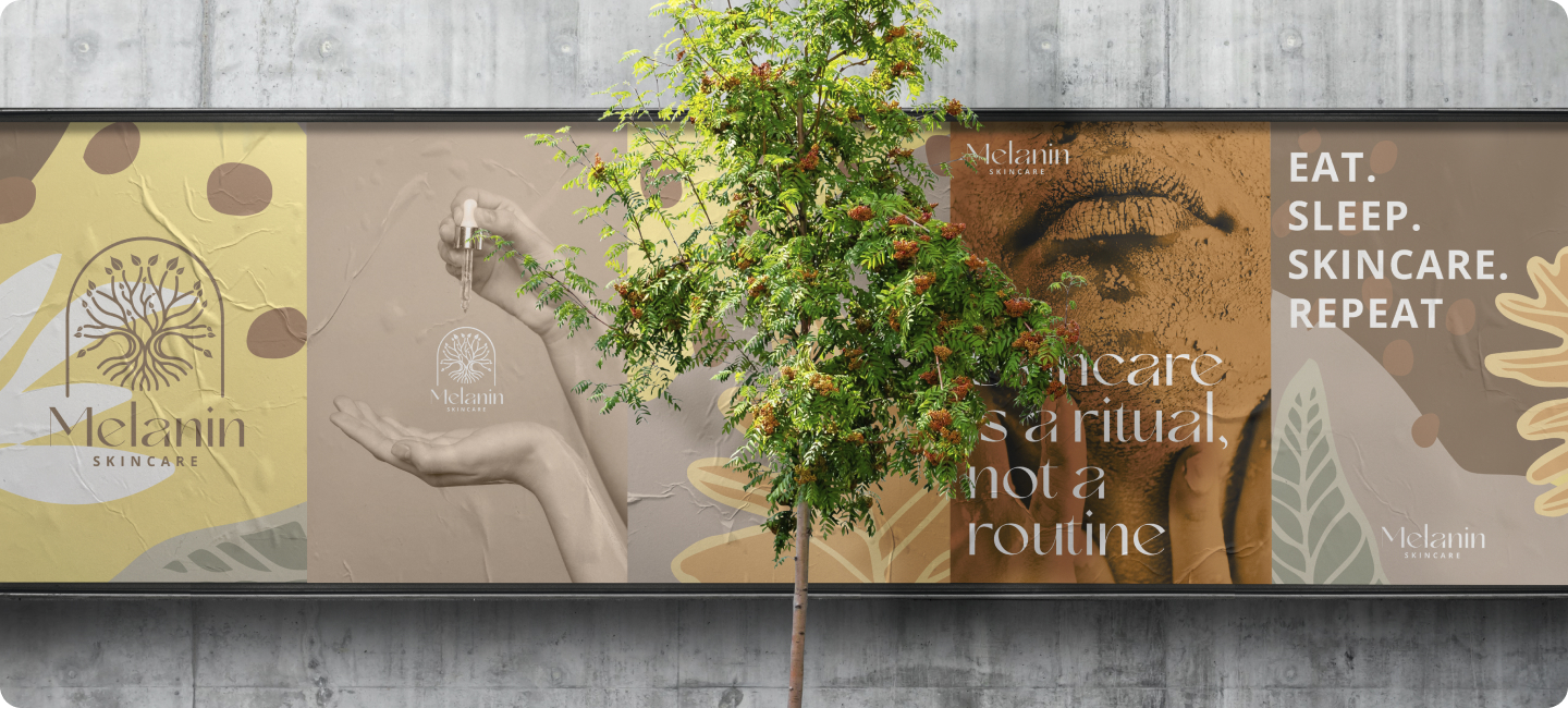
The winner logo has a tree symbol with some leaves to illustrate life and roots for the anatomy of human skin covered under an arc to depict a shade or protection to the skin. To balance the visual and make it memorable, we introduced a Mediterranean visual, using leaves and supporting organic graphics with different shades of skin colors.
