One of
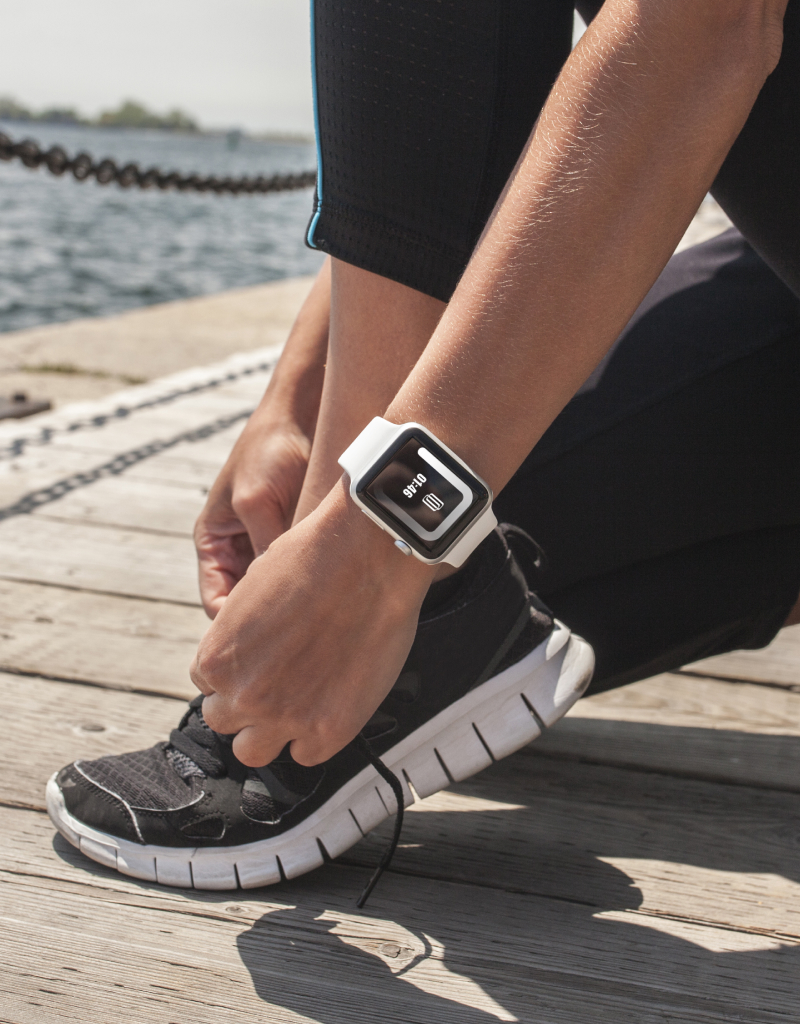
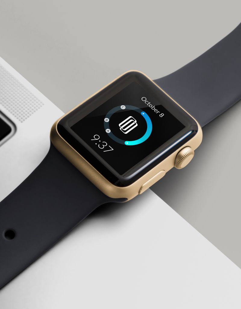
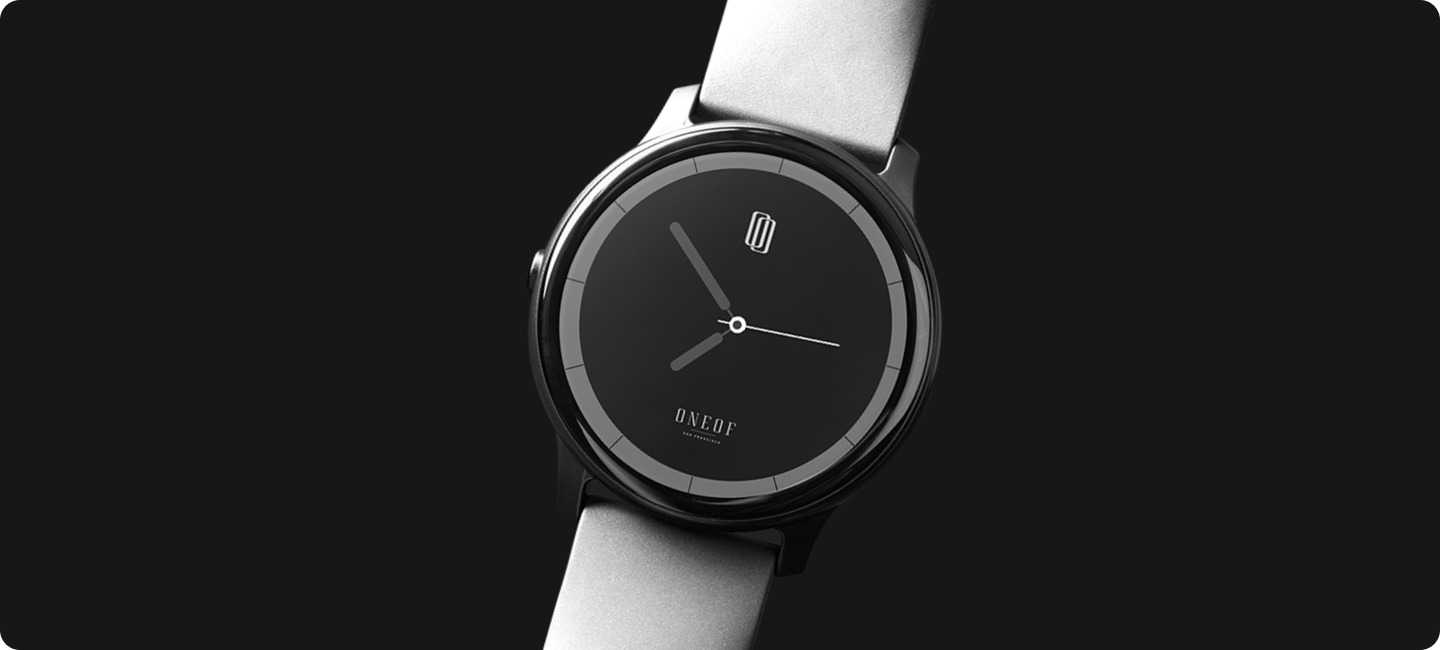
Regardless of the product, premium brands must maintain coherence and consistency in their visuals. For example, a business in San Francisco asked for our assistance in creating a brand identity for their luxurious line of wristwatches.
Challenge we face
A logo is not just about what it looks like but also how it attracts attention from current and potential consumers. Highlighting a needle from a haystack is no joke, but our creative designers enjoy creating a brand that makes a business stand-out by its unique and modern identity.
our strategy
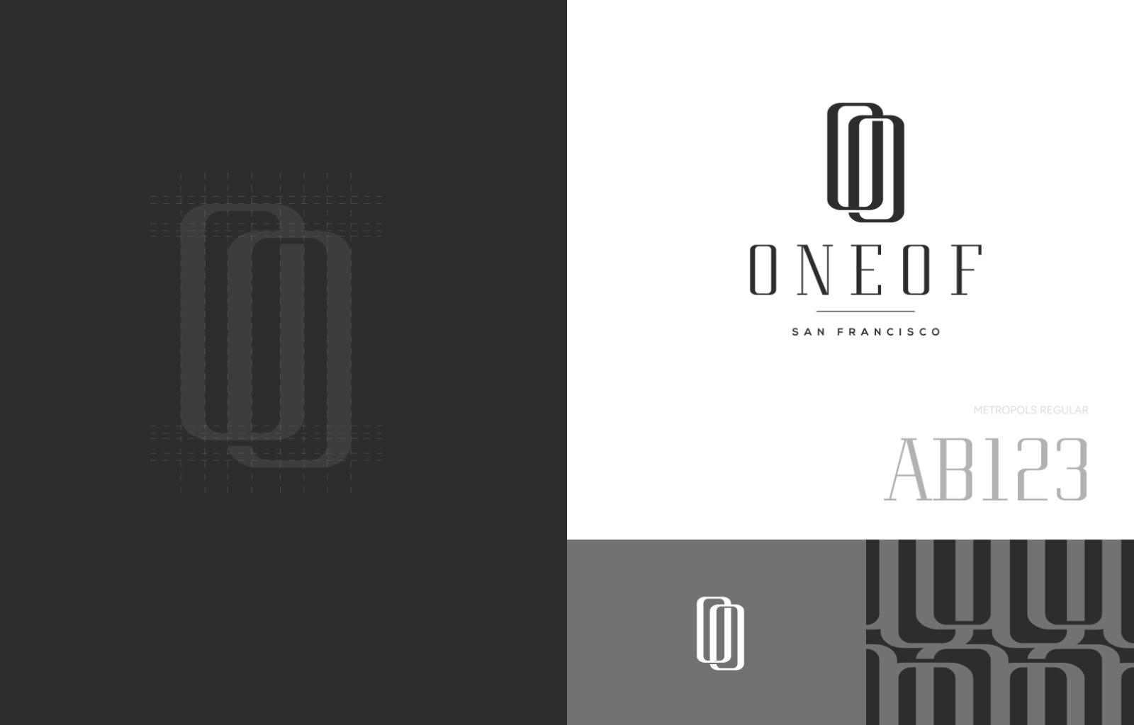
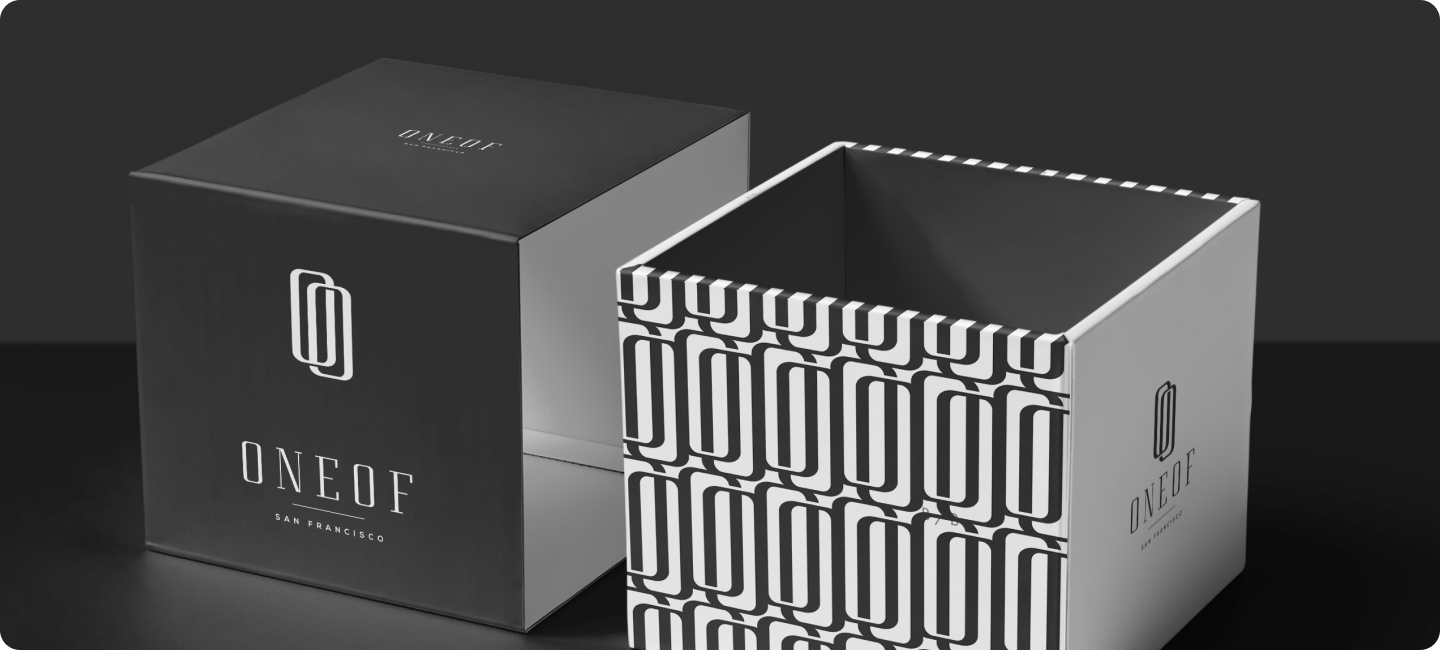
Keeping their timeless products in mind, we opted for a minimal design aesthetic revolving around different grayscale tones consistent throughout the designs.
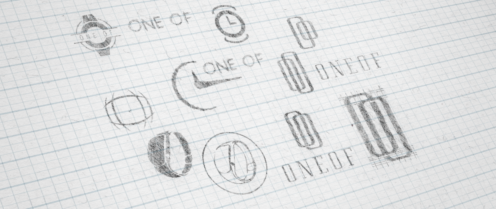
The two O's in the brand initials are the basis for their logo, inspired by the shape of an hourglass to represent time. The positioning of O’s symbolizes infinity which gives a sense of the products being timeless and something that can be passed on to generations.
