Khodry
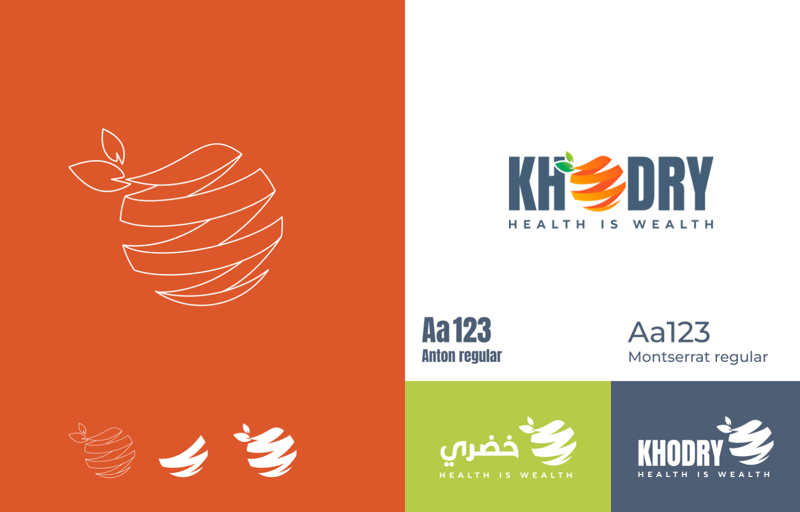
Khodry is a startup owned by a middle eastern couple. Their brand revolved around eating healthy and quality, so the design aesthetics needed to reflect that.
Challenge we face
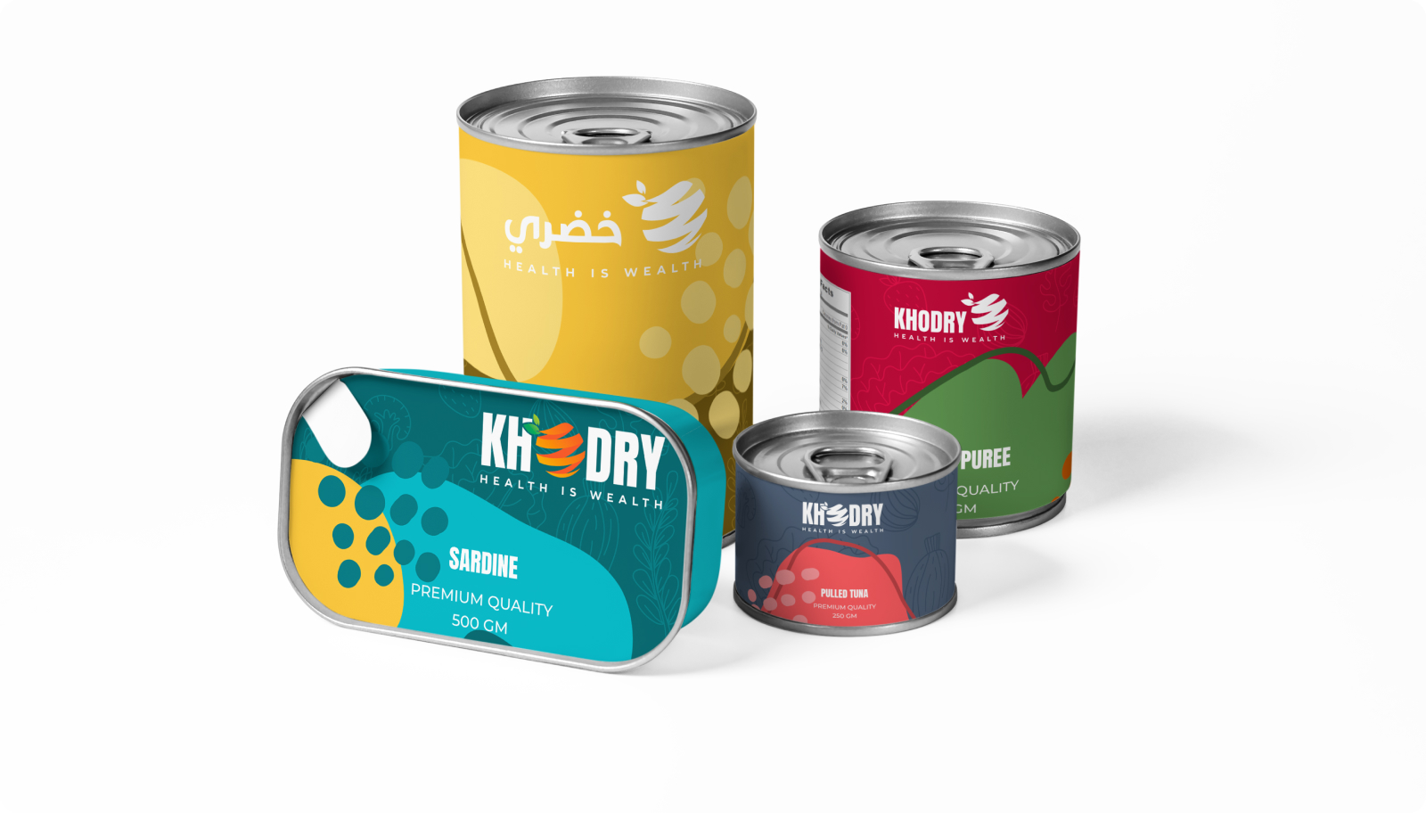
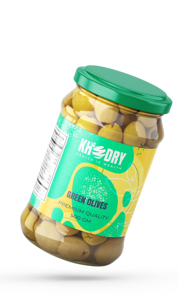
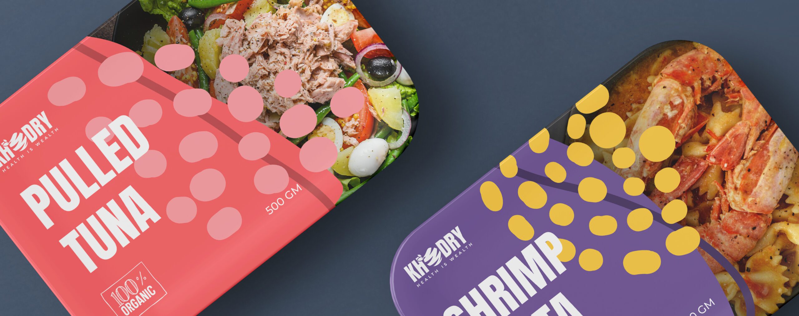
Healthy food is a staple in many consumers' lives, forming part of a balanced lifestyle. So whether a business specializes in organic produce, nutritious cuisine, or guilt-free treats, the brand's identity plays a pivotal role in making it memorable. Therefore, we proposed a combination mark with a set of solid brand elements to represent the content of the packaging.
our strategy
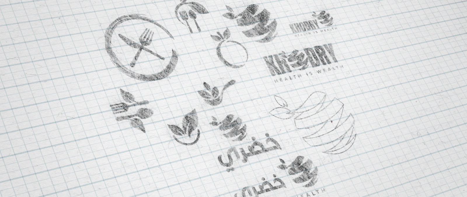
The client was happy with the brand's name Khodry as the origin of the word is Arabic which means "Green," and an abstract reconstruction of an orange to depict healthy food. To expand the brand and create an impactful visual for packaging, we custom-illustrated a set of graphics for their product to go with each product separately by choosing its content's colors and some organic shapes.
