Lego has been one of the world’s most beloved toy brands for decades, thanks in large part to its timeless mission to create playful experiences that promote self-expression and exploration. As such, it comes as no surprise that Lego is also known for having a strong brand identity – an identity that not only drives customer loyalty but can also be seen influencing user engagement on multiple levels. In this blog post, we’ll take a deep dive into how Lego’s creative products and recognizable logo design have established their presence in our lives and look at why their commitment to providing quality interaction with users continues to make them stand out from other toy providers today.
Lego’s Branding – A Brief Overview
At the heart of Lego’s brand identity is their commitment to creating products that empower children and adults alike to explore their imaginations with endless possibilities. Not only do they offer a wide range of sets and pieces, but also an expansive array of interactive experiences such as games, apps, and virtual building tools – all of which are designed to help foster user engagement. Through these digital activities, users have the opportunity to engage in creative play while connecting with others who share similar interests. This encourages people not only to build upon their own skills but also to form meaningful relationships with like-minded individuals in the process. Moreover, Lego has firmly established its presence by adopting a recognizable logo that is easily identifiable across all platforms. This iconic image not only serves to promote the brand but also reinforces their commitment to creating quality experiences that bring users together. By displaying their logo, they continue to remind customers and potential customers of the value they provide – whether it be in the form of a physical product or engaging activity.
Introducing Impact of Lego’s Brand Identity on User Engagement
Lego, a multinational toy company, is known for its colorful plastic blocks that have captured the imagination of children and adults across generations. The company’s brand identity has been carefully crafted over the years, with a focus on creativity, individuality, and fun. Lego’s brand values are reflected in their products, which encourage users to build anything they can imagine. This ideology has led to an engaged community of fans who share their creations online, participate in Lego-themed events, and eagerly anticipate the release of new sets. Lego’s brand identity has had a significant impact on user engagement, as it fosters a sense of belonging and shared experiences among its fans. Whether you’re a seasoned Lego builder or new to the hobby, the brand’s identity invites you to join in on the fun and unleash your creativity.
Examining Lego’s Longstanding Brand Equity and How it Relates to User Loyalty
When it comes to building block toys, few names are as synonymous with the industry as Lego. For decades, children and adults alike have been enthralled with the endless possibilities that these colorful bricks provide. From simple structures to complex creations, the Lego brand has become a staple in households around the world. But what sets Lego apart is their commitment to quality and user experience, which has fostered a deep sense of loyalty among its users. By consistently providing innovative, fun, and challenging products, Lego has taken something as simple as building blocks and turned it into a cultural phenomenon. It’s no wonder that legions of fans continue to stay dedicated to the brand to this day.
Examining how user engagement and loyalty are connected to Lego’s brand identity
Lego, the globally acclaimed brand of interlocking plastic bricks, knows how to make storytelling work for them. They don’t just create simple toy blocks, they create worlds, characters, and stories to go with them. By weaving narratives into their products, they have managed to engage their target audience – children – on a deeper level. They take their young fans on imaginative journeys beyond the confines of their playroom and have them explore their wildest dreams. From fairy tales to sci-fi, from superheroes to tourist adventures, Lego has a story for every child and every interest. With its boundless creativity, Lego proves that storytelling is not just for books or movies; it can be an integral part of a toy that provides endless hours of fun and learning.
Exploring Lego’s use of color, imagery, and typography in promoting its brand
Lego has undeniably become a household name, a brand that has captured the hearts of children and adults everywhere. One of the ways Lego has managed to maintain its iconic image is through its use of color, imagery, and typography. The vibrant hues of red, blue, yellow, and green are unmistakably Lego and evoke a sense of playfulness and creativity. In addition, Lego’s imagery, such as the classic brick design, instantly transports us back to our childhoods and stimulates an innate desire to build and create. Finally, Lego’s use of typography, with its bold sans-serif font, exudes confidence and a sense of fun. Together, these elements have proven to be a winning combination in building Lego’s brand and fostering a strong connection with its loyal customers.
Discovering the psychological impact of Lego’s brand on users
Lego is not just a toy, it is a brand that holds a special place in the hearts of many individuals. For some, playing with Lego bricks was a fond childhood memory and for others, it is a creative outlet that they still indulge in today. But have you ever thought about the psychological impact that the Lego brand has on its users? Research has shown that using Lego can increase creativity, and problem-solving skills, and even reduce stress levels. Moreover, the bright colors and imaginative designs of Lego sets can spark positive emotions and memories. As such, Lego is not only a fun toy, it is also a powerful tool that can have a lasting impact on its users.
Investigating how Lego encourages customer loyalty through their branding strategies
Lego, the beloved toy brand, has become a household name over the years. But what makes it stand out among its competitors? The answer lies in the company’s clever branding strategies that encourage customer loyalty. From its playful and imaginative advertising campaigns to its recognizable block design, Lego has managed to capture the hearts of young and old alike. By tapping into the emotions of its customers and providing a consistently high-quality product, the brand has fostered a community of loyal fans who eagerly await each new release. It’s no wonder that Lego has become a shining example of successful branding in the toy industry.
Conclusion
Despite being founded nearly seventy years ago, the Lego brand has proven to be timeless and resilient. Through thoughtful color selection, powerful imagery, typography, and engagement techniques, Lego has crafted a brand identity that is unparalleled in the toy industry. Each facet of the brand subtly reinforces user loyalty and encourages responsiveness from players. Understanding how each element contributes to the larger picture of the company’s branding can help marketers understand how to effectively curate their own product narratives. From elementary classrooms to corporate boardrooms, Lego’s ubiquitous “CLICK” will rally minds together for generations to come as an impactful part of popular culture in modern times. As internet technology continues to progress, so will our appreciation for this legendary toy manufacturer’s remarkable branding.
With more than 690 million people using Netflix around the world, it’s no wonder that this streaming platform has become one of the most popular sources of entertainment today. Though there are plenty of reasons why people love to watch shows on Netflix, including its massive library of films and TV series, one factor that often goes unnoticed is the clever UI/UX design behind its interface. By making every aspect of their experience as easy and effortless as possible, Netflix has created a perfect environment for binge-watching. In this blog post, we’ll uncover how smart UI & UX design plays an essential role in encouraging users to stay glued to their screens!
Understanding the Principles of UI & UX Design
Netflix has revolutionized the entertainment industry, not just with its innovative content but also with its seamless user interface and user experience design. The streaming platform’s interface is sleek, intuitive, and easy to navigate, making it effortless to discover movies and shows that interest you. Netflix’s design principles revolve around putting the user first, with a focus on relevance, personalization, and simplicity. From the home screen to the content pages, every element is geared towards making the user experience as smooth and enjoyable as possible. By understanding the principles behind Netflix’s UI and UX design, we can gain valuable insights into how to create effective digital experiences that keep users coming back for more.
Uncovering Netflix’s Binge-Watching Strategy
Netflix has revolutionized the way we consume entertainment. From classic movies to original series, the streaming giant has it all. One aspect that sets it apart is its binge-watching strategy. As opposed to traditional TV broadcasting, Netflix releases entire seasons of shows at once. This allows viewers to watch at their own pace, whether it’s one episode a night or a full weekend binge. But why is this the formula for success? By releasing full seasons, Netflix creates anticipation and increases engagement. It’s no longer a waiting game for the next episode, but rather a choice in how quickly the storyline unfolds. It’s safe to say, Netflix has mastered the art of keeping its audience hooked.
– Autoplay and endless scrolling options
The user experience of streaming services has never been more critical, and Netflix knows that better than anyone. That’s why they’ve implemented their autoplay feature and endless scrolling options to keep you hooked on one episode after another. With a few clicks, viewers can keep binge-watching without ever feeling like they’re coming up for air. The UX of Netflix’s platform is tailored to make it as easy and seamless as possible to navigate through its vast library of content. Their autoplay function gives viewers the thrill of watching something new without much effort, making it feel like the content is always fresh. Overall, Netflix’s UX design ensures that viewers never have to struggle to find something they enjoy, and its autoplay feature and endless scrolling make streaming all the more addictive.
– Recommendations tailored to individual users
Netflix has taken streaming to the next level with its personalized recommendations. By using a complex algorithm, the platform is able to suggest content that is specifically tailored to each individual user’s preferences. Gone are the days of aimlessly scrolling through countless titles, trying to find something to watch. With Netflix’s recommendations, users can easily discover new shows and movies that align with their viewing habits. From comedy to drama, and everything in between, there is something for everyone. This innovative technology not only saves time but also ensures that viewers are consistently entertained and engaged. It’s no wonder that Netflix has become the go-to streaming platform for millions of people around the world.
– Intuitive cues and visual design elements
Netflix’s success as a streaming platform is not only due to its vast selection of shows and movies but also its use of intuitive cues and visual design elements. From the moment users open the app, they are greeted with a personalized homepage that uses algorithms to suggest content based on their viewing history and preferences. The use of vertical scrolling and large images accompanied by minimal text make it easy for users to navigate and make decisions on what to watch. As users select a specific title, the platform displays additional information such as a synopsis, reviews, and a “play” button in a prominent position. The clean and cohesive design of the platform allows users to seamlessly move from one page to another, creating a frictionless experience that keeps them coming back for more.
The Role of Psychology in Netflix’s UI & UX Design
Netflix has become a powerhouse in the world of streaming platforms, not only for its extensive library of movies and TV shows but also for its user interface and experience. What many may not realize is the key role that psychology plays in Netflix’s UI and UX design. Through the use of data analytics and user research, Netflix is able to effectively tailor its platform to the needs and preferences of its audience. Whether it be recommending similar shows or adjusting the layout of the interface, Netflix is constantly shaping the user’s experience to keep them engaged and satisfied. Psychology has become an essential component in ensuring that the user’s journey on Netflix is smooth and enjoyable, making it a prime example of how research and design can work in harmony to create a top-tier digital experience.
– Playful animations, subtle sound effects, and other sensory cues
Netflix’s user interface has been designed to offer an immersive entertainment experience, complete with playful animations, subtle sound effects, and other sensory cues. These features provide a more engaging and intuitive way for users to navigate the streaming platform’s vast library of movies and TV shows. From browsing through different tiles to selecting an episode or a movie, the interface comes alive with carefully crafted animations that give the user a sense of control and interactivity. The sound effects, on the other hand, help create a sense of anticipation and excitement, making the whole experience even more enjoyable. These small details, often overlooked, show Netflix’s commitment to delivering a cohesive and delightful user experience.
– Triggering viewers’ intrinsic motivation through simple reward systems
One of the key features that make Netflix so addictive and immersive is its simple reward systems that trigger viewers’ intrinsic motivation. Whether it’s the satisfying sound of a show auto-playing the next episode or the triumphant feeling of completing a series, Netflix is designed to keep viewers hooked. By using data-driven insights and behavioral science principles, the platform offers personalized content recommendations, progress tracking, and a seamless viewing experience. These reward systems tap into the pleasure centers of our brains, creating a sense of accomplishment and satisfaction that keeps us coming back for more. With Netflix’s seamless and immersive experience, viewers can enjoy their favorite shows while feeling truly motivated and rewarded.
How User Testing Has Contributed to Netflix’s UI & UX Success
Netflix is an entertainment giant that has revolutionized the streaming industry with its user-friendly interface and unrivaled content library. User testing has played a crucial role in restructuring their UI and enhancing their UX, making it more personalized and efficient. By conducting extensive research and feedback sessions, Netflix has been able to identify user preferences and behaviors, which has helped them optimize various features of their platform such as recommendations, search filters, and navigation. With this continuous improvement process, Netflix has successfully built a loyal user base that highly values its streaming experience. Through its innovative approach to user testing, Netflix has undoubtedly secured its position as the industry leader in the streaming world.
Strategies Other Brands Can Use to Create a Binge-Watching Experience
With the rising popularity of streaming services and the ease of access they provide, binge-watching has become a common pastime for many viewers. While some brands may struggle to create a binge-worthy experience, there are several strategies that can be used to make it happen. One approach is to tell a compelling story through a series of episodes, leaving viewers eagerly anticipating the next installment. Another effective strategy is to create complex and relatable characters that viewers can connect with emotionally. Additionally, incorporating cliffhangers and plot twists at the end of each episode can keep viewers hooked and invested in the story. By utilizing these and other techniques, other brands can create a binge-watching experience that captivates viewers and keeps them coming back for more.
Conclusion
In conclusion, there is no doubt that Netflix’s UI & UX design techniques have been extremely successful in creating a desirable binge-watching experience. By understanding the principles behind UI and UX design, analyzing their recommended strategies and tactics, and implementing user testing every step of the way, any business can create an engaging interface that encourages continuous interactions. From subtle sound effects to autoplay features, Netflix has creatively incorporated aspects of psychology into its product to trigger viewers’ intrinsic motivation and inspire loyalty. It is easy to see how these insights can be used by any other brands and UI/UX design agencies to craft an immersive UI & UX design for their customers.
When it comes to the look and feel of your website, making the right choice between minimalism and complexity can be daunting. After all, your professional web presence is an essential tool when it comes to engaging with potential clients, so it’s important for your site to have an aesthetic appeal that resonates with its audience. To help you make a decision on what type of design best fits your brand’s personality and needs, let’s explore why minimalism and complexity provide different advantages during the web design process plus how they serve different user experiences. With this blog post in hand, you will be well prepared to choose a style that meets both your vision as well as end values of users who interact on your site.
Understanding the Impact of Web Design on Your Brand
Your brand is more than just a logo or a slogan. It’s the sum total of all the impressions people have of your company. And in today’s digital age, much of that impression comes from your website. That’s why understanding the impact of web design on your brand is so important. A well-designed website can help build trust and credibility with your audience, while a poor one can drive them away. Beyond that, your website’s design can communicate a lot about your company’s personality, values, and style. So take some time to evaluate your site’s design and think about how it’s contributing to your overall brand identity.
Benefits of Minimalism in Web Design
Minimalism in web design has become a popular trend due to its many benefits. By stripping away unnecessary elements, a minimalist design can improve the user experience by increasing the focus on the most important content. Not only is it visually appealing, but it can also improve the loading speed of a website and make it easier to navigate. With more and more people accessing websites on their mobile devices, minimalism can also make a site more mobile-friendly. In addition, a minimalist design can help a website stand out from the cluttered landscape of the internet. So if you want to make a lasting impression on your visitors, minimalism may be the way to go.
Drawbacks of Complexity in Web Design
Web design has come a long way since its inception. Today’s websites boast visually stunning graphics, unparalleled functionality, and seamless user experiences. However, with all the advancements comes a downside – complexity. The fashion for complex designs has its drawbacks, including longer loading times, higher costs, and greater susceptibility to malfunctions. While complexity can enhance a website’s appeal, the drawbacks shouldn’t be overlooked. It’s essential to strike a balance between an aesthetically pleasing design and practical functionality. As a brand, you must consider the costs and benefits of complexity to provide the best possible experience for our users.
Determine the Balance Between Minimalist and Complex Design
Creating a brand is not an easy task. It requires time, effort, and a vision for the future. However, equally important is understanding the needs of your brand and determining the perfect balance between minimalist and complex design. By assessing the needs of your brand, you can identify the factors that make it unique and communicate them effectively to your audience. In doing so, the importance of designing a simple but memorable logo, selecting a color palette that accurately represents your brand, and creating a consistent design across all marketing materials cannot be overstated. At the same time, it is essential to avoid cluttering designs with too much detail, as it can distract or confuse potential customers. Once you have balanced the minimalist and complexity of your brand’s design, you can create a lasting impact on your customers. It is this careful balance that will set your brand apart from your competitors and help it flourish in the market.
Advantages and Disadvantages of Minimalism and Complexity for Creating a Successful Website
In creating a website, one of the main considerations is its design. Often, developers struggle with whether they should go for a minimal or complex look and feel. Minimalism is an approach where designers strip down everything that doesn’t serve a purpose, resulting in a simple but elegant design. On the other hand, complexity entails using intricate designs and features to create an engaging user experience. Minimalism has the advantage of creating a clean and uncluttered interface that allows visitors to focus on the content. It also loads faster and is easier to navigate. However, it might lack the visual appeal needed to catch the visitor’s attention. Complexity has the advantage of being visually engaging, creating an immersive experience that visitors would love. It also allows for more creativity, which is essential in e-commerce and other sectors. However, it could lead to slower loading speeds, confusion, and higher costs for maintenance and upkeep. Therefore, developers should carefully consider the strengths and weaknesses of the two approaches before settling on one.
Type of Content that Requires Minimalism or Complexity in Web Design
Web design is a crucial aspect of creating a successful website. One important decision web designers must make is whether to utilize minimalism or complexity in the design of their website’s content. Certain types of content require minimalism, such as blogs, news articles, and product descriptions. These types of content benefit from a simple, yet sleek design that allows the reader to focus on the text and its message without any distractions. On the other hand, more complex content, such as interactive applications, data visualizations, or e-commerce sites, often require a more intricate design that can effectively communicate the information and provide an enjoyable user experience. Knowing when to implement minimalism versus complexity in design is key to creating a website that effectively delivers its content to the intended audience.
Key Tips on Choosing the Right Type of Web Design
Creating a website can be daunting, especially when it comes to choosing the right type of web design. Your website should reflect your brand’s style and personality, while also being easy to navigate and visually appealing. One important tip is to keep it simple. Minimalistic designs are not only popular but also efficient in highlighting important content. Another tip is to consider your target audience. What will appeal to them? Lastly, stay up-to-date with the latest design trends and continuously update your website. By keeping these tips in mind, you can choose the right type of web design for your brand and make a lasting impression on your audience.
Examples of Brands That Successfully Incorporated Minimalism and Complexity into Their Web Designs
In today’s digital age, having a visually appealing website is crucial in attracting and retaining customers. Brands that have successfully incorporated both minimalism and complexity into their web designs stand out from the rest. Take Apple, for example. Their website features a clean and simple design, with elegant typography and white space. However, they also incorporate complex interactive elements, such as product demonstrations and 360-degree views. Another brand that nails this balance is Dropbox. Their website uses a subtle color scheme and minimal graphics, while still providing ample information and functionality for users to navigate easily. By combining minimalist aesthetics with complex features, these brands have created websites that not only look great but also function efficiently.
Tips on Combining Minimalism & Complexity on a Single Site
When it comes to website design, it’s all about finding the right balance between minimalism and complexity. Using a minimalist approach can make a site visually clean and easy to navigate while incorporating complex elements that can add depth and interest. So, how do you combine both on a single site? First, focus on the user experience and prioritize functionality over decoration. Next, choose a cohesive color palette and typography that complements your brand. Incorporate white space to give the design room to breathe and use contrasting elements to draw the eye to important information. Lastly, experiment with animation and parallax effects to add movement and dimension to your design. With these tips, you can create a website that is both sleek and dynamic, while still serving its purpose in the most efficient way possible.
Conclusion
Ultimately, when it comes to choosing a web design for a brand, balance is key. It’s important to consider the advantages and disadvantages of minimalism or complexity in the context of your brand’s content and objectives – are you highlighting products/services more? Providing informational services? Aiming to amplify your storytelling capabilities? There’s no one-size-fits-all answer, but what has been consistently proven effective is finding a balance between minimalist and complex designs that allow when creating and delivering engaging experiences to end users. By evaluating the usefulness of either approach – or both — brands can be sure to unlock all their potential while still ensuring that their target audience has an enjoyable user experience. With these tips in mind, web designers will have a better understanding of how to use minimalism or complexity – or both – to elevate their brand’s website substantially.
At first glance, it’s natural to assume that when it comes to design, minimalism would be the most effective route. After all, less is more, right? However, there are certain scenarios where elaborate and complex designs can make a bigger impact than their simpler counterparts. In this blog post, we’ll be exploring those cases in-depth – from opting for bold typography and expressive illustrations to unique color palettes and interactive elements. It may seem counterintuitive at first but by the time you’re done reading this post, you’ll see why elaborate web designs don’t need to sacrifice effectiveness or aesthetic appeal in order to create an engaging user experience with incredible results.
Defining Minimalism and Elaborate Web Design
Minimalism in web design can be defined as the art of creating simple, yet visually appealing websites that focus on usability and functionality. A minimalist web design approach emphasizes a clean layout, white space, and clear typography which reduces clutter and enhances user experience. On the other hand, elaborate web design incorporates complex visuals, graphics, and multimedia elements to create a unique and engaging website. While minimalist websites provide an effortless and straightforward experience, elaborate designs showcase creativity, innovation, and attention to detail that can make a website stand out from the crowd. Both design styles have their benefits and drawbacks, and choosing the appropriate approach depends on the purpose and target audience of the website. Ultimately, in defining minimalism and elaborate web design, it is the balance between simplicity and extravagance that creates an effective and engaging website.
Myths of Minimalism
Minimalism in web design has been a popular trend in recent years, but it’s important to understand that it doesn’t always work. While the idea of clean, simple designs that focus on functionality may seem appealing, it can sometimes result in a lack of personality or uniqueness. Additionally, some websites require more content or features to effectively communicate their message or provide necessary functions to users. It’s important to evaluate each website individually and determine the best design approach based on its specific goals and needs. Ultimately, successful web design is about creating an engaging user experience that effectively communicates the desired message, and sometimes that may require a more complex design approach.
The Benefits of Breaking the Mold and Going for Elaborate Design
In today’s fast-paced online world, having a website that stands out from the crowd is essential for businesses to thrive. By breaking the mold and opting for an elaborate web design, you can create a unique online identity that leaves a lasting impression on your visitors.
A well-designed website can boost your brand recognition, improve user experience, and ultimately increase conversions.
With elaborate design elements like interactive animations, custom graphics, and creative layouts, you can convey your message in a visually engaging way that captivates your audience.
Plus, a professionally designed website can enhance your credibility and establish you as an authority in your industry.
Why settle for a standard, cookie-cutter website when you can have a stunning online presence that sets you apart? Take the leap and break the mold with an elaborate web design today.
When Elaborate Web Design Works Better Than Minimalism?
When it comes to web design, there is an ongoing debate between minimalism and elaborate design. While minimalism often emphasizes simplicity and functionality, there are times when elaborate designs can be more effective. For instance, if you’re creating a website for an art gallery or a luxury brand, elaborate design can help to convey a sense of elegance and sophistication. Or, if your website is meant to be interactive and engaging, elaborate designs can help to draw users in and make the experience more immersive. However, it’s important to remember that overly complicated designs can be overwhelming and confusing for users. Ultimately, the key is to find a balance that works for your audience and your brand.
How to Choose the Right Balance Between Elaborate Design and Minimalism
When it comes to web design, finding the perfect balance between elaborate and minimalistic can be a daunting task. On one hand, you want your website to be visually stunning and memorable, but on the other hand, you don’t want to overwhelm your audience with too many bells and whistles. The key to choosing the right balance is to understand your audience and their preferences. A younger demographic might prefer a more flashy, elaborate design, while an older demographic might appreciate a simpler, more straightforward approach. It’s also important to consider the purpose of your website and its functionality. The design should enhance the user experience and make navigation easy, rather than hinder it. By finding the sweet spot between elaborate and minimalistic design, you can create a website that is both visually appealing and user-friendly.
Tips on Crafting an Effective Elaborate Web Design
In the modern world, web design has become an integral part of any online business. With so many websites vying for attention, it’s essential to craft an elaborate design that keeps your visitors engaged. A successful web design goes beyond simply creating a visually appealing website. It requires a keen eye for detail and an understanding of what your visitors expect from your website.
To craft an effective web design, it’s crucial to keep your design simple, clean, and easy to navigate.
Additionally, you need to ensure that your website’s loading speed is at its best, ensuring a smooth user experience.
Finally, make sure that your design is responsive, which means that it should seamlessly adapt to any screen size, from desktop to mobile.
With these tips, you can create a web design that not only looks great but also drives traffic to your website.
Creating Your Own Unique Style Using Elaborate Web Design Elements
Designing a website is no longer just about placing content and a few images on a page. With the advent of elaborate web design elements, we can now create a unique style that sets our website apart from the rest. Whether we want to use animations, 3D designs, or other innovative tools, the possibilities are endless. The key to success lies in combining these elements with your own creative touch to create a style that speaks to your audience. By taking the time to experiment with different styles and explore the latest design trends, you can surely elevate your website to the next level, making it memorable and effective. Remember, a well-designed website not only attracts new visitors but keeps them coming back for more.
Conclusion
It’s clear to see that there are many benefits to elaborate web design. From inspiring users and showing off features, to creating an efficient and user-friendly experience, detailed design can bring your website alive. However, it’s important to remember that less can be more when it comes to winning over customers—it’s all about striking the right balance between creative design elements and minimalism. By taking the time to understand BOTH approaches, you should be able to create a unique style that resonates with users while remaining true to your brand. With these tips in mind, now is the time to experiment with varying styles of elements both simple and complex until you find the perfect fit for your website – so start designing today!
Minimalism has become a popular trend in recent years, influencing everything from home design to how we consume media. But minimalism may be even more impactful for businesses – where simple designs can make all the difference in standing out among their competitors and connecting with customers. In this blog post, we’ll look at how minimalist design helps differentiate brands and why it’s worth considering when launching your business or revamping an existing visual identity. From the benefits of clean lines to increasing recognizability, find out why minimalist web design is becoming a go-to choice for entrepreneurs worldwide!
The Benefits of Going Minimalist
In a world where there seems to be an endless stream of information and distractions, going minimalist has become a popular trend. Unsurprisingly, brands are now opting for a clean, simple design that avoids unnecessary clutter. Not only does it make their products or services easier to understand and navigate, but it also allows for a more focused and memorable brand image. Minimalist designs can evoke a sense of sophistication and elegance, attracting a more discerning and upscale consumer. So if you’re a brand looking to stand out in a crowded market, consider going minimalist for a fresh, modern approach that will captivate your audience.
Elements to Include in Your Brand’s Minimalist Strategy
Minimalism is a popular design choice among brands looking for a clean and modern aesthetic. However, it’s not just about stripping away excess design elements. To create a successful minimalist strategy, brands need to include key elements that will make their brand recognizable and memorable. This includes a distinct color palette, a unique typography style, and a simple yet striking logo. Brands should also focus on the user experience, making sure that their website and other marketing materials are easy to navigate and user-friendly. By incorporating these essential elements into a minimalist design strategy, brands can achieve a visually appealing and cohesive brand identity that resonates with their target audience.
Re-evaluating Your Brand’s Color Palette
Your brand’s color palette is integral to establishing your identity, making it crucial to periodically re-evaluate and refresh it to ensure continued relevance and effectiveness. Choosing a minimalist color scheme for your brand can be a bold move, but one that can pay off in spades. By embracing simplicity, you open yourself up to a whole new world of brand possibilities that can set you apart from the competition. To apply a minimalist approach to your color palette, start by narrowing it down to a select few colors that embody your brand’s personality and messaging. Incorporate these colors strategically throughout all aspects of your brand, including your website design. With a minimalist color palette, the focus will be on the quality of your content and the strong impression your brand leaves on visitors.
Simplifying Your Logo Design
Simplicity has become imperative for most businesses and when it comes to creating a logo, it’s no different. A simple logo can make a strong impact, while a complicated one can become a challenge to remember. Moreover, designing minimalist logos also conveys a sense of elegance and sophistication, depicting your company as modern and efficient. With the right combination of elements, a minimalist logo can give your brand a unique identity, capturing your audience’s attention. Keep in mind that creating a minimalistic logo doesn’t mean that it has to be boring or uninteresting. It’s all about finding the right balance of design elements to communicate your brand’s values and message effectively. Keep reading to find out how you can create a simple yet compelling logo that represents your business.
Prioritize Content
When it comes to designing a minimalistic website, less is certainly more. However, this can pose a challenge when it comes to prioritizing and showcasing the most important content. After all, you want to ensure that visitors to your website understand your brand’s message without compromising its sleek and modern aesthetic. Fortunately, by taking a strategic approach to your content, you can strike the perfect balance between form and function. Whether it’s placing your value proposition front and center or incorporating subtle design elements that draw the eye to key information, there are plenty of ways to make sure your website does its job while looking great doing it.
Utilizing Typography
Beautiful typography can truly elevate the look and feel of your brand. When it comes to choosing fonts, it’s important to look beyond the basic fonts that everyone is using. Opt for unique fonts that match the personality and style of your brand. A carefully chosen font can convey your brand’s values and message in an instant and can be an effective way to stand out from the competition. With so many options available, take the time to choose a font that is not only visually appealing but also reflects the heart and soul of your brand. By utilizing typography in this way, you can create a cohesive and recognizable brand identity that will make a lasting impact on your audience.
Optimizing Your Website Design
Creating an engaging user experience on your website is crucial to attract and retain customers and one effective approach is adopting a minimalist design, which not only improves visual appeal but also enhances functionality. A minimalist design is all about stripping down unnecessary elements and focusing on the core components that effectively communicate your message. However, designing a minimalist website can be challenging, especially if you lack the necessary technical skills and expertise. That’s where a web design agency comes in. With their experienced team and cutting-edge tools, they can help you optimize your website design, delivering a remarkable user experience and ultimately boosting your business success.
Examples of Brands with Minimalist Design
Minimalism is a design philosophy that has been embraced by many brands, and there are numerous success stories to back it up. One of these brands that stand out is Apple. The tech giant has been a pioneer in clean, simple, and elegant design since its inception. Its website reflects this philosophy, with a minimalist interface that’s easy to navigate. Another brand that has embraced minimalism is Google. The search engine giant’s website is uncluttered, with a focus on typography, whitespace, and ease of use. Airbnb is another brand that has succeeded with minimalism. Its website is a testament to the power of simplicity, with a clear hierarchy and minimal distractions. These examples show that minimalist websites can be elegant, effective, and engaging.
Conclusion
Minimalism is a powerful tool for brands. Its impact often extends beyond aesthetics and influences the way a brand interacts with customers. With the right strategy, a minimalist approach allows brands to create simple yet effective visuals that will capture their audience’s attention. The key is to make sure the design of your elements ‐ from colors and fonts to logos and typography ‐ is intentional. When implemented into your branding and website design, these components enhance experiences and drive engagement. By assessing current practices and making necessary adjustments, you can ensure your brand’s success by taking a minimalist approach. Ultimately, there are countless advantages to creating a visually stimulating online presence using minimalistic standards – it elevates your identity in a unique way no one else in the market can replicate quite like you can. If done correctly, it will leave a lasting impression on users that they won’t be able to forget!
As every website owner knows, a basic design won’t cut it in today’s increasingly competitive online arena. It’s critical to ensure that your site is aesthetically pleasing and can be scaled and adapted to changing market needs. Fortunately, with the rise of minimalist web design and modern techniques such as responsive web design, building a scalable and adaptable website doesn’t have to require extensive time or energy. In this blog post, we’ll take an in-depth look at how optimizing for scalability from the outset can help you create websites that are both beautiful and effective – no matter what direction technology takes over the coming years. So read on for tips on achieving elegant simplicity through scalability!
Benefits of Minimal Web Design
Minimal web design is an increasingly popular approach to website layout and design. When executed correctly, the benefits are clear. By stripping away excess elements, a minimalist design creates a sleek and seamless user experience, allowing the content to take center stage. It also makes navigation more accessible and faster, allowing users to easily find what they are looking for without being distracted by flashing graphics or overwhelming colors. Minimalism also provides a cleaner and more professional look, which can help to establish trust with visitors and potential customers. But perhaps the best advantage of a minimal design is that it loads faster, ensuring that visitors don’t have to wait and that the page is more likely to be ranked higher by search engines. All in all, minimal web design is simple but powerful and can undoubtedly improve the overall effectiveness of your website.
The Benefits of a Scalable & Adaptable Website
In today’s rapidly evolving digital landscape, having a scalable and adaptable website has become a necessity for businesses to stay competitive. A website that can expand or contract based on changing needs and can easily take on new functionalities without requiring a complete overhaul is a valuable asset. Such a website not only saves money and time but also enables businesses to keep up with the latest technologies and trends easily. Furthermore, a scalable and adaptable website enhances the user experience, as it can adjust to different devices and screen sizes, making it easier for visitors to navigate and interact with the site. The benefits of such a website are numerous and far-reaching, making it a smart investment for any business looking to succeed in the digital world.
Scalable Graphics and Coding Techniques
Utilizing scalable graphics and coding techniques is an easy way to streamline your website and make it more professional-looking, improving your users’ experience. With the ever-increasing demand for fast-loading sites, optimizing images and coding can go a long way in enhancing your website’s appeal. Providing an enjoyable and seamless user experience has become crucial in attracting and retaining visitors, especially on mobile devices. If you’re looking to give your site that extra edge, consider incorporating scalable graphics and coding techniques that can help your website run faster and smoother than ever before. Or you can just get expert services from a web design agency and they’ll get you hooked!
Develop Responsive Navigation for Different Platforms
With the majority of people accessing the internet through their mobile devices, businesses must develop responsive navigation that adjusts to different platforms. This means exploring different design techniques that cater to the needs of users, regardless of the device they are using. A website that is adaptable to different platforms not only enhances the user’s experience but also improves the website’s visibility and search engine ranking. As such, it’s important to prioritize responsive navigation when creating a website. By ensuring that your website is accessible and user-friendly on all devices, you can attract more visitors, improve engagement, and achieve your business goals.
Consider Adaptability with Changing User Needs & Trends
As technology advances, so do the needs and trends of users. This means that your website must have the flexibility to adapt and evolve alongside them. Ensuring the adaptability of your website means considering numerous factors, including changes in user behavior, updates in search engine algorithms, and advancements in web design. By continuously assessing and refining your website’s features, content, and functionality, you can stay ahead of the curve and provide users with an exceptional browsing experience, no matter how their needs and trends change over time. Don’t let an outdated website hold you back – invest in adaptability and keep pace with the ever-evolving digital landscape.
Implement Search Engine Optimization
Simply having a website is not enough for your business. You need to make sure that potential customers can find it. This is where Search Engine Optimization (SEO) comes in. By implementing SEO techniques, you can improve your website’s ranking on search engines like Google. This means that when someone searches for a product or service that your business offers, your website will appear higher in the search results. By increasing your website’s visibility through SEO, you can drive more traffic to your site and ultimately increase your business’s revenue. Don’t let your website get lost in the vastness of the internet. Implement SEO techniques and watch your website soar to the top of the search results.
Ensure Accessibility with ARIA attributes
Making a website accessible for all users can seem like a daunting task, but with the help of ARIA attributes, it’s easier than you might think! ARIA, or “Accessible Rich Internet Applications”, is a set of attributes that can be added to HTML code to help make web content more accessible for users with disabilities. By adding these attributes, you can ensure that your website is compatible with a range of assistive technologies, such as screen readers, that help users interact with your content. Whether you’re building a new website from scratch or updating an existing one, using ARIA attributes is a critical step towards ensuring that all of your users, regardless of their abilities, can access your content with ease.
Leveraging Browser-Based Automation as a Time-Saving Tool
Leveraging browser-based automation can be a great time-saving tool to achieve this goal. By automating repetitive tasks, such as form submissions and page scrolling, you can free up valuable time to focus on other aspects of your website. Additionally, automation ensures consistency across your website and reduces the possibility of human error. With a faster and more efficient website, you can provide a better user experience for your customers, increasing their engagement and ultimately, your bottom line. So why not take advantage of browser-based automation and give your website the boost it needs to succeed in an increasingly competitive online marketplace?
Employ Reusable Components & Modular Architecture
Creating a website that is visually appealing, responsive, and user-friendly can be challenging, but there are ways to make the process smoother. Employing reusable components and modular architecture is a great way to keep things organized and efficient. By breaking down the website into reusable components, you can easily create a consistent design and make updates quickly. Modular architecture allows you to build a website in a way that is easy to modify and scale. Utilizing these techniques will not only save you time and energy but also result in a better user experience. With reusable components and modular architecture, you can create a website that is both visually stunning and easy to navigate.
Conclusion
Creating a minimal, scalable, and adaptable design for your website offers many long-term benefits. Not only does it make the user experience more enjoyable, but it also allows you to quickly adjust to changing needs and trends. Additionally, by utilizing SEO tactics and embracing accessibility standards, you’re providing an inviting online presence for all users. By leveraging cross-platform compatibility for multiple devices, as well as taking advantage of browser-based automation, you can ensure your website is always up to date with the latest design trends. Finally, creating reusable components and modular architecture will help keep your website organized while streamlining maintenance in the long run. While there’s a lot that goes into designing a successful website, focusing on these key principles is the first step in building a site that looks great and works like a dream.
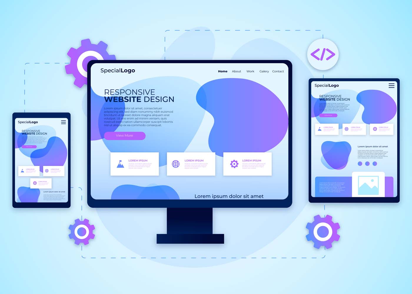
It’s undeniable – we’re living in a mobile age. Smartphones help us stay connected, entertained, and up-to-date on news, entertainment, and much more. That’s why it’s essential for any modern website or web application to be a custom web design with an eye toward the increasingly dominant mobile device market. One solution that many designers have turned to is a responsive web design, which focuses on minimizing the number of page elements necessary while maximizing usability across various devices and platforms. In this blog post, we’ll discuss some of the key concepts behind responsive design as well as how minimalism can play an important part in developing effective solutions for today’s users who are always connected with their mobile phones close by.
What is Responsive Design and Why Does it Matter in the Mobile Age
In today’s mobile age, having a website that is easily accessible on multiple devices is more important than ever. This is where responsive design comes into play. Responsive design is a method of web design that allows websites to adapt to different screen sizes and resolutions without sacrificing functionality or user experience. It ensures that your website looks and works just as well on a smartphone as it does on a desktop computer. With the majority of internet users now accessing the web from mobile devices, having a responsive website is not just a luxury, it’s a necessity. Without it, you could be missing out on a significant portion of your potential audience. So, if you want to stay ahead of the curve in the digital age, responsive design is a must-have for your website.
Minimalism as the Key to Effective Responsive Design
Minimalism is more than just a trendy design movement. It’s a powerful tool that can enhance the effectiveness of responsive design. By stripping away unnecessary elements, minimalism can help to simplify the user experience and improve website loading times. In a world where consumers expect quick and easy access to information, this is crucial. Not only does minimalism improve functionality, but it also creates a stronger brand identity by highlighting key elements of a website’s design. Embracing minimalism can be difficult, but it’s definitely worth considering for those seeking to optimize their website’s usability and overall design.
Four Principles of Responsive Design to Follow
In today’s digital age, having a website that’s mobile-friendly is more important than ever before. That’s why it’s crucial to follow the four principles of responsive design.
Firstly, ensure that your website has a flexible and fluid layout that can adapt to different screen sizes.
Secondly, use high-quality images that load quickly regardless of the device being used.
Thirdly, choose legible fonts that are easy to read on small screens.
Lastly, make sure that your website is easy to navigate regardless of whether it’s being accessed on a phone or desktop.
By following these principles, you can create a website that not only looks great but also provides a positive user experience for all visitors.
Strategies for Optimizing Content for Mobile Devices
As more and more people rely on their mobile devices for online browsing, it’s becoming increasingly important for businesses to optimize their websites for these smaller screens. But how can you ensure that your web content is efficiently translated onto a mobile device? One key strategy is to simplify your design. Get rid of any clutter that might distract from your message, and consider ways to streamline your text and images. You’ll also want to make sure your site loads quickly and smoothly, so users aren’t stuck waiting for your content to appear. Ultimately, the goal is to create a seamless user experience that makes browsing your website a pleasure, rather than a chore. With these strategies in mind, you can take your web content to the next level and reach a wider audience than ever before.
Benefits of a Responsive Website for Your Brand
A responsive website is one that is designed to adapt to various screen sizes, from desktop computers to mobile phones. Not only does this provide a better user experience for consumers, but it also has numerous benefits for your brand including increased visibility, improved search engine rankings, and stronger brand recognition. With more people using their mobile devices to access the internet, having a website that is optimized for these smaller screens is crucial to staying competitive in today’s market. By investing in a responsive website, you can ensure that your brand is reaching as many potential customers as possible and delivering the best possible online experience.
Tools and Resources For Creating A Responsive Site
Having a responsive website is essential for any business. But creating such a site can be a daunting task if you don’t have the right tools and resources. Luckily, there are plenty of options out there to help you create a dynamic and responsive website. From website builders like WordPress and Wix to frameworks like Bootstrap and Foundation, there are many ways to get started with responsive web design. Additionally, there are a variety of online resources, tutorials, and communities where you can learn from experts and get support as you build your site. With the right tools and resources at your fingertips, you can create a website that is optimized for any device, ensuring that your customers can easily access your content no matter where they are.
How to Optimize Your Site for SEO with Minimalist Design
Your website’s design plays a crucial role in determining your search engine ranking. Search engine optimization (SEO) must be an integral part of your website design strategy to help boost your website’s visibility. A minimalist design is a popular trend in web design and is a perfect way to optimize your site for SEO purposes. Minimalism in web design means having fewer elements on a webpage, reducing clutter and unnecessary distractions, and providing a better user experience. Simple, clean designs with white space and clear navigation menus can improve your site’s ranking and make your site more accessible to your audience. With a minimalist design, your website can rank higher, load faster, and offer a better user experience.
Why Responsive Design Tends to be More Usable on Mobile Devices
Mobile devices have become an essential part of our daily lives, and with that, the importance of responsive design has also risen significantly. The reason why responsive design tends to be more usable on mobile devices is quite simple – it adapts to the size and orientation of the device. With responsive design, there’s no need to zoom in or pinch to view content on a smaller screen. The layout adjusts automatically to fit the screen size, making it easier to navigate and access information. This approach provides a seamless user experience across all devices, and it’s no surprise that it’s become an essential part of web design in today’s mobile-first world.
Examples of Successful Minimalist Web Designs
Minimalism is all the rage these days, and it’s not difficult to see why. Nothing beats the clean, sophisticated vibe of a website with a minimalistic design. If you’re looking for inspiration, here are a few exemplary minimalist websites that are sure to impress. First up, we have Dropbox’s website, which features a simple and elegant design with a bright blue header that’s hard to miss. Next, take a look at Airbnb’s website, with its white background and bold font that draws the user’s attention to important features of the site. Finally, there’s Medium’s website, which boasts a clean and crisp design with plenty of white space. All of these minimalist websites have one thing in common: they convey the message with simplicity, yet with all the necessary design elements in place.
Conclusion
It is undeniable that mobile technology has revolutionized the way businesses and consumers interact, making it essential for any business or online presence to have a mobile strategy. Responsive design, with its emphasis on simplicity and minimalism, may just be the key to meeting this challenge. By following the four pillars of responsive design, using tools and resources designed specifically for creating a responsive site, and leveraging optimized content for mobile devices, your brand can gain tremendous benefits from a successful mobile experience. As seen in many examples of minimalist website designs, creating a beautifully simple user experience with responsive design has never been easier. With all the advancements of today’s technology, it is advisable to take advantage of cutting-edge approaches such as responsive design in order to stay competitive in today’s mobile age.
Are you looking for ways to speed up your website and make it more engaging? Minimal websites provide a number of benefits that can help boost website performance, promote user engagement, and improve the overall experience of visiting your site. In this blog post, we’ll be discussing 9 key reasons why going minimal on web design is the way to go—from faster loading times to creating an uninterrupted viewing experience that keeps users engaged throughout their journey with your brand. So let’s dive in!
Minimalism Reduces File Sizes & Load Times
Minimalism is the key to success when it comes to designing a website that loads quickly and efficiently. By reducing the file sizes on your website, you can significantly improve performance and ensure that visitors don’t lose patience waiting for pages to load. Using a minimalistic approach in your design can also help to eliminate clutter and improve the overall user experience. Whether you’re a seasoned web design service provider or just starting out, the benefits of optimizing your website for performance cannot be overstated. So why wait? Start reducing file sizes and load times today to create a website that truly stands out from the competition.
Fewer HTTP Requests
When it comes to web design, the phrase “less is more” couldn’t be more accurate. Minimal web design is all about simplifying your website’s visual appearance to create a more efficient and streamlined user experience. But it’s not just about aesthetics – minimizing HTTP quirequests is also a crucial component of this design approach. By reducing the number of HTTP requests needed to load your page, you can significantly speed up your website’s loading time. This not only improves the user experience but can also boost your website’s search engine rankings. So, if you’re looking to enhance your website’s performance, consider embracing minimal web design principles and saying goodbye to unnecessary HTTP requests.
Cleaner Design Is Easier to Understand and Use
People don’t have the time or patience to sift through cluttered websites to find what they need. That’s why minimalist website design has become so popular. By stripping away unnecessary elements, the minimalist design creates a more streamlined and visually appealing experience. Not only does it look better, but it also makes navigating the website much easier. Users can focus on the content and take action without getting distracted or overwhelmed by flashy graphics or excessive text. Whether you’re a blogger, an e-commerce store, or a startup, a cleaner website design will not only improve usability but also help you stand out in a crowded online space.
More Accessible to All Devices
In a world where technology is constantly changing and evolving, it’s important for websites to adapt in order to reach the widest possible audience. This is where minimal web design comes in. By stripping away all unnecessary elements, minimal websites are able to load quickly and smoothly on any device, from desktops to smartphones and everything in between. Not only does this make them more accessible to users who may not have the latest technology, but it also ensures that everyone has a seamless browsing experience. So whether you’re browsing on a tiny screen or a massive monitor, a minimal website ensures that you can access the content you need with ease.
Increased Focus on Important Content & Features
The rise of minimalist website design has taken the digital world by storm. It’s no secret that the average attention span of internet users is decreasing, forcing developers to rethink the way they design websites. Minimalism offers the perfect solution, by removing everything that isn’t necessary, leaving only the most important content and features. By doing this, users are less likely to get distracted, allowing them to focus on the task at hand. This has resulted in increased engagement rates and a better user experience overall. Whether you’re designing a blog, an e-commerce store, or a corporate site, minimalist design is the way to go.
Improved Navigation Simplifies User Experience (UX)
As our lives grow increasingly hectic, the need for simplicity and ease of use becomes ever more important. This is especially true in the realm of online browsing, where having a minimalist website can make all the difference. And when it comes to user experience (UX), there’s nothing quite as crucial as intuitive navigation. That’s why we’re excited to share that we’ve recently made improvements to our website’s navigation, streamlining the process and making it easier for users to find exactly what they need with minimal clicks. The result? A faster, more efficient, and enjoyable browsing experience for all.
Increased Usability With Intuitive Design Elements
When it comes to designing a website, simplicity is key. Minimalist design not only looks clean and modern but also enhances user experience by removing any unnecessary elements. By implementing intuitive design elements, like clear navigation and ample white space, users can easily find what they’re looking for and appreciate the straightforwardness of the website. A minimalist approach also allows for faster loading times, which can positively impact search engine optimization and overall user satisfaction. So, if you’re looking to improve the usability of your website, consider embracing a minimalist design with intuitive elements.
Quick Loading Times Reduce Frustration for Mobile Users
Simplicity is the name of the game in the world of website design. With the majority of users accessing websites from their mobile devices, it’s important to ensure that their experience is as smooth as possible. This is where minimalist website design comes into play. By stripping away unnecessary elements, a website can load more quickly, reducing frustration and making the user experience more enjoyable. Users on mobile devices are often on the go and need information quickly. With a minimalist website, they can find what they need with ease and speed, without getting bogged down by extraneous graphics or other distractions. A minimalist website is like a breath of fresh air, giving users a seamless experience from start to finish.
Clean Interface Draws Attention to the Call-To-Action
A minimalist website is all about simplicity and elegance. With a clean interface, the website can easily draw attention to the call-to-action elements, enticing the visitors to take action. A minimalistic approach makes the website look uncluttered and easy to navigate, providing an optimal user experience. The clean lines and open spaces on the website allow for smooth browsing, without any distractions. A minimalist design not only enhances the aesthetic appeal but also enhances the overall functionality of the website. So, if you’re looking to create a website that is both visually appealing and highly effective, a minimalist approach is the way to go.
Conclusion
To sum up, minimalism offers many advantages when it comes to website design. Whether you’re a business owner needing to keep user experience (UX) in mind or someone who values simplicity and clean lines on the web, minimal web design offers numerous benefits. It reduces file size and load times while allowing the optimization of important content and features that will be accessed across all devices. Additionally, improving navigation simplifies user experience and usability with intuitive design elements that draw attention to the call-to-action elements. Minimal web design not only allows for mobile visitors to benefit from minimal load times but also reduces frustration for those on mobile devices as quick loading times reduce bounce rates. As we have seen, minimalism has taken the world of website development by storm – creating a cleaner look that almost anyone can appreciate!
With an ever-increasing demand for responsive website design (RWD) among businesses today, it’s more important now than ever before to make sure you have a thorough understanding of the techniques, frameworks, and tools available. Understanding why RWD is such an integral part of modern website development can help you both expand your knowledge and create attractive sites that are tailored to user preferences. In this blog post, we’ll be discussing the reasons behind the high demand for RWD in 2023 and revealing some key tips to get you started on creating effective websites with the basic principles of RWD. So let’s dive right into why you should prioritize using these techniques when developing your sites!
What is Responsive Web Design (RWD)?
A responsive web design (RWD) is a design approach that allows a website’s layout and content to adjust and adapt to various screen sizes, from a desktop computer to a tablet or mobile device. This means that no matter what device your audience is using, your website will look great and be functional. RWD also provides a better user experience and improves the website’s search engine rankings. In short, a responsive website design is a smart investment for anyone looking to reach a wider online audience.
Why is RWD Important for Businesses in Today’s Digital World
RWD allows websites to be easily accessible and navigable across all devices, including smartphones, tablets, and desktops. As more and more people use their mobile devices to browse the internet, businesses need to ensure that their website is optimized for the best user experience possible. By implementing RWD, businesses can improve their website’s visibility and accessibility, ultimately increasing their online presence and revenue. With RWD, businesses can stay ahead in the game and provide customers with a seamless and enjoyable browsing experience no matter where they are.
Advantages of RWD Techniques, Frameworks, and Tools
Responsive Web Design (RWD) techniques, frameworks, and tools have revolutionized the way websites are built and used. There are many advantages to using RWD that make it a popular choice for developers. With RWD, websites can be viewed on any device, eliminating the need for multiple websites targeted at different devices. This in turn saves developers time and money, while also providing a better user experience. RWD also allows for easier maintenance and updates, as changes made to the website only need to be made once to be reflected across all devices. Additionally, RWD techniques ensure that websites are optimized for search engines, making them more likely to appear in search results. Finally, the use of frameworks and tools further allows developers to easily create responsive designs, leading to even greater efficiency and effectiveness. Overall, RWD techniques, frameworks, and tools have greatly improved the web development process and are a valuable asset to any developer.
Common RWD Techniques
With the advancement of technology, developers use various techniques to build responsive website designs. Among these techniques, flexible grids, images, media queries, and breakpoints play a significant role in making a website responsive. Flexible grids allow the web layout to adjust according to the screen size, while images and media queries help optimize image size, layout, and content based on the device. Breakpoints, on the other hand, assist in determining the layout and style changes at specific screen sizes. When developing a responsive website, mastering these techniques is essential to create an exceptional user experience. Understanding and implementing these techniques require a detailed approach, but it’s worth the effort to ensure your website looks great on every device.
Popular RWD Frameworks, and Tools Available on the Market
Popular RWD frameworks like Bootstrap, Foundation, and Semantic UI have made designing and developing responsive websites easier than ever before. These frameworks boast a variety of tools and features, such as pre-built templates, responsive navigation, and user interface components. Bootstrap is a widely used framework, favored for its extensive documentation and flexibility. Foundation offers a more modular approach, with customizable components that allow for greater flexibility. Semantic UI, while newer than the other two, offers a more modern and streamlined design. With these frameworks and the abundance of tools available on the market, designing a responsive website has never been easier or more accessible.
a) Bootstrap
Bootstrap is a widely-used Responsive Website Design (RWD) framework that has gained a large following among web developers. One of the key features that make Bootstrap so popular is its ability to create responsive and mobile-friendly websites. It provides a user-friendly grid system that allows developers to easily customize layouts and design elements to create websites that look great on any device. Additionally, Bootstrap comes with robust CSS components and JavaScript plugins that make it easy to incorporate interactive elements, such as navigation menus and forms, into websites. Overall, Bootstrap is an excellent RWD framework that offers a great balance between functionality and ease of use.
b) Foundation
Foundation is a highly popular responsive web design (RWD) framework that is extensively used by web developers for creating stunning web applications. This open-source framework is loaded with a wide range of features that make it easy to create responsive designs in real time. From customizable UI components and semantic coding to compatibility with almost all major web browsers, Foundation is packed with features that simplify the process of building responsive websites. This framework also has an intuitive grid system that makes aligning content on a webpage a breeze. With all these features and more, it’s no wonder Foundation is one of the most widely used RWD frameworks in the industry!
c) Semantic UI
Semantic UI is a highly popular responsive web design (RWD) framework that has gained traction among developers due to its excellent features. This framework is an intuitive and comprehensive toolkit that offers robust CSS and SASS components, enabling developers to create high-quality, responsive websites with ease. The framework’s naming convention and syntax are very clear and concise, making it easy for developers to comprehend and remember the code. Additionally, Semantic UI’s collection of pre-designed themes allows developers to customize their site design and focus on functionality rather than aesthetic elements. Overall, Semantic UI is a highly effective RWD framework that triumphs due to its ease of use and adaptability.
How to Implement an Effective and Engaging RWD Strategy
Implementing an effective and engaging RWD strategy can be challenging. To begin, start by analyzing your website’s current traffic and functionality. This will help you determine which devices and screen sizes your audience is using the most. From there, it’s important to create a design that is visually appealing and easily navigable on all devices. Incorporating interactive elements, such as animations or videos, can also help enhance engagement and make your website stand out. Ensuring your website loads quickly and has clean code is also crucial in maintaining an effective RWD strategy. With these tips in mind, you’ll be on your way to creating a responsive website that engages with your audience and boosts your online presence.
Tips and Best Practices for Responsive Web Design (RWD)
First and foremost, make sure your website is flexible and fluid, meaning that it can adjust to different screen sizes. Additionally, use media queries to adjust the layout, font size, and images. And don’t forget about touch-friendly buttons and navigation. By following these tips and best practices, you’ll be well on your way to creating a website that’s optimized for all devices and user-friendly for all visitors.
Conclusion
In conclusion, responsive web design (RWD) is a must-have in today’s digitally-driven world. When businesses offer an optimized user experience regardless of device or platform, they stand the greatest chance of success. Adopting RWD techniques allows you to guarantee excellent customer service and boost loyalty from customers without having to use multiple sites for different devices. Popular RWD frameworks include Bootstrap, Foundation, and Semantic UI – each offering its own set of features for developers and designers to utilize. Regardless of which framework is used, businesses should ensure their websites are fully optimized with well-thought responses for each device type and screen size for optimum performance. Implementing an effective and engaging RWD strategy is paramount for any organization — from small startups to large enterprises — who want to stay on top in their industry. Follow these tips and best practices to make sure your website is able to keep up with the swiftly changing web trends while providing an appealing and reliable service!
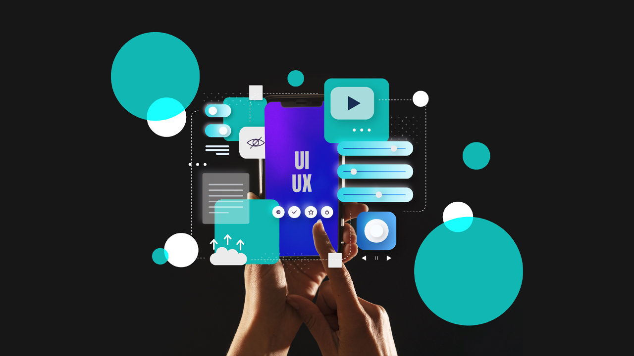
The minimalist design trend is becoming increasingly popular, especially among tech-savvy designers who aim to create user experiences that are easy to navigate, aesthetically pleasing, and effective. Minimalist UI/UX design delivers numerous advantages in terms of space management and usability for users; it also has a few drawbacks. In this blog post, we’ll explore how minimalism is transforming the way that businesses engage with their audiences, as well as its limitations when used on the web. We’ll look at examples of successful minimalist design implementations and discuss best practices for putting together your own designs that maximize results while mitigating potential pitfalls. Whether you’re just getting started with designing or an experienced veteran looking to hone your skills, read on to discover more about the benefits (and limitations) of minimalist web design!
What is Minimalist UI/UX Design and How Does it Relate to User Experience (UX)?
Minimalist UI/UX design focuses on simplifying user interfaces by removing unnecessary elements and emphasizing functionality. This approach follows the concept that “less is more” when it comes to UX design. By minimizing the clutter and prioritizing the most important features, the minimalist design enhances the user’s experience by making it easier for them to navigate and achieve their desired tasks. Adopting minimalist design principles can result in increased user satisfaction, engagement, and loyalty. In order to implement a successful minimalist UI/UX design, designers need to understand their target audience and carefully consider which elements are crucial to the user experience.
Benefits of Minimalist UI/UX Design
Minimalist UI/UX design has become increasingly popular in recent years due to its many benefits. With a minimalist design, clutter is reduced and functionality is prioritized. This not only creates a clean and visually appealing user interface but also makes it easier for users to navigate and find what they are looking for. A minimalist design also improves website speed and performance, which is essential for providing a seamless user experience. In addition, minimalist design allows for faster development and easier maintenance, making it a cost-effective option for businesses. Ultimately, a minimalist design prioritizes user needs and enhances the overall user experience, making it a valuable approach in today’s digital landscape.
Improved Usability
With the rise of minimalism in design, it’s easy to assume that usability might be sacrificed in the pursuit of a sleek and streamlined aesthetic. However, the truth is quite the opposite. Minimalism can actually enhance usability and make for a more intuitive user experience. By cutting down on visual clutter and unnecessary elements, users can more easily find what they need and focus on the task at hand. Plus, a simple and elegant design can be visually appealing and even calming to use. The key is to strike the right balance between minimalism and functionality, ensuring that the design remains user-friendly and not just fashionable. With this in mind, designers can create interfaces that are both beautiful and easy to use.
Enhanced Focus on Mobile-Friendly Features
To truly succeed in today’s fast-paced digital environment, it’s crucial to enhance the focus on mobile-friendly features. This means ensuring that the design is not only aesthetically pleasing and easy to navigate but also optimized for a seamless mobile experience. From intuitive touch controls to responsive layouts, a focus on mobile-friendly design features can provide users with a streamlined experience that keeps them engaged and satisfied.
Fewer Distractions for Users
A minimalist design can make a world of difference when it comes to user experience. By reducing distractions, users can focus on the essential aspects of the interface they are interacting with. A cluttered design could make it arduous for users to understand what action they should take next. On the other hand, a clean and straightforward approach to design can improve the experience and ease the user’s journey toward their goal. Fewer distractions can also mean a reduced cognitive load, allowing users to process the information effectively and without confusion. A minimalist design approach ensures that your website or application fits the user’s needs while providing them with a seamless experience.
Limitations of Minimalist UI/UX Design
Minimalist UI/UX design may have its praises, but it certainly has limitations. While the lack of clutter and sleek aesthetics may seem pleasing to the eye, it can also limit the amount of information that can be conveyed to the user. Important details might get lost in the sea of white space or overshadowed by the design itself. Another limitation of minimalist design is its tendency towards impersonality. While simplicity is key, attempting to create a completely streamlined experience can take away the human touch that many users crave. Ultimately, while there is value in minimalist design, it’s important to remember that it may not always be the best approach for every project.
Limited Customization Options
Minimalist design is all about simplicity and a clean, uncluttered look. While this design approach is visually appealing and can lead to a sleek, modern aesthetic, it can also limit the customization options available to users. With fewer design elements to work with, designers may feel constrained in their ability to create something truly unique. However, this limitation can also lead to a greater focus on the essential elements of design, resulting in a design that is both functional and visually appealing. In the end, the choice of a minimalist design should be based on the specific needs and goals of the project, and whether the trade-offs in customization are worth the benefits of a more streamlined approach.
Difficulty Accommodating Complex Interactions
Minimalist design has become increasingly popular in recent years for its clean, simplistic aesthetic. However, as sleek as it may appear, minimalist design can present challenges when dealing with more complex interactions. Accommodating these interactions can be difficult without compromising the overall minimalist feel. Finding a balance between functionality and design can be a daunting task. Nonetheless, designers are up for the challenge and are constantly exploring new ways to incorporate complex interactions into minimalist design without compromising the user experience. The goal is to create a design that not only looks great but also functions seamlessly. So, while a minimalist design may present challenges when it comes to complex interactions, it also presents an opportunity for creativity and innovation.
Tips for Overcoming the Limitations of Minimalist UI/UX Design
Minimalist UI/UX design has become increasingly popular among designers as it provides a clean and simple interface that focuses on the functionality of the product rather than the design. However, despite the benefits it offers, a minimalist approach also presents some limitations. To overcome these limitations, a UI/UX design agency needs to find ways to balance simplicity and functionality. One tip is to incorporate subtle and tasteful animations, which can add an extra level of engagement without sacrificing the minimalist aesthetic. Another tip is to use typography to create visual interest and hierarchy, providing users with a clear understanding of the content and information displayed. With these tips, designers can overcome the limitations of minimalist UI/UX design and deliver a functional and visually appealing product.UI/UX Design Creatives
Leverage Contextual Aids & Visual Cues to Help Guide Users
While minimalist designs may appear sleek and straightforward, designers often face the challenge of helping users navigate through content without overwhelming them. That’s where contextual aids and visual cues come into play. These elements provide subtle guidance to users and can make all the difference in their experience. By utilizing context-specific information and imagery, designers can help users understand the purpose and functionality of features without the need for lengthy instructions or repetitive design elements. The end result is a harmonious balance between simplicity and usability, enabling users to effortlessly achieve their goals within the minimalist design.
Use Progressive Disclosure to Simplify Complex Interactions
Simplifying complex interactions in minimalist designs can be a daunting task, but with the help of progressive disclosure, it becomes much easier. This design technique involves breaking down information into smaller, more manageable chunks that reveal themselves gradually as the user interacts with the interface. By limiting the initial display of information to only what is necessary and progressively revealing more as needed, designers can reduce clutter, streamline the user experience, and enhance the overall usability of the interface. Through using this technique, designers can create minimalist designs that not only look sleek and modern but also provide users with the information they need in a clear and digestible manner.
When Is Minimalism Not the Best Choice for Your Website Design
Minimalism has been a popular trend in website design for years. However, just because something is trendy doesn’t mean it’s always the best choice for your website. There are times when minimalism can actually be detrimental to the user experience. For example, if your website is an e-commerce site, you may need to provide users with multiple images and detailed information about your products. In this case, a minimalist design may not be suited to showcase your products or give visitors enough information to make informed purchasing decisions. Likewise, if your website is for a creative agency or portfolio, a minimalist design may not be the best way to show off your work and attract clients. Ultimately, the design of your website should be dictated by the purpose of your site and the needs of your audience.
Examples of Successful Minimalist UI/UX Designs
Minimalist UI/UX designs are all about simplicity and efficiency. They are a great way to create a user-friendly interface without overwhelming your users with too much information. That’s why it’s important to take inspiration from successful minimalist designs. For example, take a look at Dropbox or Google’s search page. Both are clean, simple, and easy to use. The purpose of minimalist UI/UX designs is to focus on the content, rather than the design. That’s why typography, whitespace, and color are so important in these designs. They should all work together seamlessly to create a finished product that is both beautiful and functional. Whether you’re designing a website or mobile app, be sure to keep these principles in mind when creating your own minimalist UI/UX design.
Conclusion
In conclusion, minimalist UI/UX design is a great choice to elevate user experience and engage users. Although it does have its limitations, following tips such as leveraging contextual aids and visual cues and using progressive disclosure, can help you work around them. Ultimately though, minimalism may not be the right choice for every web design project. By studying successful minimalist UI/UX designs, and taking notes of common elements that make up these designs, you can decide whether this is the right direction to take your own project in. Thoughtfully considering minimalism when looking toward how you can best create an enjoyable user experience will always serve you well.