“Hey, guess what? I just came across a free logo generator website where I designed logo for my clothing brand for free!!! Isn’t that so cool? I’m so glad I didn’t spend $50 for a logo design on Fiverr. Money saved! ” – Jeremiah from Reddit.
We live in the era of instant gratification and our choices are dictated by swiping left or right. it’s only natural that emerging brands lookout for an easy way out when it comes to their branding needs. In the quest for logo designs, people sometimes end up using free online logo generators to either save their time or some bucks. While the thought of online logo makers may seem enticing as it gives you an instant logo, it’s not that good. Your brand’s image needs to be as unique and special as your brand and not some randomly generated elements you think of as logos. To give you a detailed insight into why you shouldn’t be using free logo generators, we’ve compiled this comprehensive blog where we’ve highlighted the concealed drawbacks that come with these seemingly convenient tools.
Nothing in This World Comes For Free
The word “Free” has a magnetic appeal and works like a magic word in our heads. Usually, startups and small businesses have financial constraints and a free logo generator may sound like a blessing. However, when it comes to logo generators, “free” often translates to a compromise on quality, uniqueness, and originality.
How Do Free Logos Compromise Brand Identity
Lack of Originality
Originality and distinction are two of the main objective of a logo. You don’t want your logo to look identical to any random logo you find on Google. Your logo should showcase your distinct identity, but free logo generators lack the ability to generate unique elements and grasp your brand’s soul. They churn out logos based on algorithms and therefore lack the understanding of your brand’s essence. Since these free logo makers work on algorithms, they offer a limited set of templates that leads to similar logos across different brands and business categories. Your logo is your brand’s fingerprint, an emblem of individuality. It should stand out, not blend in! Free generators fail to capture this art of uniqueness that professional designers excel at.
The Versatility Myth
Free generators offer minimal customization options which leaves you with a logo that doesn’t quite resonate with your brand’s personality. And when it comes to branding, it isn’t just about your logo; it’s an orchestra of colors, typography, and imagery. Free generators lack the harmony needed for consistent and impactful branding which leads to mismatched branding elements.
The Drawbacks of DIY Design
To a layman, a logo might initially appear as a collection of abstract shapes and colors. However, the process of designing a creative logo goes beyond the combination of these elements. Design principles and psychology come into play! Free generators overlook these crucial aspects. How can you fix it? By working with a skilled designer you can make sure that your logo embodies the essence of your brand’s identity.Consider this analogy: Would you entrust an AI to shoes a dress for you or organize your wardrobe? Just as your fashion sense is unique to you, a designer understands the intricacies and aesthetics that align with your brand. They have the expertise to craft a logo that stands as a captivating identity, capturing the essence of your brand and leaving a lasting impression on your audience.
The Hidden Costs
Have you ever considered that the logo you’re contemplating, which is supposedly “free,” may not actually be entirely yours? It’s quite unsettling to know that certain logo generators sneakily retain rights or even reuse certain elements. This seemingly harmless act could potentially result in unforeseen legal complications down the road.Moreover, as your business continues to evolve and expand, it may eventually outgrow the limitations of your free logo. At that point, the cost of rebranding could take a toll on your pocket. The initial savings that you did by getting a free logo might then appear insignificant in comparison. Therefore, it’s important to carefully consider these factors before making a decision.
Role of Psychology: The Trust Factor
Logo design is so much more than just creating a symbol to represent a brand. It involves a deep understanding of psychology and marketing. Different colors, shapes, fonts, and styles can evoke different emotions and perceptions in consumers. And these design elements differ from brand to brand. For example, a vibrant logo might represent a brand that’s fun and exciting, while a sleek and modern logo might evoke a sense of sophistication. By delving into the psychological intricacies of logo design, you can create a brand identity that touches your audience on an emotional level.
The DIY Logo vs. Professional Design
Your logo is more than just an expense; it’s a valuable investment with long-lasting benefits. A well-crafted logo created by a professional not only boosts brand recognition but also fosters customer loyalty and enhances perceived value. As your brand evolves and adapts to changes in the market, a thoughtfully designed logo grows with it, capturing the essence of your brand and resonating with your target audience. So, think long-term and make the wise choice of investing in a logo that stands the test of time.
What Can You Do?
When it comes to affordability, it’s important not to automatically assume it means compromising on quality. In fact, there are many talented designers out there who offer cost-effective solutions tailored to your brand’s specific needs. These designers possess the unique ability to transform your vision into visual poetry, truly understanding your brand’s essence and skillfully crafting a logo that tells your story. They have the remarkable talent to capture the vision behind your brand – its values, culture, and mission – and translate them into a captivating logo that effectively conveys your message.
Conclusion
While the idea of utilizing a free online logo generator may seem appealing at first, it’s important to be aware of the hidden pitfalls that can potentially tarnish your brand’s image and limit its potential. Your logo isn’t merely a visual representation; it serves as the embodiment of your narrative, essence, and connection to your audience. By investing in professional logo design services, you are making a wise investment in the long-lasting success and impactful presence of your brand.
Creating a logo or user experience that stands out from the rest can be tricky business. You want your design to pop, but you don’t want it to look tacky – so how do you get it just right? Making sure to avoid common mistakes is one way of making sure you hit the mark with your target audience. If you’re looking for tips on what not to do when designing logos and UI/UX experiences, then this blog post is for you! Find out the biggest designer disasters around – and importantly how they can be avoided. Read on now to discover the top must-nots in logo and UI/UX design – helping ensure smooth sailing as your project progress.
Impact of Design Mistakes on Client Satisfaction.
Design mistakes can have a significant impact on client satisfaction. In the world of graphic design, logo design is often the first aspect that clients review. A poorly designed logo can create a negative impression, which affects a client’s perception of a business. Similarly, UI/UX design plays a crucial role in the client’s experience with a website or mobile application. A poorly designed user interface can lead to confusion, frustration, and ultimately dissatisfaction with the product. Therefore, designers need to pay close attention to the details while creating their designs to ensure that their mistakes do not negatively affect their client’s satisfaction.
Mistake 1: Lack of Clear Communication
Effective communication plays a vital role in any successful project, especially when it comes to logos and UI/UX design. Lack of clear communication can result in misunderstandings and faulty design outcomes that do not align with the client’s vision. A design team, when working on a project, needs to establish a clear line of communication to ensure the designer’s understanding of the client’s vision and goals. Clear communication with clients about objectives, target audience, and expected outcomes can help avoid misinterpretations and lead to efficient design. Effective communication is a cornerstone for the successful implementation of any visual design project.
Mistake 2: Ignoring User Experience (UX) Principles
Designing a website is not all about aesthetics; it is also about user experience (UX). Failing to pay attention to UX principles can lead to a frustrating experience for visitors, and may even discourage them from returning. Have you ever visited a website with confusing navigation that left you searching for hours? Or, have you encountered a cluttered layout that made it impossible to find what you were looking for? Unfortunately, these are all too common mistakes that people make when designing websites. Adding to that, there is also the issue of a lack of responsiveness on certain devices. It is essential to avoid these pitfalls and to prioritize the user when creating a website, and perhaps even consult with an expert in the field. After all, an aesthetically pleasing website is only enjoyable if it is easy to navigate and responsive for all users.
Mistake 3: Neglecting Consistency and Branding
In today’s fast-paced digital world, consistency and branding are essential for any business to succeed. However, neglecting these two crucial elements can be a costly mistake. Consistency in messaging and visuals is what sets a brand apart from its competitors and creates a sense of trust and reliability for customers. Neglecting branding can lead to a lack of recognition and a decrease in customer loyalty. It’s important for designers to clearly understand the brand identity and maintain consistency across all platforms, from social media to advertising.
Examples
If a company’s logo is not consistently applied, it can lose its recognition value and create a negative impact on consumer perception. Inconsistency can confuse and damage a company’s reputation. Thus, it is crucial to follow a design style guide and implement a standard set of design practices to maintain brand identity consistency.
Mistake 4: Overcomplicating Design
Design is an art, but it is not a chance to showcase every idea in your head. Mistake 4, overcomplicating design, is a common pitfall, especially when trying to create an unforgettable computer interface. Whether designing for a website or app, the goal is always to keep users engaged and satisfied. Overloading the UI/UX design with excessive elements or complicated layouts will only lead to the opposite effect. Instead, focus on a simple yet engaging design that emphasizes the message you want to convey. A great logo can go a long way in supporting a clear and concise message. Clean and minimalistic design is the key to ensuring that users are not burdened or confused. So, let go of the temptation to add too much, and trust that less is truly more.
Simplification Techniques to Improve Clarity and Effectiveness
A well-designed logo and user interface (UI) can leave a lasting impression on users and enhance their overall experience. However, to make a design truly effective, it must also be clear and easy to understand. That’s where simplification techniques come in. By eliminating clutter, reducing complexity, and focusing on the most essential elements, designers can create designs that communicate their message more clearly and effectively. Whether it’s simplifying the layout of a UI or streamlining the elements of a logo, incorporating these techniques can make a significant difference in the success of your design.
Mistake 5: Poor Typography Choices
Typography is a crucial element to consider when creating anything that involves text, from websites to business cards. Unfortunately, it’s all too easy to make mistakes with typography that can detract from the professionalism and clarity of your materials. Some of the most common typography mistakes include using fonts that are difficult to read, failing to space your text properly, and being inconsistent with your use of typography styles. These errors can have a significant impact on how your design is perceived by others. By being mindful of your typography choices and avoiding these common mistakes, you can ensure that your design communicates effectively and accurately every time.
Mistake 6: Lack of Attention to Accessibility
It’s important to create products and experiences that are accessible to everyone. Unfortunately, many make the mistake of not paying enough attention to accessibility, which can result in frustrating experiences for users with disabilities. One common mistake is insufficient color contrast. This can be a major problem for those with visual impairments, making it difficult to read or navigate. Another mistake is the lack of alternative text, which is important for those using assistive technologies like screen readers. And let’s not forget about inaccessible navigation, which prevents users from easily moving around a website or app. By avoiding these common accessibility mistakes, you’ll not only create a more inclusive experience for all users, but you’ll also show your commitment to creating products that everyone can use.
Design Mistake 7: Failing to Iterate and Seek Feedback
Designing a logo or working on UI/UX design can be an arduous task, and a lot of effort goes into getting it right. The last thing you want is to launch a product that lacks functionality and usability. It’s not just about aesthetics; a well-designed product should have feedback from end-users incorporated into it. Failing to iterate and seek feedback can lead to missed opportunities and faults that could have been avoided. Making changes based on constructive feedback is critical for an excellent final product. To neglect it is to risk leaving behind a trail of disgruntled users who will not hesitate to abandon your brand. Therefore, it’s essential to incorporate improvements and seek feedback to avoid this design mistake.
Conclusion
It’s important for designers to be mindful of the mistakes that can be made during the design process to ensure they are providing an effective and positive experience for clients. By making sure that communication is clear, user experience principles are respected, consistency and branding are maintained, designs are not overcomplicated, typography choices are correct, accessibility standards are met, feedback is taken into consideration, and modifications are made where needed, designers can create beautiful results that correspond with their clients’ specific needs. Ultimately, avoiding these design mistakes allows designers to foster better relations with their clients while increasing customer satisfaction in the long run.
Google’s logo is an iconic symbol that has come to define our modern digital age in many ways. It stands out against its competitors and its significance cannot be understated. But what lies beneath this recognizable design? What inspired the innovative creators at Google to craft such a unique, powerful, yet simplistic logo design? In this blog post, we will take an in-depth look into the elements that comprise Google’s logo design – from its color palette and typography selection to the implications of symbolism – and analyze why it remains so impactful today. Let’s begin!
History and Evolution of Google’s Logo Design
Google’s logo has seen quite a transformation since its first rendition in 1998. The design began with a colorful and playful font, which evolved to a cleaner and simpler look with the addition of a shadow effect in 1999. Over the years, Google experimented with different colors, shapes, and styles, reflecting the evolution of technology and design trends. Their logo took a significant turn in 2015 when they unveiled a new design with a sans-serif font and a brighter color scheme. The updated logo reflected the company’s evolution from a search engine to a technology giant that provides a wide range of products and services. Google’s logo design, like the company itself, has been a fascinating journey to follow.
The Original “BackRub” Logo
The original “backrub” logo may not be a household name, but it played an important role in the origins of the internet. The logo was created for a search engine called Backrub, which was founded by Larry Page and Sergey Brin in 1996. The logo itself is simple, featuring a hand with its fingers interlocked to create a stylized letter “B”. Yet, it represented the innovative approach that the young entrepreneurs behind Backrub were taking to search technology. The name Backrub actually referred to the way their algorithm analyzed the “backlinks” on web pages to determine their relevance. Although the search engine never gained mainstream popularity, it provided the foundation for what would eventually become Google – a company that needs no introduction. Taking a closer look at the original Backrub logo provides insight into the humble beginnings of one of the most dominant forces in the modern world.
Visual Components of the Current Google Logo
Google’s iconic logo has undergone quite a few transformations since its inception in 1998, with the last major redesign occurring in 2015. The new iteration of the logo features a sans-serif typeface, with the signature bright primary colors giving way to a more subdued palette. The letter ‘g’ has also been given a softer, more rounded shape, while the rest of the letters maintain their standard shape. As for the visual components, the logo’s use of negative space is a key aspect, with the white spaces between the letters helping to integrate them into a cohesive and recognizable whole. Overall, the current Google logo exudes a fresh and modern feel that embodies the company’s innovative spirit.
Colors and Fonts Used in the Google Logo
Google is known for its simple, colorful logo. Although it may seem like a simple design, a lot of thought and consideration was put into the colors and fonts used in the logo. The primary colors used are red, yellow, and blue, with a touch of green. These colors represent playfulness, creativity, and innovation- all values that align with Google’s brand. The font used is a custom version of the classic serif font called Catull, which gives the logo a sense of professionalism and sophistication. It’s interesting to think about how the colors and fonts used in the Google logo contribute to the overall image of the company that we all know and love.
Shapes, Proportions, and Spacing of Google’s Logos
Google’s logos are easily recognizable around the world, and it’s no wonder why. If you take a closer look, you’ll see that the shapes, proportions, and spacing of the letters are all carefully crafted. Everything from the rounded edges of the letters to the perfect spacing between them is intentional. It’s not just aesthetically pleasing – it’s functional too. The clarity and legibility of the letters ensure that the logo is easily understood from a distance, or when it’s shrunk down to fit on a tiny screen. It’s a true testament to the power of design and the impact it can have on a brand.
Google’s Brand Identity
A company’s logo is the face of their brand. It needs to be distinctive and memorable. Google’s logo has been through a few changes over the years, but it still remains one of the most recognizable logos out there. The bright primary colors and playful font reflect the company’s fun and innovative personality. However, the logo is more than just a visual representation of the brand. It’s a symbol of the company’s commitment to providing users with a seamless and user-friendly experience. The logo is integrated into everything Google does, from the search engine to their suite of apps. It’s a constant reminder of the brand’s mission to connect people with the information they need, when they need it.
Color Theory in Google’s Logo Design
Google’s colorful logo is one of the most recognizable and iconic designs on the internet. But what goes into the selection of colors for such a dynamic and complex company? This is where color theory comes in. From the bright blue to the playful green and red, each shade was carefully chosen to convey specific emotions and feelings. For example, blue is often associated with trust and security, as well as intelligence and stability. Meanwhile, green is used to represent growth, vitality, and nature. By understanding the principles of color theory, Google was able to create a logo that perfectly represents the brand’s fun, innovative, and trustworthy spirit.
Hidden Cues in Google’s Logo
Google’s logo is instantly recognizable. But did you know there are hidden cues cleverly incorporated into it? In the four primary colors used in the logo – blue, red, yellow, and green – many have seen a nod to the primary colors of printing. However, the colors actually represent brand values central to Google’s philosophy. Blue represents stability and trustworthiness, red represents energy and passion, yellow represents friendliness and happiness, and green represents growth and positivity. These values are reflected in every aspect of Google’s operations, and it’s fascinating to see how even their logo conveys their core beliefs. So next time you search using Google, take a moment to appreciate these cleverly hidden details!
Conclusion
All in all, Google’s logo design lays the groundwork for a cohesive and recognizable brand identity. From its humble beginnings as a Stanford University project to its current recognition as “the world’s most recognized brand,” Google has come a long way. The simplicity of the color scheme and the perfectly proportioned letters all help to solidify their visual identity. Additionally, the hidden cues lying within each element that can be traced back to their original mission statement have served as a reminder that they continue to fight for information accessibility and digital frontiersmanship even today. As one of the most influential companies in the 21st century, Google goes beyond great design by pushing boundaries in order to not only make searching easier but make it fun while doing so. This is part of what shapes their successful story from past to present – A timeless classic Renaissance story we can all learn from.
With each passing day, we are becoming more and more aware that our decisions are heavily influenced by the biases our minds pick up over time. Our lives become a series of snap judgments – both conscious and subconscious – that determine how we interact with the world around us. This phenomenon is especially true when it comes to branding: cognitive bias can dramatically shape consumers’ perceptions of companies, products, services, and even ideologies—for better or for worse. In this blog post, we’ll explore exactly what cognitive biases are and why they should be taken into consideration in all aspects of brand marketing.
Connection Between Psychology and Branding
Branding is an essential part of any successful business, but have you ever considered the role psychology plays in crafting a brand? From logo design to advertising strategies, every aspect of a brand is carefully crafted to create a specific perception in the minds of consumers. This perception is formed by various psychological factors, such as color psychology, emotion, and cognitive biases. Understanding these factors and how they influence consumer behavior can help businesses create a brand that resonates with their target audience. By leveraging psychology in branding efforts, businesses can establish a more powerful connection with consumers and ultimately increase their bottom line.
What is Cognitive Bias?
Our brains are remarkable, complex organs that process unbelievable amounts of information every day. However, sometimes the information we receive can be flawed, and our brains might not be able to interpret it perfectly. This is where cognitive bias comes in. Put simply, cognitive bias describes the various ways our brains sometimes interpret information in a way that skews our perception of reality. This might manifest in decision-making, problem-solving, or even just our everyday behaviors. Because our brains are often on autopilot, it can be challenging to recognize when we’re experiencing cognitive biases. However, understanding this phenomenon is the first step toward making more informed, accurate decisions.
Types of Cognitive Biases
The sheer number of cognitive biases can be overwhelming, with some estimates putting the number in the hundreds. Common examples of cognitive biases include:
confirmation bias, which is the favoring of information that confirms our preexisting beliefs,
and the halo effect, which is when we make generalizations about a person based on one positive trait they possess.
All of these can impact how we perceive the world around us and make decisions. Being aware of these biases can help us make more informed decisions and avoid irrational thinking.
How Does Cognitive Bias Impact Branding?
Cognitive biases are inherent in how human brains process information, and they can have significant impacts on branding efforts.
For example, people tend to remember information that confirms their preexisting beliefs or opinions, a phenomenon known as confirmation bias. Branding strategies may fall victim to this bias if targeted messaging fails to resonate with individuals who hold different viewpoints.
Anchoring bias is another cognitive bias that tends to impact how people interpret information about price. People may perceive a product as more expensive than it actually is if the starting price presented to them is higher than they expected. This can have negative consequences for branding efforts if potential customers are turned away by a perceived high price point.
Understanding how cognitive biases influence consumer behavior is essential for successful branding campaigns.
Impact of Cognitive Bias on Product Pricing
When it comes to pricing products, it’s easy to fall prey to cognitive biases. These biases, often rooted in our subconscious, can lead us to make irrational decisions based on emotions and previous experiences.
For example, the anchoring bias may cause us to set a price based on the first number that comes to mind, rather than what the product is actually worth.
The availability bias may cause us to overvalue a product simply because it’s readily available, even if it’s not necessarily better or more functional than other options.
Being aware of these biases and taking steps to mitigate them can help businesses make more rational and profitable pricing decisions.
Examples of Brands That Incorporate Cognitive Bias Into Their Branding Strategies
With the rise of cognitive science, it’s no surprise that many successful brands are using cognitive biases in their branding strategies.
One prime example is Apple, which uses the framing effect to its advantage by presenting its products in sleek and minimalist packaging that oozes luxury.
Social proof is another popular bias, with companies like Amazon using customer reviews to reinforce brand loyalty and credibility.
Even the popular ride-sharing app Uber taps into the anchoring bias, offering different pricing tiers that make even the higher-priced options more appealing.
With these clever tactics, brands are not only staying ahead of the competition but also tapping into human psychology to win over consumers.
Risks Associated with Relying on Cognitive Biases
As humans, we often rely on cognitive bias to make decisions. This can be useful when it comes to quick, mundane choices, but when it comes to branding decisions, relying too heavily on cognitive bias can bring about a host of potential risks.
For one, cognitive bias may lead us to make decisions that are not aligned with our brand’s values, leading to a disconnect between what we think we stand for and what is actually being communicated.
Additionally, relying on personal biases may also lead to missed opportunities for growth and innovation, as we may overlook potential strategies that don’t align with our pre-existing beliefs.
In short, while cognitive bias isn’t inherently negative, it’s important to recognize its limitations and be mindful of the potential risks it can bring about in the world of branding.
Conclusion
In conclusion, it is vitally important to understand the psychological connection between branding and cognitive bias. Identifying the types of cognitive biases at play and how they have an influence on decision-making and behavior, allows marketers to make better-informed decisions about their branding strategies. Although there may be some risks associated with relying too heavily on cognitive biases when making branding decisions, successful brands such as Apple, Amazon, and Nike have been able to successfully implement cognitive bias in order to drive brand loyalty. It’s also essential for businesses to build trust with customers through ethical practices that allow them to make clear, informed decisions regarding their purchases. By leveraging the power of psychology in their branding efforts, businesses can ensure that they are accurately targeting and appealing to the right kinds of customers and increasing their chances of long-term brand success.
Color is powerful. It can cause emotions, propel memories and even influence our shopping decisions. In today’s highly competitive marketplace, understanding the science behind how colors impact how consumers interact with your brand is essential for businesses to stay ahead of their competitors. This blog post closely examines color psychology to explore why certain hues evoke specific reactions in humans at an unconscious level and what this means for companies seeking to maximize trustworthiness and brand loyalty among customers. We’ll discuss the research around color selection, provide marketing strategies that leverage these findings and offer helpful tips on choosing a cohesive palette that resonates with an intended audience for maximum success.
Why Color Matters for Businesses?
Color plays a crucial role in branding as it influences people’s emotions and perceptions of a brand. The right color choice can evoke a range of emotions, from trust and reliability to excitement and passion. For businesses, understanding color psychology can be the key to creating a strong, recognizable brand that stands out from the competition. By selecting colors that align with their brand values and messaging, companies can create a visual identity that resonates with their target audience. In today’s competitive marketplace, where brands are vying for attention, the power of color in branding cannot be overlooked. It is an essential tool in building brand recognition, creating an emotional connection with consumers, and ultimately driving business success.
Emotional Meaning Behind Hues
Colors are more than just visual stimuli. They are ingrained into our thoughts and emotions and evoke certain psychological and emotional responses. Every hue has its own psychological and emotional meaning. For example, red is often associated with passion, energy, and intensity, while yellow is associated with optimism, happiness, and warmth. Blue is often viewed as calming, trustworthy, and serene, while green evokes feelings of growth, balance, and harmony. Knowing the psychological and emotional meaning behind different color hues can be a powerful tool in creating meaningful and impactful visuals, designs, and art.
The Science Behind Color Selection
Color selection is a complex science that has far-reaching impacts on our daily lives. Multiple color theories exist, each with its own set of rules and principles governing color combinations. From complementary colors to monochromatic schemes, each theory has its place in design and art. However, the selection of colors extends beyond aesthetics; it is an emotional experience that can stir up feelings of excitement, warmth, or calmness. Colors can influence everything from our mood to our purchase decisions, making it an essential aspect of brand marketing. By understanding the science behind color selection, we can create impactful, visually appealing designs that resonate with our target audience.
Scientific Breakdowns
Color plays a significant role in branding, and scientific research confirms this fact. According to various studies, color makes up about 85% of the primary reasons that people buy particular products. Furthermore, researchers have found that using the right colors can increase brand recognition by about 80%. The scientific explanation lies in the way color affects our emotions, which, in turn, influences buying behavior. Different colors convey different emotional messages, and thus, choosing the right color can impact your brand’s ability to connect with customers. To increase your brand’s chances of success, it’s essential to consider the psychological effects of color selection.
Breaking Down the Color Wheel
The colors a brand uses can speak volumes about its values and personality. While many may associate colors like red with power and passion or green with nature and growth, the way these hues are displayed and combined on a brand’s logo or website can have a substantial impact on consumers’ perceptions of its trustworthiness. Breaking down the color wheel can help us understand why certain brands evoke a sense of reliability or approachability, while others may seem cold or untrustworthy. By digging into the psychology behind color, we can gain a greater grasp of how brands can use this powerful tool to build lasting connections with their audiences.
a) Red, Orange, and Yellow
The colors red, orange, and yellow can hold significant meaning in branding. Red is a color of passion and intensity, creating a sense of urgency and excitement. Orange is associated with energy, warmth, and friendliness, making it the perfect color to convey a welcoming feeling. Lastly, yellow represents positivity, happiness, and cheerfulness. One may use this bright color to showcase their brand as uplifting and optimistic. All three colors work together to create a dynamic and engaging brand personality.
b) Green, Blue, and Purple
The green color represents growth, nature, and health. It’s frequently used in brands related to eco-friendliness, financial institutions, and health products. Blue symbolizes trust, reliability, and professionalism; that’s why it’s commonly used in the corporate world, healthcare, and banking sectors. Finally, purple represents luxury, royalty, and creativity, and is often used in the beauty and fashion industry.
c) White and Black
The combination of white and black is a timeless and powerful statement that can transform any space. These contrasting colors symbolize purity and sophistication while balancing each other out. The white and black color palate provides a sense of clarity and simplicity without sacrificing elegance. It’s a sleek and striking contrast that can be incorporated in any design whether it’s fashion, home decor, or even a work of art. The black and white color scheme can create a dramatic and bold effect that demands attention. It’s a classic and chic choice that will never go out of style.
Examples of Marketing Campaigns That Have Successfully Used Color to Increase Brand Loyalty
From the bright red of Coca-Cola to the bold blue of IBM, colors can help a brand stand out and create an emotional connection with consumers. One example of this is the use of the color green by Starbucks. By associating their brand with the color of nature, growth, and sustainability, Starbucks has successfully positioned themselves as a socially responsible company that cares about the environment. As a result, customers who prioritize these values are more likely to develop a strong attachment to the brand, which can translate into increased loyalty and sales.
How Can Companies Use Colors to Create Memorable Customer Experience
Colors play a significant role in creating a memorable customer experience for businesses. Strategic use of colors can evoke emotions, influence behavior, and boost brand recognition. Companies often use specific colors in their branding to enhance their visual identity and improve brand recognition. For example, the blue and yellow colors of IKEA are recognized worldwide, reflecting reliability and affordability. Also, using contrasting colors for calls-to-action buttons attracts attention and encourages customers to act. Furthermore, different colors can convey different emotions and by understanding the psychological impact of colors, businesses can use them to write a compelling brand story and create a memorable customer experience.
Conclusion
In conclusion, companies need to be aware of the psychology and science behind color selection when building a brand identity. Through the use of colors that evoke emotion and create contrast, companies can enhance their customer experience, increase brand trust, and build customer loyalty. The various hues of color across the color wheel—Red, Orange, Yellow, Green, Blue, and Purple as well as leading shades such as White and Black—each bring something unique to a brand identity. According to scientific research, two-thirds of customers make their purchasing decisions based on color alone. Therefore, businesses need to take into consideration everything we have discussed in this blog post when creating motivating marketing campaigns that will appeal to consumers while also increasing trust in their brand.
Lego has been one of the world’s most beloved toy brands for decades, thanks in large part to its timeless mission to create playful experiences that promote self-expression and exploration. As such, it comes as no surprise that Lego is also known for having a strong brand identity – an identity that not only drives customer loyalty but can also be seen influencing user engagement on multiple levels. In this blog post, we’ll take a deep dive into how Lego’s creative products and recognizable logo design have established their presence in our lives and look at why their commitment to providing quality interaction with users continues to make them stand out from other toy providers today.
Lego’s Branding – A Brief Overview
At the heart of Lego’s brand identity is their commitment to creating products that empower children and adults alike to explore their imaginations with endless possibilities. Not only do they offer a wide range of sets and pieces, but also an expansive array of interactive experiences such as games, apps, and virtual building tools – all of which are designed to help foster user engagement. Through these digital activities, users have the opportunity to engage in creative play while connecting with others who share similar interests. This encourages people not only to build upon their own skills but also to form meaningful relationships with like-minded individuals in the process. Moreover, Lego has firmly established its presence by adopting a recognizable logo that is easily identifiable across all platforms. This iconic image not only serves to promote the brand but also reinforces their commitment to creating quality experiences that bring users together. By displaying their logo, they continue to remind customers and potential customers of the value they provide – whether it be in the form of a physical product or engaging activity.
Introducing Impact of Lego’s Brand Identity on User Engagement
Lego, a multinational toy company, is known for its colorful plastic blocks that have captured the imagination of children and adults across generations. The company’s brand identity has been carefully crafted over the years, with a focus on creativity, individuality, and fun. Lego’s brand values are reflected in their products, which encourage users to build anything they can imagine. This ideology has led to an engaged community of fans who share their creations online, participate in Lego-themed events, and eagerly anticipate the release of new sets. Lego’s brand identity has had a significant impact on user engagement, as it fosters a sense of belonging and shared experiences among its fans. Whether you’re a seasoned Lego builder or new to the hobby, the brand’s identity invites you to join in on the fun and unleash your creativity.
Examining Lego’s Longstanding Brand Equity and How it Relates to User Loyalty
When it comes to building block toys, few names are as synonymous with the industry as Lego. For decades, children and adults alike have been enthralled with the endless possibilities that these colorful bricks provide. From simple structures to complex creations, the Lego brand has become a staple in households around the world. But what sets Lego apart is their commitment to quality and user experience, which has fostered a deep sense of loyalty among its users. By consistently providing innovative, fun, and challenging products, Lego has taken something as simple as building blocks and turned it into a cultural phenomenon. It’s no wonder that legions of fans continue to stay dedicated to the brand to this day.
Examining how user engagement and loyalty are connected to Lego’s brand identity
Lego, the globally acclaimed brand of interlocking plastic bricks, knows how to make storytelling work for them. They don’t just create simple toy blocks, they create worlds, characters, and stories to go with them. By weaving narratives into their products, they have managed to engage their target audience – children – on a deeper level. They take their young fans on imaginative journeys beyond the confines of their playroom and have them explore their wildest dreams. From fairy tales to sci-fi, from superheroes to tourist adventures, Lego has a story for every child and every interest. With its boundless creativity, Lego proves that storytelling is not just for books or movies; it can be an integral part of a toy that provides endless hours of fun and learning.
Exploring Lego’s use of color, imagery, and typography in promoting its brand
Lego has undeniably become a household name, a brand that has captured the hearts of children and adults everywhere. One of the ways Lego has managed to maintain its iconic image is through its use of color, imagery, and typography. The vibrant hues of red, blue, yellow, and green are unmistakably Lego and evoke a sense of playfulness and creativity. In addition, Lego’s imagery, such as the classic brick design, instantly transports us back to our childhoods and stimulates an innate desire to build and create. Finally, Lego’s use of typography, with its bold sans-serif font, exudes confidence and a sense of fun. Together, these elements have proven to be a winning combination in building Lego’s brand and fostering a strong connection with its loyal customers.
Discovering the psychological impact of Lego’s brand on users
Lego is not just a toy, it is a brand that holds a special place in the hearts of many individuals. For some, playing with Lego bricks was a fond childhood memory and for others, it is a creative outlet that they still indulge in today. But have you ever thought about the psychological impact that the Lego brand has on its users? Research has shown that using Lego can increase creativity, and problem-solving skills, and even reduce stress levels. Moreover, the bright colors and imaginative designs of Lego sets can spark positive emotions and memories. As such, Lego is not only a fun toy, it is also a powerful tool that can have a lasting impact on its users.
Investigating how Lego encourages customer loyalty through their branding strategies
Lego, the beloved toy brand, has become a household name over the years. But what makes it stand out among its competitors? The answer lies in the company’s clever branding strategies that encourage customer loyalty. From its playful and imaginative advertising campaigns to its recognizable block design, Lego has managed to capture the hearts of young and old alike. By tapping into the emotions of its customers and providing a consistently high-quality product, the brand has fostered a community of loyal fans who eagerly await each new release. It’s no wonder that Lego has become a shining example of successful branding in the toy industry.
Conclusion
Despite being founded nearly seventy years ago, the Lego brand has proven to be timeless and resilient. Through thoughtful color selection, powerful imagery, typography, and engagement techniques, Lego has crafted a brand identity that is unparalleled in the toy industry. Each facet of the brand subtly reinforces user loyalty and encourages responsiveness from players. Understanding how each element contributes to the larger picture of the company’s branding can help marketers understand how to effectively curate their own product narratives. From elementary classrooms to corporate boardrooms, Lego’s ubiquitous “CLICK” will rally minds together for generations to come as an impactful part of popular culture in modern times. As internet technology continues to progress, so will our appreciation for this legendary toy manufacturer’s remarkable branding.
As a brand or business, having an effective logo design is essential to set you apart and make an impact on your audience. The logo design needs to be unique and recognizable enough that it distinguishes your brand from your competitors while also effectively communicating what values you stand for. Finding the right logo design style that balances these goals can be a difficult task – which is why we’re here to help! In this blog post, we’re exploring different logo design styles to help you determine which is right for your brand. From minimal logos to intricate illustrations, understanding the differences between them will give you plenty of options as you create (or update) the perfect logo for your business.
Understand the Different Types of Logo Design Styles
Logo design is an essential part of the branding and crafting a logo requires careful consideration. To achieve the desired impact, different logo design styles can be implemented. For example, a minimalist logo design typically features simple shapes and lines, often using one color or having a subtly implied three-dimensional effect. It’s perfect for companies that want to portray efficiency and sophistication in their logo identity. On the other hand, modern logo designs usually highlight current trends like bold typography and flat graphics, often accompanied by gradients or cosmic backgrounds. For brands wanting to associate themselves with innovation and immediacy, a modern logo could be the right choice. Creative logos use non-traditional elements such as animation, geometric figures, and optical illusions to signal playfulness or make an eye-catching statement. Ultimately, choosing between logo design styles should come down to understanding the purpose of the logo and building toward establishing a brand identity that resonates with its target audience.
a) Minimalist
Minimalist logo design has become a popular choice among logos in recent years; it emphasizes simplicity and minimal detail, often featuring a single, basic shape or one word. The best minimalist designs use colors and shapes to express the brand message clearly with as few elements as possible – allowing the reader to not be distracted by unnecessary details. A successful minimalist logo should also be scalable and easy to reproduce across different media platforms with minor adjustments, so the company’s brand recognition remains consistent across all channels. Understanding how to create a minimalist design for your brand is essential for making sure that your logo applies well to any situation you require it for.
b) Typography-Based
When it comes to creating memorable and distinctive logos, typography-based logo design is a great option for businesses to consider. The use of typefaces can help organizations achieve a unique visual identity that stands out from the crowd. To create a typography-based logo, graphic designers select one or two fonts to represent the business and then pair them with other design elements – such as color, shapes, and size – to create balance and contrast. With this style, the type should always remain straightforward and well-organized while still incorporating elements of creativity. By understanding the underlying principles of typographic design, companies can ensure that their logos communicate with powerful precision what their brand has to offer.
c) Abstract
The abstract logo design style is a versatile and often underappreciated method of graphic design that is perfect for young, trendy businesses and creative individuals. It involves the use of shapes, symbols, and colors to create graphical metaphors that convey a company’s story, values, or ideas without relying solely on words. This dynamic approach can create an innovative and memorable visual identity that serves to both engage customers and differentiate itself from the competition. To achieve this unique form of logo design, first consider the mission or idea behind a brand before seeking inspiration from art and design around you – this will help narrow the selection when choosing elements like fonts, shapes, or colors. With time and dedication, it’s possible to craft an abstract logo design whose beauty speaks for itself!
d) Symbol/Icon Based
Icon or symbol-based logo design styles are a great way to create an eye-catching brand image. This style is especially popular in the tech industry, as it allows brands to stand out and be uniquely associated with a specific icon. Icon designs can incorporate abstract shapes, characters, animals, simple illustrations, gradients, and even shapes of letters. One of the benefits of this style of logo is that it can communicate an idea or meaning in just one glance. Furthermore, since these icons do not contain words, they can be easily recognized across multiple languages – making them ideal for global brands. When designing an icon-based logo, it’s important to choose an image that fits the brand’s personality while remaining unique and timeless.
Identify Your Brand’s Personality and Target Audience
Identifying your brand’s personality and target audience is an essential step in custom logo design. Whether you are working with a professional designer or creating a logo on your own, understanding how to communicate the values of your business is key for any successful logo. To discover your brand’s personality and target audience, consider factors such as defining the purpose of your brand and researching current trends to create an engaging custom design that will appeal to the appropriate audience. With some trial and error, you can find a custom logo design that fully reflects the core values of your brand.
Research Popular Logos in Your Industry for Inspiration
When preparing to create or update a logo for your brand, it is beneficial to do your research. Take some time to explore popular logos in your industry that you find particularly impactful and inspirational. Pay attention to their color schemes and how they come across visually – notice the differences between sleek, modern logos versus classic ones. As you review the logos, think of how both the core elements and surrounding details can lead to a successful design. Consider how the chosen logo will look on printed and digital materials, as well as what message it conveys about the brand. This research can help you capture an essence that resonates with your target audience and informs future branding decisions.
Brainstorm Ideas for Your Logo Design
Brainstorming ideas for a logo design is an exciting challenge. It helps to narrow down the process by asking yourself key questions about your business goals and values. First, consider the unique elements of your business that need to be showcased in a logo. This can include colors, shapes, fonts, or even symbols. Next, decide if there are any words or phrases that should be represented visually – ones that people would use to refer to or easily recognize your brand. Finally, think of how the overall look and feel of the logo can match these elements while also representing you and your business in a creative way. Through careful exploration of all aspects of your business, you will soon find yourself with great ideas for a logo design that defines its own story and stands out from others.
Choose Colors That Represent Your Brand
When choosing colors to represent your brand, consider how you want to make people feel. Think of adjectives that best describe your business and try to find colors that embody those qualities. For example, if you are targeting a professional, high-end market then lean towards classic colors such as blues, blacks, and whites; whereas for something modern and creative the sky’s the limit in terms of more daring color combinations. Also, think about contrast – light colors against dark or vice versa – as this can create a visually interesting effect. But always simplify; more than likely one or two striking colors will represent your brand better than an amalgamation of many of them. Do not forget that color is an integral part of any brand identity, so choose wisely and it will pay in the future.
Create a Rough Draft and Get Feedback from Others
When it comes to designing a logo for your business, creating a rough draft and getting feedback from others can be beneficial. This initial draft can help you to brainstorm ideas and ensure any creative inspiration remains intact. Once the draft has been created, it’s important to solicit feedback from colleagues and customers, as they may have valuable insight into what works best visually and conceptually. Doing this early on in the design process can help you to prevent costly mistakes such as overlooking minor details that may have a profound effect overall on the success of the logo. Remember, taking the time and effort to get input on your draft will ultimately help you create the perfect logo for your business.What Logo Design Style is Right for Your Brand?
Conclusion
In conclusion, designing an effective logo requires research and brainstorming. After understanding the different types of logo design styles, assess your brand’s personality and identify your target audience. Go further to research popular logos in your industry for inspiration when creating a logo for yourself. Brainstorm ideas and choose preferred colors that represent your brand – it’s important to consider the feelings associated with certain colors when making this decision. Lastly, once you have a rough draft, don’t forget to get feedback from others who can provide helpful insights. Designing a logo may seem daunting at first, but as long as you steadily progress through each step keeping key tips in mind along the way, you’ll be sure to see success in the end.
We live in an age of brand loyalty, where consumers are looking for that one product or service that stands out from the rest and offers something unique. Whether it’s a luxury automobile, designer fashion, or fine dining experience–consumers now seek these experiences with more discerning eyes than ever before. To meet this demand, products must offer more value than simple convenience; they must provide an unforgettable and exclusive experience that speaks directly to today’s consumer needs. This post will explore some top luxury brands across different industries and their corresponding unique value propositions (UVPs). From Armani and Bentley all the way through Zenith, our journey will span a range of industries from fashion and beauty to travel and real estate. We’ll be looking at how each company distinguishes itself in its particular field with impressive UVPs worth noting!
A is for Armani
Armani, a renowned fashion brand, is known for its sleek and sophisticated Italian designs. The company offers various products, including clothing, accessories, and fragrances. What sets Armani apart is its iconic logo design, instantly recognizable and an emblem of luxury. The sleek and simple design perfectly captures the essence of the brand’s fashion-forward aesthetic. Armani consistently delivers high-quality products, focusing on craftsmanship and attention to detail.
B is for Bentley
Bentley is an exceptional brand known for producing some of the planet’s most luxurious and awe-inspiring automobiles. The combination of exceptional craftsmanship, cutting-edge technology, and powerful performance has set them apart from others in the industry. When you hear the word “Bentley”, images of sleek lines, soft leather, and impressive engines come to mind. But the logo is equally as impressive as the cars themselves. The iconic “B” emblem logo design is instantly recognizable and represents the brand’s status as a luxury and elite sophistication symbol. So, while many luxury car brands are on the market, none quite compare to the precision and elegance of a Bentley.
C is for Chanel
Chanel is a fashion house that has stood the test of time with its stunning creations. Their trademark logo is known worldwide, as is their iconic Chanel suit and 2.55 handbag. Their timeless and elegant designs have become a significant part of fashion history. The brand has successfully adapted to the changing times while maintaining its essence and aesthetic.
D is for Dior
Dior is more than just a luxury brand. It’s a global symbol of sophistication, elegance, and innovation. With its seamless fusion of haute couture craftsmanship, timeless designs, and innovative beauty products, Dior has made a name for itself in the world of high-end fashion. Its iconic logo design is instantly recognizable, representing a commitment to quality and style that has been unmatched for decades. From its classic dresses to its cutting-edge beauty products, Dior continues to push the boundaries of luxury and creativity.
E is for Ermenegildo Zegna
Ermenegildo Zegna is a brand that needs no introduction. It has become synonymous with luxurious men’s clothing and has a reputation for exquisite fabrics. Known for their tailored suits and fine textiles, the Italian brand has carved a name for itself in fashion. Their emblem logo is easily recognizable and sets them apart from their competitors. When you see the Ermenegildo Zegna emblem, you know you’re looking at a premium quality product.
F is for Fendi
Fendi is a brand synonymous with luxury and distinction. The iconic “FF” logo design has become a symbol of high-end fashion, recognized worldwide. They have created some of the most coveted fur creations and leather goods, known for their exquisite craftsmanship and attention to detail. Fendi’s legacy is built on its ability to blend tradition with innovation, constantly pushing the boundaries of fashion. It’s no wonder the brand has remained at the forefront of the industry for over 90 years.
G is for Gucci
Gucci is one of the most distinguishable fashion brands in the world and is extremely known for its distinctive and innovative designs. The brand offers an extensive range of fashion, accessories, and fragrances. When it comes to luxury brands and fashion as a whole, the Gucci logo is instantly recognizable. This Italian brand is a symbol of luxury and high fashion. With its signature interlocking “GG”‘ logo, Gucci has managed to stand out and become a true icon of the fashion world.
H is for Hermès
Hermès, the renowned luxury brand, is synonymous with exquisite craftsmanship and timeless elegance. From handcrafted leather accessories to their iconic Birkin and Kelly bags, Hermès has become a symbol of luxury and sophistication. Fashion mavens have adorned their famous silk scarves for decades, and their logo design is instantly recognizable as a mark of excellence. Hermès represents the pinnacle of craftsmanship and testament to the classic style’s enduring power.
I is for IWC Schaffhausen
IWC Schaffhausen is a celebrated Swiss watchmaker renowned for its precision engineering, exceptional quality, and sophisticated designs. Their logo is a symbol of their commitment to excellence. With luxurious timepieces that are impeccably crafted, IWC Schaffhausen has cemented its reputation as one of the best watchmakers in the world. Their dedication to excellence and passion for perfection have made them a name that is synonymous with exceptional quality and unparalleled craftsmanship.
J is for Jimmy Choo
Famed for their sleek stilettos and dazzling embellishments, Jimmy Choo’s coveted footwear and accessories have been worn by celebrities and fashion icons. Perhaps most recognizable is the brand’s logo design, a sleek emblem that has become a symbol of high-end style and sophistication.
K is for Karl Lagerfeld
Karl Lagerfeld is a luxury fashion brand synonymous with sophistication and style. The brand is named after the famed fashion designer who was a true icon in the fashion industry. The brand offers a wide range of clothing, accessories, and fragrances designed with the utmost attention to detail and craftsmanship. The brand’s logo is instantly recognizable and represents the brand’s commitment to quality and elegance.
L is for Louis Vuitton
Louis Vuitton is a brand that needs no introduction. The iconic logo and unparalleled craftsmanship of LV products are known worldwide. Everything from LV is a statement of elegance and sophistication, from luxury trunks to handbags and accessories. The brand’s iconic monogram pattern continues to be a symbol of luxury to this day, and its attention to detail and use of high-quality materials sets it apart from the rest.
M is for Montblanc
Montblanc is a brand that speaks to those with a refined taste for elegance and sophistication. From its iconic snowcap logo to its sleek and timeless designs, Montblanc offers an array of luxury writing instruments, watches, and leather goods that embody expert craftsmanship and innovation. Whether you’re looking for a high-quality fountain pen or a classic leather briefcase, Montblanc has something to offer anyone seeking style and excellence. Experience the prestige and allure of Montblanc for yourself and indulge in its signature designs that stand the test of time.
N is for NikeLab
NikeLab is the epitome of innovation and style in athletic wear. Renowned for their collaborations with top designers, they’ve created a following of those dedicated to the excellence of their products. The NikeLab logo represents a standard of excellence in the sports world. With a reputation like theirs, it’s no surprise they draw in athletes and fashion enthusiasts alike. At NikeLab, performance and style are values held in equal measure, ensuring that their products are functional and fashionable.
O is for Omega
Omega is a powerhouse in the watchmaking industry, standing out for its unmatched precision and exceptional quality. The brand’s distinctive logo carries global recognition, associating it with space exploration and the Olympic Games. From NASA’s missions to the Olympic athletes keeping track of their time, Omega has earned a reputation for its reliability and accuracy. With its precise timekeeping and sleek, elegant designs, Omega’s timepieces are an excellent choice for those who value precision and sophistication.
P is for Prada
Regarding fashion, Prada is a name you can’t ignore. Known for their avant-garde style, they use minimalism and clean lines while incorporating luxurious materials to create modern elegance. Prada’s unique logo adds a touch of sophistication to their brand, making their products instantly recognizable. Prada always stands out, whether in clothing, accessories, or perfume. Their attention to detail and innovation has kept them at the forefront of the fashion industry, making them a true powerhouse in luxury fashion.
Q is for Qatar Airways
Qatar Airways is a top-tier airline with a reputation for its luxurious flights and top-notch service. The airline in Qatar offers various domestic and international flights catering to diverse travellers. One identifying feature of the airline is its sleek, recognizable logo that adorns the tails of its planes and can be spotted from a distance. Qatar Airways is a leading player in the aviation industry that prides itself on providing a comfortable travel experience for all passengers.
R is for Ralph Lauren
Ralph Lauren has become a hallmark of the classic American style. With a wide selection of clothing and accessories for men, women, and children, Ralph Lauren has something for everyone. But it’s not just the clothes that make Ralph Lauren iconic – the brand’s signature logo is equally recognizable. Ralph Lauren’s attention to detail and commitment to quality are evident in their sophisticated home furnishings.
S is for Salvatore Ferragamo
Salvatore Ferragamo is a renowned brand that is celebrated for its exquisite Italian-made footwear and leather goods. The brand sets itself apart from the competition, emphasising quality, craftsmanship, and unique designs. One aspect of the brand that has become iconic is its logo, which features the founder’s signature and has become synonymous with elegance and sophistication. Whether you’re looking for a statement piece or a timeless classic, Ferragamo’s selection of shoes and leather items will surely deliver. With a focus on innovation and attention to detail, Ferragamo is a brand that truly embodies the best of Italian design and craftsmanship.
T is for Tiffany & Co.
Tiffany & Co. is known for their stunning diamond engagement rings, luxury accessories, and iconic blue boxes. This jewellery company continues to dominate the market. Their logo, which consists of the company name in bold, elegant letters, is instantly recognizable. You know you’re in for a special treat when you see that famous shade of Robin’s egg blue. Whether you’re looking for a timeless piece of jewellery to cherish for years or want to experience the luxury of Tiffany & Co., you won’t be disappointed.
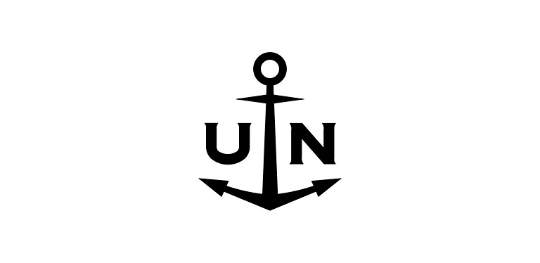
U is for Ulysse Nardin
Regarding Swiss watchmakers, one name stands out: Ulysse Nardin. Known for crafting precise marine chronometers, their attention to detail is unmatched. But it’s not just about accuracy, as their cutting-edge designs and commitment to innovation have also garnered them acclaim. And let’s not forget their distinctive logo design, a symbol of the brand’s excellence that you’ll find on each and every Ulysse Nardin timepiece.
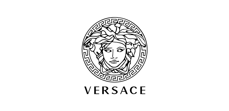
V is for Versace
When it comes to fashion, Versace is a brand that demands attention. Known for its fearless designs and stunning use of print and fabric, Versace has become a household name for anyone seeking luxury and glamour. But what really sets Versace apart is their iconic logo – bold, gold, and unmistakable. From streetwear to red carpet couture, a Versace piece is a statement that refuses to be ignored.
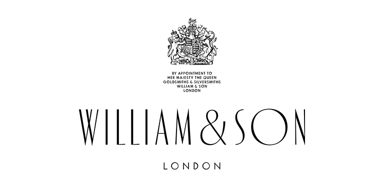
W is for William & Son
William & Son is a quintessentially British luxury brand renowned for its exceptional craftsmanship and heritage. From exquisite jewellery to designer watches and lifestyle products, William & Son epitomizes elegance and refinement with a unique touch of British sophistication. The brand’s logo symbolises its high-end quality and exceptional craftsmanship, instantly recognizable to those in the know. Regarding luxury goods, William & Son is a name that needs no introduction.
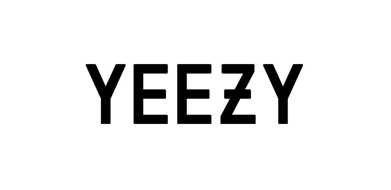
Y is for Yeezy
Yeezy results from Kanye West’s unique vision and influence on fashion. The brand has become a pivotal player in the fusion of streetwear and high-end fashion, pushing boundaries and setting trends. At the heart of Yeezy’s success is its innovative designs and logo, which have become synonymous with its iconic style. With each new collection, Yeezy continues to redefine the fashion landscape and cement its place as a groundbreaking force in the industry.
Z is for Zenith
Zenith is known for their precise timekeeping and horological innovation. Zenith watches have been crafted with meticulous attention to detail since 1865. Their rich heritage and commitment to excellence are evident in every timepiece they create. With their iconic logo, a five-pointed star, Zenith watches are instantly recognizable as a symbol of luxury and sophistication.
Conclusion
Each of these logos represented some of the world’s most iconic and recognizable fashion and luxury brands, from timeless classics like Louis Vuitton to modern upstarts like Yeezy. Regardless of your choice, all brands have succeeded through thoughtful, purposeful logo design and vibrant marketing strategies. These logos can inspire anyone wishing to build their brand’s identity – with consistent quality design and strong messaging over time.
Logo design plays a crucial role in establishing the identity of a brand. It is the visual representation of the company’s values, mission, and vision. A well-designed logo can communicate a brand’s message effectively and leave a lasting impression on the customers’ minds. One such iconic logo is the Shell logo. The Shell logo has undergone several changes over the years, and in this article, we will trace its evolution since its inception in 1890.
Shell’s Early Logo Designs (1890-1948)
Shell’s first logo was designed in 1890, and it featured a black-and-white image of a mussel shell. The word “Shell” was written in bold uppercase letters beneath the image. This logo was simple and easy to recognize, but it lacked the unique identity that a brand requires.In the early 1900s, Shell started experimenting with different logos. They tried using different shapes to create a distinct identity. In the 1900s and 1920s, they introduced a wide array of logo design updates. Mainly, they were black and white. But still, these logos lacked the unique identity that would set Shell apart from other brands.In the 1930s, Shell introduced a new logo that featured a red and yellow shell with the word “Shell” written in white. This logo was more stylized and had a more distinctive look. It was a significant improvement over their previous logos, but it still lacked the iconic symbol that would make it instantly recognizable.
The Introduction of the Iconic Scallop Shell (1948)
In 1948, Shell introduced the iconic scallop shell logo. The logo featured a yellow and red scallop shell with the word “Shell” written in bold, red letters. The scallop shell was chosen because it was a symbol of pilgrimage in Europe and had a positive association with travel. This logo was an instant hit and became synonymous with the Shell brand.The scallop shell logo was designed by a man named Raymond Loewy, a French-American industrial designer. Loewy was known for his sleek and modern designs, and the Shell logo was no exception. The scallop shell was stylized to make it more modern and dynamic, giving it a distinctive look that set it apart from other logos.
The Evolution of the Scallop Shell Logo (1955-1971)
In 1955, Shell made a minor change to the scallop shell logo. They added an outline around the shell, making it stand out more. This new logo was more impactful and helped the company establish a more prominent presence in the market and on the gas station signs.In 1961, Shell introduced yet another logo that featured a yellow and red scallop shell with the word “Shell” written in bold, black letters. This logo was a departure from the previous logo and had a more modern look. The black letters gave the logo a more sophisticated look, and the yellow and red shell made it instantly recognizable.
The Modernization of the Shell Logo (1971-1995)
In 1971, Shell introduced a new logo that featured a more streamlined and modern design. The scallop shell was stylized to make it look more futuristic, and the word “Shell” was written in bold, blue letters. This logo was a significant departure from the previous logos and helped the company establish a more modern and innovative identity.In 1981, Shell introduced a new logo that featured a more abstract design. The scallop shell was reduced to a simple, abstract shape, and the word “Shell” was written in lowercase letters. This logo was a significant departure from the previous logos and had a more minimalist and contemporary look.
The Shell Logo in the Digital Age (1995-Present)
In 1995, Shell introduced a new logo that was designed specifically for the digital age. The logo featured a more stylized and simplified scallop shell, and missing the word “Shell”. This logo was designed to be more visible on digital screens and to go with the minimalist trend while keeping the brand image and the core message consistent.
Shell’s Logo Design Strategy
Shell’s logo design strategy has always been focused on creating a distinct and recognizable identity for the brand. They have experimented with different colors, shapes, and designs to create a logo that is both modern and timeless. In recent years, the company has focused on creating logos that reflect its commitment to environmental sustainability and innovation.
The Impact of Shell’s Logo Design on Its Brand Identity
Shell’s logo design has had a significant impact on its brand identity. The iconic scallop shell is a symbol of excellence that has become synonymous with Shell’s brand identity. It is instantly recognizable worldwide, making Shell one of the most trusted and respected names in the industry. The logo’s design is simple yet powerful, perfectly capturing the essence of the company’s values and mission. Its sleek lines and elegant curves create a sense of sophistication, while its bold colors exude confidence and reliability. This clever design has played a crucial role in building brand loyalty among customers, helping them identify with the company’s values and vision. All in all, Shell’s logo has truly stood the test of time, and we can’t wait to see what new heights it will help the company reach in the future!
Other Companies with Iconic Logo Designs
Get ready to be excited because there are so many iconic logos out there that you might not even realize! Brands like Nike, Apple, and Coca-Cola have built an empire around their iconic logos that are instantly recognizable. The Nike Swoosh is a symbol of athleticism and motivation, while the Apple logo represents innovation and sleek design. And who can forget the cursive Coca-Cola script that has been around for over a century? These logos have become a part of our culture and are celebrated as works of art. It’s amazing to see how these brands have established themselves through their logos, showing that a simple design can make a huge impact in the world of business.
Conclusion: The Future of Logo Design
Logo design plays a crucial role in establishing a brand’s identity, and companies are constantly experimenting with different designs to create unique and recognizable logos. As companies continue to evolve and adapt to the changing market, we can expect to see more innovative and modern logo designs in the future. As for Shell, its logo has evolved significantly over the years, but the iconic scallop shell remains a timeless symbol of the company’s values and mission. With their focus on confidence and innovation, we can expect to see more modern and dynamic logo designs from Shell in the years to come. With the help of technology and skilled designers, companies have an unprecedented opportunity to make a lasting impact with their logo designs – just like Shell’s logo. Logos will continue to be used as the cornerstone of brand identity, and companies must leverage this powerful tool to its full potential in order to remain competitive in today’s business world.
Logo design is one of the most critical elements in marketing and a crucial part of a brand’s public perception. However, logo designers often fail to consider an aspect that is just as important – contextualization. In essence, contextualization refers to creating designs within the frame of the social and cultural understanding of your audience; taking into account things such as language, and colors associated with different sentiments across cultures, etc. Logo design without context can fail to achieve optimal results, leaving brands at risk of being misunderstood or misinterpreted by their target audience. So the importance of incorporating elements related to the logo’s context cannot be understated when constructing a corporate identity. Let’s look further into why contextualizing logo designs should be an integral step in every logo designer’s process.
Exploring the Power of Contextualization in Logo Design
Logo design is an incredibly powerful tool for communicating a company’s identity and creating a memorable impression. Key to this effective communication is contextualization; when used correctly, it can lend impactful emphasis to brand messages. By connecting the logo directly with the appropriate audience, context facilitates a greater understanding of logos and encourages more meaningful engagement from viewers. Contextualization, therefore, allows designers to create the most compelling logos that evoke positive emotions while easily distinguishing their client’s brand in a unique manner. Achieving context-effective visual design takes skill, so it is important to combine both technical expertise with a keen eye for nuanced meaning – logos placed in the right context can truly make all the difference!
How Contextualization the Influences Your Brand’s Identity
Crafting a successful logo design is essential for establishing your brand’s identity. Contextualization is a key part of the process to ensure that when customers look at your logo, they know instantly who it belongs to and what values it stands for. Depending on what kind of logo you create, contextualization can be present in many ways; from incorporating specific colors, shapes, or fonts that are relevant to the industry’s trends and similar to their cultural and societal norms; to creating designs that resonate with customer preferences and connects them emotionally with your business. In this way, contextualizing the logo design will allow you to establish and maintain an impactful presence in consumer consciousness, furthering the success of your brand’s identity.
Benefits of Contextualizing Your Logo Design
Contextualizing your logo design is an effective strategy to convey meaning, subtly direct the message to certain audiences, and create a lasting impression. A logo’s meaning can be amplified based on its context. It is important to understand the target audience, their needs, and preferences, as well as cultural and political factors. By using context and narrative to make a clear statement, brands are able to emotionally evoke customers’ interest in the brand’s message. This approach differentiates brands from their competitors by making the brand stand out. Better marketing campaigns and customer experiences are possible when customer needs are understood through the contextualization of logos.
Analyzing the Audience to Create a Personalized Design
An effective logo design is an essential element for the development of any brand. It serves to represent both a company and its values. Therefore, having an effective logo design that resonates with the intended target audience is critical. One effective way to create a plan for a custom logo design is by contextualizing it to meaningful emotions within the target audience they are likely to encounter. Analyzing this target audience can then help uncover key insights that inform logos beyond simply representing what a product or service is. It can also evoke deeper connections through emotion, creating a deeper understanding and appreciation of a brand or company among its users. When executed successfully through thoughtful design and research, the result is often far more powerful than any generic approach could provide.
Defining the Brand Values and Characteristics
It is important to define brand values and characteristics when contextualizing a logo design. Doing so allows designers and marketers to align the look and feel of the visual identity elements with the core message one wishes to convey. By creating a clear strategy for how this will be communicated, a business can ensure that its logo is effective in conveying its desired company message appropriately. When entrepreneurs know how they want to portray their product or service in terms of aesthetics, messaging, culture, and more, it enables them to create an effective logo design that stays true to their brand values. A well-contextualized logo design is more likely to make a strong connection with potential customers as every element emphasized fits together as part of a greater whole that accurately reflects the brand identity.
Incorporating Visual Cues and Symbols that Represent Your Brand
Getting your brand’s logo right can make the difference between creating a memorable experience for your customers and missing the mark. One of the most effective ways to create engaging, recognizable logos is by including visual cues and symbols that represent the brand’s essence. These visuals don’t necessarily need to be explicit. Rather, they can provide context that not only helps attract customers but also adds depth to the overall look of the logo. For example, a symbol of a mountain range might give an outdoor retailer’s logo an adventurous feel while still conveying important information about the company. Such as what types of products they offer or where they’re based. Visual cues and symbols can be a powerful component in helping distinguish your brand from others in its field.
Maximizing Visual Impact Through Strategic Logo Placement
An effective logo placement strategy can dramatically increase the visual impact of your branding. Knowing where to place a logo takes some trial and error, but having an idea of typical placements can make your visuals more attractive. If you understand the basics of graphic design by taking into account both practical and aesthetic principles, it will ensure that your audience will be engaged by your logo. These include the header, footer, title page, menu bar, or other side areas; however for maximum visibility, it is important to think about how a logo could become an integral part of an overall design concept. It’s also important to consider sizing and color so any competing elements do not diminish the impact of your logo or brand messaging. When done well, strategic logo placement will create outstanding visuals that are remembered by customers long after they’ve interacted with your brand.
Examples of Contextualization in Famous Logos
The renowned “swoosh” logo of Nike, designed by Carolyn Davidson in 1971, is representative of the wing of the Greek goddess of victory, Nike. The logo communicates the brand’s message of speed, movement, and athletics with a touch of professionalism. Similarly, Amazon’s logo has a cool arrow that starts with the “A” and ends at the “Z.” This means that Amazon sells everything from A to Z! It was designed by Turner Duckworth back in 2000. Both of these logos are great examples of contextualizing the brand message with a recognizable design.
Conclusion
With logo design, contextualization is key. By getting to know your audience and creating an identity that resonates with them, you can maximize the impact of your logo. Contextualization doesn’t just stop at visual cues and symbols though – proper placement of your logo is essential too! For those who are careful with the tiniest details, consider the environment your logo will be in when making a decision on what font and color it should have. As important as symbolism is, never forget that clear communication must still be priority number one. Throughout this whole journey of contextualizing your logo design, always remember to indeed contextualize its message too. No matter which routes you choose to go down when designing a logo for your brand, let this article be a helpful reminder that context matters – now get out there and make something great!