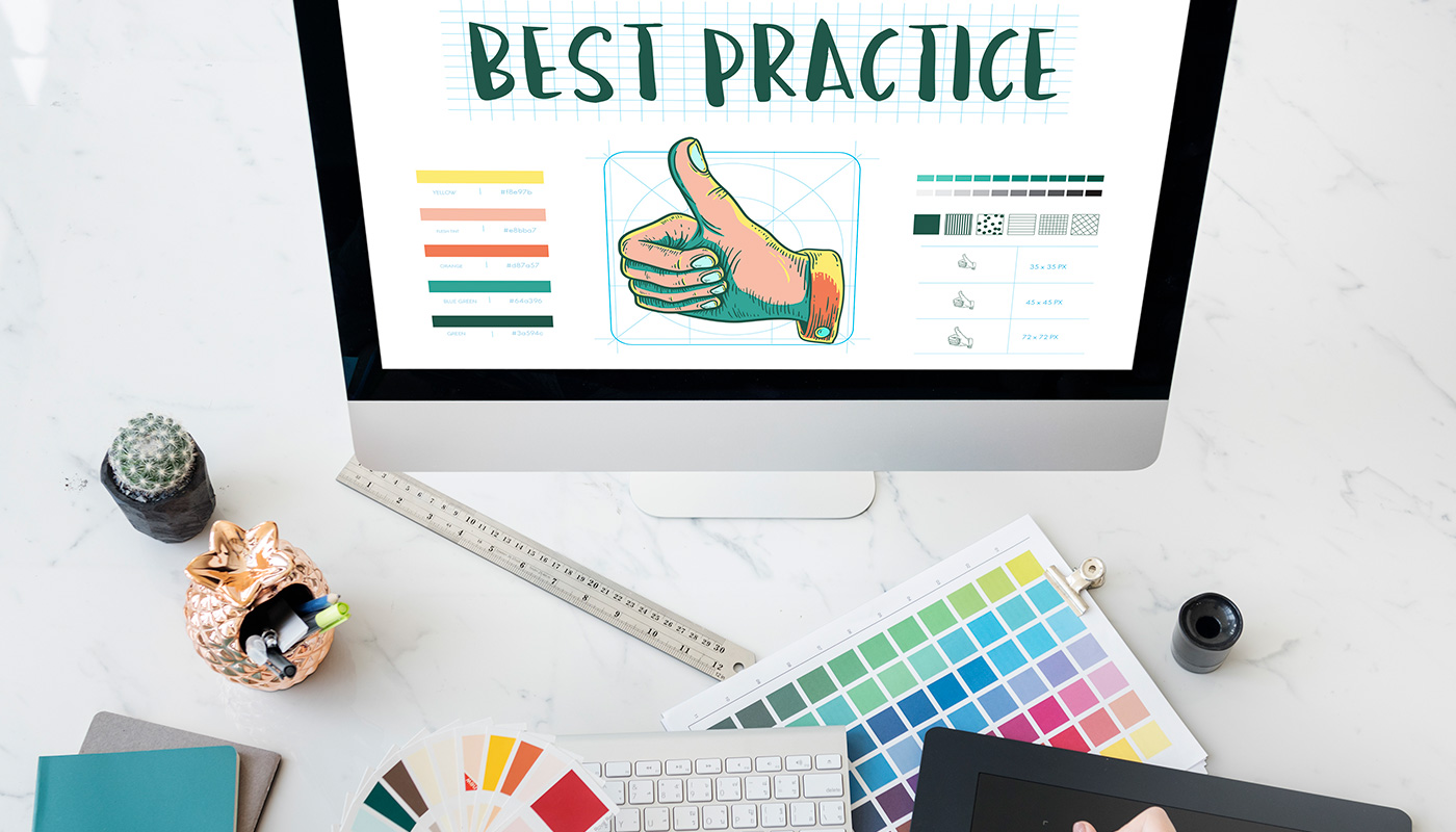
Discovering the art of web design is often a complex journey, filled with trial and error. But one thing that should remain constant in all digital platform designs is simplicity; adage notwithstanding, less can surely be more. With minimalism taking over as the hottest trend in digital design, understanding how to adhere to these principles—without sacrificing functionality or your brand’s message—is becoming increasingly important. In this blog post, we will explore the key tenets of minimalist web design and explain why keeping your user interface simple is so effective for creating an optimal online experience.
Keep it Simple
In this age of information overload, simplicity is king when it comes to website design. Minimalist designs with clean, uncomplicated lines are the key to effectively communicating your message and keeping visitors engaged. By using a simple layout, you ensure that your website is easy to navigate and uncluttered, allowing visitors to find the information they need quickly and easily. Don’t fall into the trap of trying to cram too much content onto your website – keep it simple and let your message speak for itself. With a minimalist design, your website will not only look great but it will also be functional and user-friendly. So why complicate things? Keep it simple and watch your website soar.
Choose Appropriate Color Scheme
When it comes to designing a minimal website, choosing an appropriate color scheme is critical in creating a harmonious and engaging atmosphere. The right combination of colors can make all the difference in how users perceive your website and interact with its content. A harmonious color scheme can also convey a sense of professionalism and polish, which can improve the overall user experience. So, whether you opt for a monochromatic scheme or decide to incorporate bold accent colors, be intentional in your color choices and consider how they will impact the tone and mood of your website. An effective color scheme can help you create a sleek and modern website that users will want to interact with.
Focus on the User
It’s important to remember that a website’s purpose is to provide information and connect with potential customers. That’s where user experience comes into play. Creating a streamlined and intuitive user experience on your minimal website can make a world of difference. By focusing on your user, you can make sure that your website is easy to navigate, with clear and concise language that guides them to the information they need. A streamlined user experience not only looks great but also helps to build trust and credibility with your audience. A minimal website can be a powerful tool in your marketing arsenal, but only if your user experience is on point.
Utilize Negative Space
Negative space is an often misunderstood element of design. At first glance, it can seem like wasted space or an oversight on the designer’s part. But in reality, negative space is a powerful tool in creating a minimalist website. By intentionally leaving areas of the page empty, you allow the content that is present to shine even brighter. Negative space can be used to draw the eye to certain elements, create a sense of balance, and even provide a calming visual experience for your website visitors. When utilized effectively, negative space can transform a simple website into a work of art.
Prioritize Content Hierarchy
It’s essential to prioritize content hierarchy when building your website. Doing so allows you to showcase what’s most important while de-emphasizing elements that are less significant. In a world where attention spans are becoming shorter and shorter, highlighting key features is essential to keep visitors engaged. By placing emphasis on critical elements and letting non-significant ones take a back seat, you can ensure that your visitors find the information they need quickly without getting overwhelmed by needless clutter. A minimalist website that balances content hierarchy strikes the perfect balance between simplicity and usefulness.
Leverage Contrast
When it comes to minimalist website design, contrast is key. In order to ensure that your website is both visually appealing and easily readable for viewers, it’s important to carefully consider the contrast between the background and foreground. By leveraging contrast effectively, you can prevent your website from looking flat or one-dimensional while also creating a seamless user experience that allows visitors to easily navigate your site. Whether you’re using bold typography to create contrast or playing with light and shadow to highlight important elements, the key is to remember that every choice you make should be informed by a commitment to clarity and usability for your users.
Utilize Typography
Typography is one of the most overlooked design elements on a minimalist website. Yet when utilized properly, it can elevate the overall aesthetic of a site to new heights. The key is to use typography sparingly, opting for only a few select typefaces that mesh well together to create a cohesive design. Whether you’re choosing a bold sans-serif font for your headlines or a sleek, easy-to-read serif font for your body copy, the final result should be visually pleasing and easy to navigate for your users. It’s all about finding that perfect balance between form and function, and with the right typography, you can achieve just that.
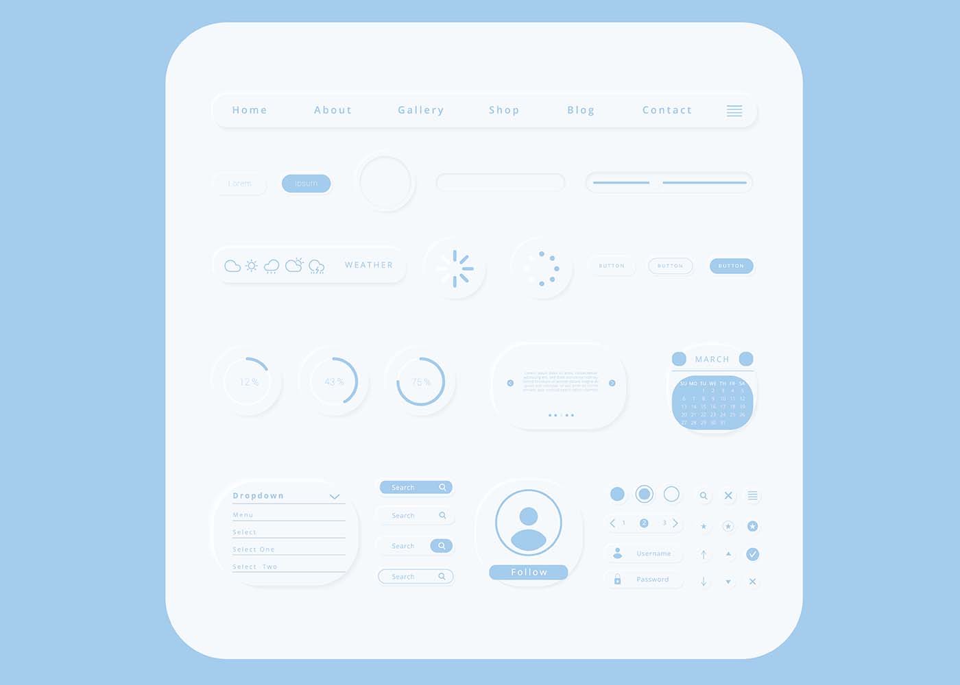
Utilize Modern UI Elements
Minimalism is a design philosophy that emphasizes simplicity and clarity in every aspect of a website. However, just because you’re going simple doesn’t mean you have to be boring. In fact, using modern user interface elements such as icons and buttons can be a great way to enhance the user experience while keeping your minimalist aesthetic intact. These elements are not only attractive and eye-catching, but they also make navigation easier and quicker, especially for mobile users. So, when designing your website, don’t be afraid to use these elements to convey your brand’s tone and personality while keeping everything clean and simple.
Focus on Content
When it comes to creating a minimalist website, it’s important to remember that less is more. While design elements can certainly enhance the look of a site, they should never overtake the content that’s being presented. After all, the main purpose of any website is to communicate information and ideas to its audience. By prioritizing the content over flashy designs, you can ensure that your message comes across loud and clear. So, when working on your minimalist website, make sure that the content is the star of the show. Keep things simple and streamlined, and don’t be afraid to let the words and ideas speak for themselves.
Implement Grid-Based Layouts
When designing a minimalist website, it’s important to maintain a sense of organization and consistency throughout. This is where grid-based layouts come in handy. By dividing your content up into evenly spaced sections, you’ll be able to create a cohesive look that’s visually appealing to your visitors. However, implementing a grid-based layout can be tricky if you don’t have the right knowledge or tools. Thankfully, there are a variety of resources available online to help get you started. So, don’t be afraid to experiment with different grid formats until you find the one that works best for your site. The end result will be a website that’s not only aesthetically pleasing but easy to navigate and understand.
Leverage Visuals
In the world of website design, being minimalist doesn’t necessarily have to mean being boring. By leveraging visuals, you can add interest and depth to your webpage without sacrificing its clean, streamlined look. Photos, icons, and illustrations can be strategically placed to create a visually appealing experience for your visitors, while still maintaining a sleek and uncluttered design. Rather than overwhelming your audience with a barrage of content, let the visuals do the talking and draw them in with their unique charm. With a little bit of creativity, your minimalist website can become the talk of the town.
Conclusion
To wrap it all up, good website design is essential for success, and keeping the rules we’ve discussed in mind is key. Keeping the design simple and focusing on the user experience will ensure visitors enjoy browsing your website. Utilize negative space, contrast, and thoughtful typography to keep visitors engaged and focused on your content. Implementing grid-based layouts with visuals will further maximize the positive effect of a well-designed website. Remember, attention to detail is essential when creating a website that provides the best user experience possible. Make sure everything works together cohesively so when visitors leave your site they have a memorable online experience they will want to repeat!
It’s no secret that the look and feel of a website is critically important. Not only do aesthetics influence users’ first impressions, but they also have an effect on whether or not people choose to stay on your site. But what you may not realize is there are additional factors at play that can determine how successful your website is: search engine optimization (SEO) and user experience (UX). The way in which UX and SEO intersect when it comes to website design can be complex, but when executed correctly can make all the difference in improving visibility, engagement, and overall success. In this blog post we will explore why UX and SEO matter for any website — we’ll identify some key considerations for improving performance with both techniques together — so stick around as we dive into Beyond Aesthetics: The Intersection Of UX And SEO In Website Design!
What are UX and SEO, and Why do They Matter in Website Design
There are two major factors that can make or break a website’s success: UX and SEO. UX stands for user experience, and it encompasses everything from layout and design to ease of use and accessibility. Simply put, if your website is difficult to navigate or doesn’t meet the needs of your audience, your visitors won’t stick around for long. That’s why UX is so important in website design. On the other hand, SEO stands for search engine optimization, and it refers to the process of optimizing your website’s content to rank higher in search engine results pages (SERPs). In other words, it’s all about helping your target audience find your website through search engines like Google. Both UX and SEO are critical to the success of any website, as they ensure that visitors can easily find and use your site, leading to increased engagement, conversions, and overall success. Whether you’re designing a new website or looking to improve an existing one, UX and SEO should always be top of mind.
How UX Impacts SEO – Best Practices for Optimizing User Experience
User experience (UX) is an important factor to consider when optimizing your website for search engine optimization (SEO). By ensuring that your content and design are user-friendly, you can encourage users to stay on the page longer, creating a better overall user experience. Best practices for optimizing UX include making sure all elements of the design and webpages load quickly, using intuitive navigation menus that make finding information easy, and providing quality content that is engaging and informative. Moreover, using schema markup to provide structure to your content can go a long way in helping it rank higher. Ultimately, great UX helps create a positive relationship between your visitors and website which will improve not only SEO ranking but also conversion rates and ROI.
Establishing a Clear Hierarchy of Information on Your Website
Building a website that is both user-friendly and optimized for search engines can be challenging, but it’s essential for website success. The intersection of UX and SEO involves creating a website that is easy to navigate, visually appealing, and search engine friendly. The key to achieving this is by establishing a clear hierarchy of information on your website. By prioritizing the most important content and making it easily accessible, you can direct visitors toward the most relevant pages and help search engines understand the structure of your site. Designing an intuitive and structured website takes careful planning, but it’s a crucial step toward building a site that’s both functional and user-friendly.
Designing for Mobile First – Knowing Key Strategies to Enhance the User Experience
We live in a digital world that is constantly evolving, and in today’s business climate, it’s imperative to have a website that is not only visually appealing but also user-friendly. As mobile usage continues to grow, it’s more important than ever to design websites that work well on smaller screens. This is where the concept of mobile-first design comes in. Designing for mobile-first means designing with the mobile user in mind and then scaling up to larger screens. But designing for mobile-first isn’t just about the design, it’s also about enhancing the user experience through SEO strategies. By optimizing your site for mobile, you can improve your site’s performance and ultimately drive more traffic to your site. In this article, we will discuss key strategies for enhancing the user experience and optimizing your site for mobile-first design.
Utilizing the Latest Search Engine Algorithm Updates to Maximize Visibility
Usability, or UX, and search engine optimization (SEO) are essential for online visibility, especially in the age of Google algorithms. With new developments mounting up on a regular basis, it is becoming increasingly important to stay updated with the latest changes and trends in order to keep your website from losing too much traffic due to outdated SEO practices. Fortunately, there are a plethora of tools available that can help us better understand why and how our website is performing – like keyword research tools, technical SEO audits, and analysis of competitor activity. Taking advantage of these resources can help you stay one step ahead of the competition and ensure maximum visibility for your business.
Creating an Intuitive Navigation System for Better User Experience
A website can have all the great content in the world, but if it’s difficult to navigate, users won’t stick around for long. That’s why creating an intuitive navigation system is crucial for a better user experience. By organizing your website in a logical and intuitive manner, visitors can easily find what they’re looking for and explore your site with ease. Navigation menus should be clear and concise, with relevant categories that correspond to the content on your site. Additionally, utilizing clear and descriptive labels, breadcrumbs, and search functions can enhance the overall user experience. By investing time and effort into creating a seamless navigation system, you’ll keep visitors engaged, increase the likelihood of them returning, and ultimately achieve your website’s goals.
Implementing Effective Calls-to-Action to Increase Conversion Rates
Your website can have all the bells and whistles, but without a clear and effective call-to-action, your conversion rates will continue to be lackluster. Implementing a call-to-action that resonates with your audience and encourages them to take action is essential for driving conversions. Whether it’s a button that prompts a user to sign up for a newsletter or a pop-up that encourages them to make a purchase, it’s important to make sure your call-to-action is prominently displayed and easy to find. By testing and tweaking your calls-to-action, you can increase the conversion rates of your website and ultimately drive more revenue.
Tips for Improving Overall Website Performance and Speed
In today’s fast-paced digital ecosystem, the speed and performance of your website have a significant impact on user experience, search engine rankings, and business success. Therefore, optimizing your website’s performance, SEO, and speed is crucial. One of the most effective ways to do this is by adopting a streamlined approach, starting with a fast and reliable hosting service, reducing HTTP requests, optimizing images and videos, using compression, leveraging browser caching, and implementing a content delivery network (CDN). Additionally, keeping your website’s content fresh, relevant, and engaging, using relevant keywords, and regularly auditing your site’s performance to tweak and improve as needed can help you stay ahead of the competition and attract and retain more visitors.Beyond Aesthetics The Intersection of UX and SEO in Website Design
Conclusion
Ultimately, UX and SEO must go hand in hand when creating an SEO-friendly web design. By taking a user-centric approach to the design process and applying best practices, users can be engaged through an enhanced user experience which can lead to increased visibility and higher conversation rates. By establishing a clear hierarchy of information on the site and creating intuitive navigation systems that make it easy to find information, website design can be improved in ways that facilitate better search engine discovery. Additionally developing for mobile first and utilizing the latest search engine algorithm updates are essential steps for maximizing visibility. Finally, web analytic tools should always be used to track user behavior so any changes made to improve UX impact SEO in the most positive way possible. With these tactics, any website designer is sure to create experiences that satisfy even the most discerning users while maximizing visibility at the same time.
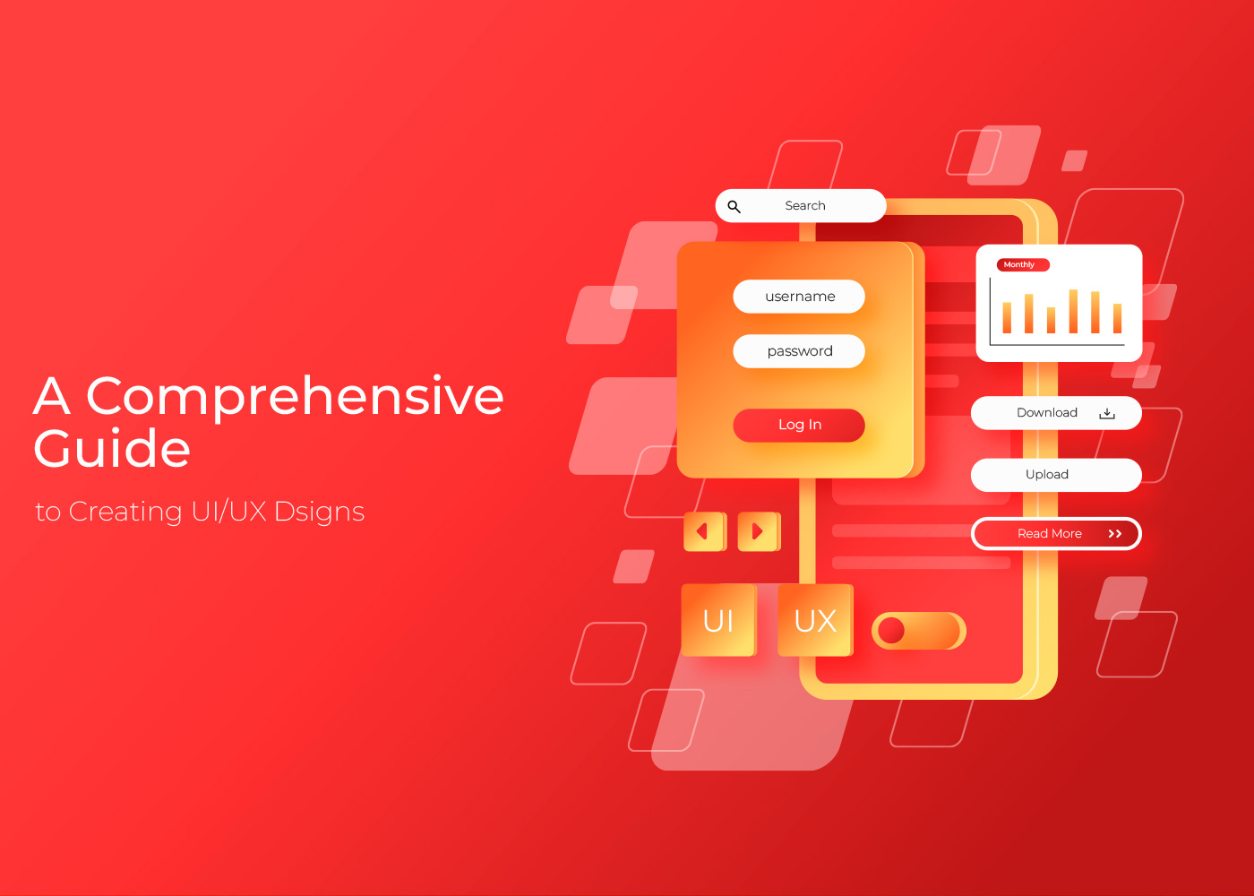
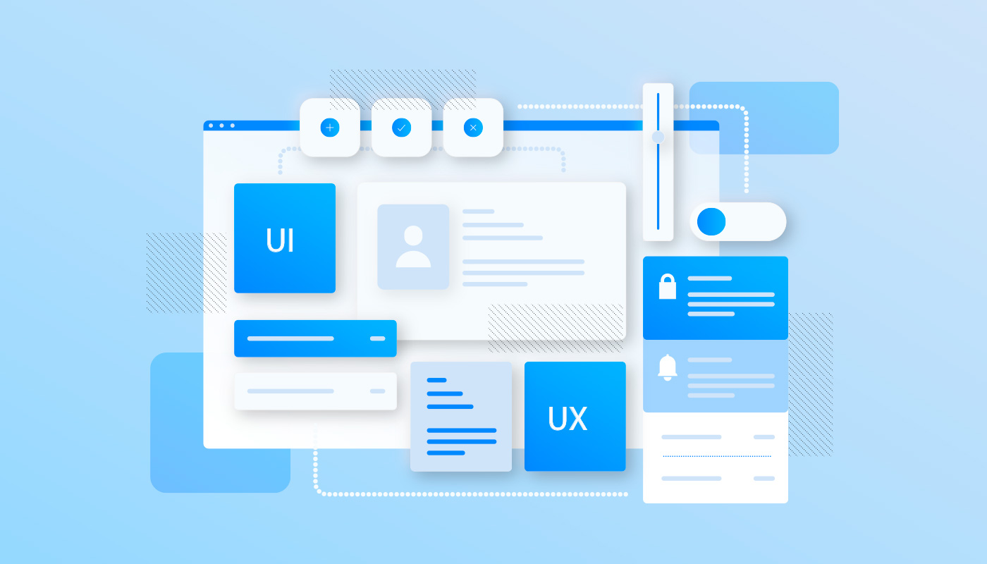
Do you want to create powerful user interfaces and experiences that captivate users and drive conversions? If so, then understanding the fundamental principles of UI/UX design is crucial. With this comprehensive guide, businesses and startups can learn how to best apply UI/UX design in their digital products. Here, we’ll walk through tips on strategizing visuals, creating an effective interface flow, addressing accessibility needs, getting feedback from customers and so much more. You’re sure to come away with all you need for success in crafting effective designs for today’s digital world.
Understand the Goals and Requirements of the Design
When undertaking a UI/UX design project, it is important to first fully understand the goals and requirements. These include “what”, “why”, and “who” corresponding to the UIUX design and the target audience. Not only should you have a clear vision of how you want the end result to look, but you should also know what value it will bring to users. That means determining who the likely users are, what features they need, and where they’ll be using the product or application. Additionally, it can be helpful to think about why someone might use your design over competitor designs and highlight how yours stands out from others. Once these components are finalized, you can then move on to creating a thoughtful and personalized user interface that allows people to navigate your product or application easily and effectively.
Research Best Practices in Design
When researching best practices in UI/UX design, it can be helpful to look at what solutions are already out there and consider which ones will work best for your target audience. Analyzing existing solutions helps shed light on the key components of solid user experience design, including intuitive navigation, visual appeal, and design for different devices. Additionally, making notes on why particular solutions are successful can give insightful feedback on what would work best with the end user experience you are aiming to create. Researching existing solutions is an important part of ensuring a great UI/UX design – taking the time to review these solutions can make all the difference when creating something that works successfully for everyone involved.
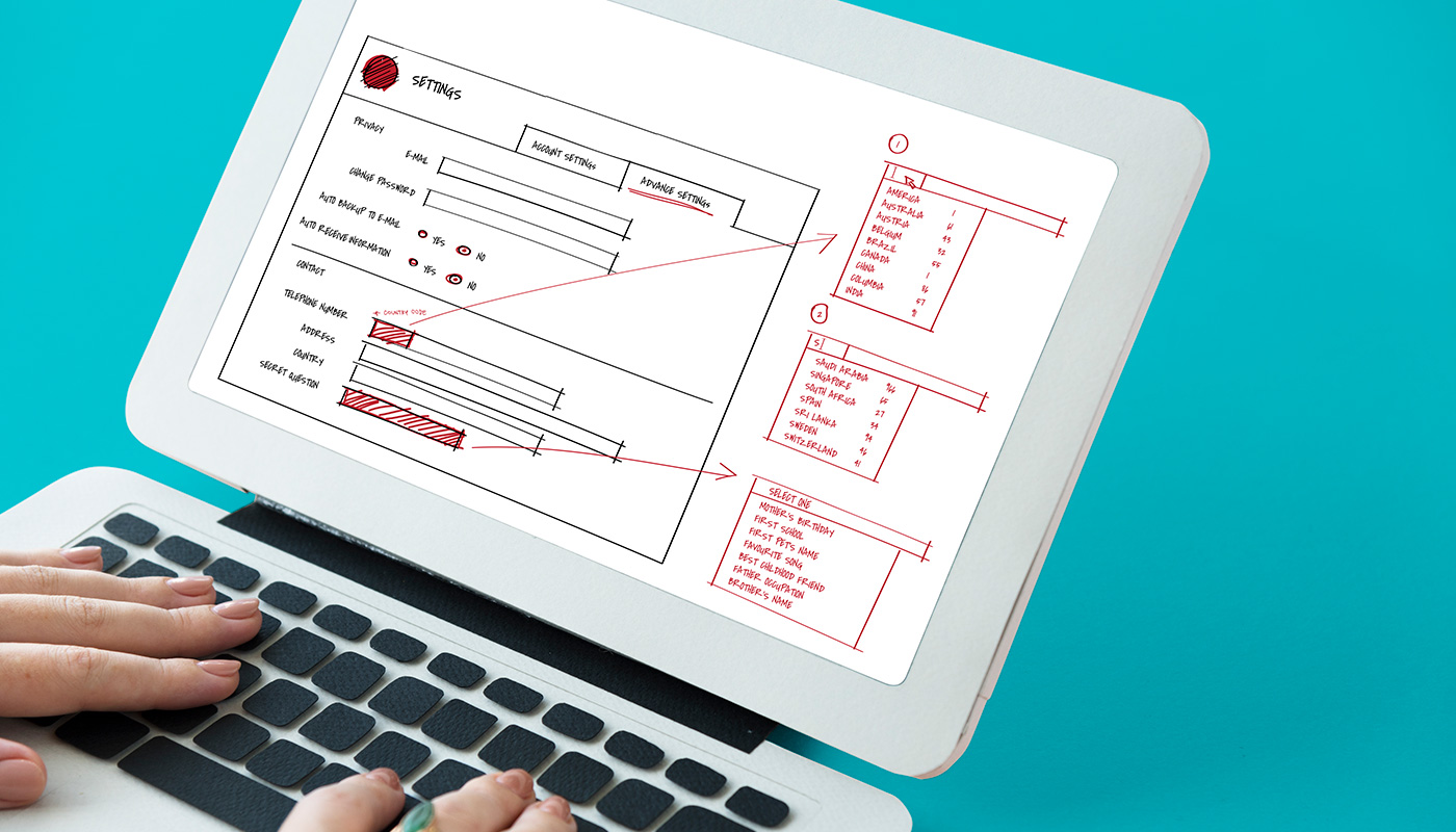
Outline Your UI/UX Design
When designing a UI/UX, it is important to identify the key elements that define the user experience. This includes the aesthetics, functionality, features, and workflows that need to be taken into account when building a successful user interface. By understanding how users interact with the interface, we can determine pathways that can be seamlessly integrated into the design to guide customers through their desired journey. Once key elements are identified and user pathways determined, wireframes can then be created emphasizing functional components such as buttons, menus, and forms according to their importance in creating a fluid user experience. Doing this helps visualize proposed changes before implementation for easier testing and modifying of interfaces.
Create a Visual Prototype
Creating a visual prototype is an excellent way to bring your product design ideas to life before beginning development. Utilizing software like Figma or Adobe XD, you can create an interactive model that allows you to showcase the look and feel of your proposed design and demonstrate the flow between different user experiences. This is an essential element for quickly creating and refining designs before this process moves forward. Visual prototypes offer a great tool to share with team members and stakeholders so they will have a clear understanding of expectations. Additionally, easy prototyping can help highlight areas where features might be missing or need further development as well as any areas that could lead to potential usability issues.
Test Your UI/UX Design
Good UI/UX design should be the foundation upon which a product is built – and only by testing it in real-world scenarios can you uncover potential issues or flaws. It’s important to run usability tests to assess the overall user experience and make sure the intended goal of your interface is achieved. A successful test should be structured around realistic tasks and use cases so that you can evaluate with actual users how easily they can interact with the design. From understanding what works well for them, to collecting feedback on any elements that hinder usability, this valuable insight can be used to identify any challenges within UI/UX design and provide guidance for future solutions. Carry out usability tests as part of your development process and take their constructive criticism into account when making changes – this will ensure a more positive outcome when it comes to user experience.
Make Final Adjustments & Launch
Finally, after investing long hours of hard work and effort into crafting a unique user experience, it is time to make the final adjustments and launch your design. It is important to take in feedback received during testing and see how you can incorporate improvements made. When gathering feedback be sure to ask open-ended questions and record everything accurately so that you can refer back to it later. Additionally, involving the design process allows you to gain a better understanding of their needs and expectations. This will ensure that you are creating something that will meet their requirements. After all the changes are made, launch the design and be ready to receive continued feedback from users while they test out your product. Building the best possible user interface that meets the desires of users takes great amounts of creative energy – launching it will require just as much enthusiasm! Celebrate all the hard work put in to create a successful product.
Conclusion
In conclusion, design is a crucial part of creating digital products, and it requires a deep understanding of not just aesthetics but also user behaviour. To bring your designs to life, you must start by having an in-depth understanding of goals and requirements. Then research what’s worked in the past and make notes to inform your own design direction. Outline the essential components required for the digital product before constructing a visual prototype to showcase its look and feel. QA testing is also important, as this allows the designers to identify any issues before the product is released into the public domain. With QA testing, bugs, and other problems can be identified and fixed quickly – making sure that the end-user experience is as smooth as possible. Lastly, analytics should be incorporated, so designers can track how users interact with the product. This data can then be used to inform any necessary changes and make sure the product is running as efficiently as possible. Based on that data, QA testing should also be conducted regularly, to ensure that no bugs or other problems are present in the product before or after its launch.Then, after making any necessary adjustments, it’s time to launch! With this process laid out from start to finish, designers will have a solid foundation on which to build great digital products that fulfil all the goals and requirements desired.
Are you looking for ways to make your user experience more engaging? Core UX design principles are a great place to start. By following these six key principles, you will be able to give your users the most seamless and fluid journey through your website, app, or product. From understanding how people interact with products and services to utilizing tried and tested strategies for effective usability testing, we’ll go through a detailed breakdown on how understanding core UX design principles is an essential part of creating an engaging user experience. Get ready to delve into the basics of UX design and improve your app or website’s success!
Content Clarity and Consistency
Consistency and clarity are two essential elements for any business to make its content successful. Always make sure your content is clear and consistent across all platforms as it helps build credibility with your customers and makes for a good first impression of your brand. Take time to ensure the same messaging, tone, and visuals are used throughout your digital marketing efforts. By doing so, you can make sure that potential users who interact with your app or website understand what you stand for and how you want them to interact with your products or services. Make sure that the entire user journey is consistent throughout so that you can create a lasting impression of trustworthiness and professionalism. Consequently, all of these factors will help you develop a distinct brand identity and establish brand loyalty amongst customers.
Usability and Accessibility
Good user experience design should be usable and accessible for everyone, regardless of their abilities or disabilities. This means that websites, apps, tools, and other digital interfaces should cater to a wide range of users with differing needs. Usability seeks to make digital products as easy to use as possible, while accessibility ensures users with disabilities can access them. Designers should consider the different types of users that may interact with their product, identify areas where each type may encounter difficulty or difficulty, and create solutions accordingly. This inclusive approach not only benefits those with impairments but improves the overall user experience for all types of people, creating a better web for everyone.
Visual Appeal
Introducing visuals into any project can be a great way to draw the user in. By selecting the right color palette and selecting relevant imagery, you can create an engaging experience for visitors. Color has the power to evoke feelings and emotions, which can be used to increase brand awareness and engagement. Additionally, visuals will be the way to go in the near future as they have been proven to increase the amount of time users spend on a page or website, helping businesses reach goals more efficiently than text alone (Appel et al., 2020). So next time you are looking for ways to drive more traffic or strengthen your brand identity, remember that visuals are just as important as words when it comes to delivering an effective message.
Responsive Design
Responsive design is essential for providing a consistent user experience across all types of devices. As technology progresses, the number of screens and devices available continues to grow. Responsive design allows your product to be displayed and experienced optimally across various device sizes and configurations, ensuring that users have the same quality, interactive experience regardless of screen size or device type. This also ensures flexibility for you, as developers, since you can access the content from any device without any hassle. By utilizing responsive design frameworks, you’ll be able to meet the needs of all users on all devices without compromising usability – creating an optimal customer experience whether viewed on desktop, tablet, or mobile.
User-Centered Design
User-centered design (UCD) is a methodology that focuses on creating an experience tailored to the needs of your target audience. It involves listening carefully to feedback and insights gathered through user research, testing prototypes, and refining user journeys and flows until they’re satisfying. The user-centered design pays attention to both form and function, emphasizing accessibility, usability, and user experience. The key to successful User-centered design implementation is understanding user behavior, culture, target population, contexts, motivators, and values. By putting people at the heart of your interface design solutions can be found that effectively meet each person’s needs.
Keep Things Simple
Minimalism is an effective approach to website design as it focuses on only the essential elements of a page. When done well, minimalistic designs can create a clean, sleek aesthetic that draws users in. A cluttered website with too much ‘noise’ – such as multiple pop-ups, banners, and excessive adverts – can be distracting and make the page difficult and frustrating to navigate. Therefore, it can hinder the user journey and result in a decrease in user engagement. Keeping the design simple means the user will be able to focus more on the content of the page without being overwhelmed by too many competing elements. Additionally, a simpler design often translates into better conversion rate performance and higher visitor engagement. So, designing with a minimalist mindset is a great way for designers to create an attractive and exciting website that won’t overwhelm users.
Conclusions
To sum everything up, creating a successful UX design requires a precisely calculated combination of content clarity and consistency, usability and accessibility, visual appeal, responsive design, user-centered design, and simplicity. It is essential to understand the importance of a good user experience for any product or website in order to ensure that users have an enjoyable experience. By following these guidelines you can create a great UX design that ties together all the necessary elements to create a memorable and engaging user experience.
Frequently Asked Questions About UX Design Principles:
How Can You Build a Cutting-Edge UX with Fleekbiz?
At Fleekbiz, we have a team of experts specializing in building UX designs from scratch or optimizing existing ones. We believe in the power of a well-designed user experience and are passionate about helping businesses reach their full potential. If you’re looking for high-impact solutions for your next project, don’t hesitate to reach out! With our years of experience, we can help take your project to the next level. Want your product or website’s UX design to engage users? Reach out to us now!
Why are UX design principles so important?
UX design principles revolve around usability, simplicity, clarity, and consistency. All of these are influenced by core human psychology. Therefore, whenever a user experience is strategized, every single one of these principles is applied to make the design as human as possible – allowing for maximum user-friendliness, and consequently, increased engagement and user satisfaction.
References
Appel, G., Grewal, L., Hadi, R., & Stephen, A. T. (2020). The future of social media in marketing. Journal of the Academy of Marketing Science, 48(1), 79–95. https://doi.org/10.1007/s11747-019-00695-1