As every website owner knows, a basic design won’t cut it in today’s increasingly competitive online arena. It’s critical to ensure that your site is aesthetically pleasing and can be scaled and adapted to changing market needs. Fortunately, with the rise of minimalist web design and modern techniques such as responsive web design, building a scalable and adaptable website doesn’t have to require extensive time or energy. In this blog post, we’ll take an in-depth look at how optimizing for scalability from the outset can help you create websites that are both beautiful and effective – no matter what direction technology takes over the coming years. So read on for tips on achieving elegant simplicity through scalability!
Benefits of Minimal Web Design
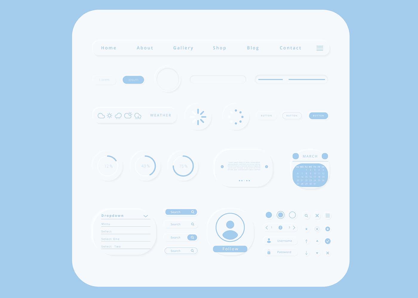
Minimal web design is an increasingly popular approach to website layout and design. When executed correctly, the benefits are clear. By stripping away excess elements, a minimalist design creates a sleek and seamless user experience, allowing the content to take center stage. It also makes navigation more accessible and faster, allowing users to easily find what they are looking for without being distracted by flashing graphics or overwhelming colors. Minimalism also provides a cleaner and more professional look, which can help to establish trust with visitors and potential customers. But perhaps the best advantage of a minimal design is that it loads faster, ensuring that visitors don’t have to wait and that the page is more likely to be ranked higher by search engines. All in all, minimal web design is simple but powerful and can undoubtedly improve the overall effectiveness of your website.
The Benefits of a Scalable & Adaptable Website
In today’s rapidly evolving digital landscape, having a scalable and adaptable website has become a necessity for businesses to stay competitive. A website that can expand or contract based on changing needs and can easily take on new functionalities without requiring a complete overhaul is a valuable asset. Such a website not only saves money and time but also enables businesses to keep up with the latest technologies and trends easily. Furthermore, a scalable and adaptable website enhances the user experience, as it can adjust to different devices and screen sizes, making it easier for visitors to navigate and interact with the site. The benefits of such a website are numerous and far-reaching, making it a smart investment for any business looking to succeed in the digital world.
Scalable Graphics and Coding Techniques
Utilizing scalable graphics and coding techniques is an easy way to streamline your website and make it more professional-looking, improving your users’ experience. With the ever-increasing demand for fast-loading sites, optimizing images and coding can go a long way in enhancing your website’s appeal. Providing an enjoyable and seamless user experience has become crucial in attracting and retaining visitors, especially on mobile devices. If you’re looking to give your site that extra edge, consider incorporating scalable graphics and coding techniques that can help your website run faster and smoother than ever before. Or you can just get expert services from a web design agency and they’ll get you hooked!
Develop Responsive Navigation for Different Platforms
With the majority of people accessing the internet through their mobile devices, businesses must develop responsive navigation that adjusts to different platforms. This means exploring different design techniques that cater to the needs of users, regardless of the device they are using. A website that is adaptable to different platforms not only enhances the user’s experience but also improves the website’s visibility and search engine ranking. As such, it’s important to prioritize responsive navigation when creating a website. By ensuring that your website is accessible and user-friendly on all devices, you can attract more visitors, improve engagement, and achieve your business goals.
Consider Adaptability with Changing User Needs & Trends
As technology advances, so do the needs and trends of users. This means that your website must have the flexibility to adapt and evolve alongside them. Ensuring the adaptability of your website means considering numerous factors, including changes in user behavior, updates in search engine algorithms, and advancements in web design. By continuously assessing and refining your website’s features, content, and functionality, you can stay ahead of the curve and provide users with an exceptional browsing experience, no matter how their needs and trends change over time. Don’t let an outdated website hold you back – invest in adaptability and keep pace with the ever-evolving digital landscape.
Implement Search Engine Optimization
Simply having a website is not enough for your business. You need to make sure that potential customers can find it. This is where Search Engine Optimization (SEO) comes in. By implementing SEO techniques, you can improve your website’s ranking on search engines like Google. This means that when someone searches for a product or service that your business offers, your website will appear higher in the search results. By increasing your website’s visibility through SEO, you can drive more traffic to your site and ultimately increase your business’s revenue. Don’t let your website get lost in the vastness of the internet. Implement SEO techniques and watch your website soar to the top of the search results.
Ensure Accessibility with ARIA attributes
Making a website accessible for all users can seem like a daunting task, but with the help of ARIA attributes, it’s easier than you might think! ARIA, or “Accessible Rich Internet Applications”, is a set of attributes that can be added to HTML code to help make web content more accessible for users with disabilities. By adding these attributes, you can ensure that your website is compatible with a range of assistive technologies, such as screen readers, that help users interact with your content. Whether you’re building a new website from scratch or updating an existing one, using ARIA attributes is a critical step towards ensuring that all of your users, regardless of their abilities, can access your content with ease.
Leveraging Browser-Based Automation as a Time-Saving Tool
Leveraging browser-based automation can be a great time-saving tool to achieve this goal. By automating repetitive tasks, such as form submissions and page scrolling, you can free up valuable time to focus on other aspects of your website. Additionally, automation ensures consistency across your website and reduces the possibility of human error. With a faster and more efficient website, you can provide a better user experience for your customers, increasing their engagement and ultimately, your bottom line. So why not take advantage of browser-based automation and give your website the boost it needs to succeed in an increasingly competitive online marketplace?
Employ Reusable Components & Modular Architecture
Creating a website that is visually appealing, responsive, and user-friendly can be challenging, but there are ways to make the process smoother. Employing reusable components and modular architecture is a great way to keep things organized and efficient. By breaking down the website into reusable components, you can easily create a consistent design and make updates quickly. Modular architecture allows you to build a website in a way that is easy to modify and scale. Utilizing these techniques will not only save you time and energy but also result in a better user experience. With reusable components and modular architecture, you can create a website that is both visually stunning and easy to navigate.
Conclusion
Creating a minimal, scalable, and adaptable design for your website offers many long-term benefits. Not only does it make the user experience more enjoyable, but it also allows you to quickly adjust to changing needs and trends. Additionally, by utilizing SEO tactics and embracing accessibility standards, you’re providing an inviting online presence for all users. By leveraging cross-platform compatibility for multiple devices, as well as taking advantage of browser-based automation, you can ensure your website is always up to date with the latest design trends. Finally, creating reusable components and modular architecture will help keep your website organized while streamlining maintenance in the long run. While there’s a lot that goes into designing a successful website, focusing on these key principles is the first step in building a site that looks great and works like a dream.
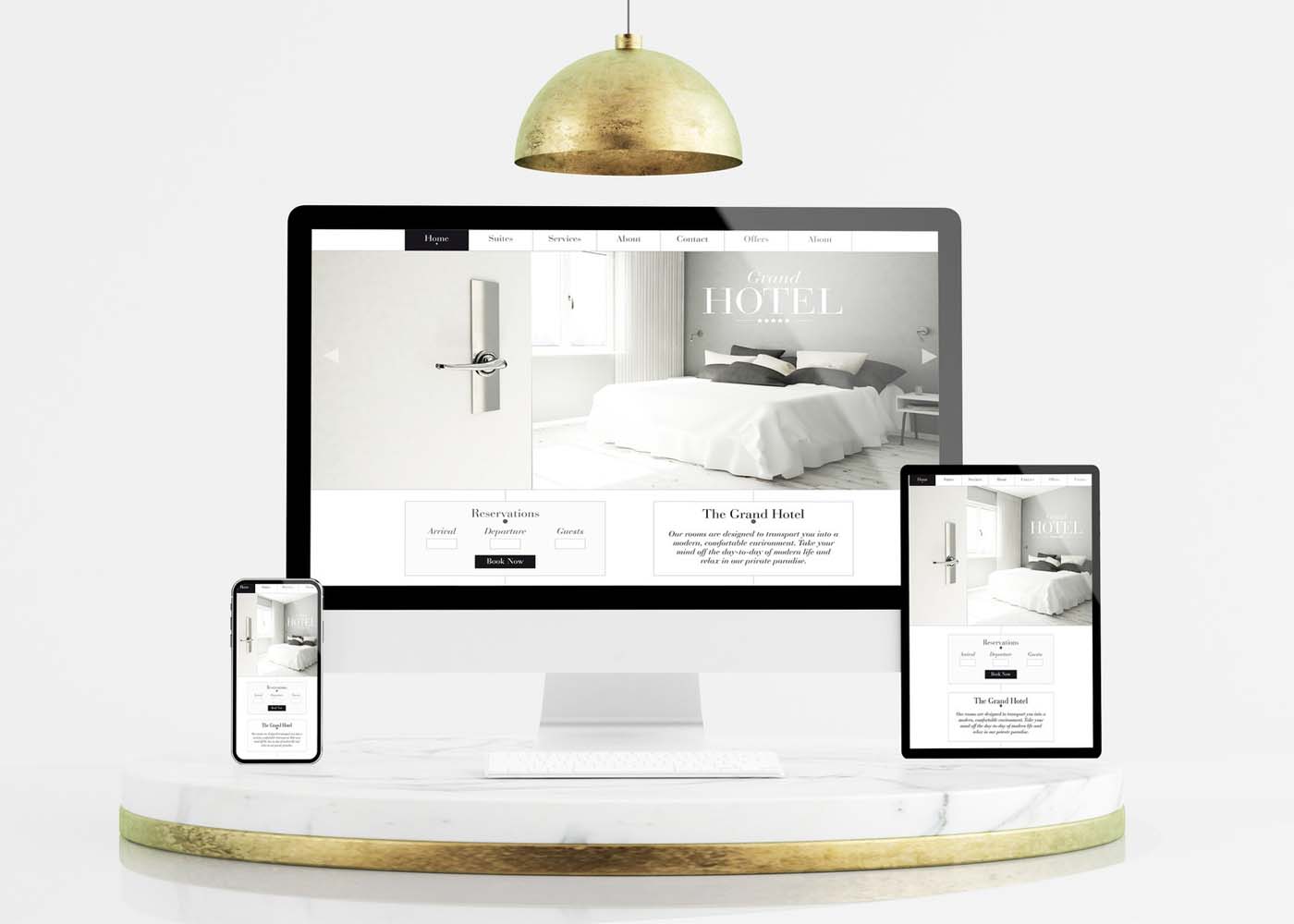
It’s undeniable – we’re living in a mobile age. Smartphones help us stay connected, entertained, and up-to-date on news, entertainment, and much more. That’s why it’s essential for any modern website or web application to be a custom web design with an eye toward the increasingly dominant mobile device market. One solution that many designers have turned to is a responsive web design, which focuses on minimizing the number of page elements necessary while maximizing usability across various devices and platforms. In this blog post, we’ll discuss some of the key concepts behind responsive design as well as how minimalism can play an important part in developing effective solutions for today’s users who are always connected with their mobile phones close by.
What is Responsive Design and Why Does it Matter in the Mobile Age
In today’s mobile age, having a website that is easily accessible on multiple devices is more important than ever. This is where responsive design comes into play. Responsive design is a method of web design that allows websites to adapt to different screen sizes and resolutions without sacrificing functionality or user experience. It ensures that your website looks and works just as well on a smartphone as it does on a desktop computer. With the majority of internet users now accessing the web from mobile devices, having a responsive website is not just a luxury, it’s a necessity. Without it, you could be missing out on a significant portion of your potential audience. So, if you want to stay ahead of the curve in the digital age, responsive design is a must-have for your website.
Minimalism as the Key to Effective Responsive Design
Minimalism is more than just a trendy design movement. It’s a powerful tool that can enhance the effectiveness of responsive design. By stripping away unnecessary elements, minimalism can help to simplify the user experience and improve website loading times. In a world where consumers expect quick and easy access to information, this is crucial. Not only does minimalism improve functionality, but it also creates a stronger brand identity by highlighting key elements of a website’s design. Embracing minimalism can be difficult, but it’s definitely worth considering for those seeking to optimize their website’s usability and overall design.
Four Principles of Responsive Design to Follow
In today’s digital age, having a website that’s mobile-friendly is more important than ever before. That’s why it’s crucial to follow the four principles of responsive design.
Firstly, ensure that your website has a flexible and fluid layout that can adapt to different screen sizes.
Secondly, use high-quality images that load quickly regardless of the device being used.
Thirdly, choose legible fonts that are easy to read on small screens.
Lastly, make sure that your website is easy to navigate regardless of whether it’s being accessed on a phone or desktop.
By following these principles, you can create a website that not only looks great but also provides a positive user experience for all visitors.
Strategies for Optimizing Content for Mobile Devices
As more and more people rely on their mobile devices for online browsing, it’s becoming increasingly important for businesses to optimize their websites for these smaller screens. But how can you ensure that your web content is efficiently translated onto a mobile device? One key strategy is to simplify your design. Get rid of any clutter that might distract from your message, and consider ways to streamline your text and images. You’ll also want to make sure your site loads quickly and smoothly, so users aren’t stuck waiting for your content to appear. Ultimately, the goal is to create a seamless user experience that makes browsing your website a pleasure, rather than a chore. With these strategies in mind, you can take your web content to the next level and reach a wider audience than ever before.
Benefits of a Responsive Website for Your Brand
A responsive website is one that is designed to adapt to various screen sizes, from desktop computers to mobile phones. Not only does this provide a better user experience for consumers, but it also has numerous benefits for your brand including increased visibility, improved search engine rankings, and stronger brand recognition. With more people using their mobile devices to access the internet, having a website that is optimized for these smaller screens is crucial to staying competitive in today’s market. By investing in a responsive website, you can ensure that your brand is reaching as many potential customers as possible and delivering the best possible online experience.
Tools and Resources For Creating A Responsive Site
Having a responsive website is essential for any business. But creating such a site can be a daunting task if you don’t have the right tools and resources. Luckily, there are plenty of options out there to help you create a dynamic and responsive website. From website builders like WordPress and Wix to frameworks like Bootstrap and Foundation, there are many ways to get started with responsive web design. Additionally, there are a variety of online resources, tutorials, and communities where you can learn from experts and get support as you build your site. With the right tools and resources at your fingertips, you can create a website that is optimized for any device, ensuring that your customers can easily access your content no matter where they are.
How to Optimize Your Site for SEO with Minimalist Design
Your website’s design plays a crucial role in determining your search engine ranking. Search engine optimization (SEO) must be an integral part of your website design strategy to help boost your website’s visibility. A minimalist design is a popular trend in web design and is a perfect way to optimize your site for SEO purposes. Minimalism in web design means having fewer elements on a webpage, reducing clutter and unnecessary distractions, and providing a better user experience. Simple, clean designs with white space and clear navigation menus can improve your site’s ranking and make your site more accessible to your audience. With a minimalist design, your website can rank higher, load faster, and offer a better user experience.
Why Responsive Design Tends to be More Usable on Mobile Devices
Mobile devices have become an essential part of our daily lives, and with that, the importance of responsive design has also risen significantly. The reason why responsive design tends to be more usable on mobile devices is quite simple – it adapts to the size and orientation of the device. With responsive design, there’s no need to zoom in or pinch to view content on a smaller screen. The layout adjusts automatically to fit the screen size, making it easier to navigate and access information. This approach provides a seamless user experience across all devices, and it’s no surprise that it’s become an essential part of web design in today’s mobile-first world.
Examples of Successful Minimalist Web Designs
Minimalism is all the rage these days, and it’s not difficult to see why. Nothing beats the clean, sophisticated vibe of a website with a minimalistic design. If you’re looking for inspiration, here are a few exemplary minimalist websites that are sure to impress. First up, we have Dropbox’s website, which features a simple and elegant design with a bright blue header that’s hard to miss. Next, take a look at Airbnb’s website, with its white background and bold font that draws the user’s attention to important features of the site. Finally, there’s Medium’s website, which boasts a clean and crisp design with plenty of white space. All of these minimalist websites have one thing in common: they convey the message with simplicity, yet with all the necessary design elements in place.
Conclusion
It is undeniable that mobile technology has revolutionized the way businesses and consumers interact, making it essential for any business or online presence to have a mobile strategy. Responsive design, with its emphasis on simplicity and minimalism, may just be the key to meeting this challenge. By following the four pillars of responsive design, using tools and resources designed specifically for creating a responsive site, and leveraging optimized content for mobile devices, your brand can gain tremendous benefits from a successful mobile experience. As seen in many examples of minimalist website designs, creating a beautifully simple user experience with responsive design has never been easier. With all the advancements of today’s technology, it is advisable to take advantage of cutting-edge approaches such as responsive design in order to stay competitive in today’s mobile age.
Are you looking for ways to speed up your website and make it more engaging? Minimal websites provide a number of benefits that can help boost website performance, promote user engagement, and improve the overall experience of visiting your site. In this blog post, we’ll be discussing 9 key reasons why going minimal on web design is the way to go—from faster loading times to creating an uninterrupted viewing experience that keeps users engaged throughout their journey with your brand. So let’s dive in!
Minimalism Reduces File Sizes & Load Times
Minimalism is the key to success when it comes to designing a website that loads quickly and efficiently. By reducing the file sizes on your website, you can significantly improve performance and ensure that visitors don’t lose patience waiting for pages to load. Using a minimalistic approach in your design can also help to eliminate clutter and improve the overall user experience. Whether you’re a seasoned web design service provider or just starting out, the benefits of optimizing your website for performance cannot be overstated. So why wait? Start reducing file sizes and load times today to create a website that truly stands out from the competition.
Fewer HTTP Requests
When it comes to web design, the phrase “less is more” couldn’t be more accurate. Minimal web design is all about simplifying your website’s visual appearance to create a more efficient and streamlined user experience. But it’s not just about aesthetics – minimizing HTTP quirequests is also a crucial component of this design approach. By reducing the number of HTTP requests needed to load your page, you can significantly speed up your website’s loading time. This not only improves the user experience but can also boost your website’s search engine rankings. So, if you’re looking to enhance your website’s performance, consider embracing minimal web design principles and saying goodbye to unnecessary HTTP requests.
Cleaner Design Is Easier to Understand and Use
People don’t have the time or patience to sift through cluttered websites to find what they need. That’s why minimalist website design has become so popular. By stripping away unnecessary elements, the minimalist design creates a more streamlined and visually appealing experience. Not only does it look better, but it also makes navigating the website much easier. Users can focus on the content and take action without getting distracted or overwhelmed by flashy graphics or excessive text. Whether you’re a blogger, an e-commerce store, or a startup, a cleaner website design will not only improve usability but also help you stand out in a crowded online space.
More Accessible to All Devices
In a world where technology is constantly changing and evolving, it’s important for websites to adapt in order to reach the widest possible audience. This is where minimal web design comes in. By stripping away all unnecessary elements, minimal websites are able to load quickly and smoothly on any device, from desktops to smartphones and everything in between. Not only does this make them more accessible to users who may not have the latest technology, but it also ensures that everyone has a seamless browsing experience. So whether you’re browsing on a tiny screen or a massive monitor, a minimal website ensures that you can access the content you need with ease.
Increased Focus on Important Content & Features
The rise of minimalist website design has taken the digital world by storm. It’s no secret that the average attention span of internet users is decreasing, forcing developers to rethink the way they design websites. Minimalism offers the perfect solution, by removing everything that isn’t necessary, leaving only the most important content and features. By doing this, users are less likely to get distracted, allowing them to focus on the task at hand. This has resulted in increased engagement rates and a better user experience overall. Whether you’re designing a blog, an e-commerce store, or a corporate site, minimalist design is the way to go.
Improved Navigation Simplifies User Experience (UX)
As our lives grow increasingly hectic, the need for simplicity and ease of use becomes ever more important. This is especially true in the realm of online browsing, where having a minimalist website can make all the difference. And when it comes to user experience (UX), there’s nothing quite as crucial as intuitive navigation. That’s why we’re excited to share that we’ve recently made improvements to our website’s navigation, streamlining the process and making it easier for users to find exactly what they need with minimal clicks. The result? A faster, more efficient, and enjoyable browsing experience for all.
Increased Usability With Intuitive Design Elements
When it comes to designing a website, simplicity is key. Minimalist design not only looks clean and modern but also enhances user experience by removing any unnecessary elements. By implementing intuitive design elements, like clear navigation and ample white space, users can easily find what they’re looking for and appreciate the straightforwardness of the website. A minimalist approach also allows for faster loading times, which can positively impact search engine optimization and overall user satisfaction. So, if you’re looking to improve the usability of your website, consider embracing a minimalist design with intuitive elements.
Quick Loading Times Reduce Frustration for Mobile Users
Simplicity is the name of the game in the world of website design. With the majority of users accessing websites from their mobile devices, it’s important to ensure that their experience is as smooth as possible. This is where minimalist website design comes into play. By stripping away unnecessary elements, a website can load more quickly, reducing frustration and making the user experience more enjoyable. Users on mobile devices are often on the go and need information quickly. With a minimalist website, they can find what they need with ease and speed, without getting bogged down by extraneous graphics or other distractions. A minimalist website is like a breath of fresh air, giving users a seamless experience from start to finish.
Clean Interface Draws Attention to the Call-To-Action
A minimalist website is all about simplicity and elegance. With a clean interface, the website can easily draw attention to the call-to-action elements, enticing the visitors to take action. A minimalistic approach makes the website look uncluttered and easy to navigate, providing an optimal user experience. The clean lines and open spaces on the website allow for smooth browsing, without any distractions. A minimalist design not only enhances the aesthetic appeal but also enhances the overall functionality of the website. So, if you’re looking to create a website that is both visually appealing and highly effective, a minimalist approach is the way to go.
Conclusion
To sum up, minimalism offers many advantages when it comes to website design. Whether you’re a business owner needing to keep user experience (UX) in mind or someone who values simplicity and clean lines on the web, minimal web design offers numerous benefits. It reduces file size and load times while allowing the optimization of important content and features that will be accessed across all devices. Additionally, improving navigation simplifies user experience and usability with intuitive design elements that draw attention to the call-to-action elements. Minimal web design not only allows for mobile visitors to benefit from minimal load times but also reduces frustration for those on mobile devices as quick loading times reduce bounce rates. As we have seen, minimalism has taken the world of website development by storm – creating a cleaner look that almost anyone can appreciate!
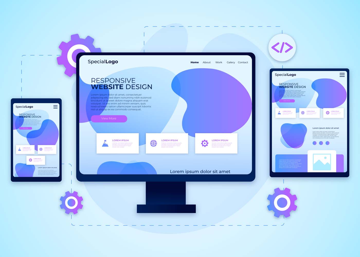
With an ever-increasing demand for responsive website design (RWD) among businesses today, it’s more important now than ever before to make sure you have a thorough understanding of the techniques, frameworks, and tools available. Understanding why RWD is such an integral part of modern website development can help you both expand your knowledge and create attractive sites that are tailored to user preferences. In this blog post, we’ll be discussing the reasons behind the high demand for RWD in 2023 and revealing some key tips to get you started on creating effective websites with the basic principles of RWD. So let’s dive right into why you should prioritize using these techniques when developing your sites!
What is Responsive Web Design (RWD)?
A responsive web design (RWD) is a design approach that allows a website’s layout and content to adjust and adapt to various screen sizes, from a desktop computer to a tablet or mobile device. This means that no matter what device your audience is using, your website will look great and be functional. RWD also provides a better user experience and improves the website’s search engine rankings. In short, a responsive website design is a smart investment for anyone looking to reach a wider online audience.
Why is RWD Important for Businesses in Today’s Digital World
RWD allows websites to be easily accessible and navigable across all devices, including smartphones, tablets, and desktops. As more and more people use their mobile devices to browse the internet, businesses need to ensure that their website is optimized for the best user experience possible. By implementing RWD, businesses can improve their website’s visibility and accessibility, ultimately increasing their online presence and revenue. With RWD, businesses can stay ahead in the game and provide customers with a seamless and enjoyable browsing experience no matter where they are.
Advantages of RWD Techniques, Frameworks, and Tools
Responsive Web Design (RWD) techniques, frameworks, and tools have revolutionized the way websites are built and used. There are many advantages to using RWD that make it a popular choice for developers. With RWD, websites can be viewed on any device, eliminating the need for multiple websites targeted at different devices. This in turn saves developers time and money, while also providing a better user experience. RWD also allows for easier maintenance and updates, as changes made to the website only need to be made once to be reflected across all devices. Additionally, RWD techniques ensure that websites are optimized for search engines, making them more likely to appear in search results. Finally, the use of frameworks and tools further allows developers to easily create responsive designs, leading to even greater efficiency and effectiveness. Overall, RWD techniques, frameworks, and tools have greatly improved the web development process and are a valuable asset to any developer.
Common RWD Techniques
With the advancement of technology, developers use various techniques to build responsive website designs. Among these techniques, flexible grids, images, media queries, and breakpoints play a significant role in making a website responsive. Flexible grids allow the web layout to adjust according to the screen size, while images and media queries help optimize image size, layout, and content based on the device. Breakpoints, on the other hand, assist in determining the layout and style changes at specific screen sizes. When developing a responsive website, mastering these techniques is essential to create an exceptional user experience. Understanding and implementing these techniques require a detailed approach, but it’s worth the effort to ensure your website looks great on every device.
Popular RWD Frameworks, and Tools Available on the Market
Popular RWD frameworks like Bootstrap, Foundation, and Semantic UI have made designing and developing responsive websites easier than ever before. These frameworks boast a variety of tools and features, such as pre-built templates, responsive navigation, and user interface components. Bootstrap is a widely used framework, favored for its extensive documentation and flexibility. Foundation offers a more modular approach, with customizable components that allow for greater flexibility. Semantic UI, while newer than the other two, offers a more modern and streamlined design. With these frameworks and the abundance of tools available on the market, designing a responsive website has never been easier or more accessible.
a) Bootstrap
Bootstrap is a widely-used Responsive Website Design (RWD) framework that has gained a large following among web developers. One of the key features that make Bootstrap so popular is its ability to create responsive and mobile-friendly websites. It provides a user-friendly grid system that allows developers to easily customize layouts and design elements to create websites that look great on any device. Additionally, Bootstrap comes with robust CSS components and JavaScript plugins that make it easy to incorporate interactive elements, such as navigation menus and forms, into websites. Overall, Bootstrap is an excellent RWD framework that offers a great balance between functionality and ease of use.
b) Foundation
Foundation is a highly popular responsive web design (RWD) framework that is extensively used by web developers for creating stunning web applications. This open-source framework is loaded with a wide range of features that make it easy to create responsive designs in real time. From customizable UI components and semantic coding to compatibility with almost all major web browsers, Foundation is packed with features that simplify the process of building responsive websites. This framework also has an intuitive grid system that makes aligning content on a webpage a breeze. With all these features and more, it’s no wonder Foundation is one of the most widely used RWD frameworks in the industry!
c) Semantic UI
Semantic UI is a highly popular responsive web design (RWD) framework that has gained traction among developers due to its excellent features. This framework is an intuitive and comprehensive toolkit that offers robust CSS and SASS components, enabling developers to create high-quality, responsive websites with ease. The framework’s naming convention and syntax are very clear and concise, making it easy for developers to comprehend and remember the code. Additionally, Semantic UI’s collection of pre-designed themes allows developers to customize their site design and focus on functionality rather than aesthetic elements. Overall, Semantic UI is a highly effective RWD framework that triumphs due to its ease of use and adaptability.
How to Implement an Effective and Engaging RWD Strategy
Implementing an effective and engaging RWD strategy can be challenging. To begin, start by analyzing your website’s current traffic and functionality. This will help you determine which devices and screen sizes your audience is using the most. From there, it’s important to create a design that is visually appealing and easily navigable on all devices. Incorporating interactive elements, such as animations or videos, can also help enhance engagement and make your website stand out. Ensuring your website loads quickly and has clean code is also crucial in maintaining an effective RWD strategy. With these tips in mind, you’ll be on your way to creating a responsive website that engages with your audience and boosts your online presence.
Tips and Best Practices for Responsive Web Design (RWD)
First and foremost, make sure your website is flexible and fluid, meaning that it can adjust to different screen sizes. Additionally, use media queries to adjust the layout, font size, and images. And don’t forget about touch-friendly buttons and navigation. By following these tips and best practices, you’ll be well on your way to creating a website that’s optimized for all devices and user-friendly for all visitors.
Conclusion
In conclusion, responsive web design (RWD) is a must-have in today’s digitally-driven world. When businesses offer an optimized user experience regardless of device or platform, they stand the greatest chance of success. Adopting RWD techniques allows you to guarantee excellent customer service and boost loyalty from customers without having to use multiple sites for different devices. Popular RWD frameworks include Bootstrap, Foundation, and Semantic UI – each offering its own set of features for developers and designers to utilize. Regardless of which framework is used, businesses should ensure their websites are fully optimized with well-thought responses for each device type and screen size for optimum performance. Implementing an effective and engaging RWD strategy is paramount for any organization — from small startups to large enterprises — who want to stay on top in their industry. Follow these tips and best practices to make sure your website is able to keep up with the swiftly changing web trends while providing an appealing and reliable service!
The minimalist design trend is becoming increasingly popular, especially among tech-savvy designers who aim to create user experiences that are easy to navigate, aesthetically pleasing, and effective. Minimalist UI/UX design delivers numerous advantages in terms of space management and usability for users; it also has a few drawbacks. In this blog post, we’ll explore how minimalism is transforming the way that businesses engage with their audiences, as well as its limitations when used on the web. We’ll look at examples of successful minimalist design implementations and discuss best practices for putting together your own designs that maximize results while mitigating potential pitfalls. Whether you’re just getting started with designing or an experienced veteran looking to hone your skills, read on to discover more about the benefits (and limitations) of minimalist web design!
What is Minimalist UI/UX Design and How Does it Relate to User Experience (UX)?
Minimalist UI/UX design focuses on simplifying user interfaces by removing unnecessary elements and emphasizing functionality. This approach follows the concept that “less is more” when it comes to UX design. By minimizing the clutter and prioritizing the most important features, the minimalist design enhances the user’s experience by making it easier for them to navigate and achieve their desired tasks. Adopting minimalist design principles can result in increased user satisfaction, engagement, and loyalty. In order to implement a successful minimalist UI/UX design, designers need to understand their target audience and carefully consider which elements are crucial to the user experience.
Benefits of Minimalist UI/UX Design
Minimalist UI/UX design has become increasingly popular in recent years due to its many benefits. With a minimalist design, clutter is reduced and functionality is prioritized. This not only creates a clean and visually appealing user interface but also makes it easier for users to navigate and find what they are looking for. A minimalist design also improves website speed and performance, which is essential for providing a seamless user experience. In addition, minimalist design allows for faster development and easier maintenance, making it a cost-effective option for businesses. Ultimately, a minimalist design prioritizes user needs and enhances the overall user experience, making it a valuable approach in today’s digital landscape.
Improved Usability
With the rise of minimalism in design, it’s easy to assume that usability might be sacrificed in the pursuit of a sleek and streamlined aesthetic. However, the truth is quite the opposite. Minimalism can actually enhance usability and make for a more intuitive user experience. By cutting down on visual clutter and unnecessary elements, users can more easily find what they need and focus on the task at hand. Plus, a simple and elegant design can be visually appealing and even calming to use. The key is to strike the right balance between minimalism and functionality, ensuring that the design remains user-friendly and not just fashionable. With this in mind, designers can create interfaces that are both beautiful and easy to use.
Enhanced Focus on Mobile-Friendly Features
To truly succeed in today’s fast-paced digital environment, it’s crucial to enhance the focus on mobile-friendly features. This means ensuring that the design is not only aesthetically pleasing and easy to navigate but also optimized for a seamless mobile experience. From intuitive touch controls to responsive layouts, a focus on mobile-friendly design features can provide users with a streamlined experience that keeps them engaged and satisfied.
Fewer Distractions for Users
A minimalist design can make a world of difference when it comes to user experience. By reducing distractions, users can focus on the essential aspects of the interface they are interacting with. A cluttered design could make it arduous for users to understand what action they should take next. On the other hand, a clean and straightforward approach to design can improve the experience and ease the user’s journey toward their goal. Fewer distractions can also mean a reduced cognitive load, allowing users to process the information effectively and without confusion. A minimalist design approach ensures that your website or application fits the user’s needs while providing them with a seamless experience.
Limitations of Minimalist UI/UX Design
Minimalist UI/UX design may have its praises, but it certainly has limitations. While the lack of clutter and sleek aesthetics may seem pleasing to the eye, it can also limit the amount of information that can be conveyed to the user. Important details might get lost in the sea of white space or overshadowed by the design itself. Another limitation of minimalist design is its tendency towards impersonality. While simplicity is key, attempting to create a completely streamlined experience can take away the human touch that many users crave. Ultimately, while there is value in minimalist design, it’s important to remember that it may not always be the best approach for every project.
Limited Customization Options
Minimalist design is all about simplicity and a clean, uncluttered look. While this design approach is visually appealing and can lead to a sleek, modern aesthetic, it can also limit the customization options available to users. With fewer design elements to work with, designers may feel constrained in their ability to create something truly unique. However, this limitation can also lead to a greater focus on the essential elements of design, resulting in a design that is both functional and visually appealing. In the end, the choice of a minimalist design should be based on the specific needs and goals of the project, and whether the trade-offs in customization are worth the benefits of a more streamlined approach.
Difficulty Accommodating Complex Interactions
Minimalist design has become increasingly popular in recent years for its clean, simplistic aesthetic. However, as sleek as it may appear, minimalist design can present challenges when dealing with more complex interactions. Accommodating these interactions can be difficult without compromising the overall minimalist feel. Finding a balance between functionality and design can be a daunting task. Nonetheless, designers are up for the challenge and are constantly exploring new ways to incorporate complex interactions into minimalist design without compromising the user experience. The goal is to create a design that not only looks great but also functions seamlessly. So, while a minimalist design may present challenges when it comes to complex interactions, it also presents an opportunity for creativity and innovation.
Tips for Overcoming the Limitations of Minimalist UI/UX Design
Minimalist UI/UX design has become increasingly popular among designers as it provides a clean and simple interface that focuses on the functionality of the product rather than the design. However, despite the benefits it offers, a minimalist approach also presents some limitations. To overcome these limitations, a UI/UX design agency needs to find ways to balance simplicity and functionality. One tip is to incorporate subtle and tasteful animations, which can add an extra level of engagement without sacrificing the minimalist aesthetic. Another tip is to use typography to create visual interest and hierarchy, providing users with a clear understanding of the content and information displayed. With these tips, designers can overcome the limitations of minimalist UI/UX design and deliver a functional and visually appealing product.UI/UX Design Creatives
Leverage Contextual Aids & Visual Cues to Help Guide Users
While minimalist designs may appear sleek and straightforward, designers often face the challenge of helping users navigate through content without overwhelming them. That’s where contextual aids and visual cues come into play. These elements provide subtle guidance to users and can make all the difference in their experience. By utilizing context-specific information and imagery, designers can help users understand the purpose and functionality of features without the need for lengthy instructions or repetitive design elements. The end result is a harmonious balance between simplicity and usability, enabling users to effortlessly achieve their goals within the minimalist design.
Use Progressive Disclosure to Simplify Complex Interactions
Simplifying complex interactions in minimalist designs can be a daunting task, but with the help of progressive disclosure, it becomes much easier. This design technique involves breaking down information into smaller, more manageable chunks that reveal themselves gradually as the user interacts with the interface. By limiting the initial display of information to only what is necessary and progressively revealing more as needed, designers can reduce clutter, streamline the user experience, and enhance the overall usability of the interface. Through using this technique, designers can create minimalist designs that not only look sleek and modern but also provide users with the information they need in a clear and digestible manner.
When Is Minimalism Not the Best Choice for Your Website Design
Minimalism has been a popular trend in website design for years. However, just because something is trendy doesn’t mean it’s always the best choice for your website. There are times when minimalism can actually be detrimental to the user experience. For example, if your website is an e-commerce site, you may need to provide users with multiple images and detailed information about your products. In this case, a minimalist design may not be suited to showcase your products or give visitors enough information to make informed purchasing decisions. Likewise, if your website is for a creative agency or portfolio, a minimalist design may not be the best way to show off your work and attract clients. Ultimately, the design of your website should be dictated by the purpose of your site and the needs of your audience.
Examples of Successful Minimalist UI/UX Designs
Minimalist UI/UX designs are all about simplicity and efficiency. They are a great way to create a user-friendly interface without overwhelming your users with too much information. That’s why it’s important to take inspiration from successful minimalist designs. For example, take a look at Dropbox or Google’s search page. Both are clean, simple, and easy to use. The purpose of minimalist UI/UX designs is to focus on the content, rather than the design. That’s why typography, whitespace, and color are so important in these designs. They should all work together seamlessly to create a finished product that is both beautiful and functional. Whether you’re designing a website or mobile app, be sure to keep these principles in mind when creating your own minimalist UI/UX design.
Conclusion
In conclusion, minimalist UI/UX design is a great choice to elevate user experience and engage users. Although it does have its limitations, following tips such as leveraging contextual aids and visual cues and using progressive disclosure, can help you work around them. Ultimately though, minimalism may not be the right choice for every web design project. By studying successful minimalist UI/UX designs, and taking notes of common elements that make up these designs, you can decide whether this is the right direction to take your own project in. Thoughtfully considering minimalism when looking toward how you can best create an enjoyable user experience will always serve you well.
Are you familiar with AI? Artificial intelligence is becoming more and more prevalent in our daily lives. From virtual assistants to chatbots, AI is changing the way we interact with technology. But did you know that AI is also revolutionizing web development? That’s right, AI is transforming websites to the next level. In this article, we will explore the role of AI in web development, the benefits of using AI, examples of AI in web development, and the future of AI in web development.
Introduction to AI in Web Development
Web development is the process of creating and maintaining websites. It involves a variety of skills, including web design, programming, and content creation. With the advancement of technology, web development has become more complex. That’s where AI comes in. AI can help web developers create websites that are more efficient, effective, and user-friendly. AI can also help web developers automate certain tasks, such as testing and analysis.AI in web development is not a new concept. In fact, AI has been used in web development for years. However, recent advancements in AI technology have made it more accessible and more affordable for web developers. This means that AI is becoming more prevalent in web development, and it is changing the way we create and maintain websites.
Understanding the Basics of Web Development
Before we dive into the role of AI in web development, let’s first understand the basics of web development. Web development involves three main components: front-end development, back-end development, and full-stack development.
Front-end development involves creating the user interface of a website. This includes designing the layout, selecting fonts and colors, and creating the navigation menu. Front-end developers use languages such as HTML, CSS, and JavaScript to create the user interface.
Back-end development involves creating the server side of a website. This includes creating and managing databases, handling server requests, and managing security. Back-end developers use languages such as PHP, Python, and Ruby to create the server side of a website.
Full-stack development involves both front-end and back-end development. Hence, full-stack developers have a broad knowledge of both front-end and back-end development.
The Role of AI in Web Development
Now that we understand the basics of web development, let’s explore the role of AI in web development. AI can play a variety of roles in web development, including:
Automating Tasks
AI can automate tasks such as testing, analysis, and optimization. This can save web developers time and improve the overall efficiency of web development.
Personalizing Content
AI can analyze user data and personalize content based on user preferences. This can improve the user experience and increase user engagement.
Improving Search Functionality
AI can improve search functionality by analyzing search queries and providing more accurate search results.
Enhancing Security
AI can detect and prevent security breaches by analyzing user behavior and identifying potential threats.
Optimizing Performance
AI can analyze website performance and optimize it for speed and efficiency.
Benefits of Using AI in Web Development
There are numerous benefits of using AI in web development. Some of these benefits include:
Improved Efficiency
AI can automate tasks and improve the overall efficiency of web development.
Better User Experience
AI can personalize content and improve search functionality, which can enhance the user experience.
Increased Security
AI can detect and prevent security breaches, which can increase the security of a website.
Improved Performance
AI can optimize website performance, which can improve the speed and efficiency of a website.
Cost Savings
AI can save web developers time and reduce costs associated with testing and analysis by cutting the fixed cost of employees as well as the time required to do the tasks.
Examples of AI in Web Development
AI is already being used in web development in a variety of ways. Here are some examples of AI in web development:
Chatbots
Chatbots use AI to provide personalized customer service and support. Generative AI models such as GPT-3 and GPT-4 can be used to automate customer service and support tasks in the websites.
Voice Search Optimization
AI is used to optimize websites for voice search, which is becoming increasingly popular.
Content Creation
AI is used to create content, such as news articles and product descriptions. There are a wide variety of apps that can be used for this purpose including ChatGPT, JasperAI, CopyAI, Writesonic, etc.
Predictive Analytics
AI is used to analyze user behavior and predict future behavior.
Website Personalization
AI is used to personalize website content based on user preferences.
AI-Powered Web Development Tools and Platforms
There are a variety of AI-powered web development tools and platforms available. These tools and platforms can help web developers automate tasks and improve the efficiency of web development. Here are some examples of AI-powered web development tools and platforms:
Google Cloud AutoML
Google Cloud AutoML is an AI-powered tool that allows web developers to create custom machine-learning models.
Wix ADI
Wix ADI is an AI-powered website builder that creates personalized websites based on user preferences.
The Grid
The Grid is an AI-powered website builder that creates websites based on user content and preferences.
Hugging Face
Hugging Face is an AI-powered platform that provides natural language processing tools for web developers.
Future of AI in Web Development
The future of AI in web development is exciting. As AI technology continues to advance, we can expect to see even more AI-powered tools and platforms for web developers. AI will also play a bigger role in website personalization and user experience. We can also expect to see more AI-powered chatbots and voice search optimization. The possibilities are endless.
Challenges and Limitations of AI in Web Development
While AI has numerous benefits in web development, it also has some challenges and limitations. One of the biggest challenges is the lack of understanding of AI among web developers. Many web developers are not familiar with AI technology, which can make it difficult to implement AI in web development. Another challenge is the cost of implementing AI. AI-powered tools and platforms can be expensive, which can make it difficult for small businesses to adopt AI technology.
How Web Developers Can Adapt to AI
To adapt to AI in web development, web developers need to stay up-to-date with the latest AI technology. They should also be willing to learn and experiment with AI-powered tools and platforms. Web developers should also focus on improving their understanding of AI and how it can be used in web development. By doing so, they can stay ahead of the curve and create more efficient, effective, and user-friendly websites.
Conclusion
AI is revolutionizing web development. It is changing the way we create and maintain websites, and it is improving the user experience. While there are challenges and limitations to using AI in web development, the benefits are numerous. As AI technology continues to advance, we can expect to see even more AI-powered tools and platforms for web developers. To stay ahead of the curve, web developers need to be willing to learn and experiment with AI in web development. By doing so, they can create websites that are more efficient, effective, and user-friendly.
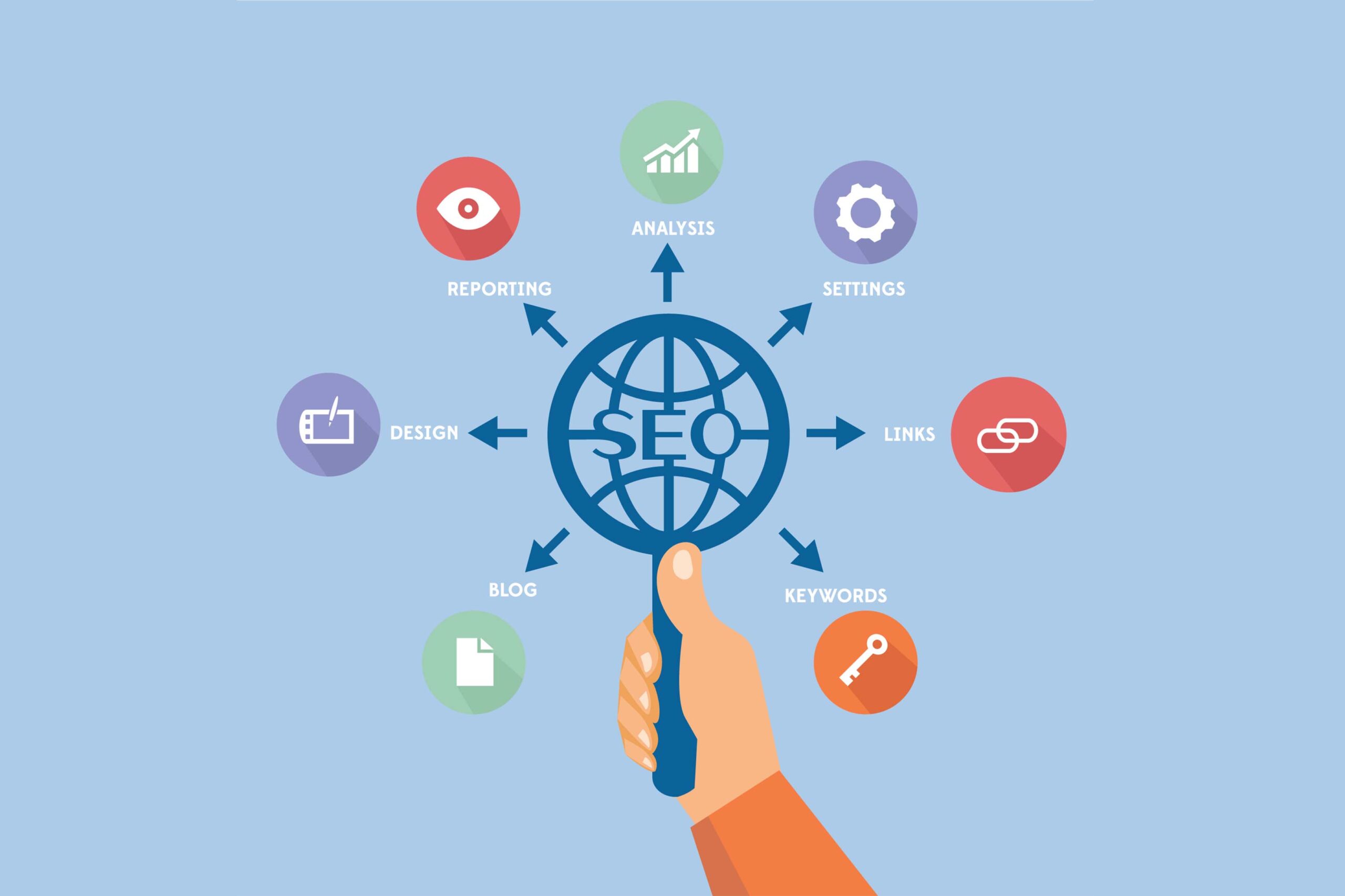
As the world becomes increasingly interconnected, businesses are expanding their reach beyond their domestic markets. To succeed in a globalized economy, companies must ensure their online presence is optimized for international audiences. That’s where international SEO comes in. In this article, we’ll break down the basics of international SEO and provide tips on how to achieve global success.
Introduction to International SEO
International SEO is the practice of optimizing your website and content to rank higher in search engine results pages (SERPs) for a global audience. It involves tailoring your SEO strategy to specific countries and languages to ensure your website is discoverable and accessible to your target audience.International SEO can be a complex process, as there are many factors to consider, including language, culture, and search engine algorithms. However, with the right approach, international SEO can help you expand your reach, increase your website traffic, and ultimately, drive more revenue.
Understanding the Importance of International SEO
In today’s globalized economy, businesses that fail to optimize their online presence for international audiences risk losing out on potential customers and revenue. By investing in an international SEO strategy, you can ensure your website is discoverable to users in different countries and languages, and increase your chances of attracting new customers.Moreover, international SEO can help you establish your brand as a global player in your industry. By appearing in search results for different countries and languages, you can build trust and credibility with international audiences, which can ultimately lead to increased conversions and revenue.
Challenges in International SEO
One of the biggest challenges in international SEO is understanding the different search engine algorithms used in different countries. Google may be the dominant search engine in many countries, but there are other search engines, such as Baidu in China and Yandex in Russia, that have their own unique algorithms.
Another challenge is language and cultural barriers. To effectively optimize your website for international audiences, you need to understand the nuances of different languages and cultures. This includes understanding how users in different countries search for information online, as well as the cultural differences that can impact user behavior and preferences.
Finally, there are technical challenges to consider. For example, you may need to implement hreflang tags to ensure your content is properly translated and displayed to users in different countries, or use a content delivery network (CDN) to ensure your website loads quickly for users in different regions.
Conducting International Keyword Research
Effective keyword research is the foundation of any successful SEO strategy, and international SEO is no exception. However, conducting keyword research for international SEO requires a different approach than traditional SEO.First, you need to identify the keywords and phrases that are relevant to your target audience in different countries and languages. This may involve using tools like Google Trends, which can show you the popularity of certain keywords in different regions.Next, you need to consider the different search engine algorithms used in different countries. For example, Baidu places more emphasis on the number of backlinks a page has, while Yandex considers social signals when ranking pages.Finally, you need to consider the cultural nuances that can impact keyword usage. For example, there may be different slang terms or colloquialisms used in different regions that you need to account for in your keyword research.
On-Page Optimization for International SEO
On-page optimization is the practice of optimizing the content and structure of your website to improve its visibility in search engine results pages. In international SEO, on-page optimization involves tailoring your website content to specific countries and languages.One of the most important aspects of on-page optimization for international SEO is implementing hreflang tags. Hreflang tags tell search engines which version of your content to display to users based on their location and language preferences.Additionally, you should ensure your website content is properly translated and localized for different countries and languages. This involves more than simply translating your content word-for-word; you need to consider the cultural nuances and preferences of your target audience in each country.Finally, you should ensure your website is mobile-friendly and loads quickly for users in different regions. This can involve using a content delivery network (CDN) to ensure your website content is served from servers located closer to your target audience.
Technical Optimization for International SEO
Technical optimization involves optimizing the technical aspects of your website to improve its visibility in search engine results pages. In international SEO, technical optimization involves implementing technical elements that ensure your website is discoverable and accessible to users in different countries.Additionally, you should ensure your website is hosted on servers located in the same country as your target audience. This can improve your website’s load time and make it more accessible to users in different regions.
Creating Multilingual Content
Creating multilingual content is an important aspect of international SEO. By translating your website content into different languages, you can ensure your website is accessible to users in different countries and languages.To effectively create multilingual content, you need to consider the cultural nuances and preferences of your target audience in each country. This involves more than simply translating your content word-for-word; you need to ensure your content is properly localized for each country and language.Additionally, you should consider implementing a content management system (CMS) that supports multilingual content. This can make it easier to manage and update your website content in different languages.
Building Backlinks for International SEO
Backlinks are an important factor in SEO, and this is no different from international SEO. However, building backlinks for international SEO requires a different approach than traditional SEO.First, you need to identify relevant websites in different countries and languages that are likely to link to your content. This may involve using tools like Ahrefs or SEMrush to identify websites that link to your competitors.Next, you need to consider the different search engine algorithms used in different countries. For example, Baidu places more emphasis on the number of backlinks a page has, while Yandex considers social signals when ranking pages.Finally, you need to ensure your backlink profile is diverse and natural. This means avoiding spammed link-building tactics and focusing on building high-quality, relevant backlinks that will improve your website’s visibility in search engine results pages.
Localizing your Website for International SEO
Localizing your website involves tailoring your website content and user experience to specific countries and languages. This is an important aspect of international SEO, as it can improve your website’s visibility and accessibility to users in different regions.To effectively localize your website, you need to consider the cultural nuances and preferences of your target audience in each country. This includes everything from the language and content of your website to the design and layout of your website.Additionally, you should consider implementing local search engine optimization (SEO) tactics, such as optimizing your Google My Business listing and building citations on local directories. This can improve your website’s visibility in local search results and make it more accessible to users in different regions.
Measuring Success in International SEO
Measuring the success of your international SEO efforts is important to ensure you’re achieving your goals and driving ROI. To effectively measure success in international SEO, you need to track key performance indicators (KPIs) that are relevant to your business and goals.Some common KPIs to track in international SEO include website traffic, search engine rankings, backlinks, and conversions. Additionally, you should consider tracking KPIs that are specific to each country and language you’re targeting, as these may vary depending on the cultural nuances and preferences of your target audience.
Conclusion
In conclusion, international SEO is a complex process that requires a tailored approach for each country and language you’re targeting. However, by investing in international SEO, you can expand your reach, increase your website traffic, and ultimately, drive more revenue.To achieve success in international SEO, you need to understand the different search engine algorithms used in different countries, as well as the cultural nuances and preferences of your target audience. Additionally, you should focus on implementing technical optimization, creating high-quality multilingual content, and building a diverse and natural backlink profile.By following these tips, you can ensure your website is discoverable and accessible to users in different countries and languages, and establish your brand as a global player in your industry.
Discovering the art of web design is often a complex journey, filled with trial and error. But one thing that should remain constant in all digital platform designs is simplicity; adage notwithstanding, less can surely be more. With minimalism taking over as the hottest trend in digital design, understanding how to adhere to these principles—without sacrificing functionality or your brand’s message—is becoming increasingly important. In this blog post, we will explore the key tenets of minimalist web design and explain why keeping your user interface simple is so effective for creating an optimal online experience.
Keep it Simple
In this age of information overload, simplicity is king when it comes to website design. Minimalist designs with clean, uncomplicated lines are the key to effectively communicating your message and keeping visitors engaged. By using a simple layout, you ensure that your website is easy to navigate and uncluttered, allowing visitors to find the information they need quickly and easily. Don’t fall into the trap of trying to cram too much content onto your website – keep it simple and let your message speak for itself. With a minimalist design, your website will not only look great but it will also be functional and user-friendly. So why complicate things? Keep it simple and watch your website soar.
Choose Appropriate Color Scheme
When it comes to designing a minimal website, choosing an appropriate color scheme is critical in creating a harmonious and engaging atmosphere. The right combination of colors can make all the difference in how users perceive your website and interact with its content. A harmonious color scheme can also convey a sense of professionalism and polish, which can improve the overall user experience. So, whether you opt for a monochromatic scheme or decide to incorporate bold accent colors, be intentional in your color choices and consider how they will impact the tone and mood of your website. An effective color scheme can help you create a sleek and modern website that users will want to interact with.
Focus on the User
It’s important to remember that a website’s purpose is to provide information and connect with potential customers. That’s where user experience comes into play. Creating a streamlined and intuitive user experience on your minimal website can make a world of difference. By focusing on your user, you can make sure that your website is easy to navigate, with clear and concise language that guides them to the information they need. A streamlined user experience not only looks great but also helps to build trust and credibility with your audience. A minimal website can be a powerful tool in your marketing arsenal, but only if your user experience is on point.
Utilize Negative Space
Negative space is an often misunderstood element of design. At first glance, it can seem like wasted space or an oversight on the designer’s part. But in reality, negative space is a powerful tool in creating a minimalist website. By intentionally leaving areas of the page empty, you allow the content that is present to shine even brighter. Negative space can be used to draw the eye to certain elements, create a sense of balance, and even provide a calming visual experience for your website visitors. When utilized effectively, negative space can transform a simple website into a work of art.
Prioritize Content Hierarchy
It’s essential to prioritize content hierarchy when building your website. Doing so allows you to showcase what’s most important while de-emphasizing elements that are less significant. In a world where attention spans are becoming shorter and shorter, highlighting key features is essential to keep visitors engaged. By placing emphasis on critical elements and letting non-significant ones take a back seat, you can ensure that your visitors find the information they need quickly without getting overwhelmed by needless clutter. A minimalist website that balances content hierarchy strikes the perfect balance between simplicity and usefulness.
Leverage Contrast
When it comes to minimalist website design, contrast is key. In order to ensure that your website is both visually appealing and easily readable for viewers, it’s important to carefully consider the contrast between the background and foreground. By leveraging contrast effectively, you can prevent your website from looking flat or one-dimensional while also creating a seamless user experience that allows visitors to easily navigate your site. Whether you’re using bold typography to create contrast or playing with light and shadow to highlight important elements, the key is to remember that every choice you make should be informed by a commitment to clarity and usability for your users.
Utilize Typography
Typography is one of the most overlooked design elements on a minimalist website. Yet when utilized properly, it can elevate the overall aesthetic of a site to new heights. The key is to use typography sparingly, opting for only a few select typefaces that mesh well together to create a cohesive design. Whether you’re choosing a bold sans-serif font for your headlines or a sleek, easy-to-read serif font for your body copy, the final result should be visually pleasing and easy to navigate for your users. It’s all about finding that perfect balance between form and function, and with the right typography, you can achieve just that.
Utilize Modern UI Elements
Minimalism is a design philosophy that emphasizes simplicity and clarity in every aspect of a website. However, just because you’re going simple doesn’t mean you have to be boring. In fact, using modern user interface elements such as icons and buttons can be a great way to enhance the user experience while keeping your minimalist aesthetic intact. These elements are not only attractive and eye-catching, but they also make navigation easier and quicker, especially for mobile users. So, when designing your website, don’t be afraid to use these elements to convey your brand’s tone and personality while keeping everything clean and simple.
Focus on Content
When it comes to creating a minimalist website, it’s important to remember that less is more. While design elements can certainly enhance the look of a site, they should never overtake the content that’s being presented. After all, the main purpose of any website is to communicate information and ideas to its audience. By prioritizing the content over flashy designs, you can ensure that your message comes across loud and clear. So, when working on your minimalist website, make sure that the content is the star of the show. Keep things simple and streamlined, and don’t be afraid to let the words and ideas speak for themselves.
Implement Grid-Based Layouts
When designing a minimalist website, it’s important to maintain a sense of organization and consistency throughout. This is where grid-based layouts come in handy. By dividing your content up into evenly spaced sections, you’ll be able to create a cohesive look that’s visually appealing to your visitors. However, implementing a grid-based layout can be tricky if you don’t have the right knowledge or tools. Thankfully, there are a variety of resources available online to help get you started. So, don’t be afraid to experiment with different grid formats until you find the one that works best for your site. The end result will be a website that’s not only aesthetically pleasing but easy to navigate and understand.
Leverage Visuals
In the world of website design, being minimalist doesn’t necessarily have to mean being boring. By leveraging visuals, you can add interest and depth to your webpage without sacrificing its clean, streamlined look. Photos, icons, and illustrations can be strategically placed to create a visually appealing experience for your visitors, while still maintaining a sleek and uncluttered design. Rather than overwhelming your audience with a barrage of content, let the visuals do the talking and draw them in with their unique charm. With a little bit of creativity, your minimalist website can become the talk of the town.
Conclusion
To wrap it all up, good website design is essential for success, and keeping the rules we’ve discussed in mind is key. Keeping the design simple and focusing on the user experience will ensure visitors enjoy browsing your website. Utilize negative space, contrast, and thoughtful typography to keep visitors engaged and focused on your content. Implementing grid-based layouts with visuals will further maximize the positive effect of a well-designed website. Remember, attention to detail is essential when creating a website that provides the best user experience possible. Make sure everything works together cohesively so when visitors leave your site they have a memorable online experience they will want to repeat!
Are you a new website owner who is looking to optimize your online presence? If so, then understanding the basics of SEO (search engine optimization) and implementing best practices on your website is crucial. Whether you are just launching your first business venture or revamping an existing site, utilizing SEO correctly can have a tremendous impact on your long-term success. In this blog post, we’ll show you exactly how to get started with SEO for new websites—including key tips for developing effective content strategies, leveraging keyword research tactics, and more! Keep reading to learn all about optimizing your site for search engines in 2023.
Thorough Keyword Research
To ensure your online presence is as effective as possible, conducting thorough keyword research is an essential first step. By taking the time to thoroughly investigate and find the right keywords and phrases, you can maximize the reach and visibility of your content, products, or services. This can go a long way in driving traffic to your website, raising your brand’s profile, and ultimately, generating more leads. Whether you’re a small local business or a large international corporation, keyword research is an indispensable tool that can help you achieve your online goals. So, make sure you dive deep and consider all of the relevant keywords that pertain to your business, and get ready to see increased online success.
Create Engaging Content
Creating engaging content for your website is a crucial aspect of any successful online presence. Not only does it provide valuable information to your readers, but it also helps to keep them interested and coming back for more. One important way to achieve this is by including plenty of internal links throughout your content. Not only does this improve your SEO, but it also encourages readers to explore your website and learn more about your business or brand. So, take the time to craft informative and engaging content, and don’t forget to pepper in those important internal links to keep your readers engaged!
Optimize Images
When it comes to SEO, images can play a crucial role in driving traffic to your website. However, simply uploading a bunch of images and calling it a day is not enough. To truly optimize your images, it’s important to add relevant Alt text and captions. Alt text is a short description of what the image is portraying and helps search engines understand the context of your image. Captions, on the other hand, provide additional information and can help keep visitors engaged with your content. By taking the time to add these important elements, you can improve your website’s search rankings and attract more visitors.
Use Headings with Keywords
If you’re looking to improve your website’s SEO, using proper headings is a simple yet effective way to do so. By breaking up your content into manageable chunks with H1, H2, and H3 headings, not only will your readers be able to scan your content more easily, but search engines will also be able to better understand what your content is about. This is because search engines rely heavily on headings to determine the main topics and sections of your website. So, whether you’re a blogger or a business owner, taking the time to use headings with keywords can go a long way in boosting your website’s visibility and search engine rankings.
Use Simple URLs
When search engines crawl through your website, the URL is one of the most important elements they look at to determine the relevance of your webpage. A clear and concise URL not only helps search engines understand your content but also makes it easier for users to read and remember. A well-optimized URL includes the primary keyword relevant to the content and enhances the chances of it showing up in search engine results pages (SERPs). Therefore, it’s essential to create URLs that are easy to understand and relevant to the content of your website.
Meta Descriptions
A meta description is a short summary of your webpage that appears in search results, giving people a glimpse into what they can expect to find on your site. Including a meta description on all pages of your website is a simple yet effective way to boost your search engine rankings and attract more organic traffic. By crafting compelling, concise descriptions that accurately reflect the content of each page, you can entice users to click through to your site and increase your chances of converting them into loyal customers. So if you haven’t already, it’s time to start using meta descriptions across your entire website and take your SEO game to the next level.
Site Structure
When it comes to optimizing your website for search engines, site structure plays a crucial role. An intuitive and well-organized structure ensures that search engine crawlers can easily access and index all the pages on your site. This, in turn, can significantly improve your SEO performance and help your site rank higher in search engine results pages. A good site structure should include a clear and concise hierarchy of pages, internal linking, and proper URL structure. By paying attention to these details and taking the time to create a comprehensive site structure, you can give your website the best possible chance to rank well in search engines and attract more traffic to your site. Overall, a thoughtful approach to site structure can pay significant dividends when it comes to SEO and online visibility.
Internal Linking
Internal linking between pages of your website may seem like a small detail, but it can have a significant impact on your website’s user experience and search engine optimization (SEO) ranking. By linking relevant content between pages, visitors can easily navigate your site and find the information they need. This can improve user engagement and reduce bounce rates, which can ultimately lead to higher conversions. Additionally, internal links can help search engines understand the structure of your website and the relevance of your pages. When done correctly, internal linking can improve your website’s visibility and increase your chances of ranking higher on search engine results pages (SERPs). So don’t overlook the importance of internal linking in improving both user experience and SEO ranking.
Conclusion
To maximize your website’s SEO ranking, it is important to consider all aspects of a good SEO strategy. Thorough keyword research and content optimization are essential for great search engine results. Utilizing headings and meta descriptions with the right keywords will help maximize site visibility. In addition, creating simple URLs that are easy to understand and incorporating internal linking can improve user experience as well as user rankings in search engine results. Lastly, a properly structured website with unique titles and concise text will help ensure that your website content is easily indexed by crawlers, thus further increasing your chances of achieving top rankings on SERPs. With these measures in place, you can be sure that your website has an optimal chance of showing up in search engine results.
As an ecommerce business striving to reach potential customers, it is essential to ensure your website has high visibility on search engine results. SEO (Search Engine Optimization) is an invaluable tool for online businesses seeking success as it can positively affect both visibility and sales by utilizing the natural power of organic search responses. By understanding the fundamentals of creating a top-notch SEO strategy and implementing best practices, you will be able to maximize conversions from organic sources and attract more visitors to your site. In this blog post, I will provide insights into how SEO impacts ecommerce operations and provides more lucrative opportunities in the digital economy.
Basics of SEO and How It Can Benefit Your Ecommerce Store
In today’s digital age, having an online presence is crucial for any business – especially for ecommerce stores. And that’s where search engine optimization (SEO) comes in. In its simplest form, SEO is the practice of optimizing your website’s content and structure to improve its visibility in search engine results pages (SERPs). By doing so, you’re increasing your chances of getting more website traffic, which can eventually lead to more sales. Understanding the basics of SEO can be the difference between your ecommerce store’s success or failure. With the right strategies, you could potentially rank higher than your competitors on SERPs, making it easier for potential customers to find your store. The benefits of SEO for ecommerce stores are endless, so it’s time to start implementing it into your digital marketing strategy.
Key Elements of a Successful SEO Strategy
A successful online store SEO strategy can be a game-changer for any online business. The key elements of such a strategy include identifying the most relevant keywords, optimizing on-page SEO, building a strong backlink profile, and regularly updating content. In today’s crowded online marketplace, it is crucial to target the right keywords and make sure your website is easily searchable and accessible to potential customers. Additionally, building a strong backlink profile will help boost your website’s authority and improve its ranking on search engines. Finally, regularly updating your website’s content with fresh, relevant information can attract and retain customers, encourage social media engagement, and keep your website at the top of search engine results pages. By focusing on these key elements, your ecommerce business can significantly improve its SEO and boost its online visibility and sales.
Optimizing Web Content for Search Engine Algorithms
What good is a website if it’s not easily searchable? That’s where search engine optimization (SEO) comes into play. By optimizing your website’s content for search engine algorithms, you can drive more traffic to your site and improve your online visibility. Effective ecommerce SEO involves a combination of techniques, including keyword research, link building, and creating quality content. By understanding the algorithms that search engines use to rank websites, you can tailor your content to meet those criteria and improve your search rankings. It may take some time and effort, but optimizing your website for SEO is certainly worth it in the long run.
Optimizing Titles, Meta Descriptions, and URLs
By optimizing your titles, meta descriptions, and URLs, you can increase the visibility of your online store and attract more potential customers. These elements serve as important pieces of information that search engines use to determine the relevance of your website to a user’s search query. By ensuring that they are all fully optimized with relevant keywords, you can increase the chances of your website appearing at the top of search engine results pages.
Use a Mobile-Friendly Design
With more and more people using their smartphones and tablets to access the internet, implementing a mobile-friendly design is crucial for increasing visibility on search engines. Not only will a responsive design make it easier for users to navigate your site on their small screens, but it will also improve your site’s search engine rankings. When your website is mobile-friendly, it will rank higher on search engines, leading to increased visibility and more traffic to your site.
Leverage Online Reviews to Boost SEO Ranking
Online reviews can do wonders for your ecommerce business in terms of generating customer trust and loyalty, but they can also have a significant impact on your website’s SEO ranking. Positive reviews signal to search engines that your website and products are trustworthy, which can increase visibility in search results. Additionally, online reviews provide valuable user-generated content that search engines love. By leveraging online reviews, you can not only establish credibility and connect with customers but also boost your website’s SEO ranking, leading to increased traffic, sales, and online success.
Use Social Media to Reach Out to Customers
By utilizing social media platforms such as Facebook, Twitter, and Instagram, ecommerce stores can reach out to target audiences and foster brand loyalty. Not only does social media engagement help build a stronger relationship with customers, but it can also boost an ecommerce store’s SEO rankings. By regularly posting relevant and engaging content, ecommerce stores can improve their visibility on search engines, ultimately driving more traffic and sales. In short, if you’re looking to take your ecommerce store to new heights, incorporating social media into your marketing strategy is a must.
Benefits of Using SEO in eCommerce
For an ecommerce business, attracting traffic and driving sales are crucial to success. That’s where SEO comes in. By optimizing your website with relevant keywords and phrases, you can increase your visibility on search engines and attract more potential customers. A well-executed SEO strategy can lead to higher rankings on search engine results pages and ultimately, more clicks and conversions. Not only does SEO help boost sales, but it also increases brand visibility and credibility in your industry. With so many online businesses competing for attention, investing in SEO is a smart move that can make a big difference in your ecommerce success.
Track Performance Metrics to Make Necessary Adjustments
Tracking your performance through metrics allows you to make necessary adjustments to increase traffic and sales. Don’t make the mistake of ignoring data and relying on intuition alone. With the right tools and knowledge, you can optimize your content, improve user experience, and drive conversions. By integrating regular performance tracking into your ecommerce routine, you’ll be able to identify areas of improvement and make impactful changes that will take your business to new heights.
Conclusion
With an understanding of SEO and the tools available to you, your ecommerce store will be well-equipped to climb higher in search engine rankings. Put these tips into practice on your online store and expect a boost in organic traffic, more sales, greater visibility, and improved website performance as a result. As your ecommerce SEO journey continues, it’s important to track the changes made to monitor its success. Remember that SEO requires consistent effort, whether it be optimization of content or creating engaging posts across social media platforms – the rewards are often worth it! With this long-term approach and commitment, you will experience positive results with regard to customers engaging with your online presence on their own terms. So don’t delay any longer – begin optimizing your ecommerce strategies today!