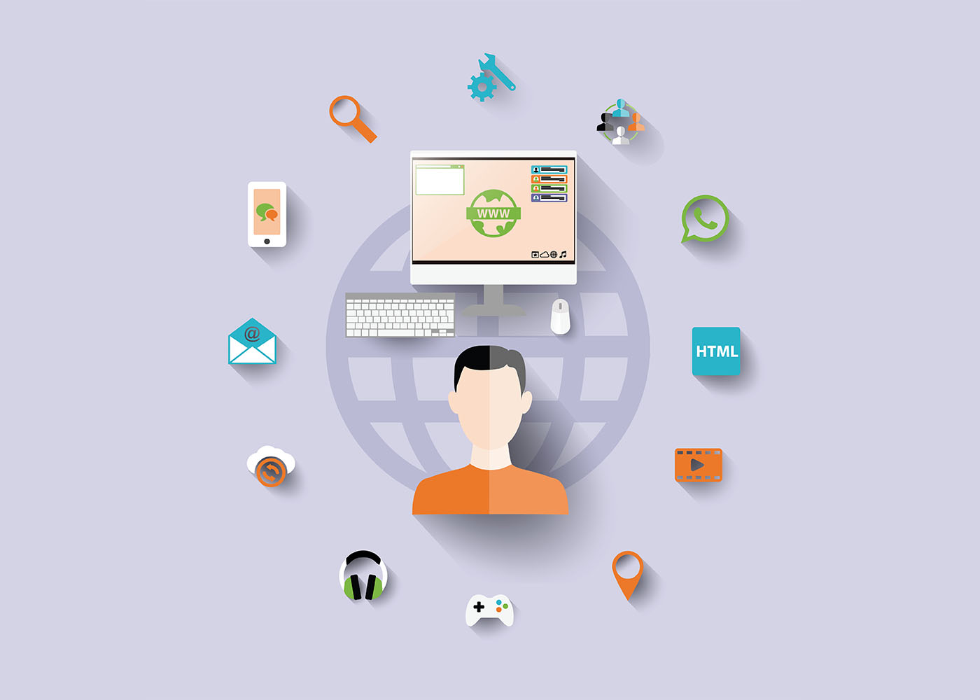
If you’re an e-commerce business owner, it’s essential to understand how SEO can be used to help your company reach a wider audience and increase sales. Search engine optimization (SEO) is a powerful tool for increasing organic search traffic to your website, allowing more potential customers to find the products they need when searching online. Through optimizing title tags and meta descriptions, managing user intent keywords, leveraging internal linking strategies, and utilizing high-quality content creation techniques—all optimized for SEO—you’ll have greater success driving target visitors directly from search engines. This blog post will explain the fundamentals of SEO in relation to e-commerce stores, including tips on how you can optimize your own store quickly and effectively!
Understanding Search Engine Optimization (SEO): What it is and Why it’s Important
If you’re running an e-commerce site, you’re likely familiar with the concept of Search Engine Optimization (SEO). But understanding the intricacies of SEO can be a bit more complicated than you might expect. At its most basic level, SEO refers to a set of practices designed to help your site rank higher in search engine results pages (SERPs). To achieve this goal, you’ll need to focus on a range of factors – from keyword optimization to website architecture, and beyond. Why is SEO important? Quite simply, it’s because, without an effective SEO strategy, your e-commerce site is unlikely to be visible to potential customers who are searching for products just like yours. In an incredibly crowded marketplace, effective SEO can help you stand out from the crowd and drive more traffic and sales to your online store.
Introducing Keywords to Increase Visibility on Search Engines
In today’s digital age, having an e-commerce business is no longer just about selling products online, but also about making sure that potential customers can easily find your online store. This is where SEO (Search Engine Optimization) comes in. By incorporating relevant keywords into your e-commerce website’s content and metadata, you can improve your website’s visibility on search engines like Google. But with so many businesses vying for attention online, how do you choose the right keywords? It’s all about thorough research, identifying the search terms that your target audience is using, and strategically incorporating them into your website’s content. By mastering the art of keyword optimization, you can drive more traffic to your online store and increase your chances of turning browsing shoppers into loyal customers.
Crafting Unique and Relevant Meta Descriptions for Your Products
As an E-commerce business owner or marketer, you know how important it is to have your products stand out in the sea of competitors. One of the crucial elements that can make a difference in your click-through rates and ultimately sales is crafting unique and relevant meta descriptions for your products. Meta descriptions are brief summaries that appear under your product title and URL in search engine results. They provide searchers with a glimpse of what they can expect to find on the page. By creating compelling meta descriptions with targeted keywords, you can attract potential buyers and increase your chances of making a sale. Remember, a good meta description can make all the difference in the world of SEO, so take the time to craft them carefully.
Utilize Long Tail Keywords To Increase Organic Search Traffic
In today’s highly competitive online marketplace, it’s crucial for e-commerce businesses to have a strong SEO strategy to stay ahead of the competition. One effective strategy is to utilize long tail keywords, which are more specific and less commonly used than broader, generic keywords. By incorporating long-tail keywords into your website’s content and meta descriptions, you can increase your organic search traffic and attract more qualified leads to your site. With the right long-tail keywords, you can optimize your product pages and blog posts to connect with your target audience and improve your search engine ranking, helping you achieve greater online visibility and ultimately driving more sales.
Utilizing Social Media Platforms to Target Your Customers
In today’s digital age, ecommerce has become a booming industry with countless businesses vying for the customer’s attention. One of the most crucial aspects of running a successful e-commerce business is Search Engine Optimization or SEO. While SEO tactics have evolved over time, one strategy that remains effective is targeting customers through social media platforms. With over 3.6 billion active social media users worldwide, tapping into this pool of potential customers can significantly boost your e-commerce business. Utilizing social media platforms with a carefully crafted SEO plan can help you not only connect with your audience but also direct more traffic toward your e-commerce website. So, if you’re an e-commerce business looking to expand your customer base, it’s high time to leverage the power of social media and optimize your SEO game.
Encouraging Reviews for Better Rankings and Increased Sales
When it comes to boosting the visibility and success of an e-commerce site, search engine optimization (SEO) is a critical component. Not only can SEO techniques help improve search rankings, but they can also drive more traffic to your site and ultimately result in increased sales. One key aspect of SEO that should not be overlooked is customer reviews. By encouraging customers to leave reviews of your products and services, you can not only engage with your audience and build trust but also improve your search rankings. Google favors websites with fresh, relevant content, and customer reviews are a great way to achieve this. So if you’re looking to take your e-commerce business to the next level, make sure to prioritize customer reviews as part of your SEO strategy.
Use Structured Data Markup to Improve Click Through Rate (CTR)
Search engine optimization (SEO) is crucial for e-commerce businesses to increase their website’s visibility and attract potential customers. One effective strategy that many businesses overlook is the use of structured data markup. Structured data markup is a code that search engines use to understand the content and context of your website better. By including this code on your website, you can help search engines display rich snippets that provide more information to users, which can improve your click-through rate (CTR). In turn, a higher CTR means more potential customers are clicking through to your website, increasing the likelihood of conversion. So, if you want to enhance your SEO and increase your e-commerce sales, consider implementing structured data markup today.
Conclusion
Ultimately, understanding and implementing a strong ecommerce SEO can make all the difference in search engine rankings and customer visibility. By considering search engine optimization from the moment you launch your site, to the content you include on product pages, and even how you engage customers on social media, you can set yourself up for better rankings and more sales. Additionally, reviews are important connections to customers and can really help boost credibility as well as click-through rates. The best way to achieve success is to focus on the optimization of your content for search engines without compromising your core messaging. With a few simple steps, every leader in e-commerce can have a successful SEO strategy that will drive long-term results!Finally, content marketing can be a powerful tool for e-commerce leaders. By leveraging content with the right keywords and phrases, you can connect with your customers on a deeper level and build long-term relationships.
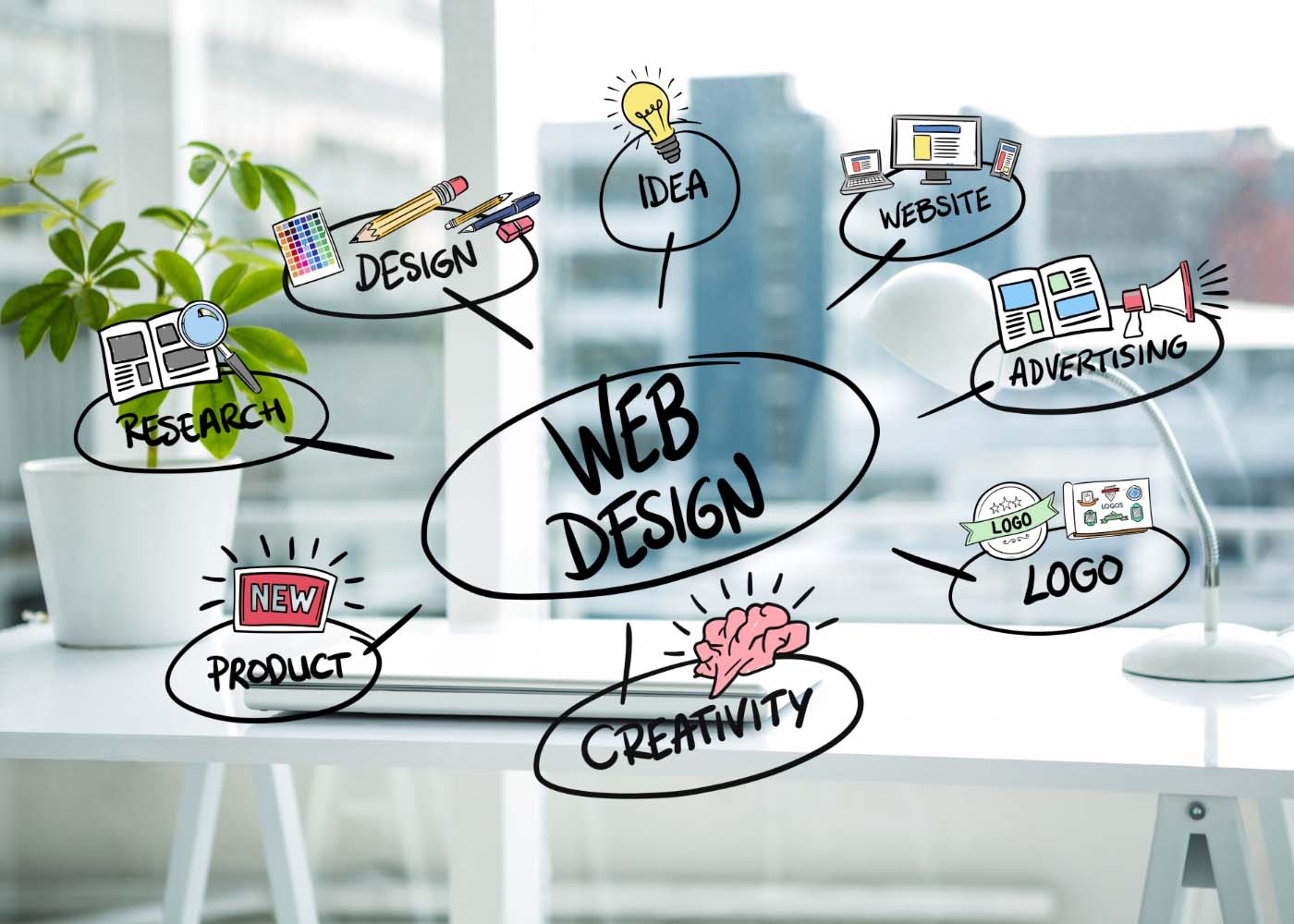
It’s no secret that the look and feel of a website is critically important. Not only do aesthetics influence users’ first impressions, but they also have an effect on whether or not people choose to stay on your site. But what you may not realize is there are additional factors at play that can determine how successful your website is: search engine optimization (SEO) and user experience (UX). The way in which UX and SEO intersect when it comes to website design can be complex, but when executed correctly can make all the difference in improving visibility, engagement, and overall success. In this blog post we will explore why UX and SEO matter for any website — we’ll identify some key considerations for improving performance with both techniques together — so stick around as we dive into Beyond Aesthetics: The Intersection Of UX And SEO In Website Design!
What are UX and SEO, and Why do They Matter in Website Design
There are two major factors that can make or break a website’s success: UX and SEO. UX stands for user experience, and it encompasses everything from layout and design to ease of use and accessibility. Simply put, if your website is difficult to navigate or doesn’t meet the needs of your audience, your visitors won’t stick around for long. That’s why UX is so important in website design. On the other hand, SEO stands for search engine optimization, and it refers to the process of optimizing your website’s content to rank higher in search engine results pages (SERPs). In other words, it’s all about helping your target audience find your website through search engines like Google. Both UX and SEO are critical to the success of any website, as they ensure that visitors can easily find and use your site, leading to increased engagement, conversions, and overall success. Whether you’re designing a new website or looking to improve an existing one, UX and SEO should always be top of mind.
How UX Impacts SEO – Best Practices for Optimizing User Experience
User experience (UX) is an important factor to consider when optimizing your website for search engine optimization (SEO). By ensuring that your content and design are user-friendly, you can encourage users to stay on the page longer, creating a better overall user experience. Best practices for optimizing UX include making sure all elements of the design and webpages load quickly, using intuitive navigation menus that make finding information easy, and providing quality content that is engaging and informative. Moreover, using schema markup to provide structure to your content can go a long way in helping it rank higher. Ultimately, great UX helps create a positive relationship between your visitors and website which will improve not only SEO ranking but also conversion rates and ROI.
Establishing a Clear Hierarchy of Information on Your Website
Building a website that is both user-friendly and optimized for search engines can be challenging, but it’s essential for website success. The intersection of UX and SEO involves creating a website that is easy to navigate, visually appealing, and search engine friendly. The key to achieving this is by establishing a clear hierarchy of information on your website. By prioritizing the most important content and making it easily accessible, you can direct visitors toward the most relevant pages and help search engines understand the structure of your site. Designing an intuitive and structured website takes careful planning, but it’s a crucial step toward building a site that’s both functional and user-friendly.
Designing for Mobile First – Knowing Key Strategies to Enhance the User Experience
We live in a digital world that is constantly evolving, and in today’s business climate, it’s imperative to have a website that is not only visually appealing but also user-friendly. As mobile usage continues to grow, it’s more important than ever to design websites that work well on smaller screens. This is where the concept of mobile-first design comes in. Designing for mobile-first means designing with the mobile user in mind and then scaling up to larger screens. But designing for mobile-first isn’t just about the design, it’s also about enhancing the user experience through SEO strategies. By optimizing your site for mobile, you can improve your site’s performance and ultimately drive more traffic to your site. In this article, we will discuss key strategies for enhancing the user experience and optimizing your site for mobile-first design.
Utilizing the Latest Search Engine Algorithm Updates to Maximize Visibility
Usability, or UX, and search engine optimization (SEO) are essential for online visibility, especially in the age of Google algorithms. With new developments mounting up on a regular basis, it is becoming increasingly important to stay updated with the latest changes and trends in order to keep your website from losing too much traffic due to outdated SEO practices. Fortunately, there are a plethora of tools available that can help us better understand why and how our website is performing – like keyword research tools, technical SEO audits, and analysis of competitor activity. Taking advantage of these resources can help you stay one step ahead of the competition and ensure maximum visibility for your business.
Creating an Intuitive Navigation System for Better User Experience
A website can have all the great content in the world, but if it’s difficult to navigate, users won’t stick around for long. That’s why creating an intuitive navigation system is crucial for a better user experience. By organizing your website in a logical and intuitive manner, visitors can easily find what they’re looking for and explore your site with ease. Navigation menus should be clear and concise, with relevant categories that correspond to the content on your site. Additionally, utilizing clear and descriptive labels, breadcrumbs, and search functions can enhance the overall user experience. By investing time and effort into creating a seamless navigation system, you’ll keep visitors engaged, increase the likelihood of them returning, and ultimately achieve your website’s goals.
Implementing Effective Calls-to-Action to Increase Conversion Rates
Your website can have all the bells and whistles, but without a clear and effective call-to-action, your conversion rates will continue to be lackluster. Implementing a call-to-action that resonates with your audience and encourages them to take action is essential for driving conversions. Whether it’s a button that prompts a user to sign up for a newsletter or a pop-up that encourages them to make a purchase, it’s important to make sure your call-to-action is prominently displayed and easy to find. By testing and tweaking your calls-to-action, you can increase the conversion rates of your website and ultimately drive more revenue.
Tips for Improving Overall Website Performance and Speed
In today’s fast-paced digital ecosystem, the speed and performance of your website have a significant impact on user experience, search engine rankings, and business success. Therefore, optimizing your website’s performance, SEO, and speed is crucial. One of the most effective ways to do this is by adopting a streamlined approach, starting with a fast and reliable hosting service, reducing HTTP requests, optimizing images and videos, using compression, leveraging browser caching, and implementing a content delivery network (CDN). Additionally, keeping your website’s content fresh, relevant, and engaging, using relevant keywords, and regularly auditing your site’s performance to tweak and improve as needed can help you stay ahead of the competition and attract and retain more visitors.Beyond Aesthetics The Intersection of UX and SEO in Website Design
Conclusion
Ultimately, UX and SEO must go hand in hand when creating an SEO-friendly web design. By taking a user-centric approach to the design process and applying best practices, users can be engaged through an enhanced user experience which can lead to increased visibility and higher conversation rates. By establishing a clear hierarchy of information on the site and creating intuitive navigation systems that make it easy to find information, website design can be improved in ways that facilitate better search engine discovery. Additionally developing for mobile first and utilizing the latest search engine algorithm updates are essential steps for maximizing visibility. Finally, web analytic tools should always be used to track user behavior so any changes made to improve UX impact SEO in the most positive way possible. With these tactics, any website designer is sure to create experiences that satisfy even the most discerning users while maximizing visibility at the same time.
It’s no secret that website design plays an essential role in engaging users and driving conversions. With the right design decisions, developers can craft user experiences with high levels of retention and satisfaction. But how? Behind successful website designs is a thorough understanding of psychology: specifically, human behavior when interacting with webpages. By leveraging this knowledge — and making small changes inspired by it — you can create websites designed for maximum engagement. In this post, we’ll discuss several theories surrounding user behaviors on the internet and explore how those ideas can be applied to your own site design strategies!
Understand the basics of user psychology, and how it applies to website design
Understanding the psychology of the user is invaluable when it comes to creating effective designs that speak to their needs and desires. Understanding user psychology means understanding the way people think, feel, and behave when interacting with websites. It involves knowing how to create a seamless and intuitive user interface, how to engage the user’s emotions with color and imagery, and how to communicate effectively through the written word. By applying these principles to your custom web design, you can create an experience that connects with your target audience in a way that is meaningful and memorable, inspiring them to take action and engage with your brand. So if you want to design websites that truly resonate with your users, start by understanding the basics of user psychology and how it applies to web design.
Analyze User Behavior and Create Elements that Can Help Increase Engagement
Designing a website that users will engage with requires a thorough understanding of user behavior. As an expert in this field, I have discovered several key elements that can be leveraged to increase engagement.
Firstly, users expect a seamless and intuitive navigation experience. Complicated menu structures and confusing page layouts can quickly turn users away.
Secondly, engaging content is vital for retaining your audience. This can include informative blog posts or high-quality images and videos.
Finally, social proof, such as client testimonials or social media shares, can boost your site’s credibility and encourage users to interact further.
By incorporating these key elements into your website design, you can create a user-friendly and engaging experience that encourages visitors to explore and return.
Ways to Use Psychology to Create a Positive User Experience
By understanding how people behave and what motivates them, you can design interfaces and experiences that feel intuitive and engaging.
One way to do this is to focus on creating a sense of flow, where users feel fully absorbed in a task and lose track of time.
Another approach is to tap into people’s social needs, such as by providing opportunities to connect with others or by rewarding them for engaging in certain behaviors.
Additionally, using colors, fonts, and other visual cues can help to establish a consistent and appealing mood that keeps users coming back for more.
By incorporating psychological insights into your design process, you can build a user experience that’s both enjoyable and effective.
Utilize Colors, Shapes, and Fonts That Evoke Certain Emotions
When designing a website, it is important to consider the emotional impact that colors, shapes, and fonts can have on users. For example, using warm colors like red, orange, and yellow can evoke feelings of excitement and urgency, while cool colors like blue and green can elicit a sense of calm and relaxation. Similarly, using circular shapes can create a sense of unity and friendliness, while angular shapes can convey strength and stability. And when it comes to fonts, serif fonts can lend an air of sophistication, while sans-serif fonts are a better choice for a modern and minimalist look. By thoughtfully utilizing these design elements, you can create a website that not only looks great but also helps users feel the way you want them to feel.
Detail effective ways to create an engaging visual hierarchy on a website
Creating an engaging visual hierarchy on a website is essential for helping users navigate your site and find important information quickly.
One effective way to accomplish this is by utilizing the size and placement of visual elements to guide the eye. Large, prominently placed headings draw attention and help establish the hierarchy of information, while smaller elements like subheadings and body text provide additional context. Color can also be used strategically to highlight important information or create contrast between elements.
Another helpful technique is to use negative space, which can create a sense of balance and give the eye a break from too much visual stimulation.
By implementing these techniques and experimenting with different layouts, you can design a website that engages users and effectively communicates your message.
Use Visual Cues to Guide Users to Perform Specific Actions
When designing a website, it’s essential to consider how users will navigate and interact with it. Visual cues can be an effective way to guide users towards specific actions and simplify their experience. These cues can take many forms, such as arrows, colors, shapes, or icons, and help draw users’ attention to critical areas or call-to-actions. By making these elements more prominent through visual cues, you can increase the likelihood of users performing the desired action, such as filling out a form, making a purchase, or subscribing to a newsletter. So, whether you’re revamping an existing website or creating a new one, implementing visual cues should be a top priority in promoting user engagement and improving overall website usability.
Add Calls-to-Action (CTAs) in Strategic Locations
You want your customers to take action on your website whether that means making a purchase or submitting their contact information. One way to encourage users to take action is to strategically place calls-to-action (CTAs) throughout your site. These could include buttons like “Buy Now,” “Sign Up,” or “Learn More.” By placing these CTAs in easy-to-spot locations, you make it simple for users to take the next step in their journey with your brand. Don’t hesitate to experiment with different language, placement, and color schemes until you find what works best for your specific audience. With the right CTAs in the right locations, you can guide users toward the actions that benefit both them and your business.
Showcase successful examples of websites that leverage user psychology for improved engagement
The best websites know how to tap into the psychology of their users to create the ultimate user experience. By understanding human behavior and decision-making, these websites have been able to create a more engaging and valuable experience for users.
Take Amazon, for example. The website makes use of targeted recommendations and personalized shopping experiences to keep users coming back.
LinkedIn is another great example of a website that understands how to use psychology to improve engagement. By incorporating features such as endorsements and recommendations, LinkedIn makes users feel more connected with their professional network, which ultimately drives more visits to the site.
These successful websites are proof that leveraging user psychology can have a huge impact on engagement and overall success.Psychology of Website Design
Conclusion
The foundation of having a successful website all comes down to understanding how users think and interact. This is the first step in providing them with an engaging user experience. By leveraging user psychology, you can create an effective website design and drive greater engagement. Take time to analyze user behavior, and use colors, shapes, fonts, and visual cues that evoke certain emotions or elicit specific actions from the user. Don’t forget to add strategic CTA’s on your site that will compel visitors to take action – this can be a major factor in driving conversions and sales. With this knowledge in mind, go out there and use what you’ve learned to craft beautiful designs that are not only visually pleasing but also emotionally satisfying!
Are you looking to give your website a bold, unique look that stands out from the competition? Templates can work, but they don’t always provide all the custom web design options you need. If you want to go beyond the ordinary and create something truly special for your business or creative project, then learning some innovative approaches to website design is key. From strategic color palettes and dynamic typography pairings to clever uses of imagery and animation, there are countless ways to level up your web design game. Let’s take a look at some of the most effective strategies that can help you break the mold and create a truly remarkable web presence.
Designing with the Right Color
Colors have the power to ignite emotions, create a sense of order, and enhance the visual appeal of your website design. To achieve a harmonious and polished look, it’s essential to work with a focused color scheme and maintain its consistency throughout your website. Additionally, by strategically employing one or two accent colors, you can direct your users’ focus toward certain page elements such as calls to action. Let your color choices speak volumes and leave a lasting impact on your audience.
Leveraging Storytelling Techniques to Create a More Immersive Experience
Gone are the days when a basic website template with some images and text was enough to attract and engage users. In today’s competitive digital landscape, it’s all about creating a unique experience that captivates your audience from the moment they land on your site. One innovative approach to website design that is gaining popularity is leveraging storytelling techniques to create a more immersive experience. By weaving a compelling narrative throughout your site, you can create an emotional connection with your visitors and keep them engaged for longer periods. Whether you’re showcasing your brand’s history or telling the story of a customer’s success, incorporating innovative storytelling techniques can take your website design to the next level.
Incorporating Visuals to Create an Engaging Experience
When it comes to website design, it’s easy to fall into the trap of using generic templates that lack personality and creativity. But why settle for average when you can stand out with innovative approaches? One effective tactic is incorporating visuals that go beyond the usual stock photos. Consider using custom illustrations or animations to add a personal touch to your website. In addition, videos can be a powerful way to engage visitors and bring your content to life. By taking advantage of these creative strategies, you can create a website that not only looks great but also provides a one-of-a-kind experience for your audience. So why not take your website design to the next level and go beyond the template?
Bring Web Pages to Life with Animations
Have you ever visited a website that was static and lacked any visual appeal? It can be a downright snooze-fest. Luckily, incorporating animation to bring web pages to life has become a popular trend, and for good reason. Not only does it engage visitors and enhance their user experience, but it also helps convey your brand’s message in a more dynamic and memorable way. Animations can vary from simple hover effects to immersive 3D experiences, each adding their own unique touch of personality to your web pages. Whether it’s a cute illustration that catches the viewer’s eye or a slick interactive element that keeps them coming back for more, adding animation to your web pages is a surefire way to stand out in today’s digital landscape.
Organize Content with White Space and Typography
White space and typography can do wonders for organizing content and making it more digestible for readers. By strategically placing blank areas between blocks of text and using different font styles and sizes, you can guide your audience’s eyes to the most important information on your page. And these design elements aren’t just functional, they can also give your content an extra touch of personality. For example, a playful font paired with generous white space might give a lighthearted feel to your brand, while a more traditional serif font with narrow margins exudes a sense of sophistication. By paying attention to these visual details, you’ll be able to create an engaging user experience that effectively conveys your message.
Optimizing for Readability
No matter how visually stunning your website design is, if it’s not easy to read, your visitors will quickly become frustrated and move on. To ensure that your text can be easily scanned and understood, keep line lengths short and use a font size that’s comfortable to read. Additionally, utilize white space and make sure that different elements have enough breathing room. By improving readability, you can ensure a better user experience.
Integrate Social Media Widgets to Provide Interactive User Experience
Social media has revolutionized the way people interact with one another, and with the world around them. Integrating social media widgets into your website can help you tap into this social network, and provide your visitors with an interactive and engaging user experience. Social media widgets such as the Facebook-like button, Twitter feeds, and Instagram galleries allow visitors to connect with your brand on a personal level, leading to increased engagement and loyalty. Additionally, incorporating social media into your website can help grow your online presence, as visitors are more likely to share and recommend content that they find interesting or valuable. In a world where social media is increasingly important for businesses of all sizes, integrating these widgets into your website is a must.
Make sure all web pages are mobile-friendly for optimal viewing on any device
Nowadays, people use a variety of devices to access the internet, from laptops and desktops to tablets and smartphones. This means that making sure your web pages are mobile-friendly has never been more important. By optimizing your website for mobile devices, you can ensure that users can easily navigate your site and view all of your content, no matter what kind of device they are using. Whether you’re a business owner looking to attract new customers, or a blogger hoping to reach a wider audience, it’s essential to make sure that your website is designed with mobile users in mind. Not only will this lead to more engagement and satisfaction among your visitors, but it can also improve your search engine rankings and overall online presence. So if you haven’t already, it’s time to start prioritizing mobile responsiveness in your web design strategy.Innovative Approaches to Web Design That Go Beyond Templates
Conclusion
Now that you have a better understanding of how to leverage storytelling, visuals, features and typography for creating an immersive experience, you can apply these principles to create amazing content for your users. Incorporating unique elements such as interactive features and parallax scrolling that allow users to control their own journey will make the website more engaging. Incorporating engaging visuals like stock images, animations, or videos can also help to add depth and interest. Remember to use white space and typography to organize content and make it easier for users to find what they’re searching for. Last but not least, don’t forget about social media widgets as they are a great way to provide an interactive experience that encourages user engagement. And above all else, always ensure that all pages are mobile-friendly so that your users can get the best possible viewing experience on any device. With this knowledge at hand, now you can start designing the perfect online user experience!
We’re in the midst of a digital revolution. It’s become increasingly important for websites to provide an engaging user experience to keep up with the latest trends and competition, and Motion UI is an incredibly powerful tool that can make it happen. With its array of animation libraries, ready-made templates, and easy integration into existing web applications, Motion UI gives developers the tools they need to quickly build interactive layouts that are sure to captivate their audience. In this blog post, we’ll delve deeper into what makes Motion UI so exceptional by exploring its best features and benefits as well as how it stands out from other web development frameworks. By the end of this article, you should have a better understanding of why so many experienced web developers are turning to Motion UI when constructing modern websites!
What is Motion UI and How Does It Work
As the internet constantly progresses, so do the tools and techniques used in web development. One of the latest trends gaining momentum is Motion UI. Motion UI is a library that allows a developer to easily create engaging and dynamic user interfaces. It involves the use of animations, transitions, and other effects to make the user experience more enjoyable and engaging. With Motion UI, a website can transform from a static page to a living world of movement and interaction, keeping visitors engaged and captivated. This trend is becoming increasingly popular in the web development industry as more and more web designers are recognizing the benefits of implementing this library.
Benefits of Developing with Motion UI
Motion UI is quickly becoming the future of web development and for good reason. With its ability to seamlessly animate and transition elements on a webpage, it creates a more engaging and interactive user experience. Developed by ZURB, Motion UI is recognized for its ease of use and versatility, making it a popular choice for web developers. Additionally, the benefits of using Motion UI extend beyond just visually appealing effects. It can also enhance the overall functionality of a website by providing cue-based interactions, which help users navigate and understand how to interact with a page. With the rise of mobile devices, Motion UI has become even more important as it provides a responsive design that adapts to different screen sizes. By utilizing Motion UI in web development, designers can create websites that not only look great but also provide an intuitive and user-friendly experience.
Best Practices for Incorporating Motion UI into Your Web Projects
Motion UI has become an increasingly important part of web development, as it can make web pages more interactive and engaging for users. Incorporating this technology in creative and efficient ways can be a fantastic addition to any project. Yet without the proper knowledge, or best practices laid out in advance, things can quickly go wrong. Knowing how to make use of the many functionalities available within Motion UI while still creating an efficient web project is key. The use of precoded libraries is a great way to access easy-to-implement motion components, while carefully designing custom motion sequences that are tailored toward specific projects can yield impressive results. Making smart decisions about when to leverage tools versus constructing custom motion sequences from scratch remains a key component for success in working with Motion UI. Consequently, gaining a deep understanding of how to best incorporate Motion UI into Web projects is essential for producing effective projects that stand out!
Integrating Motion UI with Other Frameworks
The world of web development is constantly evolving and bringing new innovations to the forefront. One such innovation is Motion UI, which is shaping up to be the future of web development. Motion UI is a powerful tool that allows you to create engaging and interactive user interfaces that are both visually appealing and functional. When integrated with other frameworks such as Bootstrap and Foundation, it becomes even more powerful, providing developers with an unparalleled level of flexibility and creativity. By using Motion UI alongside other frameworks, developers can create stunning animations, transitions, and effects that make your website come alive. With Motion UI, the future of web development is bright, and the possibilities are endless.
Tips to Optimize Performance When Using Motion UI
In today’s technological age, Motion UI has become a popular choice for creating modern and interactive websites. However, it’s essential to optimize the performance of your Motion UI designs to ensure that they load quickly and provide a seamless user experience. To optimize performance, consider compressing and minifying your code, reducing the number of assets and files, and using JavaScript libraries. Additionally, optimizing images, reducing HTTP requests, and prioritizing assets can help to improve your website’s speed and overall performance. By following these tips to optimize performance when using Motion UI, you can ensure that your website is both stylish and efficient, providing your visitors with an exceptional digital experience.Motion UI as the Future of Web Development
Troubleshooting Common Issues During Development
Motion UI is one of the most popular design languages in the digital world, allowing developers to create visually stunning and immersive experiences for users. However, like any design language, there are a few common issues that can arise during development. That’s where troubleshooting comes in. By understanding how to tackle these issues head-on, developers can save time, and resources, and ensure a seamless user experience. Common issues might include elements not transitioning correctly or certain animations not being compatible with a specific browser. By thoroughly understanding the architecture of Motion UI, developers can easily identify and troubleshoot these common issues, ensuring a polished final product that will delight users.
Examples of Websites That Use Motion UI
Motion UI is an innovative approach to web design that has taken the digital world by storm. It aims to make websites more engaging and user-friendly by using animations and transitions to guide the user’s attention and enhance their overall browsing experience. There are a variety of websites that use Motion UI, each with their unique spin on the technique. For example, Stripe’s website uses motion to create a seamless checkout process and convey information in a visually appealing way. Meanwhile, Lyft’s website employs motion to convey a sense of speed and excitement, enhancing the user’s emotional connection to the brand. Other examples include Apple’s website, which uses subtle motion to give the impression of depth, and Mailchimp’s website, which uses playful motion to create a fun, friendly vibe. Motion UI is not only visually pleasing, but it also provides a more intuitive and enjoyable user experience.
Conclusion
All in all, Motion UI is a valuable tool for web developers looking to give their web projects that extra dynamic touch. Not only does the library offer a wide range of useful features tailored to making web projects with motion special, but it also increases agility and complements other tools and frameworks nicely. Remember to keep an eye out for key performance indicators like proper installation, correct optimization processes, and timely bug fixes so you can ensure as smooth a motion journey as possible! Ultimately, while this tool may take some getting used to, it pays off dividends when applied correctly – so don’t be shy and have fun utilizing the full range of its capabilities to bring your vision of interactive design alive. Who knows? Maybe one day your website will join the list of examples of notable uses of Motion UI discussed above!
Are you aware of the importance of having a mobile-friendly website for your brand? In today’s digital age, it’s no longer enough just to have an online presence. With over half of the website traffic now coming from smartphones and other mobile devices, brands need to ensure that their websites are optimized for mobile viewing in order to maximize user satisfaction and capitalize on potential conversions. In this blog post, we’ll take a close look at why businesses should prioritize developing or updating their websites with responsive website design strategies so they can quickly adjust to any consumer device and make sure each customer has the best experience possible while browsing.
Overview of What is Mobile-Friendly Website Design and Why it’s Essential
Mobile-friendly website design refers to a type of website design that ensures consistent user experience across different devices, including mobile phones, tablets, and desktops. Nowadays, more than half of all internet traffic comes from mobile devices. Thus, it is critical for businesses to adopt this design trend to cater to their mobile audience, considering the increasing number of mobile users. A mobile-friendly website design is essential because it has a direct impact on your site’s search engine optimization (SEO). Google is continuously changing its algorithms to favor mobile-friendly websites. Therefore, if you want to improve your website’s visibility on search engines, you need to ensure your site has a mobile-friendly design. Additionally, a mobile-friendly website design helps increase user engagement and ultimately boosts your site’s conversion rate. By providing a seamless user experience, customers are likely to stay longer on your website, familiarize themselves with your brand, and eventually purchase your products or services.
Advantages of a Mobile-Friendly Website Design
In today’s digital era, having a mobile-friendly website is one of the most crucial factors for businesses seeking to establish an online presence. With a significant majority of internet users browsing through their mobile devices, having a website that can adapt to various screen sizes and resolutions is of paramount importance. A mobile-friendly website design offers numerous advantages, primarily, it improves user experience, reduces bounce rates, and helps in boosting search rankings. Such a website design allows customers to access the website from anywhere and at any time, meaning businesses can gain more leads and conversions. Moreover, a mobile-friendly website is a cost-effective solution for businesses due to its ease of maintenance and fewer expenses for the development of multiple versions of the website. By adopting a mobile-friendly website design, businesses can stay ahead of the competition, attract more customers and, ultimately, grow their online presence.
Tips for Optimizing Your Website for Mobile Devices
In today’s digital age, website owners need to optimize their sites for mobile devices. With the majority of people browsing the internet on their smartphones and tablets, having a mobile-friendly website can make or break your online success. But where do you start? First, make sure your website’s responsive design adjusts to fit smaller screens. Consider simplifying your navigation menu and minimizing the amount of content per page. Additionally, optimize your images and implement a caching system to improve loading times – a crucial factor for mobile users. Don’t forget to test your website on various mobile devices and make necessary adjustments to improve user experience. By following these tips, your website will be easily accessible and enjoyable for mobile users.
Examples of Companies with Successful Mobile-Friendly Websites
As more and more people rely on their smartphones and mobile devices for browsing the Internet, having a mobile-friendly website has become essential for any business looking to stay relevant. Many companies have taken their mobile website game to the next level, providing users with a seamless and enjoyable browsing experience. Take Airbnb for example. Their mobile site showcases stunning images of properties and allows users to easily search and book accommodations. Another great example is Starbucks, whose mobile site allows customers to easily find nearby locations and order ahead for pick-up. These companies, and many more, have realized the importance of a mobile-friendly website in today’s digital age and have made it a priority to provide their customers with an engaging and hassle-free browsing experience.
How Responsive Web Design Differs from Mobile-Friendly Web Design
As internet usage continues to shift towards mobile devices, it’s important for businesses to have a website that is not only mobile-friendly, but also responsive. While both styles of web design work to optimize a website’s appearance and functionality on mobile devices, there are key differences between the two. Mobile-friendly designs simply scale down a website to fit the smaller screen size of a mobile device, while responsive designs adjust the website’s layout and content based on the specific device it is being viewed on. This includes adjusting font sizes, image placements, and even the overall website structure. By understanding these differences, businesses can make informed decisions when designing their website and ensure a smooth user experience for their mobile audience.
Best Practices for Ensuring Your Website is Mobile-Friendly Now and in the Future
In today’s digital era, having a mobile-friendly website is no longer an option, but a necessity. With more and more people accessing the internet through their mobile devices, it is crucial to ensure your website is optimized for all screens, big or small. But it’s not just about making your website mobile-friendly now, you also need to future-proof it for evolving technologies and changing user preferences. There are several best practices to follow to achieve this, such as using responsive design, optimizing images and videos, keeping your website fast and lightweight, and regularly testing it on various devices and browsers. By implementing these practices, you can ensure that your website not only caters to current user needs but also adapts to future trends in web design and technology.
Final Thoughts on the Benefits of a Mobile-Friendly Website Design
In today’s fast-paced technological world, having a mobile-friendly website design is crucial for any business that wants to remain competitive. A mobile-friendly website provides users with ease of navigation and accessibility anytime, anywhere. Additionally, a mobile-friendly website can improve the user experience by providing quick loading time, easy-to-read content, and fitting into the smaller screen sizes of mobile devices. Not only does a mobile-friendly website enhance the user experience, but it can also improve a website’s search engine optimization (SEO) by boosting its ranking on Google search results. In conclusion, every business owner should prioritize mobile website design to stay ahead of the curve and reap the benefits of a fast and accessible website.Importance of Mobile-Friendly Website Design
Conclusion
As we’ve come to understand, developing and maintaining a mobile-friendly website is essential for any business or organization in the 21st century. Having a mobile-friendly website not only allows for easier navigation, improved user experience, and better SEO rankings but gives customers more confidence in your brand. Furthermore, it’s important to note that employing responsive web design isn’t enough – you must also make sure content is optimized for all devices as well as tested regularly on all platforms. By incorporating the tips discussed in this post, such as optimizing visual assets to ensure they load quickly and investing in dedicated solutions to increase compatibility, your website will be prepared now and into the future. With streamlined websites becoming increasingly popular amongst those who access the internet often, it’s very apparent that the benefits of having a mobile-friendly website are worth far more than one might expect.
Are you considering building a website for your business? If so, you may have heard of single page websites as an option. Single page websites are designed to funnel visitors to one specific area, providing concise information without added distraction or noise. This is great news if you want the user experience on your website to be easily digestible and focused on the main goal: helping customers learn more about what you can provide them. But while single page sites offer a modern and simplified take on web design, they might not always be right for every type of business – which is why it’s important to consider both their advantages and disadvantages before making this kind of commitment. In this blog post, we will explore the pros and cons of choosing a single page web design for your business so that you can make an informed decision about whether it meets your needs.
Overview of Single Page Websites: What are they
Single page websites, as the name suggests, are websites that only have one page. They have gained popularity due to their simple and clean design, with all content fitting on one page. These websites have become increasingly popular for businesses that want to make a statement with their website, while keeping it simple and straightforward. Single page websites allow for easy navigation, which is crucial for users who are often short on time and looking for information on-the-go. They also offer a great user experience, as everything is contained on one page, eliminating the need for multiple clicks and page loads. Ultimately, single page websites offer a unique and convenient way to present information online.
Pros of Having a Single Page Website
Having a single page website can greatly benefit both you and your visitors. One of the biggest pros of this type of website is how user-friendly it is. With all the important information in one place, visitors won’t have to navigate through multiple pages to find what they’re looking for. This simplicity can also make it easier for you to design and maintain your website. Plus, with a single page website, you can make a big impact with your visuals and content. So why not consider a single page website for your business or personal brand? It might just be the solution you’ve been looking for.
Minimalism is a design movement that has grown in popularity over the years, and it is not hard to see why – the simplicity and efficiency it offers are unmatched. In particular, single page websites using minimalism create a modern look that is both visually appealing and functional. By requiring minimal scrolling, these websites maximize the space that is available, making it easier for users to find what they are looking for quickly and efficiently. With such impressive benefits, it is no wonder that single page websites are becoming increasingly popular in the world of web design.
b. Easier to Maintain
With a single page website, you don’t have to keep track of different pages and their content. Updating and making changes to the website becomes a simpler task as everything can be done on one page. This means your website won’t suffer from outdated or irrelevant information, ensuring that your visitors are always up-to-date with the latest information. So if ease and convenience are what you’re looking for, a single page website may just be the way to go.
A single-page website is an efficient way to provide mobile users with the information they need. Rather than navigating through a complex site, users can quickly find the information they’re looking for on a single page. This not only improves user experience but also saves on data usage. With less data being used, pages can load faster, allowing users to access the site and find the information they need when they need it. Overall, having a mobile-friendly, single-page website is a win-win for both website owners and users.
Cons of Having a Single Page Website
While having a single page website can seem like a sleek and modern way to showcase your content, it’s important to consider the downsides. One of the most prominent cons of a single page website is the lack of organization. Without multiple pages, it can be challenging to label, categorize, and navigate through all of your content. This can be especially problematic for businesses with a wide range of offerings that don’t fit neatly into one main category. Additionally, if your page is image-heavy, it can lead to slow loading times and a poor user experience. Ultimately, it’s crucial to weigh the pros and cons of a single page website before making the decision to move forward with one.
a. Limited Ability to Target Different Audiences
While they are visually appealing and provide a seamless user experience, single page websites do have their limitations. One major limitation is the inability to target different audiences. With a single page website, the content is the same for all users, regardless of their interests or needs. This can make it difficult to effectively engage with different user groups and provide them with the information that is most relevant and useful to them. Nonetheless, with proper website planning and a clear understanding of your target audience, a single page website can still be a valuable tool for reaching your digital goals.
b. Difficult SEO
When it comes to single page websites, search engine optimization (SEO) can present a real challenge. With only one page to work with, you have to get creative and really think about how to make that one page count. Every element on the page, from the headlines to the images to the keywords, needs to be working in harmony to catch the attention of search engines. It can be a daunting task, but with the right strategies and a little bit of patience, it’s definitely possible to create a single page website that excels in SEO.
c. Harder to Navigate
Single page websites websites can be harder to navigate, as all the content must be loaded at once, resulting in longer loading times. This can be frustrating for visitors who might lose interest if the website takes too long to load. While single page websites have their advantages, it is important to keep in mind the potential inconvenience they can cause. As web design evolves, it will be interesting to see if solutions can be found to improve the navigation experience on single page sites.
What Kinds of Businesses Benefit from a Single Page Website
In a world where attention spans are getting shorter and people are increasingly consuming information on their mobile devices, a single page website can be a game-changer for certain types of businesses. These types of sites are perfect for businesses that offer simple services or products that do not require extensive content. For instance, if you’re a freelancer, consultant, or a small retailer selling a handful of items, a single page website can be an elegant way to showcase your work and products. It allows you to focus on the essentials, eliminate clutter, and create a streamlined user experience. Beyond that, these types of websites can be an affordable and low-maintenance solution for businesses that do not have the resources or technical skills to maintain a complex website. All in all, if you’re looking for a fuss-free and visually appealing digital presence, a single page website might be just what you need.
Tips for Optimizing Your Single Page Website
To make sure that your website is optimized for maximum results, there are several key tips to keep in mind.
First and foremost, be sure to keep your layout simple and clean, with just enough content to get your message across without overwhelming visitors.
It’s also important to pay close attention to your site’s loading speed, as slow-loading sites can deter visitors and negatively impact search engine rankings.
Additionally, make sure to use responsive design principles to ensure that your site looks great on all devices.
By following these tips and putting in the effort to ensure your website is as user-friendly and optimized as possible, you can create a single-page site that truly shines.The Pros and Cons of Single Page Websites Fleekbiz
When It’s Best to Use Single Page Websites
Single page websites are great for displaying concise information or a specific product or service. They are also ideal for mobile users who prefer scrolling over clicking to access information. However, for larger businesses or those needing a lot of content, a multipage website may be more appropriate. Ultimately, the decision to use a single page website should be made based on the specific goals and needs of the business or organization.
Examples of Successful Single Page Websites and Their Designs
Single-page websites are gaining popularity among businesses of all sizes as they offer a quick and simple approach to showcase your company’s offerings, brand, and culture. These websites tend to have a clean, minimalist design with an easy-to-navigate user interface to deliver the right message. Successful single page websites leverage a creative approach to design and user experience to achieve their goals. One such example is the “One Pager Love” website, which provides curated examples of creative single-page designs. The site features a sleek and responsive design that allows for easy navigation, making it a great source of inspiration for businesses looking for a fresh, modern design to engage their customers.
Conclusion
In conclusion, single page websites are a popular choice among businesses looking to create a modern look and efficient use of space. Although these websites are easier to maintain in comparison to multi-page websites with numerous columns and pages, there are some limitations associated with them. SEO can be difficult due to the limited number of page options, it’s harder for businesses to target different audiences with varying preferences, and end users may face longer loading times due to having all the content on the same page. Ultimately, what kind of website works best for you depends upon your specific needs and preferences; however, whatever direction you go in make sure that it’s mobile friendly and customizable inclusive of your company’s branding.
The future of website design is dominated by mobile devices, and in order to provide an optimal experience for visitors who access websites on the go, companies are increasingly turning to Progressive Web Apps (PWAs) as a solution. PWAs combine features of native apps with the ease of use of web browsers, allowing them to deliver lightning-fast performance and reliable availability, even when users don’t have access to wifi or cellular service. In this comprehensive guide, we’ll take a look at six essential features that make up a PWA so businesses can decide if they are ready for this next level of website performance.
What is a Progressive Web App (PWA)?
Progressive Web Apps (PWAs) are innovative applications that are transforming the way we use websites on our mobile devices. A PWA is essentially a website that can be accessed as if it were a mobile app. It is built using similar tech as mobile app development and even has features that allow it to function like an app. These features include the ability to work offline, push notifications, and access to device hardware. The beauty of PWAs is that they don’t require a download from an app store, as they can be accessed directly from a web browser. This means they take up minimal space on your device and can be updated in real-time without requiring you to download updates. With PWAs, you can easily access your favorite websites in a way that feels like you have a dedicated app for each one, without the hassle of downloading and managing multiple apps.
How PWAs Can Enhance User Experience?
Progressive Web Applications (PWAs) combine the best of both worlds, providing the high engagement of native apps and the accessibility of web applications. PWAs enable users to receive a seamless experience regardless of the device they use through progressive enhancements and responsive designs. Furthermore, they have a unique feature that allows them to work offline and maintain data that is updated as soon as the user connects to the internet. By implementing PWAs, businesses can enhance user experience and increase customer retention. Users can enjoy faster page loading times, smoother animations, and more immersive interactions. PWAs offer a unique opportunity for businesses to provide a more user-centric experience which will ultimately lead to increased engagement and loyalty from customers.
Features of PWAs
Progressive web apps (PWAs) have quickly become a game-changer in the world of app development. One of the most attractive features of PWAs is their ability to work seamlessly on any device, whether it’s a smartphone, laptop, or tablet. This versatility is a result of their responsive web design which enables them to adjust to the screen size and operating system of the device being used. Another key feature that sets PWAs apart is their ability to function offline. This is made possible through the use of caching, a process in which the app stores data locally so that it can be accessed even when there’s no internet connection. PWAs also offer a more immersive app experience, similar to that of native apps, through the use of push notifications, background data updates, and easy installation that doesn’t require going through an app store. With all these features combined, it’s not hard to see why PWAs are gaining widespread popularity among developers and users alike.
Feature #1 – Responsive Design
With their responsive design feature, PWAs ensure that their users have a seamless experience across different devices, be it a smartphone, tablets, or desktop computers. Whether you’re scrolling through a PWA on your phone during your daily commute, or switching to your laptop at home in the evening, the PWA’s responsive design ensures that the user experience remains smooth and consistent. It’s this feature that makes PWAs such an important innovation in the world of web development.
Feature #2 – Offline Functionality
As the name suggests, PWAs offer progressive functionality, including offline capabilities, which is a game-changer for users. With PWA’s offline functionality, web applications can store and retrieve data even if the user does not have an active internet connection, allowing them to access essential features, even when the network is unavailable. Imagine never having to worry about losing work during network outages or being unable to complete a task just because the internet is down. With PWA’s offline feature, those worries are a thing of the past, making web applications more accessible and reliable for everyone.
Feature #3 – Push Notifications
Push notifications are one of the most significant features of progressive web apps (PWAs). These notifications are unique because they allow businesses and organizations to communicate directly with their customers or users without needing them to be active in the app. This means that you can send users messages about new features, sales, or reminders without them even having to open the app. With PWAs, push notifications can be personalized to suit the user’s preferences and interests, making it a more engaging and effective way to communicate. Additionally, users can quickly and easily opt-in or opt-out of push notifications, giving them complete control over their experience.
Feature #4 – Secure Connectivity
PWAs offer secure connections, ensuring users are protected from data breaches and unauthorized access. These web applications work with HTTPS protocols to encrypt communication between servers and clients, so the data is not accessible to any third party. PWA’s secure connectivity also means that users do not have to worry about their sensitive information being compromised when using these apps, giving them peace of mind while they go about their daily routines. Overall, the secure connectivity of PWAs delivers a safe and secure user experience, making it one of the most reliable forms of online engagement.
PWAs Feature #5 – Mobile-Friendly Components
With their Mobile-Friendly Components feature, PWAs make it easy to optimize your website for mobile devices without sacrificing functionality or design. By incorporating responsive design principles, PWAs ensure that your website looks and works perfectly whether viewed on a desktop, tablet, or smartphone. This feature also allows for the seamless integration of native mobile features, creating an app-like experience that keeps users engaged and coming back for more. Overall, the Mobile-Friendly Components feature is just one more reason why PWAs are the future of web development.
Feature #6 – Cross-Platform Compatibility
One of the most exciting features of Progressive Web Apps (PWAs) is their ability to work seamlessly across multiple platforms, including desktop computers, mobile devices, and even smart TVs. This cross-platform compatibility is a game-changer for developers who previously had to build and maintain separate versions of their apps for each platform. With PWAs, a single version of the app can be accessed and used on any device, with no loss of functionality or performance. This not only saves time and resources but also improves the user experience by providing a consistent interface across all devices. Whether you’re a developer or a user, the cross-platform compatibility of PWAs is sure to impress.6 Essential Features of a Progressive Web App A Comprehensive Guide
Best Practices for Developing a PWA
Developing an effective PWA can be a challenging task if you don’t follow the best practices.
To start, make sure that your PWA is reliable, fast, and responsive. No user wants to wait forever just to access your site.
Additionally, secure your app by using HTTPS and including a service worker to facilitate offline access.
Make sure to provide an immersive user experience by including a single-page application framework and allowing users to install your app on their devices.
Lastly, keep track of your app’s performance and continually improve its usability.
By adhering to these best practices, you can create a robust and valuable PWA for your users.
Conclusion
In conclusion, PWAs are becoming increasingly popular due to their ability to provide a modern and interactive user experience. While many features such as responsive design and offline functionality have already been discussed, other valuable components like push notifications and secure connection can also be added for extra convenience. Furthermore, PWAs typically perform better across all platforms when compared to website versions of the same app. Developers should take care to follow best practices when developing a PWA; such steps include specifying correct metadata for the app, optimizing images to increase loading times, and making sure all user data is properly secured. PWAs are a great way to improve customer satisfaction and make a lasting impression on your users – so why not give them a try?
Serverless architecture is revolutionizing the way modern applications are being built. Whether it’s web development or mobile app development, shifting the focus away from servers and towards core functionality is something businesses can greatly benefit from by means of increased agility, scalability, and cost savings. Now more than ever before it’s time to take advantage of serverless architecture and begin embracing its power to build resilient, cost-effective applications for a better customer experience. In this blog post, we’ll discuss what serverless architecture is, how it works, and why it has become such an attractive option for many organizations today. So dive in, explore the immense potential of serverless technology, and see just how far your organization can go!
What is Serverless Architecture and How It Can Benefit Your Business
Serverless architecture is a method of building and running applications without the need for managing infrastructure. With serverless architecture, businesses can focus on their core competencies and leave the technicalities of scaling and security to the service provider. This allows companies to reduce their operational costs and free up resources that they can reinvest in other areas of the business. An added advantage is that serverless architecture enables developers to write more efficient and portable code, which translates to faster time-to-market, better customer experience, and higher ROI. Overall, adopting serverless architecture is a game-changer for businesses that want to operate leaner, more efficiently, and with greater agility.
Cost Effectiveness of Using Serverless Architecture
Serverless architecture brings about a cost-effective and efficient model to the world of computing. It eliminates the need for server maintenance, licensing fees, and IT personnel. Additionally, companies can allocate resources on an as-needed basis, prioritizing projects that need immediate attention without worrying about investing in infrastructure. Serverless computing also allows for automatic scaling and load balancing, ensuring optimal performance without any interruptions. By minimizing operational overheads, companies can focus on their business goals and reduce development costs in the long run. Overall, with serverless architecture, businesses can increase their cost savings on a multitude of fronts and allocate their resources to projects that matter most.
Advantages of Serverless Architecture for Increased Scalability and Cost Efficiency
Serverless architecture is becoming increasingly popular among businesses due to its numerous benefits. One of the most significant advantages of this approach is its scalability. As serverless architecture allows functions to be executed on-demand, it makes it easier to scale up or down as needed, depending upon the application load. This results in an infrastructure that is much more efficient and cost-effective than traditional hosting. Additionally, serverless architecture reduces operational costs as it eliminates the need to manage infrastructure, freeing up time and resources for other essential tasks. All in all, it is clear that companies that make the switch to serverless architecture can enjoy a competitive advantage with increased scalability and significant cost savings.
Security Benefits of Serverless Architecture
Serverless architecture offers enhanced security capabilities by allowing developers to avoid dedicated server management, reduce the need for security patches, and limit the attack surface. This means that the risk of exposed sensitive data or loss of intellectual property is minimized. Additionally, the serverless architecture allows for secure infrastructure-as-code processes, which makes it easier to implement security controls. All in all, serverless architectures are a valuable option for businesses, organizations, and developers of all sizes and industries looking to enhance their security posture without compromising on performance and scalability.
Explore How Serverless Platforms are Driving Efficiency and Faster Development Cycles
Serverless platforms offer a range of benefits, including cost savings, scalability, and increased efficiency. By eliminating the need to manage and maintain infrastructure, developers can focus on creating innovative solutions and accelerating time to market. With serverless platforms, businesses can respond quickly to changing market conditions and rapidly deploy new features and updates to their applications. From startups to enterprise organizations, companies of all sizes are embracing serverless platforms as a way to drive efficiency and gain a competitive edge.
Consider the Challenges That Come with Serverless Architectures
There are several challenges associated with serverless architectures that organizations need to consider before embracing them.
One of the primary challenges is the complexity of managing and monitoring distributed services and functions. This requires a high level of expertise, which might not be available in the organization.
Additionally, serverless architectures introduce new security concerns, such as code-level vulnerabilities and access control issues. To mitigate these issues, organizations need to invest in proper monitoring and security tools while also ensuring that their teams have the necessary skills to manage and maintain serverless architectures effectively.
Despite these challenges, serverless architectures offer many great benefits and are proving to be a game-changer in the IT industry.
Learn About Migration to a Serverless Model
If you’re thinking about migrating to a serverless model, you’ve already taken the first step toward a more cost-effective, scalable, and flexible infrastructure. With cloud computing becoming the industry standard, it’s no surprise that more and more businesses are moving towards serverless architecture. But where do you start?
First, you need to understand the benefits – reduced costs, automatic scaling, and a greater focus on your application’s code, just to name a few.
Then, you’ll need to review your existing infrastructure and decide which parts can be transformed into serverless functions. This involves breaking apart your existing monolith into smaller, independent components that can be executed on demand.
Finally, you’ll need to consider your deployment strategy and make sure you have monitoring and logging in place to ensure easy troubleshooting.
As daunting as it may sound, once you’ve made the transition, you’ll wonder how you ever survived without it.
Common Pitfalls to Avoid When Adopting Serverless Architecture
Adopting serverless architecture can help companies streamline their operations, reduce costs, and scale their applications more efficiently. However, there are some common pitfalls that organizations should avoid to make the most of this transformative technology.
One of the most significant mistakes that businesses make is failing to properly plan for the migration from traditional infrastructure to a serverless environment. Without planning and preparation, the transition can be bumpy, costly, and inefficient.
Another mistake is relying too heavily on third-party services without ensuring that they are reliable and secure.
Organizations should carefully evaluate and monitor these services to ensure that they meet their needs and don’t pose a risk to their operations.
To make the most of serverless architecture, organizations should plan carefully, monitor their environment, and continuously optimize their applications for the best performance and cost efficiency.
Conclusion
To sum up, serverless architecture is undoubtedly a revolutionary technology that can offer vast cost savings and scalability. It also provides access to features such as faster development cycles, along with improved security and overall organizational efficiency. While it may seem intimidating at first, careful planning and education around the advanced implementation of this platform should help ease any concerns you may have while exploring its potential benefits. Keeping migration risks in mind, a well-thought-out migration strategy will ensure a successful deployment of serverless architectures. Remember that while there are several advantages to using serverless technologies, they also have their drawbacks which must be taken into consideration when making the decision to transition. Overall, the decision to move to a serverless architecture must be made thoughtfully and carefully in order to ensure the best possible outcomes for your business.
Creating a strong, memorable brand identity is essential for any business to stand out and be successful in today’s competitive digital landscape. With so many companies vying for the attention of potential customers, it helps to have a website that’s easy to navigate and provides captivating visuals without overloading viewers with too much information. Minimalist web design offers businesses an ideal opportunity to create stunning yet simple websites that are sure to make a lasting impression on audiences and showcase their brand identity at their best. In this blog post, we’ll explore how you can use minimalist web design techniques to get your message across clearly and effectively – all while still making an incredible impact!
Defining Minimalism in Web Design
Minimalism in web design is a popular trend that has been gaining traction in recent years. At its core, a minimalist website design for brands is all about simplicity. With fewer elements cluttering up the screen, users can focus more on the content and message being conveyed. This approach can be particularly important when it comes to branding, as a clean and sleek design can elevate a brand’s image and make it more memorable. A minimalist design can also make a website more user-friendly, allowing visitors to easily navigate and find what they’re looking for. Overall, a minimalist approach to web design can help convey a brand’s aesthetic and values more effectively, making it an appealing option for businesses of all kinds.
Simplify Your Design Aesthetic
Creating a minimalistic website design may seem daunting at first, but it can actually be quite effective in capturing the essence of your brand and delivering your message to your audience. The key is to simplify your design aesthetic while still maintaining functionality and appeal. By using plenty of white space, choosing a limited color palette, and utilizing clean lines and simple typography, you can create a website that is visually pleasing and easy to navigate. Don’t be afraid to experiment with different layouts and design elements until you find the perfect balance of simplicity and style. With a little bit of practice and patience, you can create a stunning website that accurately represents your brand while capturing the attention of your target audience.
Utilize White Space
When it comes to web design, utilizing white space can be a game-changer. Not only does it enhance the overall aesthetic of a website, but it can also have a significant impact on the user experience. By strategically using white space, designers can create a more visually appealing and organized website that’s easy on the eyes. Additionally, white space can be a powerful tool for branding. By incorporating consistent use of white space throughout all branding materials, businesses can establish a distinct and recognizable identity. So, whether you’re a web designer or a business owner looking to establish your brand, don’t underestimate the power of utilizing white space!
Keep Things Organized
Aesthetics play an integral role in making sure that people catch a glimpse of your brand and get hooked. One way to ensure that your website or brand is visually pleasing is to keep it organized by using grids and other structural elements. With a clean look, your brand will have a stronger online presence, and customers will take notice. Grids serve as a versatile tool that keeps all web elements aligned and helps your website look perfect. Not only that, but it also promotes branding, ensuring that everything is in the right place with the right color, font, or image. So if you want your brand to stand out and be readily recognizable, organize it well with grids and other structural elements!
Use Clear, Accurate Typography
Effective typography plays an essential role in creating a recognizable brand identity on your website. The right combination of fonts, sizes, and colors can make your content visually appealing and easy to read. In today’s competitive digital landscape, clear and accurate typography is a must-have. It can elevate the user experience, increase website traffic, and drive engagement. By choosing the right elements for your website’s text, you can set your brand apart and create a seamless user journey that keeps visitors coming back for more. So, invest the time and effort in getting your typography right, and see just how impactful it can be.
Remember Your Audience
As you work on creating a minimalist website, it’s important to keep your audience in mind every step of the way. You want your website to resonate with your target market so that they come back for more and share your site with others. One big part of this is understanding what your audience wants to see and tailoring your site accordingly. This means thinking about factors like user experience, design elements, and even the tone and style of your website’s content. By focusing on these details, you can ensure that your minimalist site speaks directly to your audience and leaves a lasting impression.
Utilizing Animations & Interactions
Minimalism has been all the rage in website design recently, and it’s not hard to see why. Clean lines, white space, and simple typography make for a visually stunning site that’s easy to navigate. However, there’s a danger in over-simplification – if a site is too stripped-back, it can become bland and forgettable. That’s where animations and interactions come in. By including motion and user engagement, you can elevate a minimalist site to a memorable experience. Animations can draw the eye to important information, while interactions – such as hovering over an image to reveal a caption – create a feeling of exploration. By incorporating animations and interactions thoughtfully, you can enhance user experience and promote your brand in a way that truly stands out.
Offer Tips to Avoid Information Overload
From social media notifications to emails and news updates, it can be overwhelming to keep up with everything. As a business owner, it’s important to convey important messages to your audience without adding to the already existing information overload. This is where offering tips on your website can make all the difference. By providing relevant and concise information, your audience will appreciate the effort you’ve taken to make their experience on your website a pleasant one. This useful content is also a great opportunity to reinforce your branding. So, make sure to offer tips on your website that not only convey important messages but also add to your brand’s value.
Maintain Consistency
One key aspect to consider when developing your site’s design is maintaining consistency across all elements. This includes typography, color palette, imagery, and any additional graphic elements. By doing so, you can enhance your brand’s recognition and make a lasting impression on your audience. With a cohesive design, visitors will easily recognize your brand and associate it with the values and messaging you are trying to convey. Create a seamless user experience and promote your brand further by staying true to your minimalistic design throughout all elements of your website.
Conclusion
In conclusion, minimalism in web design is about mindful simplicity and elegance. It’s important to simplify your design aesthetic by using whitespace, grids, and structured elements like typography. When strategically used together it can create a clear appealing composition and even enhance user experience. Before using animation or interactive elements it’s important to recognize the power they have in drawing visitors’ attention away from specific pieces of information or creating an unpleasant user experience due to overusing them. Lastly, when creating a minimalist website design take into consideration who the target audience is and what message you want to convey. By following these tips one can achieve a stunning website that features minimalism at its best while conveying an appropriate purpose for those viewing the page.