Understanding the Evolution of JavaScript Frameworks – React and Angular

JavaScript frameworks have been evolving for years, and with the rise of more advanced web applications, we’ve seen a steady increase in complexity and features. This has led to two hugely popular JavaScript frameworks — React and Angular. If you are a developer who wants to develop your skills with modern web application development techniques, then taking the time to understand these frameworks is imperative. In this article, we will discuss the history of each framework as well as provide you with an overview of their respective core features and advantages for developers. Ready to dive deep into React and Angular? Let’s get started!

What are React & Angular and How They Differ

React and Angular are both popular JavaScript frameworks used for developing dynamic and interactive web applications. However, there are significant differences between the two. React is a lightweight library, while Angular is a full-featured framework. React focuses on building reusable UI components, making it an excellent option for creating complex UIs. On the other hand, Angular provides a comprehensive feature set, including routing, animations, and form validations, making it more suitable for large-scale projects. React is easier to learn and has better performance, while Angular has a steeper learning curve but offers better maintainability and scalability. Ultimately, choosing between the two depends on the project’s requirements and the development team’s skills and preferences. Understanding the differences between React and Angular is crucial in selecting the right option for your next project.

Overview of React

React is a popular JavaScript library widely used by developers to build interactive user interfaces. Its popularity is attributed to its numerous advantages, including high performance, reusability of components, and ease of maintenance. One of the most significant features of React is its virtual DOM, which renders changes to the web application in real time without having to reload the entire page. React also allows developers to create reusable components, making it easier to modify and maintain the codebase. Another important feature of React is its ability to handle complex UI features, such as form validation and animation, with ease. Overall, React provides developers with a powerful tool for building dynamic web applications that are fast, scalable, and easy to maintain.

Overview of Angular

Angular is a popular JavaScript framework that has gained rapid acceptance in the web development community. Its wide range of advantages has made it a go-to solution for developers seeking to build dynamic and robust web applications. Some of these advantages include enhanced code organization, high scalability, and ease of maintenance. Angular’s use of components has been particularly useful in enabling developers to break down complex applications into distinct pieces, each with specific functionality. Additionally, Angular boasts a vast array of features that make it an ideal choice for building responsive, single-page applications. These features include its two-way data binding, dependency injection, and form validation capabilities, among others. All these aspects come together to make Angular a powerful tool for web developers looking to build high-performing web applications.

Benefits of Using Angular – Modularity and Scalability

Angular has become increasingly popular in recent years as a structural framework for dynamic web applications. With its modular architecture and ability to scale with ease, Angular presents a multitude of benefits for developers looking to streamline their workflow and create robust applications. By utilizing Angular, developers can break down complex projects into smaller, more manageable parts, with each module serving a specific function. This not only improves code organization but also allows for easier debugging and maintenance down the line. Additionally, Angular’s built-in scalability makes it easy to add new features and functionality as an application grows and evolves over time. Overall, the benefits of using Angular provide developers with a powerful tool for creating scalable and flexible applications that can stand the test of time.

Benefits of Using React – Components, State Management, and Libraries

React is a very useful tool for web development that has many benefits. One of the main advantages of using React is its component-based architecture, which allows for reusable and modular code. This makes it easier to manage complex projects and saves time when adding new features. Another benefit is its efficient state management, which ensures that changes made to one component are propagated to other parts of the app. Finally, React has a large and thriving community that creates and maintains libraries, making it easy to find and incorporate useful plugins and modules into your project. Overall, React is a powerful and versatile tool that can greatly improve the development process and user experience.

Advantages/Disadvantages of React and Angular Compared

React and Angular are two of the most popular front-end development frameworks. Although they serve the same purpose, they have unique features, advantages, and disadvantages. React is known for its simplicity, reusability, and high performance, making it easy for developers to build and maintain large applications. Furthermore, React’s virtual DOM reduces load time and improves overall site performance. On the other hand, Angular is a full-stack framework that’s ideal for building complex web applications. Its robustness, large community, and extensive documentation make it easier to develop, test and maintain these applications. However, Angular can be complex and challenging, and the learning curve can be steep, which can make it difficult for developers to adapt to new technologies quickly. Ultimately, deciding which framework to use depends on the specific project requirements and the development team’s expertise.

Understanding the Updates in Angular Versions – Version 8, 9, 10

Angular is a popular platform for building responsive and dynamic web applications. With the constant updates to the framework, it’s important to stay up-to-date with each new version release. The latest versions, 8, 9, and 10, come with exciting new features, improvements, and changes that enhance the functionality and performance of the platform. In version 8, updates were focused on making the framework smaller, faster, and easier to use while supporting new languages and adding more APIs. Version 9 came with Ivy, a new rendering engine, which provided better performance and smaller bundle sizes for applications. Additionally, in version 10, the introduced features included strict typing, enhanced diagnostic messages, and an updated compiler, amongst others. Understanding these updates and incorporating the changes into development practices will help to continually improve web application development.

Emerging Trends in JavaScript Frameworks: Vue and Svelte

As the world of web development continues to evolve, so do the frameworks that developers rely on to bring their projects to life. In recent years, Vue and Svelte have emerged as popular JavaScript frameworks, offering new and exciting possibilities for building fast, responsive user interfaces. Vue, with its templates and reactivity system, has gained a loyal following for its ease of use and flexibility. While Svelte, with its compiler that turns your code into highly-optimized JavaScript, offers unparalleled performance and speed. These emerging trends in JavaScript frameworks provide developers with new and exciting avenues to explore as they work to create powerful, dynamic web applications. With so many options at their disposal, the future of web development is sure to be full of innovative and cutting-edge projects.
Best React and Custom Development Agency Houston
Understanding the Evolution of JavaScript Frameworks – R

Conclusion

Overall, both React and Angular provide powerful frameworks for web development. They have great advantages and unique features that make them appealing to developers. React is a good choice if you need flexibility, are working with limited resources, and don’t need a large up-front investment. Angular is better for developing dynamic apps because of its versatility and scalability. However, some aspects of either framework require careful consideration in order to get the most out of it. Developers should familiarize themselves with best practices when it comes to working with React or Angular. Additionally, keeping an eye on emerging trends in JavaScript frameworks such as Vue and Svelte could benefit developers looking for the most efficient tools to use for development projects. In conclusion, it’s important to become knowledgeable about both options in order to decide which one will work best for your specific needs in terms of web development.

What is the Future of Web Design?

Predictions and Trends for 2023 and Beyond.

As the digital world continues to rapidly evolve, staying on top of the ever-changing web design trends is essential for any business or brand. The look and feel of a website provide customers with their first impression and can influence how they interact with your content in a major way – whether it be through e-commerce sales or conversions resulting from a lead generation form. To stay ahead of the competition, it’s important to have an understanding of where web design is going next, which includes predictions regarding user experience, quality content, visuals, and more. Let’s explore current trends that are emerging in 2023 as well as speculate future innovations heading our way to make sure businesses and web design agencies are prepared for what lies ahead!

Impact of Artificial Intelligence on Web Design in 2023 and Beyond

In 2023 and beyond, the impact of artificial intelligence on web design is set to be huge. AI is already being used to create personalized content for web users, and this trend is likely to continue as more and more businesses realize the value of tailoring their websites to the individual. Another way in which AI is set to revolutionize web design is through the use of chatbots. These intelligent assistants can help users navigate a website and answer their questions in real-time. Additionally, AI can be used to optimize website performance by analyzing user behavior and providing recommendations for improvements. As AI technology continues to evolve, we can expect to see even more exciting developments in the world of web design. Finally, machine learning algorithms can be used to develop content for websites and web apps in order to make them more engaging for users. This sort of AI-powered content creation will have a huge impact on the way web designers approach their craft. Additionally, AI can help to automate tasks like website testing and maintenance, making it possible for businesses to automate many of their high-priority tasks such as social engagement and customer support.

The 6 Key Trends in Mobile-Friendly Web Design

With the ongoing advancements in mobile technology and the increasing use of mobile devices, it has become crucial to optimize websites to ensure an exceptional user experience across all platforms. To achieve this, web designers must constantly keep themselves updated with the latest trends in mobile-friendly web design.

Here are six essential trends in mobile-optimized web design that every web designer must keep in mind:

  • Responsive design: A responsive design ensures that your website looks and functions great across all devices, from smartphones to tablets to desktop computers. It offers users a consistent user experience and eliminates the need for creating separate web pages for different device types. Therefore, designing a mobile-friendly website is no longer just a recommendation, it is a requirement for any firm in today’s digital domain. 
  • Simplified navigation: Navigation menus on mobile devices must be optimized for smaller screens and made easy to use with one hand. Simplified menu structures that are intuitive even for a first-time user enhance user experience.
  • Interactive elements: Interactive elements like concisely worded headings, interactive buttons, sliders, and animated images can enhance user engagement, making it more enjoyable for users to navigate around your website.
  • Clean design: Using a minimalistic approach in design with a clean layout, simple typography, and the use of white spaces contributes to better user engagement and an easier understanding of the information presented.
  • Fast loading speeds: A website’s speed can make a big difference to user experience. Optimizing images and reducing page size help improve loading speeds on mobile devices, allowing users to view and interact with your website without experiencing any lag.
  • Accessibility: Designing for accessibility, such as by including captions for videos and audio descriptions, ensures that everyone can easily use your website.
Keeping up with these trends is essential for businesses to stay competitive and provide a seamless experience for their users.

The Rise of Voice User Interfaces and Their Impact on Web Design

The rise of voice user interfaces marks a significant shift in how humans interact with technology. The ability to speak the natural language and receive spoken responses is transforming the way we search for information, shop, and even control devices in our homes. As more and more consumers embrace technologies like Amazon Alexa, Google Assistant, and Siri, web designers are adjusting their approach to meet the changing needs of users. Websites must now be optimized not only for traditional visual interfaces but for voice interfaces as well. This means incorporating structured data, optimizing for voice search, and designing with a focus on spoken content. As voice technology continues to evolve, it’s clear that the impact on web design will not be minimal. Rather, it will be pervasive, requiring the creation of entirely new design standards and best practices.

Leveraging Machine Learning to Create Personalized Experiences

In this digital age, customers are always looking for a personalized experience that caters to their individual preferences, needs, and behaviors. That’s where machine learning comes in. By leveraging sophisticated algorithms and data analysis, businesses can gather insights and develop strategies to create personalized experiences to meet individual customer needs. Machine learning can identify patterns in customer behavior, such as frequently searched products or preferred browsing methods, and predict the customer’s future preferences. This allows businesses to tailor the customer’s experience to precisely meet their needs, resulting in a happier and more satisfied customer base. Through the power of machine learning, companies can stay one step ahead in the game by providing individually-tailored products, services, and experiences to their customers.

The Increasing Popularity of Dark Mode is Changing Web Design Trends

With the rising demand for dark mode, web designers are shifting their focus on providing this feature to users. It’s not just a trend, but a shift in the way people use technology. The popularity of dark mode is not just because it’s appealing to the eye, but also because it consumes less power and is easier on the eyes. It enhances the user experience and conveys a sense of sophistication that light-mode websites cannot. The design industry is adapting to this change by incorporating darker color palettes, implementing contrast ratios, and focusing on typography. As a result, we can expect an influx of dark-mode websites in the upcoming years.

AI-Driven Chatbots are Changing the Way We Create Content and Ultimately Changing the Web Design Trends

The rise of AI-driven chatbots has brought about a significant change not just in the way we communicate but also in the way we create content. With chatbots, businesses can have real-time conversations with their customers, providing them with the information they need with the added convenience of not having to wait for a human representative to attend to them. This has also allowed content creators to tailor their output to meet the needs of their target market. As a result, web design trends have also followed suit, with a focus on creating chatbot-friendly interfaces that are more accessible to users. The possibilities with AI-driven chatbots are endless and it is exciting to see how they will continue to shape the future of content creation and web design.

Conclusion

The rise of artificial intelligence and its integration into web design is an exciting one. We’ve only just begun to explore the possibilities it could bring in 2023 and beyond, but based on the trends we’ve seen so far, there are sure to be plenty of new innovations. From mobile-friendly designs and leveraging machine learning for personalized experiences to Dark Mode websites and voice user interfaces, AI is transforming how we build. As more businesses realize the power of artificial intelligence to improve their websites, chatbots are becoming a popular way to interact with customers and create better user experiences. It’s clear that AI-driven web designs are here to stay, and we can expect even greater changes in the near future. If you’re looking to stay updated with trending technology, hiring a professional web design is the best way to go.

Top 5 Alternatives to Darwinapps.com for Web Design

In this digital era, having a website is essential for any business. But searching the web to find someone that can create your perfect web design may be time-consuming and overwhelming – until now! We’ve broken down darwinapps.com as well as five alternatives so you don’t have to do the heavy lifting of researching all options. We consider your time valuable. With this breakdown, we save you valuable time while helping make sure your site looks exactly how it should! So sit back and read through the analysis we’ve made for you. What is darwinapps.com? darwinapps.com is the go-to destination for all things related to digital business solutions! Based in the United States, it’s where you can find everything you need from UI/UX design and creative strategy to web development and SEO. Darwinapps.com has been the industry-leading agency in the above-mentioned fields. Below is a thorough breakdown of the pros and cons of darwinapps.com.

Pros 

  • SEO-friendly

Websites built by Darwin are not just visually appealing – they are also SEO-friendly! Therefore, their web-building platform is for you if you are looking for a complete package for a winning web presence.
  • Dedicated Blogging Features

Blogging is an essential part of a website that helps draw engagement. It’s always important for businesses to have a website that has dedicated blogging features. Darwin has got you covered in this too!
  • Responsive

A glitchy website is always a big turn-off. Websites built with Darwin are responsive and work fluidly regardless of the device or browser setting.

Cons

  • Some of the features are glitchy

  • Users report that the web managing and messaging tools are sometimes glitchy, resulting in a disruption in the workflow.
  • Very expensive compared to the competition

Darwin is comparatively pricer than the competition.

Pricing

Darwin’s pricing plan starts at $100 – $149 / hr.

Alternatives to Darwinapps.com

1. Fleekbiz.com

Fleekbiz is a website design agency based in Houston, Texas, and has years of industry-leading experience in the field of website design and development. Along with web design services, Fleekbiz provides specialized services like UI/UX design, search engine optimization (SEO), Social Media Management, and Logo Design. Fleekbiz has a team of experienced professionals in all of these fields along with expert marketers who know the ins and outs of any industry. fleekbiz website  

Pros

  • Custom Web Design

Fleekbiz turns your imagination into reality – designing the website of your dreams! Every aspect and design of your website is designed as per your unique idea of your website.
  • SEO-friendly

At Fleekbiz, websites are designed by taking SEO specialists on board. Therefore, these websites are 100% SEO-friendly and allow for easy search engine optimization.
  • Thorough Market and Competitors Analysis

Fleekbiz has a team of expert marketers who analyze the ins and outs of the market, study the competitors, and come up with the most effective way to market your website – resulting in higher engagement rates and customer satisfaction.
  • Dedicated Blogging Features

Blogging and content creation are essential to growing engagement among consumers. Fleekbiz knows this and therefore, their websites are equipped with the cutting-edge blogging features
  • Responsive

At Fleekbiz, websites are designed with taking cross-platform compatibility and responsiveness into consideration for a seamless and glitch-free experience – bringing value to the users without any hindrances.

Cons

  • No Trial Periods

Fleekbiz does not offer trial periods.
  • Hosting and Domain Sold as a Separate Service

Fleekbiz markets and sells hosting and domain as a separate service

2. Zo.Agency

Zö is a digital marketing agency based in the United States that offers various services like marketing strategy, UI/UX design, web design and development, and creative strategy. They specialize in designing human-centered designs that look and feel intuitive – allowing for increased engagement. Zö takes brand strategy and brand image very seriously! For that reason, they study their clients thoroughly and design strategies that cater to the individual needs of their clients. ZoAgency Alternative  

Pros

  • SEO-friendly

Zö specializes in crafting SEO-friendly websites that come with built-in navigability, so your websites can be found quickly by search engines. Although certain features may add up to the final pricing.
  • Responsive

Websites designed by Zö work seamlessly on various devices, regardless of the browser settings or the operating system. They have a team dedicated to usability testing which ensures their standard of functionality.
  • Market Analysis

Zö designs websites with a thorough market and competitor analysis – allowing their clients to stay ahead of the curve. 

Cons

  • Expensive Compared to Competitors

Zö may cost a bit more than the competition, but its pricing structure is based on how much time you actually use it – so budget accordingly!
  • No Trial Periods

Zö does not offer any trial periods.

3. Utility.agency

Utility.agency is a digital business solutions agency with a team of like-minded enthusiasts who turn ideas into mind-blowing digital products, from web design and development to product designs. Utility.agency has been in the market for quite some time. With their experience spanning years, they know how to make the ends meet! As Utility is people-centered, they work in collaboration with their clients on every step for the best possible output. Utility.agency Alternative  

Pros 

  • Custom Website Design
Utility.agency offers website design services catered to your specific needs. They have the skills and expertise required to turn the imagination of your website into reality. Also, Utility markets itself as a people-centered enterprise, therefore, working with them will be a collaborative journey.
  • Industry Leading Experience

Utility.agency is one of the leading design and development agencies in the US with years of experience. With this much experience and a people-centered approach, they know how to deliver the best possible outcome and keep the clients delighted.
  • SEO-friendly

Utility.agency designs 100% SEO-friendly websites that allow for easy search engine optimization. Their websites are loaded with cutting-edge technologies so that their clients remain at ease in the future.
  • Responsive

Utility.agency websites are designed by taking cross-platform compatibility into consideration. Regardless of the device or operating system, their websites will deliver the best value to the users.

Cons

  • No Trial Periods

The utility does not provide any trial period

4.thrive.design

Thrive is one of the leading design and development companies based in Seattle, Washington. Thrive has a team of experienced autonomous designers, developers, and strategists that have years of experience in their respective fields. The teams are from very diverse backgrounds and have been creating captivating, sleek, and secure websites for ages. Other than that, they work collaboratively with their clients and value inclusivity and connectivity. With a team of 55 full-time developers, they know how to deliver excellent products in a minimum time period.  Thrive Alternative  

Pros

  • Responsive

With years of experience in web building technology, websites designed by Thrive are top of the line and work as smooth as butter on any device – regardless of the operating system or browser settings. Their websites are optimized for fluid cross-platform functionality.
  • SEO-friendly

Websites designed by Thrive are designed using the most up-to-date methods. Their websites are 100% SEO-friendly and allow for easy and hassle-free search engine optimization. 
  • Loaded with Cutting-edge technology

Thrive websites are among the best websites you’ll come across on the internet. Top-notch functionality on their website is made possible by the use of cuddling-edge technology, along with their highly transparent and collaborative work model. 
  • Industry Leading Experience

Thrive has created website designs for many businesses, including many big brands. They are without a doubt among the big guns of the UI/UX design market.

Cons

  • No Trial Period

Thrive does not offer any trial period.
  • Expensive Compared to Competitors

Although Thrive delivers exceptional website designs, they are very expensive compared to other design companies out there. So, if you’re considering choosing Thrive, make sure to budget accordingly.
  • Do Not Provide Social Media Management

Thrive is an amazing digital agency but lacks the domain of social media marketing. 

5. Brand Vision

Brand Vision is a digital agency that creates amazing and stunning user interfaces, with an emphasis on minimalism. Brand Vision mainly markets itself towards startups or small to medium businesses. If you’re looking for a design agency that understands and empathizes with your startup journey in the form of stunning and bold designs, Brand Vision is the way to go! BrandVision Alternative  

Pros 

  • Vibrant and Catchy Designs

Brand Vision crafts high-energy, eye-catching designs that leave users wanting more. Plus with their full suite of user interface services – from delighting visitors on multiple levels with vivid visuals to fine-tuning every detail – you can be sure they’ve got it all covered. 
  • Responsiveness

Brand Vision makes their websites smooth as silk with their web-building experience and expertise. No matter your device or browser settings, you can always expect a seamless experience. Plus, it’s all optimized for cross-platform functionality – perfect for the modern digital world
  • SEO-friendly

At Brand Vision they create sites with your SEO needs in mind; their 100% search engine-friendly design ensures you won’t be missing out on any potential customers.

Cons

  • Not a very diverse portfolio

Although Brand Vision makes amazing websites and brand strategies they do not provide other digital services like graphic designs, social media marketing, SEO, etc. 

Finding the Best Web Design Agency For You

Choosing the best design agency is basically striking a balance between the affordability and skill set of the designers. Whichever design agency you choose, review their portfolio and ensure they’re up to mark when it comes to the market trends in regard to web development & design standards. To make things smooth, you can choose a company that provides the most services such as logo designing for your brand, UI/UX design, SEO, social media marketing, etc. Also, be mindful of the budget requirements by looking into different pricing options that offer high-quality services at competitive prices! It’s always best to do the research when investing in your website.

8 Tips to Design Your Brand Website with Your Target Audience in Mind

As a business or brand, having an effective website is essential to reach and engage with your target audience. Enhancing the design of your website can help you stand out from the crowd while ensuring that it meets the specific needs of your target market. The great news is that designing a website with your target audience in mind doesn’t have to be complicated – here we share our top 8 tips on how to make sure your website reflects the values and interests of those you are targeting!

Identify Your Target Audience – Who are you selling to and what do they need from your website

Identifying your target audience is a crucial research step in creating a successful website. Knowing who you are addressing and what they need from your site is vital in delivering a web experience that will engage and convert users. In order to research your target audience, consider factors such as demographics, interests, and preferences. Understanding the motivations and needs of potential customers should form the basis of an effective approach to communication via website platforms. By taking the time to research who your customers are and what they need from you, you can provide a more tailored web experience that increases customer satisfaction.

Choose a Design that Reflects Your Brand – Make sure your website design reflects the values and identity of your brand 

Your website should be an extension of your business and it’s essential that it reflects the overall tone and character of your brand. It’s important to take into account your logo, colors, messaging, and visuals when designing a website. This will help ensure that customers can quickly identify who you are and what you stand for while giving them a consistent experience across different online platforms.

Make It Easy To Navigate – Keep the navigation of your website simple, easy to find, and efficient

A practical and user-friendly website should be designed so that visitors can quickly and easily find what they are looking for. Simple, efficient navigation enables visitors to quickly get to the information most relevant to them, on any page of the site. Providing clear indicators such as menus, links, buttons, and drop-down lists allows visitors to effortlessly move around your website. Crafting easy-to-understand labels and pathways will make it easy for visitors to identify their desired destination with ease. Ultimately, a successful online presence is based on making sure your website is tailored towards viewers by ensuring the navigation is thoughtfully incorporated and well organized.

Incorporate Quality Content – Include relevant content for your target audience that is both informative and engaging

High-quality content can have a major impact on the success of any website, clearly demonstrating the values and beliefs of its company to visitors. Quality content involves writing relevant, informative material for your intended audience. It should be engaging, not only allowing your website visitors to remain longer in order to read the relevant material, but also encouraging them to take further action. In addition, unique and valuable content is highly ranked by search engines as it provides more detailed information than generic terms or phrases. Keeping user needs at the forefront and incorporating quality content can set your website apart from the competition’s sites and bring members of your target audience back time and time again.

Invest in Visual Appeal – Choose a design style that resonates with the personality of your brand

Investing in visually appealing design can have a big impact on your branding efforts. Selecting a style of design that resonates with the personality of your company can help to drive brand recognition and better connect with potential customers. It is important to select a style that complements your product or service and accurately portrays your brand values. Factors such as color schemes, typography, imagery, and layout should all be taken into consideration to ensure that these visual elements support your overall marketing strategy. Crafting a unique and exciting aesthetic tailored to your own organization will make it easier for potential consumers to identify who you are and what you can offer.

Optimize for Mobile – Ensure that your website looks great on all devices, including mobile

With the increasing use of mobile phones as primary devices to access websites, it is now more important than ever for businesses to make sure that their website functions optimally on smaller screens. A well-designed mobile-friendly website can provide an excellent user experience on any device, boosting customer engagement and potentially increasing sales. Creating a website that looks great on all devices may seem daunting, but once you understand the basic principles of responsive design you’ll be able to implement them easily. The key is making sure your website loads quickly, respond quickly to user input, allows easy navigation featuring large buttons and menus, has readable text without needing to pinch or zoom in and out, correct sizing of images and videos, and appropriately sized content sections. Taking these steps will ensure that your website looks great on all devices regardless of screen size or operating system.

Promote Your Website – Reach out to influencers, post content on social media, and utilize email marketing

In addition to optimizing your website’s design, content, and navigation, it is important to promote it as much as possible. Utilizing a combination of different methods such as reaching out to influencers in the industry or posting regularly on popular social media platforms can help to increase brand awareness and generate more leads. Additionally, email marketing campaigns and newsletters are an effective way of driving traffic back to your website and engaging with potential customers. By implementing these strategies you can significantly increase website visits and boost conversions which will help build a strong presence online.

Measure Performance Metrics – Use analytics to track how visitors interact with your website and make improvements when needed

Keeping track of website performance metrics using analytics tools is a critical aspect of running a successful business. Through this process, you can gain meaningful insights into how visitors are interacting with your websites and identify areas of improvement. Analyzing data related to website usage can inform decisions such as optimizing the loading speed, modifying elements on the homepage, or framing content to improve readability. In addition, it can help administrators uncover any problems or bugs that need to be fixed in order to ensure visitors have a seamless experience on their web platform. By staying abreast of these performance metrics, businesses can leverage data-driven insights to make improvements when needed and ultimately provide an enriched user experience.

Conclusion

Creating a website that appeals to your target audience is a critical part of success for businesses in today’s digital landscape. By carefully considering the navigation, visual appeal, content, and mobile capabilities as detailed in this blog post, businesses can maximize their effectiveness and reach more of their desired customers. It’s also essential to be sure that you are measuring performance metrics by utilizing analytics tools to track how visitors interact with your website. By staying ahead of the curve and evolving with technology businesses can remain competitive and find success in their endeavors. Digital optimization is an ongoing process realized through hard work, precise measurements, and rolling with trends while still understanding the needs of potential customers – but getting the foundations right from the start makes all the difference!  

10 Elements to Explain the Anatomy of a Website

Have you ever taken a moment to think about what makes up the anatomy of an effective web page? With all the moving pieces that go into any device we look at on a daily basis, breaking down and understanding these basic elements will help you create an efficient, user-friendly, and engaging experience for your viewers. As brands, businesses, and developers take on more complex web development tasks, it is important to understand all the details that make up a successful website – from structure and navigation to content creation. We’ll provide you with ten base elements that should be present in your website to ensure long-lasting success:  
  • Headers (title, meta tags)
  • Content (photos, videos, infographics)
  • Navigation (menus, buttons)
  • Accessibility & Compliance
  • Footers (copyright & contact information)
  • Security (SSL/TLS, CAPTCHAs)
  • Analytics
  • Interactive Forms (text boxes & drop-down menus)
  • Styling (CSS, typography, colors)
Knowing how each one works collectively can turn any good site into a great one!
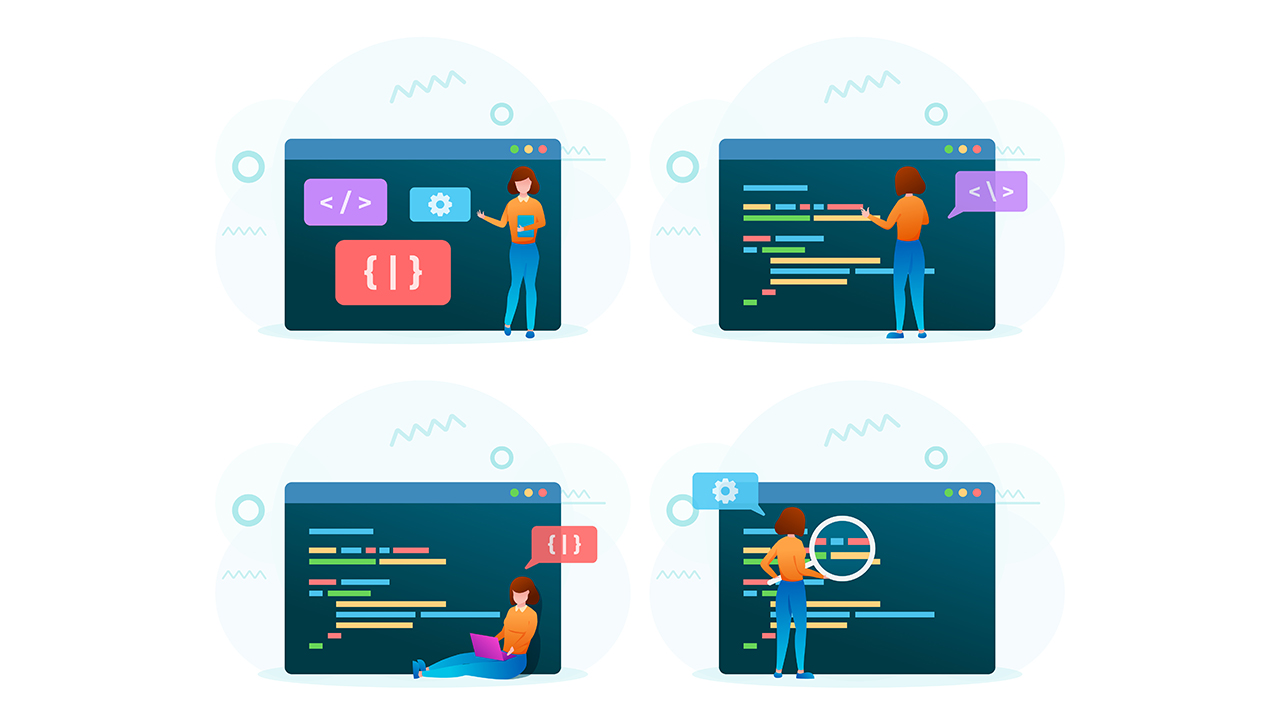
 understanding these basic website elements

Headers

Headers are a vital component of HTML, as they enable browsers to identify the overall content of a page. This is accomplished with page titles, H1 and H2 tags, description meta tags, and other elements. Page titles display in search engine results and can be used to optimize for SEO. The H1 tag provides one of the most important signals for search engines, helping to define what the page is about. Description meta tags help users understand what a website’s content is about before visiting which can entice more people to click through; these should therefore be crafted carefully but thoroughly. When implementing headers, it is important to ensure that each element accurately explains the content on each page but also appeals to end-users so as not to reduce clicks on a site from potential customers.

Content 

Above all else, successful websites need good content. The best web pages are filled with useful and engaging information that can captivate as many viewers as possible. This includes visually appealing photos, videos, infographics, and other visuals to break up blocks of text in order to make the page more digestible; it also involves well-written headlines, subheadings, and body copy that is easy to read. Additionally, by adding links to external pages or resources within a page’s copy, website owners can further drive engagement from their site visitors.

Navigation

Navigation is a key component of website design and helps guide visitors through the content on your site. This is done by creating menu options, drop-down menus, breadcrumbs, and other navigational elements that make it easier for visitors to access the information they’re looking for quickly and efficiently. Additionally, more advanced navigation strategies can be implemented including AJAX (which allows for dynamic page loading), HTML5 pushState (which enables different URLs to display the same content), and progressive enhancement (which enhances existing user experience). All these strategies should be considered when building out a website as each one provides unique advantages depending on the type of visitor you want to attract.

Accessibility & Compliance

While designing a website, it’s essential to stay on top of industry updates and digital regulations. This means making sure that any content added to your site is easily accessible and creates an inclusive experience for all users. It also involves checking logos, text, images, videos, and other types of media for copyright infringement or trademark issues. Additionally, websites should be regularly tested against accessibility standards in order to ensure they are usable by people with disabilities. Finally, companies should make sure their sites comply with global data protection laws such as GDPR in order to avoid any legal repercussions. All these steps can help businesses ensure that their digital presence is both compliant and secure.

Footers

Adding footers to web pages is a great way for businesses to provide important information about their company quickly and easily. A footer is a familiar place for website viewers to access contact information, as well as find out more about the business’s terms of service and copyright status. Not only will it make it easier for potential customers to stay informed, but a properly formatted footer will also look clean and professional. Although there are several ways of structuring the content in a footer, it’s best if you include any disclaimers and legal notices at the top, followed by company information or your general contact info. Having the right type of information added to your website’s footers can help make sure your business is maximally connected with its customers while staying compliant with laws around digital communication.

Interactive Forms

Creating forms with text boxes and drop-down menus can help ensure efficiency and accuracy when collecting information. Not only does this process save time, but it also prevents users from entering incorrect information or omitting important data. Forms should be designed with the user in mind, taking into account factors such as font size, length of textboxes, number of characters allowed, and options available in the drop-down menus. It is possible to customize form fields further by adding instructions or validations to display helpful messages when users enter invalid data or incomplete information. Good form design will streamline the submission process and make it more likely that you will receive accurate data quickly.

Security

Maintaining the security of a website is critical in today’s digital landscape as cyber-attacks have become increasingly common and damaging. This can be done through encryption techniques such as SSL/TLS, using secure hosting services, and employing firewalls and other measures to protect confidential data. Additionally, implementing CAPTCHAs on forms and login pages can help prevent automated attacks by bots. Finally, regularly updating software (including plugins) should be done often in order to ensure that all components are up-to-date with the latest security patches. Making sure your site has these basic elements will help protect your site and the data of your users.

Analytics

In order to make informed decisions about website design and development, it is essential to track user behavior on a website. This can be done through analytics services such as Google Analytics which provide valuable insights into user activity including page views, bounce rate (percentage of visitors who leave after viewing only one page), average time spent on the site, and more. This data can then be used to identify opportunities for improvement such as optimizing pages for better readability, refining navigation elements, or adding features that enhance the user experience. Additionally, analytics services can also be used to track A/B tests which allow you to compare different versions of a page to determine which one yields better results. Tracking user behavior is an essential part of website design and should not be overlooked.

Styling

CSS (Cascading Style Sheets) is a powerful language used in web development and design to define skins, fonts, colors, and a website’s overall look and feel. It involves applying styles, such as setting font sizes, text colors, margin sizes, column widths, and many more elements that make up a website’s design. CSS offers great flexibility for implementing visual changes to any webpage, making it an incredibly attractive tool for designers who want to create visually stunning websites. CSS can help give your page personality by using gradients and transitions, adding animation effects, or placing elements across the page in different formats. With careful consideration and attention to detail, these features can tie together your website into one unified look that stands out from the crowd.

Conclusion

There you have it! The building blocks of great website design. Headers, navigation, content, footers, forms, and styling are the pieces that come together to create a well-rounded user experience. It is possible to learn how to build a website from scratch, but it is important to understand the basics – headers, navigation, content, and so on – before diving in. With diligent research and planning, anyone can begin designing amazing websites. So go forward with confidence and build your masterpiece!