


Latest Blog
Simplifying UI: Key Principles of Minimalist Web Design
05-25-2023 Editorial Team Min Read


Discovering the art of web design is often a complex journey, filled with trial and error. But one thing that should remain constant in all digital platform designs is simplicity; adage notwithstanding, less can surely be more. With minimalism taking over as the hottest trend in digital design, understanding how to adhere to these principles—without sacrificing functionality or your brand’s message—is becoming increasingly important. In this blog post, we will explore the key tenets of minimalist web design and explain why keeping your user interface simple is so effective for creating an optimal online experience.
Keep it Simple
In this age of information overload, simplicity is king when it comes to website design. Minimalist designs with clean, uncomplicated lines are the key to effectively communicating your message and keeping visitors engaged. By using a simple layout, you ensure that your website is easy to navigate and uncluttered, allowing visitors to find the information they need quickly and easily. Don’t fall into the trap of trying to cram too much content onto your website – keep it simple and let your message speak for itself. With a minimalist design, your website will not only look great but it will also be functional and user-friendly. So why complicate things? Keep it simple and watch your website soar.Choose Appropriate Color Scheme
When it comes to designing a minimal website, choosing an appropriate color scheme is critical in creating a harmonious and engaging atmosphere. The right combination of colors can make all the difference in how users perceive your website and interact with its content. A harmonious color scheme can also convey a sense of professionalism and polish, which can improve the overall user experience. So, whether you opt for a monochromatic scheme or decide to incorporate bold accent colors, be intentional in your color choices and consider how they will impact the tone and mood of your website. An effective color scheme can help you create a sleek and modern website that users will want to interact with.Focus on the User
It’s important to remember that a website’s purpose is to provide information and connect with potential customers. That’s where user experience comes into play. Creating a streamlined and intuitive user experience on your minimal website can make a world of difference. By focusing on your user, you can make sure that your website is easy to navigate, with clear and concise language that guides them to the information they need. A streamlined user experience not only looks great but also helps to build trust and credibility with your audience. A minimal website can be a powerful tool in your marketing arsenal, but only if your user experience is on point.Utilize Negative Space
Negative space is an often misunderstood element of design. At first glance, it can seem like wasted space or an oversight on the designer’s part. But in reality, negative space is a powerful tool in creating a minimalist website. By intentionally leaving areas of the page empty, you allow the content that is present to shine even brighter. Negative space can be used to draw the eye to certain elements, create a sense of balance, and even provide a calming visual experience for your website visitors. When utilized effectively, negative space can transform a simple website into a work of art.Prioritize Content Hierarchy
It’s essential to prioritize content hierarchy when building your website. Doing so allows you to showcase what’s most important while de-emphasizing elements that are less significant. In a world where attention spans are becoming shorter and shorter, highlighting key features is essential to keep visitors engaged. By placing emphasis on critical elements and letting non-significant ones take a back seat, you can ensure that your visitors find the information they need quickly without getting overwhelmed by needless clutter. A minimalist website that balances content hierarchy strikes the perfect balance between simplicity and usefulness.Leverage Contrast
When it comes to minimalist website design, contrast is key. In order to ensure that your website is both visually appealing and easily readable for viewers, it’s important to carefully consider the contrast between the background and foreground. By leveraging contrast effectively, you can prevent your website from looking flat or one-dimensional while also creating a seamless user experience that allows visitors to easily navigate your site. Whether you’re using bold typography to create contrast or playing with light and shadow to highlight important elements, the key is to remember that every choice you make should be informed by a commitment to clarity and usability for your users.Utilize Typography
Typography is one of the most overlooked design elements on a minimalist website. Yet when utilized properly, it can elevate the overall aesthetic of a site to new heights. The key is to use typography sparingly, opting for only a few select typefaces that mesh well together to create a cohesive design. Whether you’re choosing a bold sans-serif font for your headlines or a sleek, easy-to-read serif font for your body copy, the final result should be visually pleasing and easy to navigate for your users. It’s all about finding that perfect balance between form and function, and with the right typography, you can achieve just that.Utilize Modern UI Elements
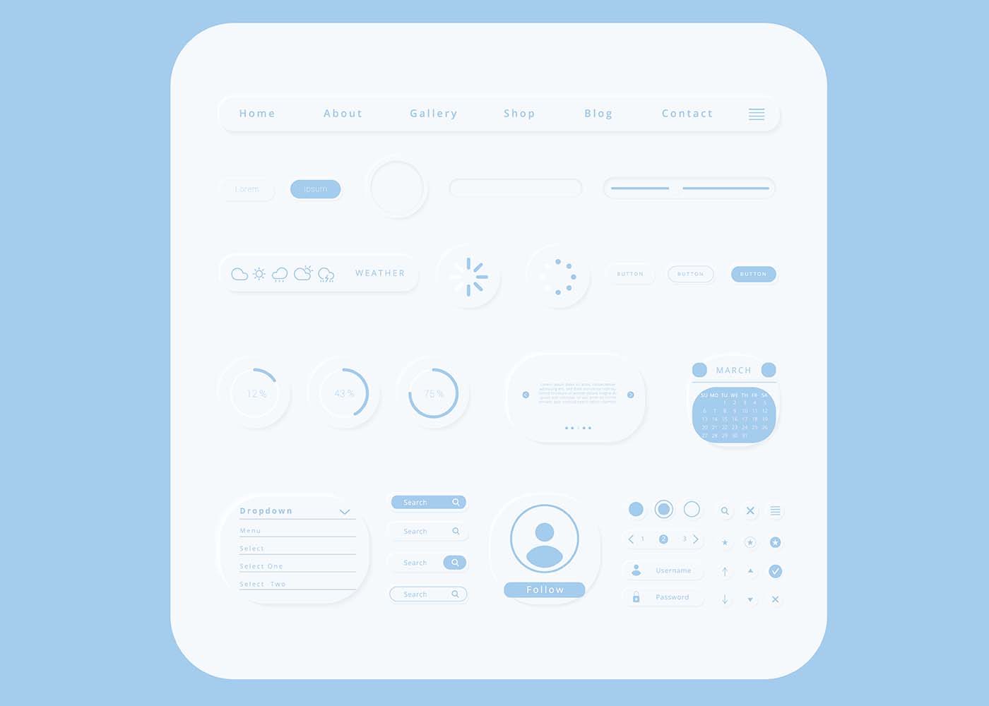
Minimalism is a design philosophy that emphasizes simplicity and clarity in every aspect of a website. However, just because you’re going simple doesn’t mean you have to be boring. In fact, using modern user interface elements such as icons and buttons can be a great way to enhance the user experience while keeping your minimalist aesthetic intact. These elements are not only attractive and eye-catching, but they also make navigation easier and quicker, especially for mobile users. So, when designing your website, don’t be afraid to use these elements to convey your brand’s tone and personality while keeping everything clean and simple.Focus on Content
When it comes to creating a minimalist website, it’s important to remember that less is more. While design elements can certainly enhance the look of a site, they should never overtake the content that’s being presented. After all, the main purpose of any website is to communicate information and ideas to its audience. By prioritizing the content over flashy designs, you can ensure that your message comes across loud and clear. So, when working on your minimalist website, make sure that the content is the star of the show. Keep things simple and streamlined, and don’t be afraid to let the words and ideas speak for themselves.Implement Grid-Based Layouts
When designing a minimalist website, it’s important to maintain a sense of organization and consistency throughout. This is where grid-based layouts come in handy. By dividing your content up into evenly spaced sections, you’ll be able to create a cohesive look that’s visually appealing to your visitors. However, implementing a grid-based layout can be tricky if you don’t have the right knowledge or tools. Thankfully, there are a variety of resources available online to help get you started. So, don’t be afraid to experiment with different grid formats until you find the one that works best for your site. The end result will be a website that’s not only aesthetically pleasing but easy to navigate and understand.Leverage Visuals
In the world of website design, being minimalist doesn’t necessarily have to mean being boring. By leveraging visuals, you can add interest and depth to your webpage without sacrificing its clean, streamlined look. Photos, icons, and illustrations can be strategically placed to create a visually appealing experience for your visitors, while still maintaining a sleek and uncluttered design. Rather than overwhelming your audience with a barrage of content, let the visuals do the talking and draw them in with their unique charm. With a little bit of creativity, your minimalist website can become the talk of the town.Conclusion
To wrap it all up, good website design is essential for success, and keeping the rules we’ve discussed in mind is key. Keeping the design simple and focusing on the user experience will ensure visitors enjoy browsing your website. Utilize negative space, contrast, and thoughtful typography to keep visitors engaged and focused on your content. Implementing grid-based layouts with visuals will further maximize the positive effect of a well-designed website. Remember, attention to detail is essential when creating a website that provides the best user experience possible. Make sure everything works together cohesively so when visitors leave your site they have a memorable online experience they will want to repeat!Related Blogs


Get the latest updates on new technology, services and many more by subscribing to this Newsletter.

