In today’s fast-paced and interconnected world, where constant communication plays a vital role in maintaining relationships with friends, family, and colleagues, effective and seamless messaging experiences are highly sought after. Recognizing this need, the Threads app, which was recently launched by Meta Inc. on July 7th, 2023, is designed to provide users with a transformative and immersive microblogging experience like never before.In this comprehensive blog post, we will dive into the exciting features and functionalities that the NEW Threads app has to offer. Additionally, we will explore its user-friendly UI design, highlighting the intuitive design that ensures a smooth and hassle-free experience. Notably, we will also discuss the limitations of the app.
Clean UI & Seamless Functionality
The Threads by Meta boasts a straightforward and user-friendly UI design that is reminiscent of the popular microblogging platform Twitter. Its clean interface allows users to effortlessly engage with the app’s features, enhancing the overall user experience. With intuitive functionality, navigating through the app becomes seamless and enjoyable. Some notable features include:
Seamless Integration: The Threads app seamlessly integrates with Instagram and requires an Instagram account to operate.
Privacy and Security: Threads place a strong emphasis on user privacy and security. Users can also control their privacy settings, choose who can see their threads, and have full control over their personal information.
Usability: The user interface of the NEW Threads app is very similar to Twitter; therefore, intuitive and user-friendly, making it accessible to everyone. You can download Threads by Meta on both iOS and Android platforms.
Limitations: While the Threads app offers an array of impressive features, it does have some limitations worth noting:
Reliance on Social Media Integration: Threads needs an Instagram account to function properly. If users do not have an Insta account they can’t use Threads.
How to Sign up on Threads?
Users can effortlessly sign up for Threads using their existing Instagram accounts. They can maintain the same username, password, and account name, providing a seamless transition. The process allows users to personalize their bio exclusively for Threads, giving them the freedom to express themselves creatively.Moreover, the app simplifies the process of importing the following accounts list from Instagram. With just a few taps, users can swiftly bring their favorite accounts onto Threads, ensuring they stay connected with their preferred content creators and friends.However, when it comes to leaving Threads, the process becomes a tad more intricate. Permanently deleting a Threads profile means you will be deleting the associated Instagram account in its entirety. This aspect has raised concerns among some users regarding the information collected by Threads and Instagram. Given these factors, users must act hesitant when making decisions about their privacy and data usage on Threads, just as they would on Instagram. Taking the time to weigh the pros and cons and staying informed empowers users to use the app responsibly while safeguarding their personal information.
How Does Threads Impact Twitter?
Instagram’s text-based conversation app aiming to rival Twitter, is quickly gaining traction as the go-to app for real-time, public conversations. With its innovative features and user-friendly interface, Threads holds immense potential for success.The rise of Threads can be attributed to the growing dissatisfaction among Twitter users since Elon Musk took control of the social media giant. Many have expressed their yearning for an alternative platform due to frequent technical issues and policy changes that have overshadowed the user experience.One key advantage that Meta, the parent company of Threads, holds over Twitter is its massive existing user base. With over 2 billion active users globally on Instagram, Meta has a significant edge in terms of reach and engagement. In comparison, Twitter now known as X currently boasts an active user base of approximately 250 million. Recognizing this immense opportunity, Meta aims to capitalize on its substantial user base by introducing Threads as its new flagship app.By joining Threads, users can expect a more immersive and rewarding social experience, with engaging conversations and vibrant communities. Threads opens up a world of possibilities for connecting with like-minded individuals, sharing ideas, and forging meaningful connections.
Conclusion
In conclusion, Threads, an Instagram app, has the potential to rival Twitter as a transformative microblogging platform. With its clean UI, seamless functionality, and intuitive design, Threads offers users an immersive messaging experience. The app’s seamless integration with Instagram, emphasis on privacy and security, and availability on both iOS and Android platforms contribute to its widespread usability. While it relies heavily on social media integration and has limitations regarding the need for an Instagram account, Threads presents an enticing alternative for real-time, public conversations. With Meta’s substantial user base from Instagram, Threads can attract a significant number of users and foster vibrant communities. As the digital landscape evolves, Threads offers a promising platform for connection, idea sharing, and meaningful interactions, positioning itself as a contender in the microblogging sphere with the potential to rival Twitter’s influence.
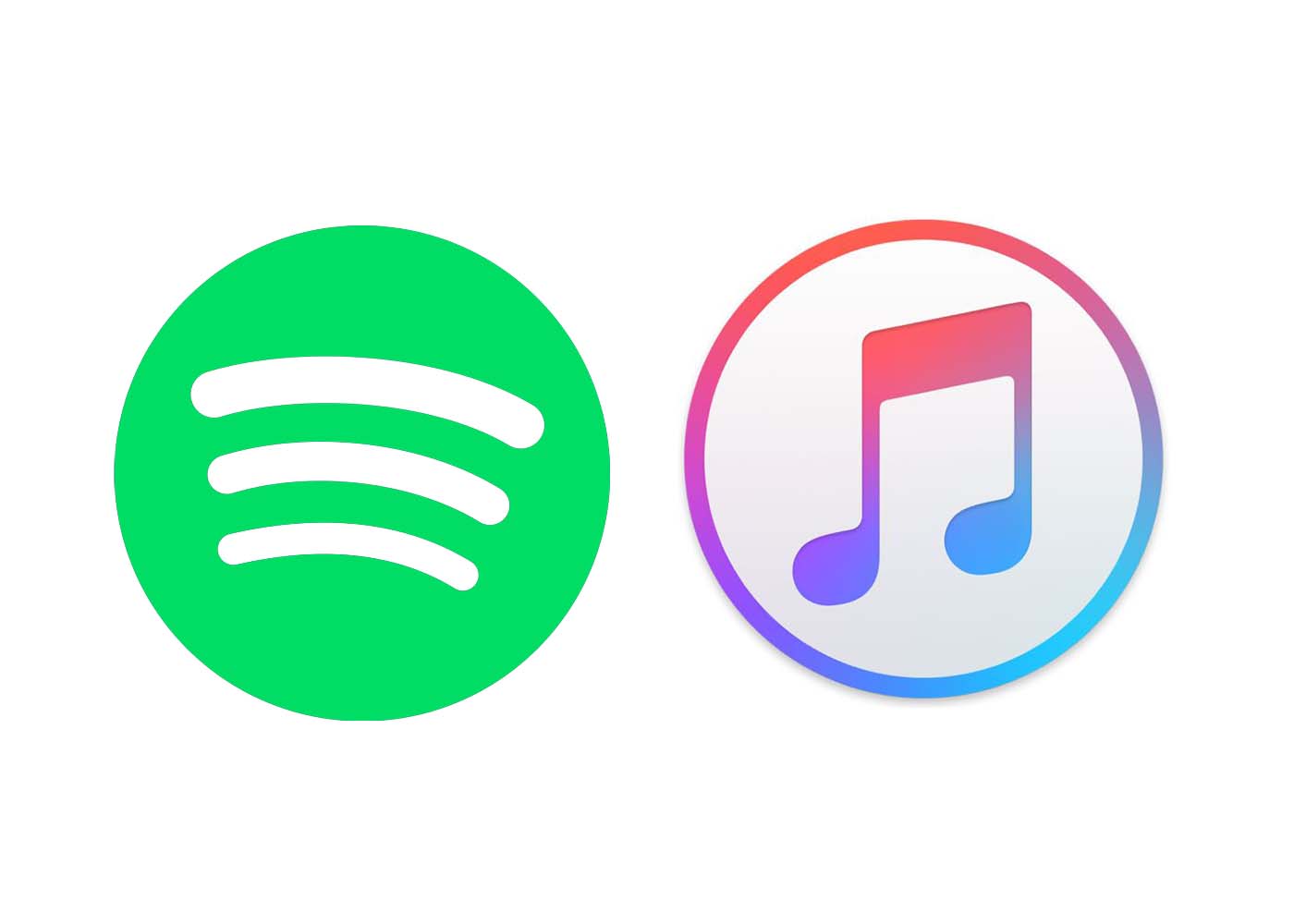
Have you ever wondered which streaming service provides the best user experience (UX) when it comes to reading tunes? With an array of options out there, choosing the one that works best for you can be tricky. In this blog post, we’re looking at two of the leading music streaming services – Spotify and Apple Music – and examining their UI/UX design offerings to see which comes out on top. Stick around as we compare features such as song selection, ease of use, pricing structure, and more!
Overview of Music Streaming Services and the Evolution of User Experience
As technology advances, so does the way we listen to music. Gone are the days of lugging around CDs or relying solely on the radio for new tunes. Nowadays, music streaming services reign supreme. Perhaps the two most popular services are Spotify and Apple Music. Both offer millions of songs at our fingertips, but they differentiate themselves through their user experience. Spotify boasts personalized playlists and a sleek, easy-to-use interface while Apple Music emphasizes their integration with Apple devices and exclusive releases. However, as these companies strive for user satisfaction, they continuously evolve their platforms. We’ve witnessed the evolution of music streaming services from simply allowing users to listen to a single song to now curating an individual’s entire music library. And, with the ever-changing landscape of technology, who knows what’s next for these streaming giants?
A Comparison of Spotify’s UX vs Apple Music’s UX
When it comes to music streaming services, Spotify and Apple Music are two of the biggest players in the game. Both offer a vast library of songs and easy-to-use interfaces, but how do their user experiences stack up against each other? One of the biggest differences between the two is their approach to customization. Spotify offers more personalized playlists and easier navigation throughout the app, while Apple Music takes a more traditional approach and emphasizes album and artist discovery. However, both services have strong points in their UX design and it ultimately comes down to personal preference. Whether you’re a die-hard Spotify fan or an Apple Music supporter, there’s no denying that each has its own unique strengths and weaknesses.
a. Platforms
Spotify’s UX is known for its clean and simple design, which is easy to navigate. Users can search for music by artist, album, or genre and create their own playlists. On the other hand, Apple Music’s UX focuses on integration with the larger Apple ecosystem and boasts a more uniform design across all of its devices. Users can easily access music, create playlists, and connect with friends.
b. Ease of Use:
Ease of use is an essential factor when it comes to attracting users, and both Spotify and Apple Music are well aware of it. Spotify’s interface is known for being straightforward, easy to navigate, and has an extensive set of features that cater to every user’s preferences. In contrast, Apple has always been particular about its looks and user experience. Apple Music’s interface is minimalistic, with a clean aesthetic, making it visually pleasing to the eyes. However, when it comes to a user’s interaction with the platform, Spotify outshines Apple Music with its extensive set of features that are easy to use
c. In-app features:
Both Spotify and Apple Music have incorporated in-app features to enhance user experience. While Spotify has a more intuitive design and attractive color scheme, Apple Music has a cleaner interface. Spotify’s personalized playlists, such as Discover Weekly and Daily Mix, and user-generated playlists are some of its strongest features. On the other hand, Apple Music’s focus on providing exclusive content and curated music videos sets it apart.
d. Pricing plans:
Both Spotify and Apple Music offer subscription plans with similar features, including ad-free listening, offline downloads, and high-definition audio streaming. However, when it comes to pricing plans, Spotify beats Apple Music by a small margin. Spotify’s individual plan starts at $9.99 per month, while Apple Music charges the same but with a 3-month free trial period. On the other hand, Apple Music’s family plan allows you to share the service among six people for $14.99 per month, while Spotify’s family plan costs $14.99 for two people and an additional $5 per extra person, up to five people. Overall, Spotify offers a better deal for individuals, but if you’re looking for a family plan, Apple Music could be a more affordable option.
Benefits and Drawbacks of Both Platforms
While Spotify and Apple Music both have their benefits and drawbacks, one area that sets them apart is user experience or UX. Spotify boasts a more user-friendly interface, with features like personalized playlists and easy navigation. On the other hand, Apple Music offers a larger music library and better sound quality. Ultimately, the choice between the two platforms may come down to personal preference and what is most important to the user. Whether it’s seamless navigation or higher-quality sound, both Spotify and Apple Music have something to offer music lovers everywhere.
Analyzing Design Features of the Music Streaming Platforms:
Both platforms have unique design features that set them apart from one another, making them popular among various groups of music lovers. Spotify has an intuitive interface that allows users to easily navigate their extensive library of songs, podcasts, and playlists. On the other hand, Apple Music prioritizes aesthetically pleasing visuals and a sense of community through curated playlists and artist radio stations. Analyzing the design features of these platforms can help users decide which service best suits their preferences and needs. Whether you’re a die-hard Apple fan or a Spotify loyalist, there’s no denying that both music streaming giants offer a compelling listening experience.
How the Future of Music Streaming Services Could Look Like:
While Spotify was founded in 2006, Apple Music, on the other hand, entered the game much later in 2015. As these two streaming services continue to evolve, we can expect to see many changes. There could be new features that enhance the music streaming experience, such as interactive playlists and podcasts. Additionally, there could also be more personalization options that cater to individual preferences. As Spotify and Apple Music compete for dominance, it remains to be seen which service will emerge as the industry leader. Nevertheless, for music lovers across the globe, the future looks bright as these platforms continue to innovate and offer their users the best music streaming experience possible.
Final Thoughts on the Future of Music Streaming Services
As the music industry continues to evolve, it’s no secret that streaming services have become a major player in the industry. With Spotify and Apple Music leading the pack, it’s hard to predict which one will come out on top. However, it’s clear that both platforms have their unique strengths and weaknesses. While some prefer the personalized playlists and user-friendly interface of Spotify, others swear by the exclusive content and seamless integration with Apple devices offered by Apple Music. Ultimately, the future of music streaming services is anyone’s guess. But one thing is for certain – as the industry continues to evolve, so will these platforms, and we can only expect more innovations and exciting developments in the near future.
Conclusion
Conclusively, we can see that the changing landscape of music streaming services has allowed users to leverage different types of platforms with distinct UI/UX designs. Ultimately, we can expect that the main themes driving design improvements on today’s top services are personalization, tailored discovery experiences, and a focus on seamless integration between platforms to provide convenience and superior methods of usage. As more companies begin to attract customers to their particular services with better leaps in technology, user experience research will become increasingly important in helping them develop more convenient solutions. In its current state, music streaming services have already taken some big strides in bringing user experience design up to speed so they can offer better products to attract and retain customers in the future.
With more than 690 million people using Netflix around the world, it’s no wonder that this streaming platform has become one of the most popular sources of entertainment today. Though there are plenty of reasons why people love to watch shows on Netflix, including its massive library of films and TV series, one factor that often goes unnoticed is the clever UI/UX design behind its interface. By making every aspect of their experience as easy and effortless as possible, Netflix has created a perfect environment for binge-watching. In this blog post, we’ll uncover how smart UI & UX design plays an essential role in encouraging users to stay glued to their screens!
Understanding the Principles of UI & UX Design
Netflix has revolutionized the entertainment industry, not just with its innovative content but also with its seamless user interface and user experience design. The streaming platform’s interface is sleek, intuitive, and easy to navigate, making it effortless to discover movies and shows that interest you. Netflix’s design principles revolve around putting the user first, with a focus on relevance, personalization, and simplicity. From the home screen to the content pages, every element is geared towards making the user experience as smooth and enjoyable as possible. By understanding the principles behind Netflix’s UI and UX design, we can gain valuable insights into how to create effective digital experiences that keep users coming back for more.
Uncovering Netflix’s Binge-Watching Strategy
Netflix has revolutionized the way we consume entertainment. From classic movies to original series, the streaming giant has it all. One aspect that sets it apart is its binge-watching strategy. As opposed to traditional TV broadcasting, Netflix releases entire seasons of shows at once. This allows viewers to watch at their own pace, whether it’s one episode a night or a full weekend binge. But why is this the formula for success? By releasing full seasons, Netflix creates anticipation and increases engagement. It’s no longer a waiting game for the next episode, but rather a choice in how quickly the storyline unfolds. It’s safe to say, Netflix has mastered the art of keeping its audience hooked.
– Autoplay and endless scrolling options
The user experience of streaming services has never been more critical, and Netflix knows that better than anyone. That’s why they’ve implemented their autoplay feature and endless scrolling options to keep you hooked on one episode after another. With a few clicks, viewers can keep binge-watching without ever feeling like they’re coming up for air. The UX of Netflix’s platform is tailored to make it as easy and seamless as possible to navigate through its vast library of content. Their autoplay function gives viewers the thrill of watching something new without much effort, making it feel like the content is always fresh. Overall, Netflix’s UX design ensures that viewers never have to struggle to find something they enjoy, and its autoplay feature and endless scrolling make streaming all the more addictive.
– Recommendations tailored to individual users
Netflix has taken streaming to the next level with its personalized recommendations. By using a complex algorithm, the platform is able to suggest content that is specifically tailored to each individual user’s preferences. Gone are the days of aimlessly scrolling through countless titles, trying to find something to watch. With Netflix’s recommendations, users can easily discover new shows and movies that align with their viewing habits. From comedy to drama, and everything in between, there is something for everyone. This innovative technology not only saves time but also ensures that viewers are consistently entertained and engaged. It’s no wonder that Netflix has become the go-to streaming platform for millions of people around the world.
– Intuitive cues and visual design elements
Netflix’s success as a streaming platform is not only due to its vast selection of shows and movies but also its use of intuitive cues and visual design elements. From the moment users open the app, they are greeted with a personalized homepage that uses algorithms to suggest content based on their viewing history and preferences. The use of vertical scrolling and large images accompanied by minimal text make it easy for users to navigate and make decisions on what to watch. As users select a specific title, the platform displays additional information such as a synopsis, reviews, and a “play” button in a prominent position. The clean and cohesive design of the platform allows users to seamlessly move from one page to another, creating a frictionless experience that keeps them coming back for more.
The Role of Psychology in Netflix’s UI & UX Design
Netflix has become a powerhouse in the world of streaming platforms, not only for its extensive library of movies and TV shows but also for its user interface and experience. What many may not realize is the key role that psychology plays in Netflix’s UI and UX design. Through the use of data analytics and user research, Netflix is able to effectively tailor its platform to the needs and preferences of its audience. Whether it be recommending similar shows or adjusting the layout of the interface, Netflix is constantly shaping the user’s experience to keep them engaged and satisfied. Psychology has become an essential component in ensuring that the user’s journey on Netflix is smooth and enjoyable, making it a prime example of how research and design can work in harmony to create a top-tier digital experience.
– Playful animations, subtle sound effects, and other sensory cues
Netflix’s user interface has been designed to offer an immersive entertainment experience, complete with playful animations, subtle sound effects, and other sensory cues. These features provide a more engaging and intuitive way for users to navigate the streaming platform’s vast library of movies and TV shows. From browsing through different tiles to selecting an episode or a movie, the interface comes alive with carefully crafted animations that give the user a sense of control and interactivity. The sound effects, on the other hand, help create a sense of anticipation and excitement, making the whole experience even more enjoyable. These small details, often overlooked, show Netflix’s commitment to delivering a cohesive and delightful user experience.
– Triggering viewers’ intrinsic motivation through simple reward systems
One of the key features that make Netflix so addictive and immersive is its simple reward systems that trigger viewers’ intrinsic motivation. Whether it’s the satisfying sound of a show auto-playing the next episode or the triumphant feeling of completing a series, Netflix is designed to keep viewers hooked. By using data-driven insights and behavioral science principles, the platform offers personalized content recommendations, progress tracking, and a seamless viewing experience. These reward systems tap into the pleasure centers of our brains, creating a sense of accomplishment and satisfaction that keeps us coming back for more. With Netflix’s seamless and immersive experience, viewers can enjoy their favorite shows while feeling truly motivated and rewarded.
How User Testing Has Contributed to Netflix’s UI & UX Success
Netflix is an entertainment giant that has revolutionized the streaming industry with its user-friendly interface and unrivaled content library. User testing has played a crucial role in restructuring their UI and enhancing their UX, making it more personalized and efficient. By conducting extensive research and feedback sessions, Netflix has been able to identify user preferences and behaviors, which has helped them optimize various features of their platform such as recommendations, search filters, and navigation. With this continuous improvement process, Netflix has successfully built a loyal user base that highly values its streaming experience. Through its innovative approach to user testing, Netflix has undoubtedly secured its position as the industry leader in the streaming world.
Strategies Other Brands Can Use to Create a Binge-Watching Experience
With the rising popularity of streaming services and the ease of access they provide, binge-watching has become a common pastime for many viewers. While some brands may struggle to create a binge-worthy experience, there are several strategies that can be used to make it happen. One approach is to tell a compelling story through a series of episodes, leaving viewers eagerly anticipating the next installment. Another effective strategy is to create complex and relatable characters that viewers can connect with emotionally. Additionally, incorporating cliffhangers and plot twists at the end of each episode can keep viewers hooked and invested in the story. By utilizing these and other techniques, other brands can create a binge-watching experience that captivates viewers and keeps them coming back for more.
Conclusion
In conclusion, there is no doubt that Netflix’s UI & UX design techniques have been extremely successful in creating a desirable binge-watching experience. By understanding the principles behind UI and UX design, analyzing their recommended strategies and tactics, and implementing user testing every step of the way, any business can create an engaging interface that encourages continuous interactions. From subtle sound effects to autoplay features, Netflix has creatively incorporated aspects of psychology into its product to trigger viewers’ intrinsic motivation and inspire loyalty. It is easy to see how these insights can be used by any other brands and UI/UX design agencies to craft an immersive UI & UX design for their customers.
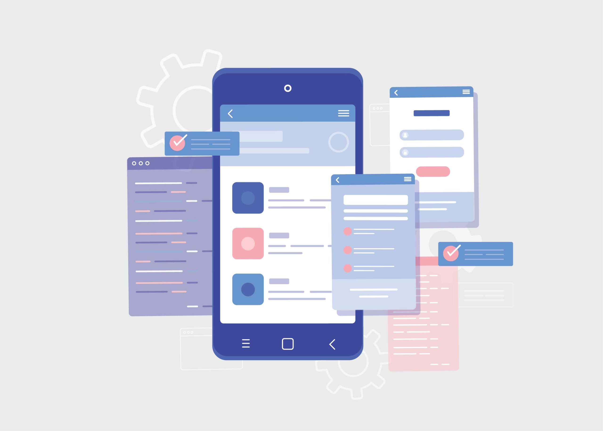
Great mobile app design can make or break a user’s experience. It can be the difference between an app that keeps customers returning and one that goes straight into the bin. But there are so many aspects to consider, from user interface design to interaction details – how do you know where to focus your energy? Well, this post is here to show you what some of the best app designers in the world have done and how their innovation has resulted in ridiculously good user experiences. From understanding customer behaviors through UX research, all the way through implementation with code – it’s time to learn the secrets of successful people who have already been there and done that. Let’s take a look at what we can learn from them!
What are the Best Mobile App Designs of 2023
As technology continues to advance rapidly, app designers are consistently pushing the boundaries of what is possible. With each passing year, we see new and innovative app designs that change the way we interact with our devices. In 2023, there were several standout designs that caught the attention of industry experts and users alike. From sleek and minimalist interfaces to more complex and interactive designs, these apps represent some of the best and most forward-thinking app designs of the year. By focusing on user experience and incorporating cutting-edge technology, these designers have set the bar high for what we can expect from app design in the years to come.
1. Netflix
Netflix has become a household name when it comes to streaming services and for good reason. The way they handle their autopay system and color scheme is nothing short of impressive. It makes the payment process easy and seamless for users, and the black and red color scheme gives the whole platform a sleek and modern look. Moreover, Netflix’s auto-plays are a game-changer when it comes to choosing what to watch. With snippets of the film/show, it’s much easier to get a feel for what you’re about to embark on. Gone are the days of blindly diving into shows without any prior knowledge or recommendations. Thanks to Netflix, users can feel confident in their content choices.
2. Google Maps
Google Maps is an app that truly lives up to its promise of delivering value to its users. With its exceptional design, the app provides a convenient way to access maps of any location around the world. It is available as both a web and mobile application, which makes it highly accessible to users. I prefer using it as a native mobile app because of the offline maps functionality, which I find particularly helpful when traveling. However, what I love most about Google Maps is the integration of photos, comments, and text in targeted destinations. The core functionalities are top-notch, and the UI design is just subtle enough to deliver its purpose. Truly, this app is an example of design done well – where value and experience are the top priority.
3. Uber
Uber has become one of the most popular transportation services around the world. There are many reasons for this, but one of them is undoubtedly the app’s well-designed user interface. The Uber app is incredibly easy to use, with clear information displayed in a way that makes sense. One great feature of the app is the map view, which lets you see where your driver is and estimate the time it will take them to arrive. Additionally, splitting fares with other riders is a game-changer for anyone who wants to share the cost of a ride. Overall, Uber has made getting around town quicker and more affordable than ever before.
4. Airbnb
Airbnb has truly set the standard for amazing app design, and it’s hard to ignore its success. One specific standout feature is the app’s search function, which makes finding your next temporary home a breeze. No matter what kind of space you’re looking for, the app’s intuitive design helps you narrow down your options with ease. Whether you want a private room in a specific neighborhood or an entire home to yourself, Airbnb has you covered. The app’s responsive design makes using it a seamless experience, regardless of the device you choose to use. It’s clear that Airbnb has raised the bar when it comes to mobile app design, and we can only wait and see which company will come close to replicating its success.
5. Alto’s Odyssey
Without a doubt, Alto’s Odyssey is a front-runner in the world of gaming app design. The competition is fierce, with dozens of new game apps hitting the market every day. However, with its stunning graphics, intuitive user interface, and refined gameplay, Alto’s Odyssey stands out from the crowd. This winning combination allows players to fully immerse themselves in the game and control the central character, Alto, with ease. From the first level to the highest peak, Alto’s Odyssey motivates you to ski your way to the top, thanks to its seamless design. It’s easy to see why Alto’s Odyssey is regarded as one of the best game apps designs available on the market today.
6. Twitter
Twitter’s streamlined design and user-friendly functionality set it apart from other social media platforms. Despite years of existence, Twitter refuses to overload its app with unnecessary features. This simplicity translates into an app that is easy to use and easy to remember how to use. The best part? There is no need to reorient yourself every time you open the app – it’s just that intuitive. When comparing Twitter to its competitors, such as Facebook, the superiority of its design becomes apparent. While Facebook has continuously added features, leaving the app bloated and confusing, Twitter has persevered with its clean and minimalistic approach.
7. TripAdvisor
TripAdvisor is the ultimate travel companion, bringing the world directly to your fingertips. The app’s ease of use truly embodies the digital revolution, allowing users to plan the perfect trip with the click of a button. Perhaps the most magical aspect of TripAdvisor is its versatility. Whether you’re looking for a hotel recommendation or a new restaurant to try in a foreign city, this app has got you covered. It’s not surprising to see that TripAdvisor has been an industry leader in travel for over two decades. So why worry about travel planning when you have TripAdvisor to rely on? Let the adventure begin!
Conclusion
This year has seen a plethora of new apps created and released, with each one providing a unique benefit. It was truly eye-opening to see the amazing select few that really defined 2023 in terms of app design – Netflix, Google Maps, Uber, Airbnb, Alto’s Odyssey, Twitter, and Trip Advisor all deserve special recognition for their excellent design. Each offers something entirely original and it’s complimented by an easy-to-use interface that makes the user experience incredibly pleasant. Moving forward into 2024 hopefully these impressive designs will be carried on to continue making our lives easier through efficient and enjoyable app design choices.


 Instagram’s text-based conversation app aiming to rival Twitter, is quickly gaining traction as the go-to app for real-time, public conversations. With its innovative features and user-friendly interface, Threads holds immense potential for success.
The rise of Threads can be attributed to the growing dissatisfaction among Twitter users since Elon Musk took control of the social media giant. Many have expressed their yearning for an alternative platform due to frequent technical issues and policy changes that have overshadowed the user experience.
One key advantage that Meta, the parent company of Threads, holds over Twitter is its massive existing user base. With over 2 billion active users globally on Instagram, Meta has a significant edge in terms of reach and engagement. In comparison, Twitter now known as X currently boasts an active user base of approximately 250 million. Recognizing this immense opportunity, Meta aims to capitalize on its substantial user base by introducing Threads as its new flagship app.
By joining Threads, users can expect a more immersive and rewarding social experience, with engaging conversations and vibrant communities. Threads opens up a world of possibilities for connecting with like-minded individuals, sharing ideas, and forging meaningful connections.
Instagram’s text-based conversation app aiming to rival Twitter, is quickly gaining traction as the go-to app for real-time, public conversations. With its innovative features and user-friendly interface, Threads holds immense potential for success.
The rise of Threads can be attributed to the growing dissatisfaction among Twitter users since Elon Musk took control of the social media giant. Many have expressed their yearning for an alternative platform due to frequent technical issues and policy changes that have overshadowed the user experience.
One key advantage that Meta, the parent company of Threads, holds over Twitter is its massive existing user base. With over 2 billion active users globally on Instagram, Meta has a significant edge in terms of reach and engagement. In comparison, Twitter now known as X currently boasts an active user base of approximately 250 million. Recognizing this immense opportunity, Meta aims to capitalize on its substantial user base by introducing Threads as its new flagship app.
By joining Threads, users can expect a more immersive and rewarding social experience, with engaging conversations and vibrant communities. Threads opens up a world of possibilities for connecting with like-minded individuals, sharing ideas, and forging meaningful connections.