Have you ever wondered which streaming service provides the best user experience (UX) when it comes to reading tunes? With an array of options out there, choosing the one that works best for you can be tricky. In this blog post, we’re looking at two of the leading music streaming services – Spotify and Apple Music – and examining their UI/UX design offerings to see which comes out on top. Stick around as we compare features such as song selection, ease of use, pricing structure, and more!
Overview of Music Streaming Services and the Evolution of User Experience
As technology advances, so does the way we listen to music. Gone are the days of lugging around CDs or relying solely on the radio for new tunes. Nowadays, music streaming services reign supreme. Perhaps the two most popular services are Spotify and Apple Music. Both offer millions of songs at our fingertips, but they differentiate themselves through their user experience. Spotify boasts personalized playlists and a sleek, easy-to-use interface while Apple Music emphasizes their integration with Apple devices and exclusive releases. However, as these companies strive for user satisfaction, they continuously evolve their platforms. We’ve witnessed the evolution of music streaming services from simply allowing users to listen to a single song to now curating an individual’s entire music library. And, with the ever-changing landscape of technology, who knows what’s next for these streaming giants?
A Comparison of Spotify’s UX vs Apple Music’s UX
When it comes to music streaming services, Spotify and Apple Music are two of the biggest players in the game. Both offer a vast library of songs and easy-to-use interfaces, but how do their user experiences stack up against each other? One of the biggest differences between the two is their approach to customization. Spotify offers more personalized playlists and easier navigation throughout the app, while Apple Music takes a more traditional approach and emphasizes album and artist discovery. However, both services have strong points in their UX design and it ultimately comes down to personal preference. Whether you’re a die-hard Spotify fan or an Apple Music supporter, there’s no denying that each has its own unique strengths and weaknesses.
a. Platforms
Spotify’s UX is known for its clean and simple design, which is easy to navigate. Users can search for music by artist, album, or genre and create their own playlists. On the other hand, Apple Music’s UX focuses on integration with the larger Apple ecosystem and boasts a more uniform design across all of its devices. Users can easily access music, create playlists, and connect with friends.
b. Ease of Use:
Ease of use is an essential factor when it comes to attracting users, and both Spotify and Apple Music are well aware of it. Spotify’s interface is known for being straightforward, easy to navigate, and has an extensive set of features that cater to every user’s preferences. In contrast, Apple has always been particular about its looks and user experience. Apple Music’s interface is minimalistic, with a clean aesthetic, making it visually pleasing to the eyes. However, when it comes to a user’s interaction with the platform, Spotify outshines Apple Music with its extensive set of features that are easy to use
c. In-app features:
Both Spotify and Apple Music have incorporated in-app features to enhance user experience. While Spotify has a more intuitive design and attractive color scheme, Apple Music has a cleaner interface. Spotify’s personalized playlists, such as Discover Weekly and Daily Mix, and user-generated playlists are some of its strongest features. On the other hand, Apple Music’s focus on providing exclusive content and curated music videos sets it apart.
d. Pricing plans:
Both Spotify and Apple Music offer subscription plans with similar features, including ad-free listening, offline downloads, and high-definition audio streaming. However, when it comes to pricing plans, Spotify beats Apple Music by a small margin. Spotify’s individual plan starts at $9.99 per month, while Apple Music charges the same but with a 3-month free trial period. On the other hand, Apple Music’s family plan allows you to share the service among six people for $14.99 per month, while Spotify’s family plan costs $14.99 for two people and an additional $5 per extra person, up to five people. Overall, Spotify offers a better deal for individuals, but if you’re looking for a family plan, Apple Music could be a more affordable option.
Benefits and Drawbacks of Both Platforms
While Spotify and Apple Music both have their benefits and drawbacks, one area that sets them apart is user experience or UX. Spotify boasts a more user-friendly interface, with features like personalized playlists and easy navigation. On the other hand, Apple Music offers a larger music library and better sound quality. Ultimately, the choice between the two platforms may come down to personal preference and what is most important to the user. Whether it’s seamless navigation or higher-quality sound, both Spotify and Apple Music have something to offer music lovers everywhere.
Analyzing Design Features of the Music Streaming Platforms:
Both platforms have unique design features that set them apart from one another, making them popular among various groups of music lovers. Spotify has an intuitive interface that allows users to easily navigate their extensive library of songs, podcasts, and playlists. On the other hand, Apple Music prioritizes aesthetically pleasing visuals and a sense of community through curated playlists and artist radio stations. Analyzing the design features of these platforms can help users decide which service best suits their preferences and needs. Whether you’re a die-hard Apple fan or a Spotify loyalist, there’s no denying that both music streaming giants offer a compelling listening experience.
How the Future of Music Streaming Services Could Look Like:
While Spotify was founded in 2006, Apple Music, on the other hand, entered the game much later in 2015. As these two streaming services continue to evolve, we can expect to see many changes. There could be new features that enhance the music streaming experience, such as interactive playlists and podcasts. Additionally, there could also be more personalization options that cater to individual preferences. As Spotify and Apple Music compete for dominance, it remains to be seen which service will emerge as the industry leader. Nevertheless, for music lovers across the globe, the future looks bright as these platforms continue to innovate and offer their users the best music streaming experience possible.
Final Thoughts on the Future of Music Streaming Services
As the music industry continues to evolve, it’s no secret that streaming services have become a major player in the industry. With Spotify and Apple Music leading the pack, it’s hard to predict which one will come out on top. However, it’s clear that both platforms have their unique strengths and weaknesses. While some prefer the personalized playlists and user-friendly interface of Spotify, others swear by the exclusive content and seamless integration with Apple devices offered by Apple Music. Ultimately, the future of music streaming services is anyone’s guess. But one thing is for certain – as the industry continues to evolve, so will these platforms, and we can only expect more innovations and exciting developments in the near future.
Conclusion
Conclusively, we can see that the changing landscape of music streaming services has allowed users to leverage different types of platforms with distinct UI/UX designs. Ultimately, we can expect that the main themes driving design improvements on today’s top services are personalization, tailored discovery experiences, and a focus on seamless integration between platforms to provide convenience and superior methods of usage. As more companies begin to attract customers to their particular services with better leaps in technology, user experience research will become increasingly important in helping them develop more convenient solutions. In its current state, music streaming services have already taken some big strides in bringing user experience design up to speed so they can offer better products to attract and retain customers in the future.
With more than 690 million people using Netflix around the world, it’s no wonder that this streaming platform has become one of the most popular sources of entertainment today. Though there are plenty of reasons why people love to watch shows on Netflix, including its massive library of films and TV series, one factor that often goes unnoticed is the clever UI/UX design behind its interface. By making every aspect of their experience as easy and effortless as possible, Netflix has created a perfect environment for binge-watching. In this blog post, we’ll uncover how smart UI & UX design plays an essential role in encouraging users to stay glued to their screens!
Understanding the Principles of UI & UX Design
Netflix has revolutionized the entertainment industry, not just with its innovative content but also with its seamless user interface and user experience design. The streaming platform’s interface is sleek, intuitive, and easy to navigate, making it effortless to discover movies and shows that interest you. Netflix’s design principles revolve around putting the user first, with a focus on relevance, personalization, and simplicity. From the home screen to the content pages, every element is geared towards making the user experience as smooth and enjoyable as possible. By understanding the principles behind Netflix’s UI and UX design, we can gain valuable insights into how to create effective digital experiences that keep users coming back for more.
Uncovering Netflix’s Binge-Watching Strategy
Netflix has revolutionized the way we consume entertainment. From classic movies to original series, the streaming giant has it all. One aspect that sets it apart is its binge-watching strategy. As opposed to traditional TV broadcasting, Netflix releases entire seasons of shows at once. This allows viewers to watch at their own pace, whether it’s one episode a night or a full weekend binge. But why is this the formula for success? By releasing full seasons, Netflix creates anticipation and increases engagement. It’s no longer a waiting game for the next episode, but rather a choice in how quickly the storyline unfolds. It’s safe to say, Netflix has mastered the art of keeping its audience hooked.
– Autoplay and endless scrolling options
The user experience of streaming services has never been more critical, and Netflix knows that better than anyone. That’s why they’ve implemented their autoplay feature and endless scrolling options to keep you hooked on one episode after another. With a few clicks, viewers can keep binge-watching without ever feeling like they’re coming up for air. The UX of Netflix’s platform is tailored to make it as easy and seamless as possible to navigate through its vast library of content. Their autoplay function gives viewers the thrill of watching something new without much effort, making it feel like the content is always fresh. Overall, Netflix’s UX design ensures that viewers never have to struggle to find something they enjoy, and its autoplay feature and endless scrolling make streaming all the more addictive.
– Recommendations tailored to individual users
Netflix has taken streaming to the next level with its personalized recommendations. By using a complex algorithm, the platform is able to suggest content that is specifically tailored to each individual user’s preferences. Gone are the days of aimlessly scrolling through countless titles, trying to find something to watch. With Netflix’s recommendations, users can easily discover new shows and movies that align with their viewing habits. From comedy to drama, and everything in between, there is something for everyone. This innovative technology not only saves time but also ensures that viewers are consistently entertained and engaged. It’s no wonder that Netflix has become the go-to streaming platform for millions of people around the world.
– Intuitive cues and visual design elements
Netflix’s success as a streaming platform is not only due to its vast selection of shows and movies but also its use of intuitive cues and visual design elements. From the moment users open the app, they are greeted with a personalized homepage that uses algorithms to suggest content based on their viewing history and preferences. The use of vertical scrolling and large images accompanied by minimal text make it easy for users to navigate and make decisions on what to watch. As users select a specific title, the platform displays additional information such as a synopsis, reviews, and a “play” button in a prominent position. The clean and cohesive design of the platform allows users to seamlessly move from one page to another, creating a frictionless experience that keeps them coming back for more.
The Role of Psychology in Netflix’s UI & UX Design
Netflix has become a powerhouse in the world of streaming platforms, not only for its extensive library of movies and TV shows but also for its user interface and experience. What many may not realize is the key role that psychology plays in Netflix’s UI and UX design. Through the use of data analytics and user research, Netflix is able to effectively tailor its platform to the needs and preferences of its audience. Whether it be recommending similar shows or adjusting the layout of the interface, Netflix is constantly shaping the user’s experience to keep them engaged and satisfied. Psychology has become an essential component in ensuring that the user’s journey on Netflix is smooth and enjoyable, making it a prime example of how research and design can work in harmony to create a top-tier digital experience.
– Playful animations, subtle sound effects, and other sensory cues
Netflix’s user interface has been designed to offer an immersive entertainment experience, complete with playful animations, subtle sound effects, and other sensory cues. These features provide a more engaging and intuitive way for users to navigate the streaming platform’s vast library of movies and TV shows. From browsing through different tiles to selecting an episode or a movie, the interface comes alive with carefully crafted animations that give the user a sense of control and interactivity. The sound effects, on the other hand, help create a sense of anticipation and excitement, making the whole experience even more enjoyable. These small details, often overlooked, show Netflix’s commitment to delivering a cohesive and delightful user experience.
– Triggering viewers’ intrinsic motivation through simple reward systems
One of the key features that make Netflix so addictive and immersive is its simple reward systems that trigger viewers’ intrinsic motivation. Whether it’s the satisfying sound of a show auto-playing the next episode or the triumphant feeling of completing a series, Netflix is designed to keep viewers hooked. By using data-driven insights and behavioral science principles, the platform offers personalized content recommendations, progress tracking, and a seamless viewing experience. These reward systems tap into the pleasure centers of our brains, creating a sense of accomplishment and satisfaction that keeps us coming back for more. With Netflix’s seamless and immersive experience, viewers can enjoy their favorite shows while feeling truly motivated and rewarded.
How User Testing Has Contributed to Netflix’s UI & UX Success
Netflix is an entertainment giant that has revolutionized the streaming industry with its user-friendly interface and unrivaled content library. User testing has played a crucial role in restructuring their UI and enhancing their UX, making it more personalized and efficient. By conducting extensive research and feedback sessions, Netflix has been able to identify user preferences and behaviors, which has helped them optimize various features of their platform such as recommendations, search filters, and navigation. With this continuous improvement process, Netflix has successfully built a loyal user base that highly values its streaming experience. Through its innovative approach to user testing, Netflix has undoubtedly secured its position as the industry leader in the streaming world.
Strategies Other Brands Can Use to Create a Binge-Watching Experience
With the rising popularity of streaming services and the ease of access they provide, binge-watching has become a common pastime for many viewers. While some brands may struggle to create a binge-worthy experience, there are several strategies that can be used to make it happen. One approach is to tell a compelling story through a series of episodes, leaving viewers eagerly anticipating the next installment. Another effective strategy is to create complex and relatable characters that viewers can connect with emotionally. Additionally, incorporating cliffhangers and plot twists at the end of each episode can keep viewers hooked and invested in the story. By utilizing these and other techniques, other brands can create a binge-watching experience that captivates viewers and keeps them coming back for more.
Conclusion
In conclusion, there is no doubt that Netflix’s UI & UX design techniques have been extremely successful in creating a desirable binge-watching experience. By understanding the principles behind UI and UX design, analyzing their recommended strategies and tactics, and implementing user testing every step of the way, any business can create an engaging interface that encourages continuous interactions. From subtle sound effects to autoplay features, Netflix has creatively incorporated aspects of psychology into its product to trigger viewers’ intrinsic motivation and inspire loyalty. It is easy to see how these insights can be used by any other brands and UI/UX design agencies to craft an immersive UI & UX design for their customers.
Do you want to create powerful user interfaces and experiences that captivate users and drive conversions? If so, then understanding the fundamental principles of UI/UX design is crucial. With this comprehensive guide, businesses and startups can learn how to best apply UI/UX design in their digital products. Here, we’ll walk through tips on strategizing visuals, creating an effective interface flow, addressing accessibility needs, getting feedback from customers and so much more. You’re sure to come away with all you need for success in crafting effective designs for today’s digital world.
Understand the Goals and Requirements of the Design
When undertaking a UI/UX design project, it is important to first fully understand the goals and requirements. These include “what”, “why”, and “who” corresponding to the UIUX design and the target audience. Not only should you have a clear vision of how you want the end result to look, but you should also know what value it will bring to users. That means determining who the likely users are, what features they need, and where they’ll be using the product or application. Additionally, it can be helpful to think about why someone might use your design over competitor designs and highlight how yours stands out from others. Once these components are finalized, you can then move on to creating a thoughtful and personalized user interface that allows people to navigate your product or application easily and effectively.
Research Best Practices in Design
When researching best practices in UI/UX design, it can be helpful to look at what solutions are already out there and consider which ones will work best for your target audience. Analyzing existing solutions helps shed light on the key components of solid user experience design, including intuitive navigation, visual appeal, and design for different devices. Additionally, making notes on why particular solutions are successful can give insightful feedback on what would work best with the end user experience you are aiming to create. Researching existing solutions is an important part of ensuring a great UI/UX design – taking the time to review these solutions can make all the difference when creating something that works successfully for everyone involved.
Outline Your UI/UX Design
When designing a UI/UX, it is important to identify the key elements that define the user experience. This includes the aesthetics, functionality, features, and workflows that need to be taken into account when building a successful user interface. By understanding how users interact with the interface, we can determine pathways that can be seamlessly integrated into the design to guide customers through their desired journey. Once key elements are identified and user pathways determined, wireframes can then be created emphasizing functional components such as buttons, menus, and forms according to their importance in creating a fluid user experience. Doing this helps visualize proposed changes before implementation for easier testing and modifying of interfaces.
Create a Visual Prototype
Creating a visual prototype is an excellent way to bring your product design ideas to life before beginning development. Utilizing software like Figma or Adobe XD, you can create an interactive model that allows you to showcase the look and feel of your proposed design and demonstrate the flow between different user experiences. This is an essential element for quickly creating and refining designs before this process moves forward. Visual prototypes offer a great tool to share with team members and stakeholders so they will have a clear understanding of expectations. Additionally, easy prototyping can help highlight areas where features might be missing or need further development as well as any areas that could lead to potential usability issues.
Test Your UI/UX Design
Good UI/UX design should be the foundation upon which a product is built – and only by testing it in real-world scenarios can you uncover potential issues or flaws. It’s important to run usability tests to assess the overall user experience and make sure the intended goal of your interface is achieved. A successful test should be structured around realistic tasks and use cases so that you can evaluate with actual users how easily they can interact with the design. From understanding what works well for them, to collecting feedback on any elements that hinder usability, this valuable insight can be used to identify any challenges within UI/UX design and provide guidance for future solutions. Carry out usability tests as part of your development process and take their constructive criticism into account when making changes – this will ensure a more positive outcome when it comes to user experience.
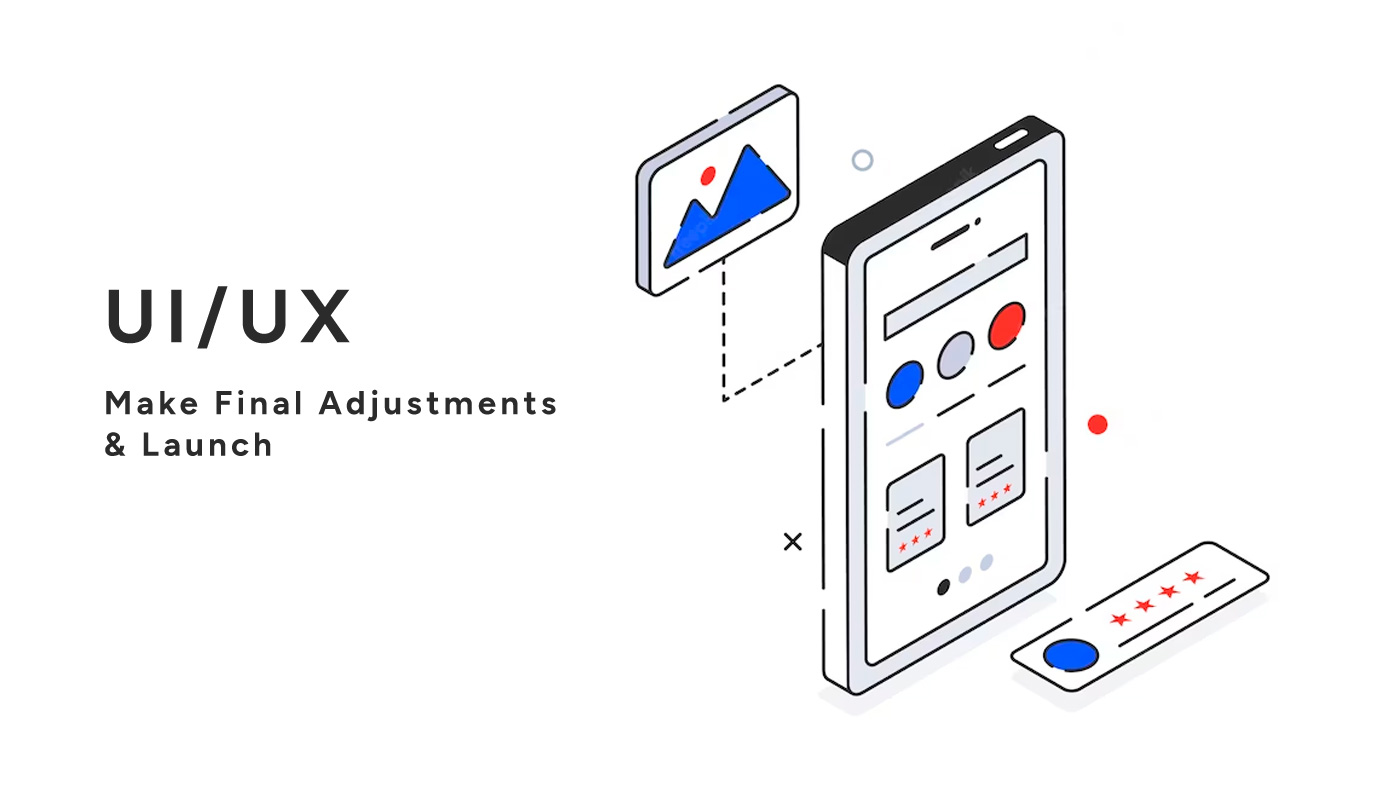
Make Final Adjustments & Launch
Finally, after investing long hours of hard work and effort into crafting a unique user experience, it is time to make the final adjustments and launch your design. It is important to take in feedback received during testing and see how you can incorporate improvements made. When gathering feedback be sure to ask open-ended questions and record everything accurately so that you can refer back to it later. Additionally, involving the design process allows you to gain a better understanding of their needs and expectations. This will ensure that you are creating something that will meet their requirements. After all the changes are made, launch the design and be ready to receive continued feedback from users while they test out your product. Building the best possible user interface that meets the desires of users takes great amounts of creative energy – launching it will require just as much enthusiasm! Celebrate all the hard work put in to create a successful product.
Conclusion
In conclusion, design is a crucial part of creating digital products, and it requires a deep understanding of not just aesthetics but also user behaviour. To bring your designs to life, you must start by having an in-depth understanding of goals and requirements. Then research what’s worked in the past and make notes to inform your own design direction. Outline the essential components required for the digital product before constructing a visual prototype to showcase its look and feel. QA testing is also important, as this allows the designers to identify any issues before the product is released into the public domain. With QA testing, bugs, and other problems can be identified and fixed quickly – making sure that the end-user experience is as smooth as possible. Lastly, analytics should be incorporated, so designers can track how users interact with the product. This data can then be used to inform any necessary changes and make sure the product is running as efficiently as possible. Based on that data, QA testing should also be conducted regularly, to ensure that no bugs or other problems are present in the product before or after its launch.Then, after making any necessary adjustments, it’s time to launch! With this process laid out from start to finish, designers will have a solid foundation on which to build great digital products that fulfil all the goals and requirements desired.