Did you know that the colors used in an app’s UI/UX design can have a psychological impact on users? Believe it or not, Instagram’s color scheme has been carefully chosen to elicit certain emotional reactions from its users; these feelings and thoughts could inspire more likes, shares, followers, and even purchases. In this blog post, we’ll explore how the shades of blue chosen by Instagram are influencing their user behavior as well as some other Insta-worthy tips for designing effective color psychology into your own app. So if you’re curious about why certain hues can be so powerful – stay tuned!
Color Psychology – How it Affects Our Behavior and Emotions
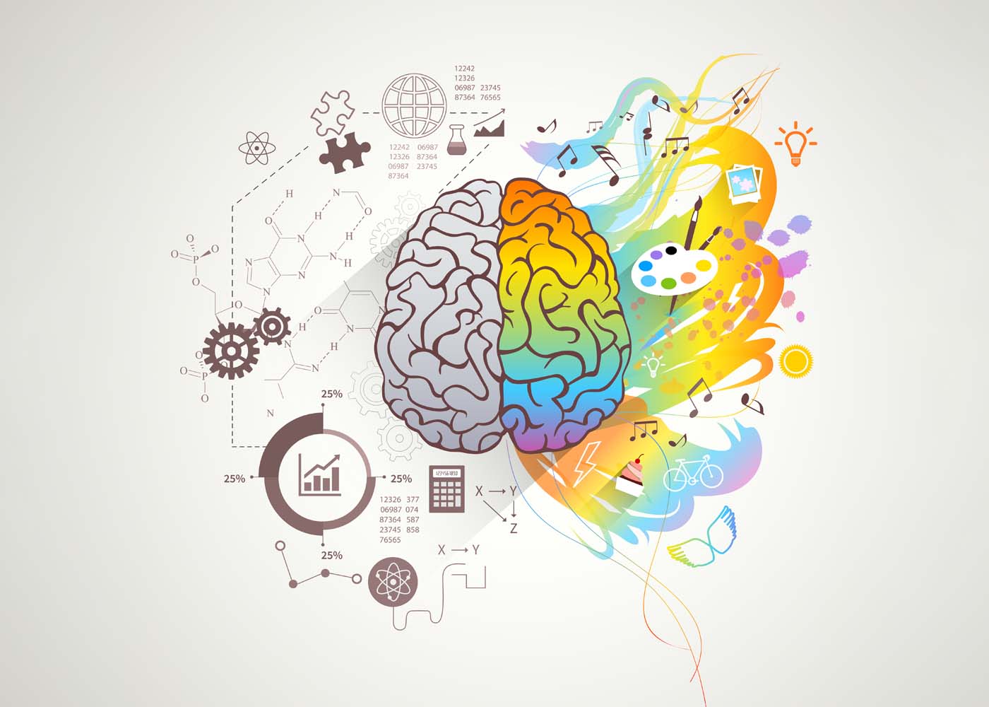
Have you ever noticed how certain colors make you feel a certain way? For instance, red might make you feel passionate or energized while blue might make you feel calm or relaxed. This is the basis of color psychology, which explores how colors can affect our behavior, emotions, and even our physical sensations. Different colors can evoke different moods, feelings, and associations, depending on cultural and personal experiences. Understanding color psychology can be helpful in various fields such as marketing, design, and even personal development. By harnessing the power of color, we can better communicate our messages, improve our environments, and enhance our well-being.
App Design and Its Impact on User Experience
App design choices have a powerful impact on user experience, making an app easy or frustrating to navigate. Once an understanding of how app users interact with the design elements is gained, app designers can make informed decisions to create user-centered experiences. This can involve evaluating different color schemes, layouts, and navigation options to find the most effective combination. By conducting extensive research and testing, app creators can deliver tailored experiences that users find both intuitive and pleasurable. Ultimately, the design choices made by app developers can make all the difference in whether an app is downloaded and used or abandoned quickly.
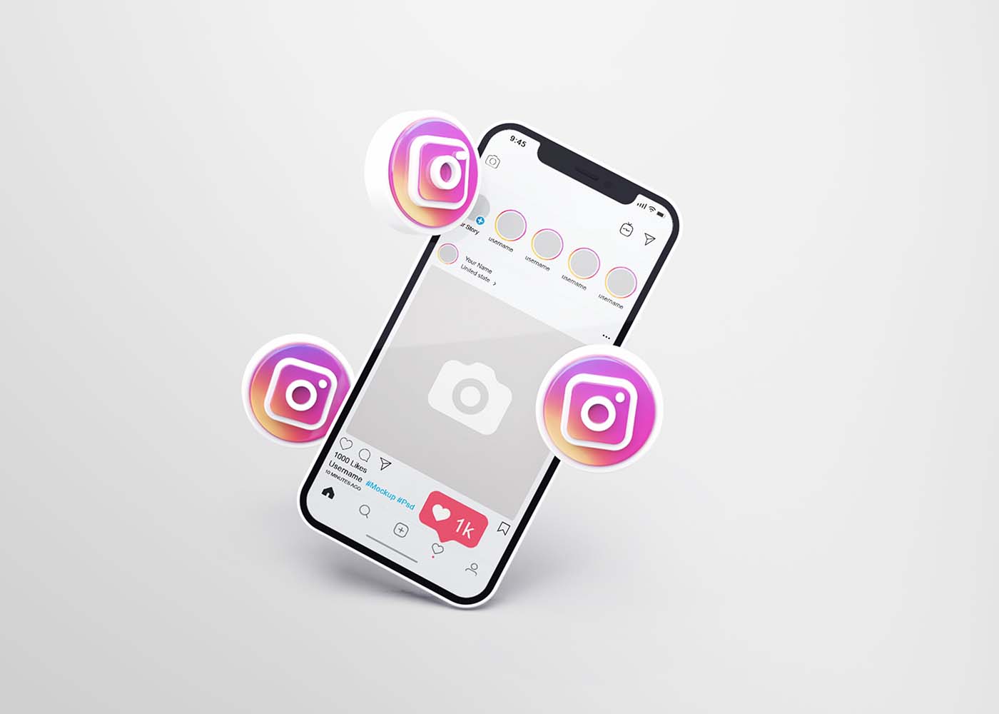
The Overview of the Instagram App Design
Instagram has become one of the most popular social media platforms, with millions of active users. The design of the app is simple and intuitive, making it easy for people to use and navigate. When you first open the app, you’ll be greeted with the Instagram feed, which displays photos and videos from people you follow. From there, you can search for content, follow other users, and engage with posts by liking and commenting. Additionally, Instagram’s various filters and editing tools make it easy to enhance and customize your photos before sharing them with your followers. By understanding the basics of Instagram app design, you’ll be able to make the most out of your experience on the platform.
The Different Colors Used by Instagram
Instagram is more than just a platform for posting pictures. It’s a visual medium that allows people to express their personalities and emotions with a simple click of a button. One of the ways that Instagram does this is through its use of colors. Each color has a specific meaning that can convey a range of emotions and associations. For example, red is often associated with passion and excitement, while blue is seen as calming and peaceful. By using these colors in various ways throughout the app, Instagram cultivates a unique and memorable experience for its users. Whether you’re scrolling through your feed or creating your own content, the colors used by Instagram can say a lot about your personality and the message you want to convey.
Effect of Instagram’s App Design on User Behavior
Instagram has gained immense popularity among users since its conception, and it’s not just because of its user-friendly nature. Instagram’s app design plays a significant role in driving users to engage actively on the platform. The app’s vibrant visuals, ease of use, and intuitive navigation make it appealing to a broad audience. With features like the explore tab, stories, and reels, Instagram incentivizes users to share content frequently and interact with others on the platform. Additionally, Instagram’s design positively impacts user behavior by fostering a sense of community and encouraging users to build connections with others. Overall, Instagram’s thoughtful app design has contributed significantly to its success and is likely to continue driving user behavior and engagement well into the future.
Psychological Impact of Instagram’s Iconography and Typography
Social media platforms like Instagram have become a ubiquitous part of our daily lives, influencing the way we perceive and interact with the world around us. But have you ever stopped to consider the impact of Instagram’s iconography and typography on our psychology? A growing body of research is exploring how the platform’s visual cues affect our emotional responses, cognitive processes, and even our sense of identity and self-worth. From the iconic camera logo to the app’s sleek sans-serif font, every design element has the potential to shape our behaviors and beliefs in subtle and profound ways. Research suggests that visuals are processed 60,000 times faster than text, so it’s no surprise that Instagram has become a place to share visual stories. It’s important to consider how the platform’s design elements can best serve your content and create a more compelling experience for users. From colors and fonts to icons and filters, there are countless ways to connect with viewers on an emotional level.For example, the right color palette can be used to convey a certain mood or emotion. Additionally, certain fonts have been proven to be more effective at conveying different messages. By using the right combination of design elements, you can ensure that your content is not only visually appealing but also informative and engaging for users.
Consequences of Instagram’s algorithm – Fear of Missing Out (FOMO)
With the Instagram algorithm changing frequently, something that most users fear is the possibility of missing out on something important. This fear of missing out, or FOMO, is a common psychological phenomenon that stems from our innate desire to feel connected and included. The algorithm is designed to show users the most engaging posts first, leaving other content that may be just as important, yet less engaging, unnoticed. This creates a sense of insecurity and worries about social acceptance, especially for those who rely on Instagram for professional or personal reasons. The consequences of Instagram algorithms are real, and they can lead users to experience anxiety, uncertainty, and a heightened sense of competition.
Conclusion
Colors, design, iconography, typography, and algorithms all play a major role in influencing the emotional experience of a user on Instagram. It’s important to be aware of how these variables are being used to manipulate behavior and possibly create feelings of FOMO. Furthermore, understanding the basics of color psychology can also help designers make better decisions when constructing their own app designs. As we can see, intricate details like these can significantly impact how people interact with digital platforms. If harnessed correctly, they could no doubt lead users to a much more enjoyable experience and produce greater engagement overall. We should continue to explore the nuances behind designing effective apps in order to ensure that both companies and users benefit from the technology we rely on every single day.
Color is powerful. It can cause emotions, propel memories and even influence our shopping decisions. In today’s highly competitive marketplace, understanding the science behind how colors impact how consumers interact with your brand is essential for businesses to stay ahead of their competitors. This blog post closely examines color psychology to explore why certain hues evoke specific reactions in humans at an unconscious level and what this means for companies seeking to maximize trustworthiness and brand loyalty among customers. We’ll discuss the research around color selection, provide marketing strategies that leverage these findings and offer helpful tips on choosing a cohesive palette that resonates with an intended audience for maximum success.
Why Color Matters for Businesses?
Color plays a crucial role in branding as it influences people’s emotions and perceptions of a brand. The right color choice can evoke a range of emotions, from trust and reliability to excitement and passion. For businesses, understanding color psychology can be the key to creating a strong, recognizable brand that stands out from the competition. By selecting colors that align with their brand values and messaging, companies can create a visual identity that resonates with their target audience. In today’s competitive marketplace, where brands are vying for attention, the power of color in branding cannot be overlooked. It is an essential tool in building brand recognition, creating an emotional connection with consumers, and ultimately driving business success.
Emotional Meaning Behind Hues
Colors are more than just visual stimuli. They are ingrained into our thoughts and emotions and evoke certain psychological and emotional responses. Every hue has its own psychological and emotional meaning. For example, red is often associated with passion, energy, and intensity, while yellow is associated with optimism, happiness, and warmth. Blue is often viewed as calming, trustworthy, and serene, while green evokes feelings of growth, balance, and harmony. Knowing the psychological and emotional meaning behind different color hues can be a powerful tool in creating meaningful and impactful visuals, designs, and art.
The Science Behind Color Selection
Color selection is a complex science that has far-reaching impacts on our daily lives. Multiple color theories exist, each with its own set of rules and principles governing color combinations. From complementary colors to monochromatic schemes, each theory has its place in design and art. However, the selection of colors extends beyond aesthetics; it is an emotional experience that can stir up feelings of excitement, warmth, or calmness. Colors can influence everything from our mood to our purchase decisions, making it an essential aspect of brand marketing. By understanding the science behind color selection, we can create impactful, visually appealing designs that resonate with our target audience.
Scientific Breakdowns
Color plays a significant role in branding, and scientific research confirms this fact. According to various studies, color makes up about 85% of the primary reasons that people buy particular products. Furthermore, researchers have found that using the right colors can increase brand recognition by about 80%. The scientific explanation lies in the way color affects our emotions, which, in turn, influences buying behavior. Different colors convey different emotional messages, and thus, choosing the right color can impact your brand’s ability to connect with customers. To increase your brand’s chances of success, it’s essential to consider the psychological effects of color selection.
Breaking Down the Color Wheel
The colors a brand uses can speak volumes about its values and personality. While many may associate colors like red with power and passion or green with nature and growth, the way these hues are displayed and combined on a brand’s logo or website can have a substantial impact on consumers’ perceptions of its trustworthiness. Breaking down the color wheel can help us understand why certain brands evoke a sense of reliability or approachability, while others may seem cold or untrustworthy. By digging into the psychology behind color, we can gain a greater grasp of how brands can use this powerful tool to build lasting connections with their audiences.
a) Red, Orange, and Yellow
The colors red, orange, and yellow can hold significant meaning in branding. Red is a color of passion and intensity, creating a sense of urgency and excitement. Orange is associated with energy, warmth, and friendliness, making it the perfect color to convey a welcoming feeling. Lastly, yellow represents positivity, happiness, and cheerfulness. One may use this bright color to showcase their brand as uplifting and optimistic. All three colors work together to create a dynamic and engaging brand personality.
b) Green, Blue, and Purple
The green color represents growth, nature, and health. It’s frequently used in brands related to eco-friendliness, financial institutions, and health products. Blue symbolizes trust, reliability, and professionalism; that’s why it’s commonly used in the corporate world, healthcare, and banking sectors. Finally, purple represents luxury, royalty, and creativity, and is often used in the beauty and fashion industry.
c) White and Black
The combination of white and black is a timeless and powerful statement that can transform any space. These contrasting colors symbolize purity and sophistication while balancing each other out. The white and black color palate provides a sense of clarity and simplicity without sacrificing elegance. It’s a sleek and striking contrast that can be incorporated in any design whether it’s fashion, home decor, or even a work of art. The black and white color scheme can create a dramatic and bold effect that demands attention. It’s a classic and chic choice that will never go out of style.
Examples of Marketing Campaigns That Have Successfully Used Color to Increase Brand Loyalty
From the bright red of Coca-Cola to the bold blue of IBM, colors can help a brand stand out and create an emotional connection with consumers. One example of this is the use of the color green by Starbucks. By associating their brand with the color of nature, growth, and sustainability, Starbucks has successfully positioned themselves as a socially responsible company that cares about the environment. As a result, customers who prioritize these values are more likely to develop a strong attachment to the brand, which can translate into increased loyalty and sales.
How Can Companies Use Colors to Create Memorable Customer Experience
Colors play a significant role in creating a memorable customer experience for businesses. Strategic use of colors can evoke emotions, influence behavior, and boost brand recognition. Companies often use specific colors in their branding to enhance their visual identity and improve brand recognition. For example, the blue and yellow colors of IKEA are recognized worldwide, reflecting reliability and affordability. Also, using contrasting colors for calls-to-action buttons attracts attention and encourages customers to act. Furthermore, different colors can convey different emotions and by understanding the psychological impact of colors, businesses can use them to write a compelling brand story and create a memorable customer experience.
Conclusion
In conclusion, companies need to be aware of the psychology and science behind color selection when building a brand identity. Through the use of colors that evoke emotion and create contrast, companies can enhance their customer experience, increase brand trust, and build customer loyalty. The various hues of color across the color wheel—Red, Orange, Yellow, Green, Blue, and Purple as well as leading shades such as White and Black—each bring something unique to a brand identity. According to scientific research, two-thirds of customers make their purchasing decisions based on color alone. Therefore, businesses need to take into consideration everything we have discussed in this blog post when creating motivating marketing campaigns that will appeal to consumers while also increasing trust in their brand.