Color is powerful. It can cause emotions, propel memories and even influence our shopping decisions. In today’s highly competitive marketplace, understanding the science behind how colors impact how consumers interact with your brand is essential for businesses to stay ahead of their competitors. This blog post closely examines color psychology to explore why certain hues evoke specific reactions in humans at an unconscious level and what this means for companies seeking to maximize trustworthiness and brand loyalty among customers. We’ll discuss the research around color selection, provide marketing strategies that leverage these findings and offer helpful tips on choosing a cohesive palette that resonates with an intended audience for maximum success.
Why Color Matters for Businesses?
Color plays a crucial role in branding as it influences people’s emotions and perceptions of a brand. The right color choice can evoke a range of emotions, from trust and reliability to excitement and passion. For businesses, understanding color psychology can be the key to creating a strong, recognizable brand that stands out from the competition. By selecting colors that align with their brand values and messaging, companies can create a visual identity that resonates with their target audience. In today’s competitive marketplace, where brands are vying for attention, the power of color in branding cannot be overlooked. It is an essential tool in building brand recognition, creating an emotional connection with consumers, and ultimately driving business success.
Emotional Meaning Behind Hues
Colors are more than just visual stimuli. They are ingrained into our thoughts and emotions and evoke certain psychological and emotional responses. Every hue has its own psychological and emotional meaning. For example, red is often associated with passion, energy, and intensity, while yellow is associated with optimism, happiness, and warmth. Blue is often viewed as calming, trustworthy, and serene, while green evokes feelings of growth, balance, and harmony. Knowing the psychological and emotional meaning behind different color hues can be a powerful tool in creating meaningful and impactful visuals, designs, and art.
The Science Behind Color Selection
Color selection is a complex science that has far-reaching impacts on our daily lives. Multiple color theories exist, each with its own set of rules and principles governing color combinations. From complementary colors to monochromatic schemes, each theory has its place in design and art. However, the selection of colors extends beyond aesthetics; it is an emotional experience that can stir up feelings of excitement, warmth, or calmness. Colors can influence everything from our mood to our purchase decisions, making it an essential aspect of brand marketing. By understanding the science behind color selection, we can create impactful, visually appealing designs that resonate with our target audience.
Scientific Breakdowns
Color plays a significant role in branding, and scientific research confirms this fact. According to various studies, color makes up about 85% of the primary reasons that people buy particular products. Furthermore, researchers have found that using the right colors can increase brand recognition by about 80%. The scientific explanation lies in the way color affects our emotions, which, in turn, influences buying behavior. Different colors convey different emotional messages, and thus, choosing the right color can impact your brand’s ability to connect with customers. To increase your brand’s chances of success, it’s essential to consider the psychological effects of color selection.
Breaking Down the Color Wheel
The colors a brand uses can speak volumes about its values and personality. While many may associate colors like red with power and passion or green with nature and growth, the way these hues are displayed and combined on a brand’s logo or website can have a substantial impact on consumers’ perceptions of its trustworthiness. Breaking down the color wheel can help us understand why certain brands evoke a sense of reliability or approachability, while others may seem cold or untrustworthy. By digging into the psychology behind color, we can gain a greater grasp of how brands can use this powerful tool to build lasting connections with their audiences.
a) Red, Orange, and Yellow
The colors red, orange, and yellow can hold significant meaning in branding. Red is a color of passion and intensity, creating a sense of urgency and excitement. Orange is associated with energy, warmth, and friendliness, making it the perfect color to convey a welcoming feeling. Lastly, yellow represents positivity, happiness, and cheerfulness. One may use this bright color to showcase their brand as uplifting and optimistic. All three colors work together to create a dynamic and engaging brand personality.
b) Green, Blue, and Purple
The green color represents growth, nature, and health. It’s frequently used in brands related to eco-friendliness, financial institutions, and health products. Blue symbolizes trust, reliability, and professionalism; that’s why it’s commonly used in the corporate world, healthcare, and banking sectors. Finally, purple represents luxury, royalty, and creativity, and is often used in the beauty and fashion industry.
c) White and Black
The combination of white and black is a timeless and powerful statement that can transform any space. These contrasting colors symbolize purity and sophistication while balancing each other out. The white and black color palate provides a sense of clarity and simplicity without sacrificing elegance. It’s a sleek and striking contrast that can be incorporated in any design whether it’s fashion, home decor, or even a work of art. The black and white color scheme can create a dramatic and bold effect that demands attention. It’s a classic and chic choice that will never go out of style.
Examples of Marketing Campaigns That Have Successfully Used Color to Increase Brand Loyalty
From the bright red of Coca-Cola to the bold blue of IBM, colors can help a brand stand out and create an emotional connection with consumers. One example of this is the use of the color green by Starbucks. By associating their brand with the color of nature, growth, and sustainability, Starbucks has successfully positioned themselves as a socially responsible company that cares about the environment. As a result, customers who prioritize these values are more likely to develop a strong attachment to the brand, which can translate into increased loyalty and sales.
How Can Companies Use Colors to Create Memorable Customer Experience
Colors play a significant role in creating a memorable customer experience for businesses. Strategic use of colors can evoke emotions, influence behavior, and boost brand recognition. Companies often use specific colors in their branding to enhance their visual identity and improve brand recognition. For example, the blue and yellow colors of IKEA are recognized worldwide, reflecting reliability and affordability. Also, using contrasting colors for calls-to-action buttons attracts attention and encourages customers to act. Furthermore, different colors can convey different emotions and by understanding the psychological impact of colors, businesses can use them to write a compelling brand story and create a memorable customer experience.
Conclusion
In conclusion, companies need to be aware of the psychology and science behind color selection when building a brand identity. Through the use of colors that evoke emotion and create contrast, companies can enhance their customer experience, increase brand trust, and build customer loyalty. The various hues of color across the color wheel—Red, Orange, Yellow, Green, Blue, and Purple as well as leading shades such as White and Black—each bring something unique to a brand identity. According to scientific research, two-thirds of customers make their purchasing decisions based on color alone. Therefore, businesses need to take into consideration everything we have discussed in this blog post when creating motivating marketing campaigns that will appeal to consumers while also increasing trust in their brand.
Are you struggling to create a user-friendly interface for your website or application? UI design can be a complex process, but it is essential for creating a positive user experience. In this guide, we will take you through the principles of UI design, the UI design process, best practices, and current trends. By the end of this guide, you will have a solid understanding of UI design and how to simplify and streamline your interface design.
Introduction to UI Design
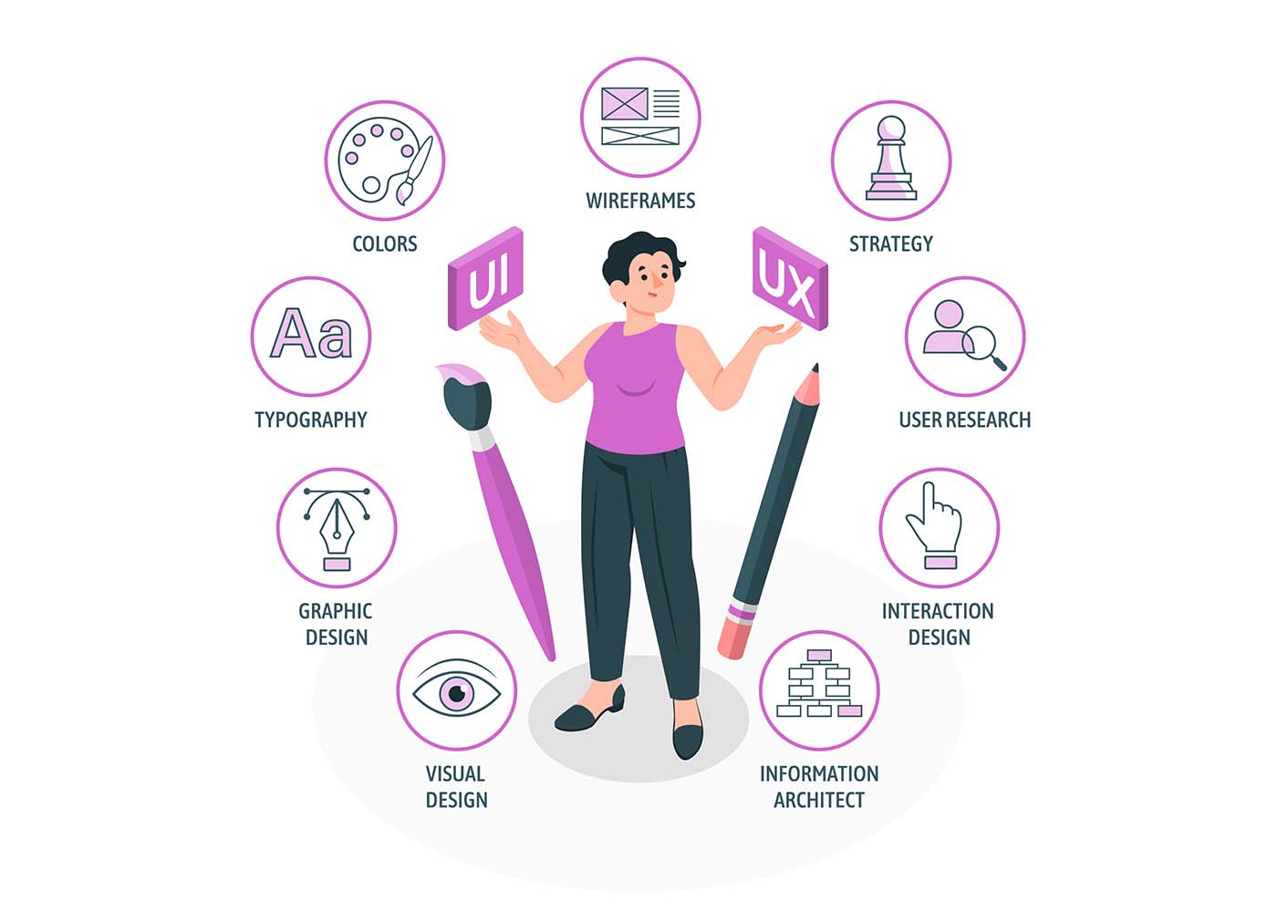
UI design, or user interface design, is the process of designing the visual and interactive elements of a website or application. UI design is not only about making something look good; it is also about creating a positive user experience. The primary goal of UI design is to make it easy for users to accomplish their goals and complete tasks without any confusion or frustration.A well-designed user interface can improve user engagement, reduce bounce rates, and increase customer satisfaction. UI design is also essential for branding and creating a cohesive user experience across all platforms.
The Importance of UI Design for User Experience
UI design is critical for creating a positive user experience. A well-designed interface can make it easy for users to navigate your website or application, find what they need, and complete tasks quickly. On the other hand, a poorly designed interface can lead to confusion, frustration, and even abandonment.The design elements of UI, such as color, typography, and layout, can also affect the emotional response of users. A well-designed interface can evoke positive emotions and create a strong connection between the user and the product or service.
Principles of UI Design
To create an effective UI design, it is essential to follow some basic principles. These principles include:
Consistency
Consistency is key in UI design. A consistent interface makes it easy for users to navigate and understand how to interact with the product. Consistency should be maintained across all pages and platforms.
Simplicity
A simple interface is easier to use and understand. Users should be able to complete tasks quickly and without any confusion. Avoid clutter and unnecessary elements.
Clarity
The interface should be clear and easy to understand. Use clear language and visual cues to guide users through the product.
Feedback
Provide feedback to users when they perform actions. This feedback can be visual or audible, but it should be clear and timely.
Accessibility
The interface should be accessible to all users, including those with disabilities. This includes designing for screen readers, color blindness, and other accessibility needs.
UI Design Process
The UI design process involves several stages, including user research, wireframing and prototyping, and testing. Let’s take a closer look at each stage.
User Research and Analysis
User research and analysis involve gathering data about the target audience, their needs, and their behavior. This data can be collected through surveys, interviews, and user testing. The goal is to create a user-centered design that meets the needs of the target audience.
Wireframing and Prototyping
Wireframing and prototyping involve creating a visual representation of the interface. A wireframe is a basic layout of the interface, while a prototype is a working model of the interface. These tools allow designers to test and refine the interface before moving on to the final design.
Color Theory and Typography in UI Design
Color theory is the study of how colors can affect people’s emotional response to a particular design. Color choices can influence a user’s mood, perception, and overall experience with a product. Therefore, designers should carefully choose colors that are appropriate for the product’s purpose and target audience. For instance, using bright, cheerful colors for a children’s game app may be more appropriate than using dark and muted tones.Typography, on the other hand, refers to the style, size, and arrangement of text on a page or screen. A good typography design can significantly impact the readability and accessibility of a product. The text should be legible, easy to read, and visually appealing. Typography should also complement the color scheme and overall design of the product.
UI Design Tools and Software
There are many UI design tools and software available, including Sketch, Adobe XD, and Figma. These tools allow designers to create and test interfaces quickly and efficiently. It is essential to choose the right tool for the job and become proficient in its use.
Best Practices for UI Design
To create an effective UI design, it is essential to follow some best practices. These practices include:
Keep it Simple
A simple UI design ensures that users can navigate through the product effortlessly without getting lost or overwhelmed.To achieve simplicity in UI design, it is essential to avoid clutter and unnecessary elements that can confuse users. A cluttered design can be overwhelming and confusing, leading to frustration and a poor user experience. Designers should focus on the product’s core functionalities and prioritize the most critical elements. A clear and straightforward design ensures that users can understand the product’s purpose, features, and benefits without any confusion or distraction.Simplicity also means reducing the number of clicks and steps required to complete a task or access a feature. The more straightforward and intuitive the design, the more likely users are to engage with the product and achieve their goals.
Use Clear Language & Visual Cues
Clear instructions are necessary to help users understand how to use the product and achieve their goals. Instructions should be concise and to the point, avoiding any confusing language or technical jargon. Visual cues, such as icons and images, can also be useful in guiding users through the product. They provide an easy-to-understand reference point that users can quickly recognize and associate with specific actions.UI UX designers can use various techniques to provide clear instructions and visual cues in the product’s design. For example, they can use tooltips or pop-ups to provide additional information about specific features or actions. They can also use animation and transitions to indicate changes in the product’s state or highlight important information.
Make it Accessible
With millions of people living with various disabilities worldwide, creating digital products that are accessible to all is not only a legal requirement but also a moral obligation. As such, UI designers need to design products with accessibility in mind, including screen readers and color blindness.Screen readers are assistive technologies that convert text into speech or Braille for people with visual impairments. UI designers need to ensure that their designs are compatible with screen readers by providing alternative text for images, headings, and other content elements. They should also avoid using images as the only means of conveying information and provide text-based alternatives where necessary.Color blindness, which affects around 8% of men and 0.5% of women worldwide, is another accessibility consideration in UI design. Designers should ensure that the product’s color palette is accessible to users with color blindness, which can be achieved by using contrasting colors, adding patterns or textures, or using symbols to supplement color coding.
Test and Refine
UI design is an iterative process, and testing and refining the user interface is a crucial part of that process. User testing and feedback provide valuable insights into how users interact with the product, what works well, and what needs improvement. This feedback can be used to make informed design decisions and create a better user experience.User testing can take many forms, from usability testing to focus groups and surveys. Usability testing involves observing users as they interact with the product and gathering feedback on their experience. Focus groups and surveys can provide broader feedback on user preferences and opinions.
UI Design Trends and Innovations
UI design is constantly evolving, and it is essential to stay up-to-date with current trends and innovations. Some current trends include:
Dark mode
Dark mode is a popular trend that can reduce eye strain and improve battery life.
Minimalism
Minimalism is a trend that focuses on simplicity and minimal design elements.
Voice interfaces
Voice interfaces are becoming more popular and can provide a hands-free user experience.
Importance of UI Design in Mobile App Development
UI design is especially critical in mobile app development. Mobile interfaces are smaller and require a more streamlined design. A well-designed mobile interface can improve user engagement and retention.
Conclusion
UI design is an essential component of creating a positive user experience. By following the principles of UI design, the UI design process, and best practices, you can create a streamlined and user-friendly interface. It is also essential to stay up-to-date with current trends and innovations to create a modern and engaging interface. Remember, the goal of UI design is to make it easy for users to accomplish their goals and complete tasks without any confusion or frustration.