“Hey, guess what? I just came across a free logo generator website where I designed logo for my clothing brand for free!!! Isn’t that so cool? I’m so glad I didn’t spend $50 for a logo design on Fiverr. Money saved! ” – Jeremiah from Reddit.
We live in the era of instant gratification and our choices are dictated by swiping left or right. it’s only natural that emerging brands lookout for an easy way out when it comes to their branding needs. In the quest for logo designs, people sometimes end up using free online logo generators to either save their time or some bucks. While the thought of online logo makers may seem enticing as it gives you an instant logo, it’s not that good. Your brand’s image needs to be as unique and special as your brand and not some randomly generated elements you think of as logos. To give you a detailed insight into why you shouldn’t be using free logo generators, we’ve compiled this comprehensive blog where we’ve highlighted the concealed drawbacks that come with these seemingly convenient tools.
Nothing in This World Comes For Free
The word “Free” has a magnetic appeal and works like a magic word in our heads. Usually, startups and small businesses have financial constraints and a free logo generator may sound like a blessing. However, when it comes to logo generators, “free” often translates to a compromise on quality, uniqueness, and originality.
How Do Free Logos Compromise Brand Identity
Lack of Originality
Originality and distinction are two of the main objective of a logo. You don’t want your logo to look identical to any random logo you find on Google. Your logo should showcase your distinct identity, but free logo generators lack the ability to generate unique elements and grasp your brand’s soul. They churn out logos based on algorithms and therefore lack the understanding of your brand’s essence. Since these free logo makers work on algorithms, they offer a limited set of templates that leads to similar logos across different brands and business categories. Your logo is your brand’s fingerprint, an emblem of individuality. It should stand out, not blend in! Free generators fail to capture this art of uniqueness that professional designers excel at.
The Versatility Myth
Free generators offer minimal customization options which leaves you with a logo that doesn’t quite resonate with your brand’s personality. And when it comes to branding, it isn’t just about your logo; it’s an orchestra of colors, typography, and imagery. Free generators lack the harmony needed for consistent and impactful branding which leads to mismatched branding elements.
The Drawbacks of DIY Design
To a layman, a logo might initially appear as a collection of abstract shapes and colors. However, the process of designing a creative logo goes beyond the combination of these elements. Design principles and psychology come into play! Free generators overlook these crucial aspects. How can you fix it? By working with a skilled designer you can make sure that your logo embodies the essence of your brand’s identity.Consider this analogy: Would you entrust an AI to shoes a dress for you or organize your wardrobe? Just as your fashion sense is unique to you, a designer understands the intricacies and aesthetics that align with your brand. They have the expertise to craft a logo that stands as a captivating identity, capturing the essence of your brand and leaving a lasting impression on your audience.
The Hidden Costs
Have you ever considered that the logo you’re contemplating, which is supposedly “free,” may not actually be entirely yours? It’s quite unsettling to know that certain logo generators sneakily retain rights or even reuse certain elements. This seemingly harmless act could potentially result in unforeseen legal complications down the road.Moreover, as your business continues to evolve and expand, it may eventually outgrow the limitations of your free logo. At that point, the cost of rebranding could take a toll on your pocket. The initial savings that you did by getting a free logo might then appear insignificant in comparison. Therefore, it’s important to carefully consider these factors before making a decision.
Role of Psychology: The Trust Factor
Logo design is so much more than just creating a symbol to represent a brand. It involves a deep understanding of psychology and marketing. Different colors, shapes, fonts, and styles can evoke different emotions and perceptions in consumers. And these design elements differ from brand to brand. For example, a vibrant logo might represent a brand that’s fun and exciting, while a sleek and modern logo might evoke a sense of sophistication. By delving into the psychological intricacies of logo design, you can create a brand identity that touches your audience on an emotional level.
The DIY Logo vs. Professional Design
Your logo is more than just an expense; it’s a valuable investment with long-lasting benefits. A well-crafted logo created by a professional not only boosts brand recognition but also fosters customer loyalty and enhances perceived value. As your brand evolves and adapts to changes in the market, a thoughtfully designed logo grows with it, capturing the essence of your brand and resonating with your target audience. So, think long-term and make the wise choice of investing in a logo that stands the test of time.
What Can You Do?
When it comes to affordability, it’s important not to automatically assume it means compromising on quality. In fact, there are many talented designers out there who offer cost-effective solutions tailored to your brand’s specific needs. These designers possess the unique ability to transform your vision into visual poetry, truly understanding your brand’s essence and skillfully crafting a logo that tells your story. They have the remarkable talent to capture the vision behind your brand – its values, culture, and mission – and translate them into a captivating logo that effectively conveys your message.
Conclusion
While the idea of utilizing a free online logo generator may seem appealing at first, it’s important to be aware of the hidden pitfalls that can potentially tarnish your brand’s image and limit its potential. Your logo isn’t merely a visual representation; it serves as the embodiment of your narrative, essence, and connection to your audience. By investing in professional logo design services, you are making a wise investment in the long-lasting success and impactful presence of your brand.
As a brand or business, having an effective logo design is essential to set you apart and make an impact on your audience. The logo design needs to be unique and recognizable enough that it distinguishes your brand from your competitors while also effectively communicating what values you stand for. Finding the right logo design style that balances these goals can be a difficult task – which is why we’re here to help! In this blog post, we’re exploring different logo design styles to help you determine which is right for your brand. From minimal logos to intricate illustrations, understanding the differences between them will give you plenty of options as you create (or update) the perfect logo for your business.
Understand the Different Types of Logo Design Styles
Logo design is an essential part of the branding and crafting a logo requires careful consideration. To achieve the desired impact, different logo design styles can be implemented. For example, a minimalist logo design typically features simple shapes and lines, often using one color or having a subtly implied three-dimensional effect. It’s perfect for companies that want to portray efficiency and sophistication in their logo identity. On the other hand, modern logo designs usually highlight current trends like bold typography and flat graphics, often accompanied by gradients or cosmic backgrounds. For brands wanting to associate themselves with innovation and immediacy, a modern logo could be the right choice. Creative logos use non-traditional elements such as animation, geometric figures, and optical illusions to signal playfulness or make an eye-catching statement. Ultimately, choosing between logo design styles should come down to understanding the purpose of the logo and building toward establishing a brand identity that resonates with its target audience.
a) Minimalist
Minimalist logo design has become a popular choice among logos in recent years; it emphasizes simplicity and minimal detail, often featuring a single, basic shape or one word. The best minimalist designs use colors and shapes to express the brand message clearly with as few elements as possible – allowing the reader to not be distracted by unnecessary details. A successful minimalist logo should also be scalable and easy to reproduce across different media platforms with minor adjustments, so the company’s brand recognition remains consistent across all channels. Understanding how to create a minimalist design for your brand is essential for making sure that your logo applies well to any situation you require it for.
b) Typography-Based
When it comes to creating memorable and distinctive logos, typography-based logo design is a great option for businesses to consider. The use of typefaces can help organizations achieve a unique visual identity that stands out from the crowd. To create a typography-based logo, graphic designers select one or two fonts to represent the business and then pair them with other design elements – such as color, shapes, and size – to create balance and contrast. With this style, the type should always remain straightforward and well-organized while still incorporating elements of creativity. By understanding the underlying principles of typographic design, companies can ensure that their logos communicate with powerful precision what their brand has to offer.
c) Abstract
The abstract logo design style is a versatile and often underappreciated method of graphic design that is perfect for young, trendy businesses and creative individuals. It involves the use of shapes, symbols, and colors to create graphical metaphors that convey a company’s story, values, or ideas without relying solely on words. This dynamic approach can create an innovative and memorable visual identity that serves to both engage customers and differentiate itself from the competition. To achieve this unique form of logo design, first consider the mission or idea behind a brand before seeking inspiration from art and design around you – this will help narrow the selection when choosing elements like fonts, shapes, or colors. With time and dedication, it’s possible to craft an abstract logo design whose beauty speaks for itself!
d) Symbol/Icon Based
Icon or symbol-based logo design styles are a great way to create an eye-catching brand image. This style is especially popular in the tech industry, as it allows brands to stand out and be uniquely associated with a specific icon. Icon designs can incorporate abstract shapes, characters, animals, simple illustrations, gradients, and even shapes of letters. One of the benefits of this style of logo is that it can communicate an idea or meaning in just one glance. Furthermore, since these icons do not contain words, they can be easily recognized across multiple languages – making them ideal for global brands. When designing an icon-based logo, it’s important to choose an image that fits the brand’s personality while remaining unique and timeless.
Identify Your Brand’s Personality and Target Audience
Identifying your brand’s personality and target audience is an essential step in custom logo design. Whether you are working with a professional designer or creating a logo on your own, understanding how to communicate the values of your business is key for any successful logo. To discover your brand’s personality and target audience, consider factors such as defining the purpose of your brand and researching current trends to create an engaging custom design that will appeal to the appropriate audience. With some trial and error, you can find a custom logo design that fully reflects the core values of your brand.
Research Popular Logos in Your Industry for Inspiration
When preparing to create or update a logo for your brand, it is beneficial to do your research. Take some time to explore popular logos in your industry that you find particularly impactful and inspirational. Pay attention to their color schemes and how they come across visually – notice the differences between sleek, modern logos versus classic ones. As you review the logos, think of how both the core elements and surrounding details can lead to a successful design. Consider how the chosen logo will look on printed and digital materials, as well as what message it conveys about the brand. This research can help you capture an essence that resonates with your target audience and informs future branding decisions.
Brainstorm Ideas for Your Logo Design
Brainstorming ideas for a logo design is an exciting challenge. It helps to narrow down the process by asking yourself key questions about your business goals and values. First, consider the unique elements of your business that need to be showcased in a logo. This can include colors, shapes, fonts, or even symbols. Next, decide if there are any words or phrases that should be represented visually – ones that people would use to refer to or easily recognize your brand. Finally, think of how the overall look and feel of the logo can match these elements while also representing you and your business in a creative way. Through careful exploration of all aspects of your business, you will soon find yourself with great ideas for a logo design that defines its own story and stands out from others.
Choose Colors That Represent Your Brand
When choosing colors to represent your brand, consider how you want to make people feel. Think of adjectives that best describe your business and try to find colors that embody those qualities. For example, if you are targeting a professional, high-end market then lean towards classic colors such as blues, blacks, and whites; whereas for something modern and creative the sky’s the limit in terms of more daring color combinations. Also, think about contrast – light colors against dark or vice versa – as this can create a visually interesting effect. But always simplify; more than likely one or two striking colors will represent your brand better than an amalgamation of many of them. Do not forget that color is an integral part of any brand identity, so choose wisely and it will pay in the future.
Create a Rough Draft and Get Feedback from Others
When it comes to designing a logo for your business, creating a rough draft and getting feedback from others can be beneficial. This initial draft can help you to brainstorm ideas and ensure any creative inspiration remains intact. Once the draft has been created, it’s important to solicit feedback from colleagues and customers, as they may have valuable insight into what works best visually and conceptually. Doing this early on in the design process can help you to prevent costly mistakes such as overlooking minor details that may have a profound effect overall on the success of the logo. Remember, taking the time and effort to get input on your draft will ultimately help you create the perfect logo for your business.What Logo Design Style is Right for Your Brand?
Conclusion
In conclusion, designing an effective logo requires research and brainstorming. After understanding the different types of logo design styles, assess your brand’s personality and identify your target audience. Go further to research popular logos in your industry for inspiration when creating a logo for yourself. Brainstorm ideas and choose preferred colors that represent your brand – it’s important to consider the feelings associated with certain colors when making this decision. Lastly, once you have a rough draft, don’t forget to get feedback from others who can provide helpful insights. Designing a logo may seem daunting at first, but as long as you steadily progress through each step keeping key tips in mind along the way, you’ll be sure to see success in the end.
Logo design is one of the most critical elements in marketing and a crucial part of a brand’s public perception. However, logo designers often fail to consider an aspect that is just as important – contextualization. In essence, contextualization refers to creating designs within the frame of the social and cultural understanding of your audience; taking into account things such as language, and colors associated with different sentiments across cultures, etc. Logo design without context can fail to achieve optimal results, leaving brands at risk of being misunderstood or misinterpreted by their target audience. So the importance of incorporating elements related to the logo’s context cannot be understated when constructing a corporate identity. Let’s look further into why contextualizing logo designs should be an integral step in every logo designer’s process.
Exploring the Power of Contextualization in Logo Design
Logo design is an incredibly powerful tool for communicating a company’s identity and creating a memorable impression. Key to this effective communication is contextualization; when used correctly, it can lend impactful emphasis to brand messages. By connecting the logo directly with the appropriate audience, context facilitates a greater understanding of logos and encourages more meaningful engagement from viewers. Contextualization, therefore, allows designers to create the most compelling logos that evoke positive emotions while easily distinguishing their client’s brand in a unique manner. Achieving context-effective visual design takes skill, so it is important to combine both technical expertise with a keen eye for nuanced meaning – logos placed in the right context can truly make all the difference!
How Contextualization the Influences Your Brand’s Identity
Crafting a successful logo design is essential for establishing your brand’s identity. Contextualization is a key part of the process to ensure that when customers look at your logo, they know instantly who it belongs to and what values it stands for. Depending on what kind of logo you create, contextualization can be present in many ways; from incorporating specific colors, shapes, or fonts that are relevant to the industry’s trends and similar to their cultural and societal norms; to creating designs that resonate with customer preferences and connects them emotionally with your business. In this way, contextualizing the logo design will allow you to establish and maintain an impactful presence in consumer consciousness, furthering the success of your brand’s identity.
Benefits of Contextualizing Your Logo Design
Contextualizing your logo design is an effective strategy to convey meaning, subtly direct the message to certain audiences, and create a lasting impression. A logo’s meaning can be amplified based on its context. It is important to understand the target audience, their needs, and preferences, as well as cultural and political factors. By using context and narrative to make a clear statement, brands are able to emotionally evoke customers’ interest in the brand’s message. This approach differentiates brands from their competitors by making the brand stand out. Better marketing campaigns and customer experiences are possible when customer needs are understood through the contextualization of logos.
Analyzing the Audience to Create a Personalized Design
An effective logo design is an essential element for the development of any brand. It serves to represent both a company and its values. Therefore, having an effective logo design that resonates with the intended target audience is critical. One effective way to create a plan for a custom logo design is by contextualizing it to meaningful emotions within the target audience they are likely to encounter. Analyzing this target audience can then help uncover key insights that inform logos beyond simply representing what a product or service is. It can also evoke deeper connections through emotion, creating a deeper understanding and appreciation of a brand or company among its users. When executed successfully through thoughtful design and research, the result is often far more powerful than any generic approach could provide.
Defining the Brand Values and Characteristics
It is important to define brand values and characteristics when contextualizing a logo design. Doing so allows designers and marketers to align the look and feel of the visual identity elements with the core message one wishes to convey. By creating a clear strategy for how this will be communicated, a business can ensure that its logo is effective in conveying its desired company message appropriately. When entrepreneurs know how they want to portray their product or service in terms of aesthetics, messaging, culture, and more, it enables them to create an effective logo design that stays true to their brand values. A well-contextualized logo design is more likely to make a strong connection with potential customers as every element emphasized fits together as part of a greater whole that accurately reflects the brand identity.
Incorporating Visual Cues and Symbols that Represent Your Brand
Getting your brand’s logo right can make the difference between creating a memorable experience for your customers and missing the mark. One of the most effective ways to create engaging, recognizable logos is by including visual cues and symbols that represent the brand’s essence. These visuals don’t necessarily need to be explicit. Rather, they can provide context that not only helps attract customers but also adds depth to the overall look of the logo. For example, a symbol of a mountain range might give an outdoor retailer’s logo an adventurous feel while still conveying important information about the company. Such as what types of products they offer or where they’re based. Visual cues and symbols can be a powerful component in helping distinguish your brand from others in its field.
Maximizing Visual Impact Through Strategic Logo Placement
An effective logo placement strategy can dramatically increase the visual impact of your branding. Knowing where to place a logo takes some trial and error, but having an idea of typical placements can make your visuals more attractive. If you understand the basics of graphic design by taking into account both practical and aesthetic principles, it will ensure that your audience will be engaged by your logo. These include the header, footer, title page, menu bar, or other side areas; however for maximum visibility, it is important to think about how a logo could become an integral part of an overall design concept. It’s also important to consider sizing and color so any competing elements do not diminish the impact of your logo or brand messaging. When done well, strategic logo placement will create outstanding visuals that are remembered by customers long after they’ve interacted with your brand.
Examples of Contextualization in Famous Logos
The renowned “swoosh” logo of Nike, designed by Carolyn Davidson in 1971, is representative of the wing of the Greek goddess of victory, Nike. The logo communicates the brand’s message of speed, movement, and athletics with a touch of professionalism. Similarly, Amazon’s logo has a cool arrow that starts with the “A” and ends at the “Z.” This means that Amazon sells everything from A to Z! It was designed by Turner Duckworth back in 2000. Both of these logos are great examples of contextualizing the brand message with a recognizable design.
Conclusion
With logo design, contextualization is key. By getting to know your audience and creating an identity that resonates with them, you can maximize the impact of your logo. Contextualization doesn’t just stop at visual cues and symbols though – proper placement of your logo is essential too! For those who are careful with the tiniest details, consider the environment your logo will be in when making a decision on what font and color it should have. As important as symbolism is, never forget that clear communication must still be priority number one. Throughout this whole journey of contextualizing your logo design, always remember to indeed contextualize its message too. No matter which routes you choose to go down when designing a logo for your brand, let this article be a helpful reminder that context matters – now get out there and make something great!
Color is powerful. It’s a universal language that has the potential to influence emotion, evokes memories, and engage viewers – no matter their cultural background. While the interpretation of many colors and color combinations is universal; cultural differences, context, and individual differences are the things that you should never overlook! But did you know that color also plays a crucial role in how brands communicate? Whether it’s bold oranges or calming blues, using just the right hues can be the difference between getting your brand noticed or forgotten. In this blog post, we’ll explain what creative professionals mean by “color psychology” and explore how every color combination holds a significant meaning in developing a distinct brand identity. We’ll also take you through 17 of the most effective and meaningful color combinations businesses can use to give their logo design an advantage over the competition. So, if you want to discover more about which colors could take your business to greater heights – let’s dive into color psychology!
The Color Theory
Color theory is an essential tool for logo design, helping create a resonant image that stands out against competitors. Every single color has a different psychological significance and effect, depending on the context. Blue is often used in logos to make a calm, modern aesthetic statement, and sense of security. This is one of the reasons behind the famous logos of giant companies like VISA, Venmo, and PayPal. Green can provide a sense of peace, harmony, and balance, which is seen in famous logos like Spotify. Moreover, orange conveys confidence and enthusiasm. Red,however, creates feelings of love, passion, and boldness. The red color is used by famous companies like Coca-Cola, Netflix, YouTube, and Nintendo. In regard to social media, a recent study showed that colors can predict the number of likes on Instagram posts (Yu et al., 2020). Another study has shown that logos help build customer self-identity and expressiveness, represent a brand’s functional benefits, and offer aesthetic appeal (Park et al., 2013). By appreciating the influence of color theory on logos, designers can create a powerful visual representation of a very distinct brand identity.
Types of Color Combinations
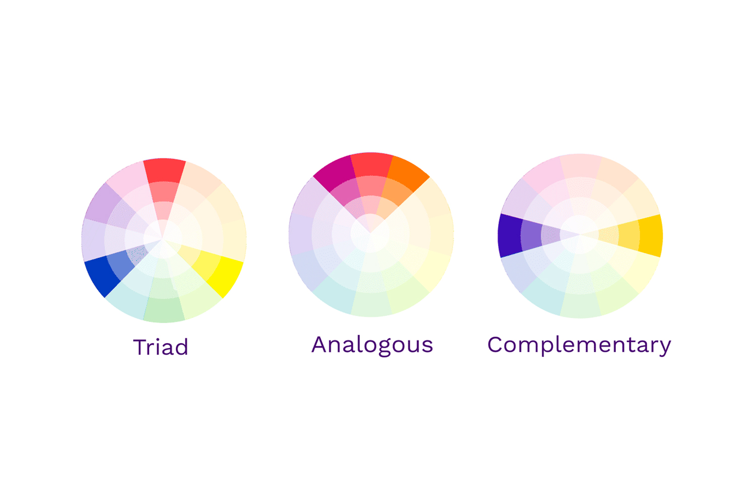
Choosing an effective color combination can be a daunting task if you start picking random colors from the RGB spectrum. To choose meaningful color combinations, a color wheel is used. Opposite ends of the color wheel consist of opposite hues so the relationship between various colors in the entire spectrum becomes clearly visible even if you’re not a designer.
Using the color wheel, colors can be picked in the following combinations:
Complimentary Color Combinations
Complimentary colors are basically the opposite colors. Pick one point on the color wheel and the opposite side of the color wheel would have its opposite color. For example; the opposite of blue would be orange.
Analogous Color Combinations
Analogous colors are adjacent to each other on the color wheel. As these colors are found in nature, they create a sense of harmony and safety. In these combinations, one color is used as the primary color whilst others contribute to the depth and accents.
Triadic Color Combinations
Triadic colors are three totally opposite colors on the color wheel. To get triadic colors, you’ll draw a triangle on the color wheel and every color at the corners would be taken in the palette. Triadic colors are mostly used for the energetic, funky, and sometimes cyberpunk-looking vibes.To make things simpler for you, we have chosen some of the most effective color combination inspirations from the business that established its identity globally. These combinations will surely inspire your custom logo design.
1. Black & Yellow
Yellow color is used to express happiness, hope, and spontaneity. Yellow on black is considered the color combination of warning and danger. For these reasons, heavy manufacturing companies like Caterpillar and JCB have used the combination of Black and Yellow for their logo designs.
2. Black & Red
The combination of black and red is nothing but dominating and energetic! In this color combination, black acts as the perfect element to immediately draw attention toward the red – making the logo design intelligible even at the faintest glance. As red is the color of passion, love, ambition, and even danger, it can be used to excite as well as draw the attention of your audience – as companies like Netflix have done it effectively.
3. Black & Gold
Gold has always been the color of luxury, wealth, royalty, and sophistication, therefore, it’s one of the best choices for logo design as it depicts wealth. Pair that with black or dark gray, and it’ll instantly draw the audience’s attention and evoke feelings of richness! Use of this intricate and royal combination is seen in Lamborghini’s logo among many others.
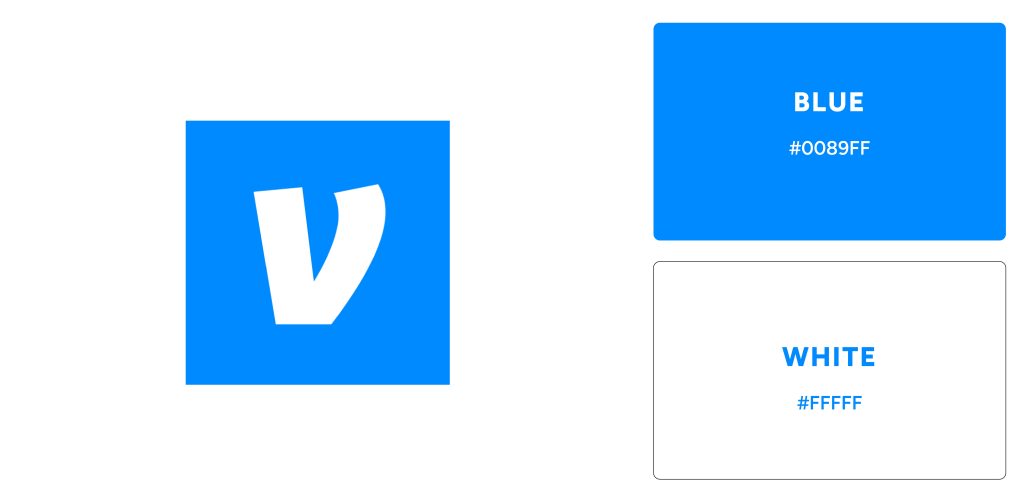
4. Blue & White
Blue is associated with the feeling of security, trust, calmness, and confidence, therefore, it’s one of the most used colors for logos along with white when it comes to health, non-profit, and banking industry. Common health companies include Pfizer, P&G, and Oral-B, whereas common banking companies include VISA, Venmo, PayPal, and American Express.
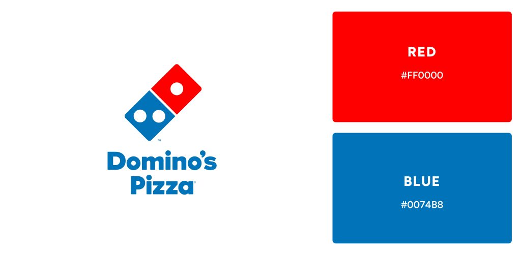
5. Red & Blue
While it seems like an odd color combination for logo design, it is actually one of the most recognizable ones! This combination holds significance because red is the color of passion and enthusiasm whereas blue is the color of trust and confidence. Multinational companies like Pepsi and Domino’s have utilized the color psychology behind this color combination most effectively.
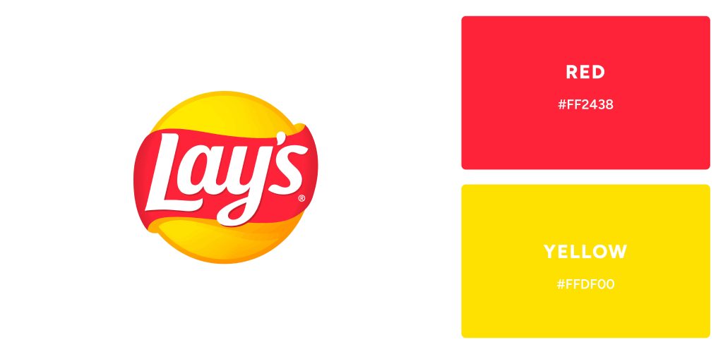
6. Red & Yellow
The powerful combination of red and yellow creates strong emotional connections with your customers. Red symbolizes ambition, while the vibrancy of yellow expresses joy – together forming a successful pairing for companies wanting to create positive experiences. Multinational firms such as Lays, Lipton, and DHL have adopted this combo in their branding efforts to energize relationships with their clientele.
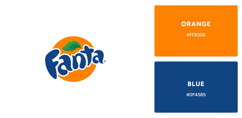
7. Orange & Blue
This is an unusual but powerful color combination that can be used to create strong logos. By combining these two colors, you will give customers a sense of energy and confidence! It can be seen in Fanta’s bold orange and blue logo which reflects an energetic, confident vibe that resonates with customers.
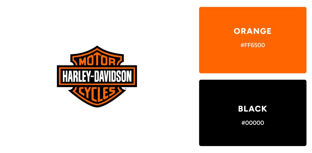
8. Black & Orange
Similar to Black and Yellow, this color combination makes up for logos that are enthusiastic and energetic while being professional. This combination is one of the best choices for brands who want to present themselves as joyful as well as formal.
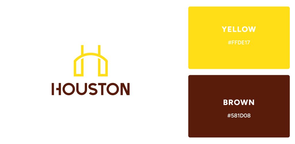
9. Brown & Yellow
This subtly earthy combination of brown and yellow is a nostalgic favorite for any logo design. Its success extends beyond the boundaries of graphic design, making it the perfect choice to grace restaurants and food businesses.
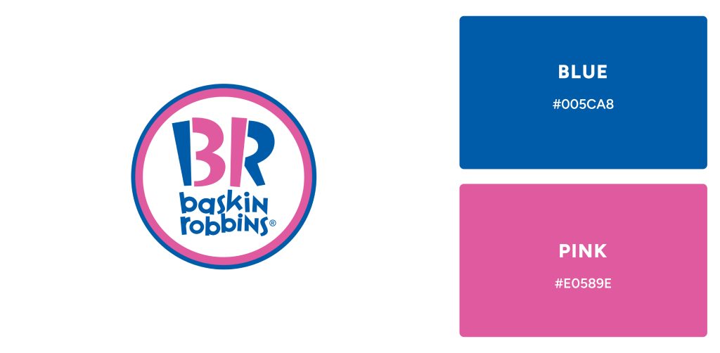
10. Blue & Pink
Companies who wish to stand out with unorthodox designs can utilize the perfect duo of colors: Blue and Pink. While blue radiates a calmness, pink brings vibrant energy – making them an ideal combination for businesses looking to make their mark. We see this combination come alive in corporate identities like Baskin-Robbins’ ice cream parlor atmosphere or Taco Bell’s fun Mexican flavors!
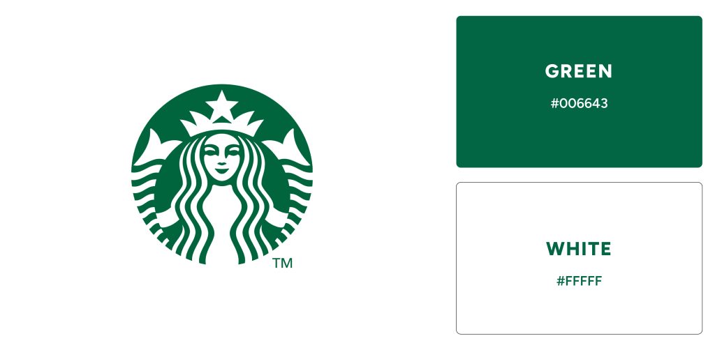
11. Green & White
Green and white is a powerful color combination that resonates with many – representing renewal, freshness, nature’s bounty, and purity. Its connection with nature has made it the go-to choice for popular brands such as Whatsapp, Spotify, and Starbucks when designing their logos – providing immediate recognition of these iconic companies to customers around the world.
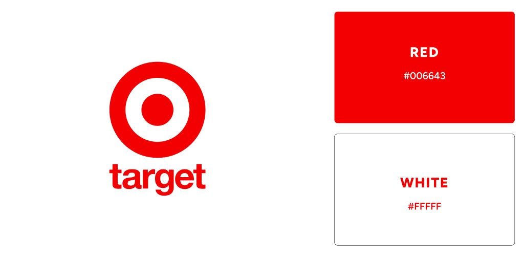
12. Red & White
Red is a hue of passion and power, the perfect choice for any logo design that needs to capture attention. Combined with white – another primary color symbolic of purity and innocence – it makes an iconic combination sure to be remembered. Examples of Red and White logos include Adobe, Lenovo, Levi’s, and Target.
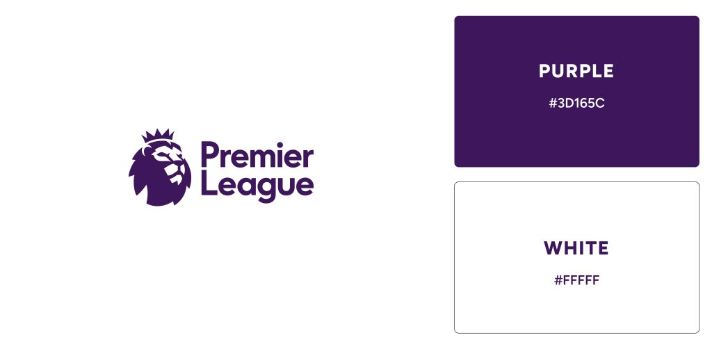
13. Purple & White
Throughout history, purple has been seen as a symbol of status and wealth. Its rarity in nature made it an exclusive color to be associated with royalty, luxury, and great wealth. Due to this, modern-day luxury brands such as Hallmark and Premier League have truly embraced it combined with white for their branding.
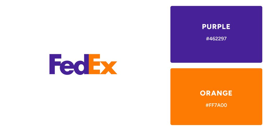
15. Purple & Orange
Combining the luxury of purple with the joyfulness of orange gives a bold and confident brand identity. FedEx is one such example, who has made expert use of these colors in their logo – perfect for those looking to make an impactful statement!
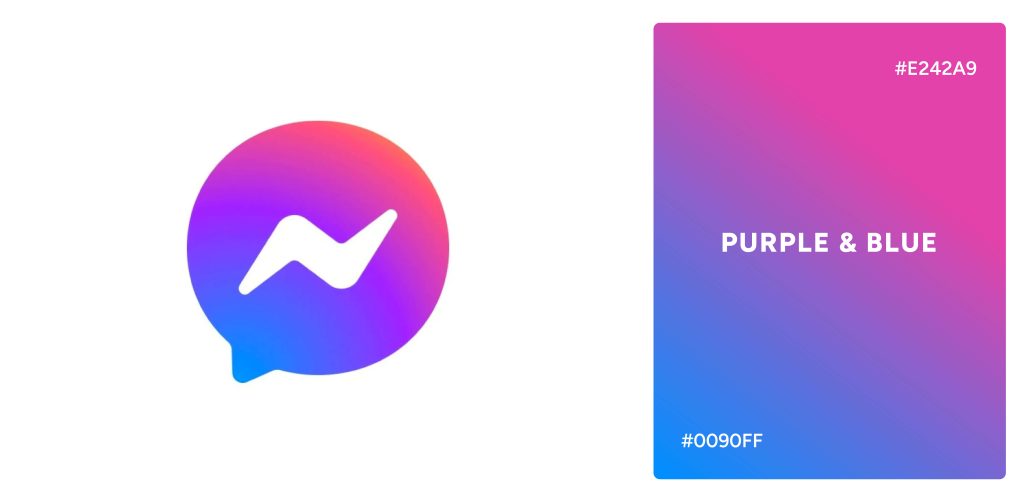
16. Purple-Blue Gradient
Gradients are also one of the effective ways to utilize colors in logos. The purple and blue gradient signifies the luxury and power associated with purple as well as the depth and calmness associated with blue – making it a worthwhile choice for brands with a more dynamic personality. Examples of purple-blue gradients include the Facebook Messenger logo.
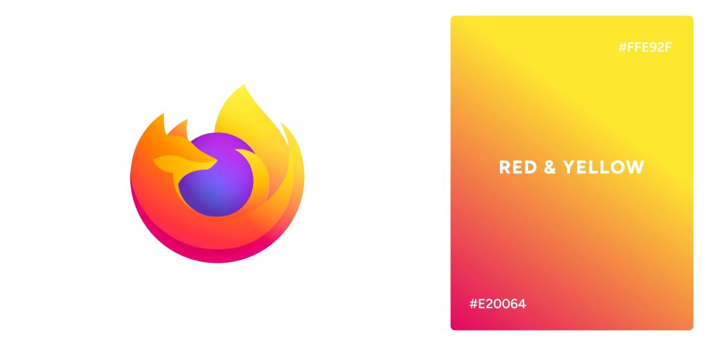
17. Red-Yellow Gradient
Red and yellow are paired to create an exciting, dynamic expression of love, passion, and joy – the perfect combination for any project looking to convey a bright message. This color scheme is seen in FireFox’s logo.
How to Choose the Right Color Combination for Your logo?
Color should be given careful consideration when creating a logo. Using color psychology, the color combination should be chosen to tell a story that resonates with the target audience and reflects your brand. As colors carry powerful subconscious meanings, it is important to study color theory and draw inspiration from it when making decisions. Also, it should be kept in mind that the meanings behind colors may vary from culture to culture and context to context, as well as individual experience. Knowing your target audience and thoroughly researching color psychology will ensure that your colors are appropriate for your target audience and target culture.
References
Park, C. W., Eisingerich, A. B., Pol, G., & Park, J. W. (2013). The role of brand logos in firm performance. Journal of Business Research, 66(2), 180–187. https://doi.org/10.1016/j.jbusres.2012.07.011
Yu, C.-E., Xie, S. Y., & Wen, J. (2020). Coloring the destination: The role of color psychology on Instagram. Tourism Management, 80(104110), 104110. https://doi.org/10.1016/j.tourman.2020.104110