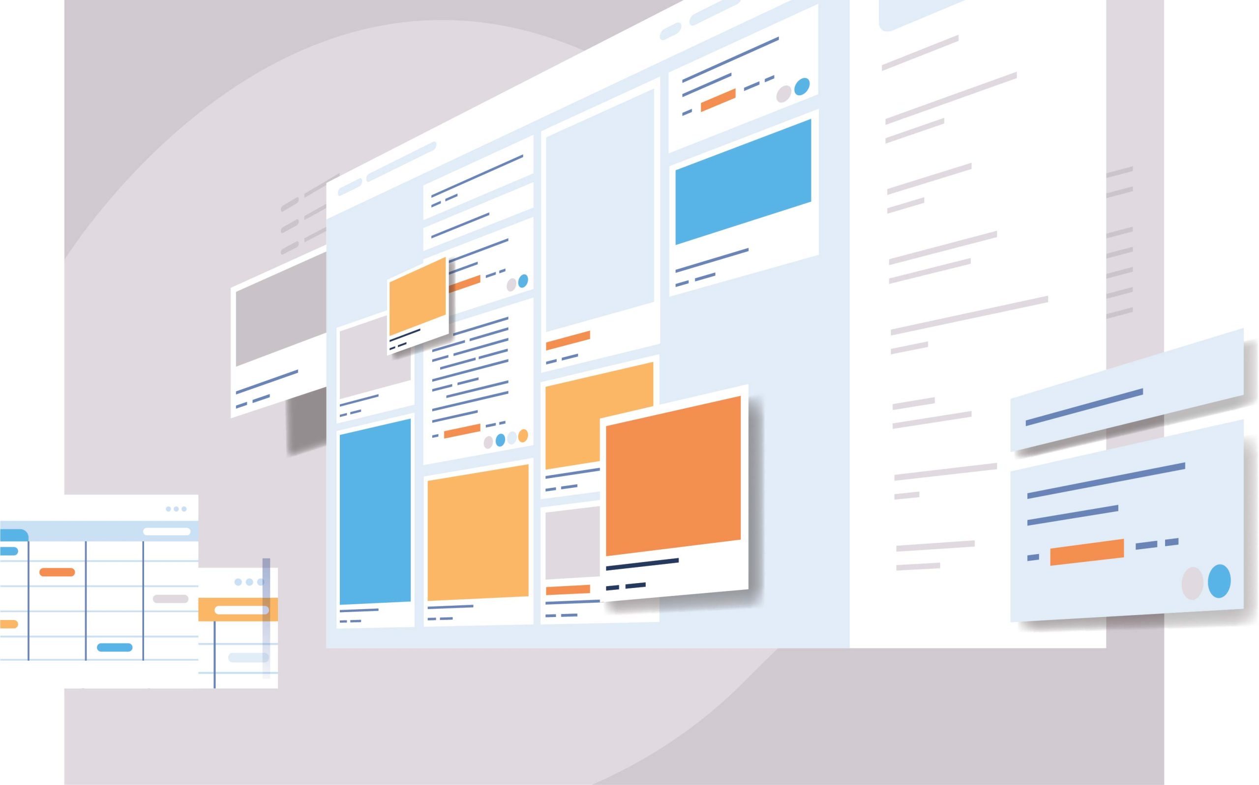
At first glance, it’s natural to assume that when it comes to design, minimalism would be the most effective route. After all, less is more, right? However, there are certain scenarios where elaborate and complex designs can make a bigger impact than their simpler counterparts. In this blog post, we’ll be exploring those cases in-depth – from opting for bold typography and expressive illustrations to unique color palettes and interactive elements. It may seem counterintuitive at first but by the time you’re done reading this post, you’ll see why elaborate web designs don’t need to sacrifice effectiveness or aesthetic appeal in order to create an engaging user experience with incredible results.
Defining Minimalism and Elaborate Web Design
Minimalism in web design can be defined as the art of creating simple, yet visually appealing websites that focus on usability and functionality. A minimalist web design approach emphasizes a clean layout, white space, and clear typography which reduces clutter and enhances user experience. On the other hand, elaborate web design incorporates complex visuals, graphics, and multimedia elements to create a unique and engaging website. While minimalist websites provide an effortless and straightforward experience, elaborate designs showcase creativity, innovation, and attention to detail that can make a website stand out from the crowd. Both design styles have their benefits and drawbacks, and choosing the appropriate approach depends on the purpose and target audience of the website. Ultimately, in defining minimalism and elaborate web design, it is the balance between simplicity and extravagance that creates an effective and engaging website.
Myths of Minimalism
Minimalism in web design has been a popular trend in recent years, but it’s important to understand that it doesn’t always work. While the idea of clean, simple designs that focus on functionality may seem appealing, it can sometimes result in a lack of personality or uniqueness. Additionally, some websites require more content or features to effectively communicate their message or provide necessary functions to users. It’s important to evaluate each website individually and determine the best design approach based on its specific goals and needs. Ultimately, successful web design is about creating an engaging user experience that effectively communicates the desired message, and sometimes that may require a more complex design approach.
The Benefits of Breaking the Mold and Going for Elaborate Design
In today’s fast-paced online world, having a website that stands out from the crowd is essential for businesses to thrive. By breaking the mold and opting for an elaborate web design, you can create a unique online identity that leaves a lasting impression on your visitors.
A well-designed website can boost your brand recognition, improve user experience, and ultimately increase conversions.
With elaborate design elements like interactive animations, custom graphics, and creative layouts, you can convey your message in a visually engaging way that captivates your audience.
Plus, a professionally designed website can enhance your credibility and establish you as an authority in your industry.
Why settle for a standard, cookie-cutter website when you can have a stunning online presence that sets you apart? Take the leap and break the mold with an elaborate web design today.
When Elaborate Web Design Works Better Than Minimalism?
When it comes to web design, there is an ongoing debate between minimalism and elaborate design. While minimalism often emphasizes simplicity and functionality, there are times when elaborate designs can be more effective. For instance, if you’re creating a website for an art gallery or a luxury brand, elaborate design can help to convey a sense of elegance and sophistication. Or, if your website is meant to be interactive and engaging, elaborate designs can help to draw users in and make the experience more immersive. However, it’s important to remember that overly complicated designs can be overwhelming and confusing for users. Ultimately, the key is to find a balance that works for your audience and your brand.
How to Choose the Right Balance Between Elaborate Design and Minimalism
When it comes to web design, finding the perfect balance between elaborate and minimalistic can be a daunting task. On one hand, you want your website to be visually stunning and memorable, but on the other hand, you don’t want to overwhelm your audience with too many bells and whistles. The key to choosing the right balance is to understand your audience and their preferences. A younger demographic might prefer a more flashy, elaborate design, while an older demographic might appreciate a simpler, more straightforward approach. It’s also important to consider the purpose of your website and its functionality. The design should enhance the user experience and make navigation easy, rather than hinder it. By finding the sweet spot between elaborate and minimalistic design, you can create a website that is both visually appealing and user-friendly.
Tips on Crafting an Effective Elaborate Web Design
In the modern world, web design has become an integral part of any online business. With so many websites vying for attention, it’s essential to craft an elaborate design that keeps your visitors engaged. A successful web design goes beyond simply creating a visually appealing website. It requires a keen eye for detail and an understanding of what your visitors expect from your website.
To craft an effective web design, it’s crucial to keep your design simple, clean, and easy to navigate.
Additionally, you need to ensure that your website’s loading speed is at its best, ensuring a smooth user experience.
Finally, make sure that your design is responsive, which means that it should seamlessly adapt to any screen size, from desktop to mobile.
With these tips, you can create a web design that not only looks great but also drives traffic to your website.
Creating Your Own Unique Style Using Elaborate Web Design Elements
Designing a website is no longer just about placing content and a few images on a page. With the advent of elaborate web design elements, we can now create a unique style that sets our website apart from the rest. Whether we want to use animations, 3D designs, or other innovative tools, the possibilities are endless. The key to success lies in combining these elements with your own creative touch to create a style that speaks to your audience. By taking the time to experiment with different styles and explore the latest design trends, you can surely elevate your website to the next level, making it memorable and effective. Remember, a well-designed website not only attracts new visitors but keeps them coming back for more.
Conclusion
It’s clear to see that there are many benefits to elaborate web design. From inspiring users and showing off features, to creating an efficient and user-friendly experience, detailed design can bring your website alive. However, it’s important to remember that less can be more when it comes to winning over customers—it’s all about striking the right balance between creative design elements and minimalism. By taking the time to understand BOTH approaches, you should be able to create a unique style that resonates with users while remaining true to your brand. With these tips in mind, now is the time to experiment with varying styles of elements both simple and complex until you find the perfect fit for your website – so start designing today!
Minimalism has become a popular trend in recent years, influencing everything from home design to how we consume media. But minimalism may be even more impactful for businesses – where simple designs can make all the difference in standing out among their competitors and connecting with customers. In this blog post, we’ll look at how minimalist design helps differentiate brands and why it’s worth considering when launching your business or revamping an existing visual identity. From the benefits of clean lines to increasing recognizability, find out why minimalist web design is becoming a go-to choice for entrepreneurs worldwide!
The Benefits of Going Minimalist
In a world where there seems to be an endless stream of information and distractions, going minimalist has become a popular trend. Unsurprisingly, brands are now opting for a clean, simple design that avoids unnecessary clutter. Not only does it make their products or services easier to understand and navigate, but it also allows for a more focused and memorable brand image. Minimalist designs can evoke a sense of sophistication and elegance, attracting a more discerning and upscale consumer. So if you’re a brand looking to stand out in a crowded market, consider going minimalist for a fresh, modern approach that will captivate your audience.
Elements to Include in Your Brand’s Minimalist Strategy
Minimalism is a popular design choice among brands looking for a clean and modern aesthetic. However, it’s not just about stripping away excess design elements. To create a successful minimalist strategy, brands need to include key elements that will make their brand recognizable and memorable. This includes a distinct color palette, a unique typography style, and a simple yet striking logo. Brands should also focus on the user experience, making sure that their website and other marketing materials are easy to navigate and user-friendly. By incorporating these essential elements into a minimalist design strategy, brands can achieve a visually appealing and cohesive brand identity that resonates with their target audience.
Re-evaluating Your Brand’s Color Palette
Your brand’s color palette is integral to establishing your identity, making it crucial to periodically re-evaluate and refresh it to ensure continued relevance and effectiveness. Choosing a minimalist color scheme for your brand can be a bold move, but one that can pay off in spades. By embracing simplicity, you open yourself up to a whole new world of brand possibilities that can set you apart from the competition. To apply a minimalist approach to your color palette, start by narrowing it down to a select few colors that embody your brand’s personality and messaging. Incorporate these colors strategically throughout all aspects of your brand, including your website design. With a minimalist color palette, the focus will be on the quality of your content and the strong impression your brand leaves on visitors.
Simplifying Your Logo Design
Simplicity has become imperative for most businesses and when it comes to creating a logo, it’s no different. A simple logo can make a strong impact, while a complicated one can become a challenge to remember. Moreover, designing minimalist logos also conveys a sense of elegance and sophistication, depicting your company as modern and efficient. With the right combination of elements, a minimalist logo can give your brand a unique identity, capturing your audience’s attention. Keep in mind that creating a minimalistic logo doesn’t mean that it has to be boring or uninteresting. It’s all about finding the right balance of design elements to communicate your brand’s values and message effectively. Keep reading to find out how you can create a simple yet compelling logo that represents your business.
Prioritize Content
When it comes to designing a minimalistic website, less is certainly more. However, this can pose a challenge when it comes to prioritizing and showcasing the most important content. After all, you want to ensure that visitors to your website understand your brand’s message without compromising its sleek and modern aesthetic. Fortunately, by taking a strategic approach to your content, you can strike the perfect balance between form and function. Whether it’s placing your value proposition front and center or incorporating subtle design elements that draw the eye to key information, there are plenty of ways to make sure your website does its job while looking great doing it.
Utilizing Typography
Beautiful typography can truly elevate the look and feel of your brand. When it comes to choosing fonts, it’s important to look beyond the basic fonts that everyone is using. Opt for unique fonts that match the personality and style of your brand. A carefully chosen font can convey your brand’s values and message in an instant and can be an effective way to stand out from the competition. With so many options available, take the time to choose a font that is not only visually appealing but also reflects the heart and soul of your brand. By utilizing typography in this way, you can create a cohesive and recognizable brand identity that will make a lasting impact on your audience.
Optimizing Your Website Design
Creating an engaging user experience on your website is crucial to attract and retain customers and one effective approach is adopting a minimalist design, which not only improves visual appeal but also enhances functionality. A minimalist design is all about stripping down unnecessary elements and focusing on the core components that effectively communicate your message. However, designing a minimalist website can be challenging, especially if you lack the necessary technical skills and expertise. That’s where a web design agency comes in. With their experienced team and cutting-edge tools, they can help you optimize your website design, delivering a remarkable user experience and ultimately boosting your business success.
Examples of Brands with Minimalist Design
Minimalism is a design philosophy that has been embraced by many brands, and there are numerous success stories to back it up. One of these brands that stand out is Apple. The tech giant has been a pioneer in clean, simple, and elegant design since its inception. Its website reflects this philosophy, with a minimalist interface that’s easy to navigate. Another brand that has embraced minimalism is Google. The search engine giant’s website is uncluttered, with a focus on typography, whitespace, and ease of use. Airbnb is another brand that has succeeded with minimalism. Its website is a testament to the power of simplicity, with a clear hierarchy and minimal distractions. These examples show that minimalist websites can be elegant, effective, and engaging.
Conclusion
Minimalism is a powerful tool for brands. Its impact often extends beyond aesthetics and influences the way a brand interacts with customers. With the right strategy, a minimalist approach allows brands to create simple yet effective visuals that will capture their audience’s attention. The key is to make sure the design of your elements ‐ from colors and fonts to logos and typography ‐ is intentional. When implemented into your branding and website design, these components enhance experiences and drive engagement. By assessing current practices and making necessary adjustments, you can ensure your brand’s success by taking a minimalist approach. Ultimately, there are countless advantages to creating a visually stimulating online presence using minimalistic standards – it elevates your identity in a unique way no one else in the market can replicate quite like you can. If done correctly, it will leave a lasting impression on users that they won’t be able to forget!
As every website owner knows, a basic design won’t cut it in today’s increasingly competitive online arena. It’s critical to ensure that your site is aesthetically pleasing and can be scaled and adapted to changing market needs. Fortunately, with the rise of minimalist web design and modern techniques such as responsive web design, building a scalable and adaptable website doesn’t have to require extensive time or energy. In this blog post, we’ll take an in-depth look at how optimizing for scalability from the outset can help you create websites that are both beautiful and effective – no matter what direction technology takes over the coming years. So read on for tips on achieving elegant simplicity through scalability!
Benefits of Minimal Web Design
Minimal web design is an increasingly popular approach to website layout and design. When executed correctly, the benefits are clear. By stripping away excess elements, a minimalist design creates a sleek and seamless user experience, allowing the content to take center stage. It also makes navigation more accessible and faster, allowing users to easily find what they are looking for without being distracted by flashing graphics or overwhelming colors. Minimalism also provides a cleaner and more professional look, which can help to establish trust with visitors and potential customers. But perhaps the best advantage of a minimal design is that it loads faster, ensuring that visitors don’t have to wait and that the page is more likely to be ranked higher by search engines. All in all, minimal web design is simple but powerful and can undoubtedly improve the overall effectiveness of your website.
The Benefits of a Scalable & Adaptable Website
In today’s rapidly evolving digital landscape, having a scalable and adaptable website has become a necessity for businesses to stay competitive. A website that can expand or contract based on changing needs and can easily take on new functionalities without requiring a complete overhaul is a valuable asset. Such a website not only saves money and time but also enables businesses to keep up with the latest technologies and trends easily. Furthermore, a scalable and adaptable website enhances the user experience, as it can adjust to different devices and screen sizes, making it easier for visitors to navigate and interact with the site. The benefits of such a website are numerous and far-reaching, making it a smart investment for any business looking to succeed in the digital world.
Scalable Graphics and Coding Techniques
Utilizing scalable graphics and coding techniques is an easy way to streamline your website and make it more professional-looking, improving your users’ experience. With the ever-increasing demand for fast-loading sites, optimizing images and coding can go a long way in enhancing your website’s appeal. Providing an enjoyable and seamless user experience has become crucial in attracting and retaining visitors, especially on mobile devices. If you’re looking to give your site that extra edge, consider incorporating scalable graphics and coding techniques that can help your website run faster and smoother than ever before. Or you can just get expert services from a web design agency and they’ll get you hooked!
Develop Responsive Navigation for Different Platforms
With the majority of people accessing the internet through their mobile devices, businesses must develop responsive navigation that adjusts to different platforms. This means exploring different design techniques that cater to the needs of users, regardless of the device they are using. A website that is adaptable to different platforms not only enhances the user’s experience but also improves the website’s visibility and search engine ranking. As such, it’s important to prioritize responsive navigation when creating a website. By ensuring that your website is accessible and user-friendly on all devices, you can attract more visitors, improve engagement, and achieve your business goals.
Consider Adaptability with Changing User Needs & Trends
As technology advances, so do the needs and trends of users. This means that your website must have the flexibility to adapt and evolve alongside them. Ensuring the adaptability of your website means considering numerous factors, including changes in user behavior, updates in search engine algorithms, and advancements in web design. By continuously assessing and refining your website’s features, content, and functionality, you can stay ahead of the curve and provide users with an exceptional browsing experience, no matter how their needs and trends change over time. Don’t let an outdated website hold you back – invest in adaptability and keep pace with the ever-evolving digital landscape.
Implement Search Engine Optimization
Simply having a website is not enough for your business. You need to make sure that potential customers can find it. This is where Search Engine Optimization (SEO) comes in. By implementing SEO techniques, you can improve your website’s ranking on search engines like Google. This means that when someone searches for a product or service that your business offers, your website will appear higher in the search results. By increasing your website’s visibility through SEO, you can drive more traffic to your site and ultimately increase your business’s revenue. Don’t let your website get lost in the vastness of the internet. Implement SEO techniques and watch your website soar to the top of the search results.
Ensure Accessibility with ARIA attributes
Making a website accessible for all users can seem like a daunting task, but with the help of ARIA attributes, it’s easier than you might think! ARIA, or “Accessible Rich Internet Applications”, is a set of attributes that can be added to HTML code to help make web content more accessible for users with disabilities. By adding these attributes, you can ensure that your website is compatible with a range of assistive technologies, such as screen readers, that help users interact with your content. Whether you’re building a new website from scratch or updating an existing one, using ARIA attributes is a critical step towards ensuring that all of your users, regardless of their abilities, can access your content with ease.
Leveraging Browser-Based Automation as a Time-Saving Tool
Leveraging browser-based automation can be a great time-saving tool to achieve this goal. By automating repetitive tasks, such as form submissions and page scrolling, you can free up valuable time to focus on other aspects of your website. Additionally, automation ensures consistency across your website and reduces the possibility of human error. With a faster and more efficient website, you can provide a better user experience for your customers, increasing their engagement and ultimately, your bottom line. So why not take advantage of browser-based automation and give your website the boost it needs to succeed in an increasingly competitive online marketplace?
Employ Reusable Components & Modular Architecture
Creating a website that is visually appealing, responsive, and user-friendly can be challenging, but there are ways to make the process smoother. Employing reusable components and modular architecture is a great way to keep things organized and efficient. By breaking down the website into reusable components, you can easily create a consistent design and make updates quickly. Modular architecture allows you to build a website in a way that is easy to modify and scale. Utilizing these techniques will not only save you time and energy but also result in a better user experience. With reusable components and modular architecture, you can create a website that is both visually stunning and easy to navigate.
Conclusion
Creating a minimal, scalable, and adaptable design for your website offers many long-term benefits. Not only does it make the user experience more enjoyable, but it also allows you to quickly adjust to changing needs and trends. Additionally, by utilizing SEO tactics and embracing accessibility standards, you’re providing an inviting online presence for all users. By leveraging cross-platform compatibility for multiple devices, as well as taking advantage of browser-based automation, you can ensure your website is always up to date with the latest design trends. Finally, creating reusable components and modular architecture will help keep your website organized while streamlining maintenance in the long run. While there’s a lot that goes into designing a successful website, focusing on these key principles is the first step in building a site that looks great and works like a dream.
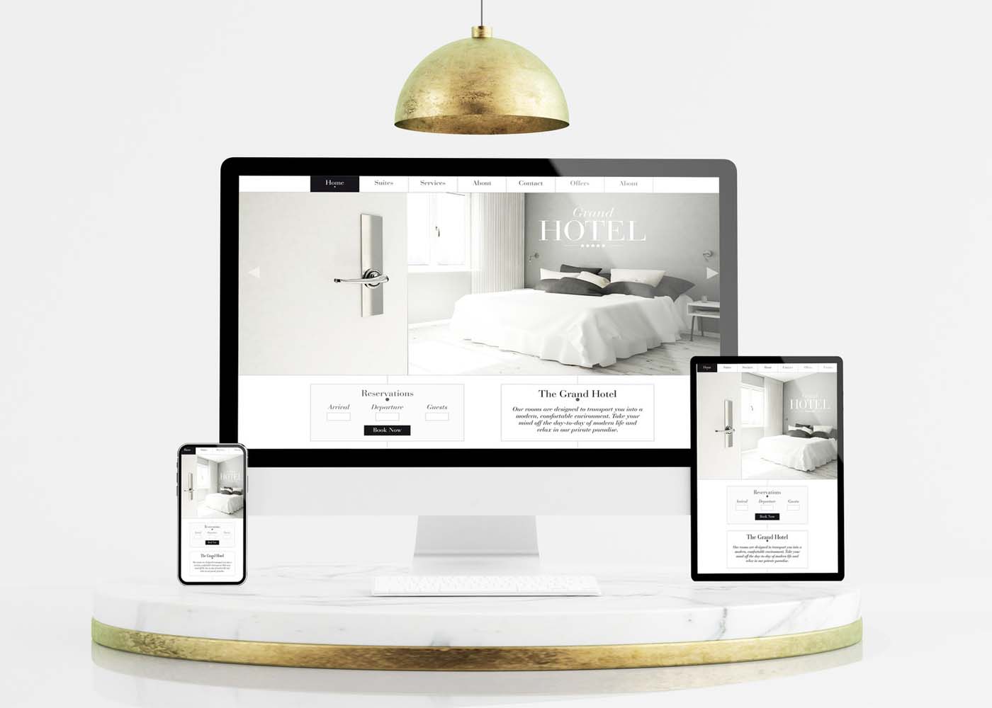
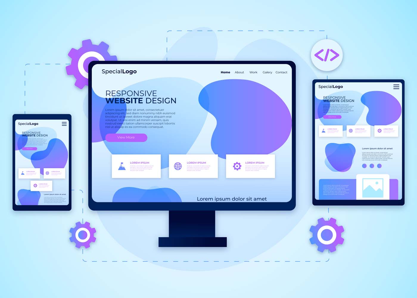
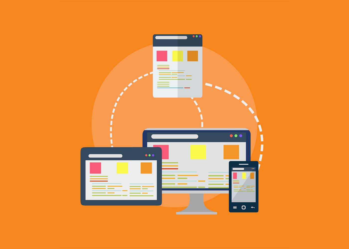
It’s undeniable – we’re living in a mobile age. Smartphones help us stay connected, entertained, and up-to-date on news, entertainment, and much more. That’s why it’s essential for any modern website or web application to be a custom web design with an eye toward the increasingly dominant mobile device market. One solution that many designers have turned to is a responsive web design, which focuses on minimizing the number of page elements necessary while maximizing usability across various devices and platforms. In this blog post, we’ll discuss some of the key concepts behind responsive design as well as how minimalism can play an important part in developing effective solutions for today’s users who are always connected with their mobile phones close by.
What is Responsive Design and Why Does it Matter in the Mobile Age
In today’s mobile age, having a website that is easily accessible on multiple devices is more important than ever. This is where responsive design comes into play. Responsive design is a method of web design that allows websites to adapt to different screen sizes and resolutions without sacrificing functionality or user experience. It ensures that your website looks and works just as well on a smartphone as it does on a desktop computer. With the majority of internet users now accessing the web from mobile devices, having a responsive website is not just a luxury, it’s a necessity. Without it, you could be missing out on a significant portion of your potential audience. So, if you want to stay ahead of the curve in the digital age, responsive design is a must-have for your website.
Minimalism as the Key to Effective Responsive Design
Minimalism is more than just a trendy design movement. It’s a powerful tool that can enhance the effectiveness of responsive design. By stripping away unnecessary elements, minimalism can help to simplify the user experience and improve website loading times. In a world where consumers expect quick and easy access to information, this is crucial. Not only does minimalism improve functionality, but it also creates a stronger brand identity by highlighting key elements of a website’s design. Embracing minimalism can be difficult, but it’s definitely worth considering for those seeking to optimize their website’s usability and overall design.
Four Principles of Responsive Design to Follow
In today’s digital age, having a website that’s mobile-friendly is more important than ever before. That’s why it’s crucial to follow the four principles of responsive design.
Firstly, ensure that your website has a flexible and fluid layout that can adapt to different screen sizes.
Secondly, use high-quality images that load quickly regardless of the device being used.
Thirdly, choose legible fonts that are easy to read on small screens.
Lastly, make sure that your website is easy to navigate regardless of whether it’s being accessed on a phone or desktop.
By following these principles, you can create a website that not only looks great but also provides a positive user experience for all visitors.
Strategies for Optimizing Content for Mobile Devices
As more and more people rely on their mobile devices for online browsing, it’s becoming increasingly important for businesses to optimize their websites for these smaller screens. But how can you ensure that your web content is efficiently translated onto a mobile device? One key strategy is to simplify your design. Get rid of any clutter that might distract from your message, and consider ways to streamline your text and images. You’ll also want to make sure your site loads quickly and smoothly, so users aren’t stuck waiting for your content to appear. Ultimately, the goal is to create a seamless user experience that makes browsing your website a pleasure, rather than a chore. With these strategies in mind, you can take your web content to the next level and reach a wider audience than ever before.
Benefits of a Responsive Website for Your Brand
A responsive website is one that is designed to adapt to various screen sizes, from desktop computers to mobile phones. Not only does this provide a better user experience for consumers, but it also has numerous benefits for your brand including increased visibility, improved search engine rankings, and stronger brand recognition. With more people using their mobile devices to access the internet, having a website that is optimized for these smaller screens is crucial to staying competitive in today’s market. By investing in a responsive website, you can ensure that your brand is reaching as many potential customers as possible and delivering the best possible online experience.
Tools and Resources For Creating A Responsive Site
Having a responsive website is essential for any business. But creating such a site can be a daunting task if you don’t have the right tools and resources. Luckily, there are plenty of options out there to help you create a dynamic and responsive website. From website builders like WordPress and Wix to frameworks like Bootstrap and Foundation, there are many ways to get started with responsive web design. Additionally, there are a variety of online resources, tutorials, and communities where you can learn from experts and get support as you build your site. With the right tools and resources at your fingertips, you can create a website that is optimized for any device, ensuring that your customers can easily access your content no matter where they are.
How to Optimize Your Site for SEO with Minimalist Design
Your website’s design plays a crucial role in determining your search engine ranking. Search engine optimization (SEO) must be an integral part of your website design strategy to help boost your website’s visibility. A minimalist design is a popular trend in web design and is a perfect way to optimize your site for SEO purposes. Minimalism in web design means having fewer elements on a webpage, reducing clutter and unnecessary distractions, and providing a better user experience. Simple, clean designs with white space and clear navigation menus can improve your site’s ranking and make your site more accessible to your audience. With a minimalist design, your website can rank higher, load faster, and offer a better user experience.
Why Responsive Design Tends to be More Usable on Mobile Devices
Mobile devices have become an essential part of our daily lives, and with that, the importance of responsive design has also risen significantly. The reason why responsive design tends to be more usable on mobile devices is quite simple – it adapts to the size and orientation of the device. With responsive design, there’s no need to zoom in or pinch to view content on a smaller screen. The layout adjusts automatically to fit the screen size, making it easier to navigate and access information. This approach provides a seamless user experience across all devices, and it’s no surprise that it’s become an essential part of web design in today’s mobile-first world.
Examples of Successful Minimalist Web Designs
Minimalism is all the rage these days, and it’s not difficult to see why. Nothing beats the clean, sophisticated vibe of a website with a minimalistic design. If you’re looking for inspiration, here are a few exemplary minimalist websites that are sure to impress. First up, we have Dropbox’s website, which features a simple and elegant design with a bright blue header that’s hard to miss. Next, take a look at Airbnb’s website, with its white background and bold font that draws the user’s attention to important features of the site. Finally, there’s Medium’s website, which boasts a clean and crisp design with plenty of white space. All of these minimalist websites have one thing in common: they convey the message with simplicity, yet with all the necessary design elements in place.
Conclusion
It is undeniable that mobile technology has revolutionized the way businesses and consumers interact, making it essential for any business or online presence to have a mobile strategy. Responsive design, with its emphasis on simplicity and minimalism, may just be the key to meeting this challenge. By following the four pillars of responsive design, using tools and resources designed specifically for creating a responsive site, and leveraging optimized content for mobile devices, your brand can gain tremendous benefits from a successful mobile experience. As seen in many examples of minimalist website designs, creating a beautifully simple user experience with responsive design has never been easier. With all the advancements of today’s technology, it is advisable to take advantage of cutting-edge approaches such as responsive design in order to stay competitive in today’s mobile age.
Are you looking for ways to speed up your website and make it more engaging? Minimal websites provide a number of benefits that can help boost website performance, promote user engagement, and improve the overall experience of visiting your site. In this blog post, we’ll be discussing 9 key reasons why going minimal on web design is the way to go—from faster loading times to creating an uninterrupted viewing experience that keeps users engaged throughout their journey with your brand. So let’s dive in!
Minimalism Reduces File Sizes & Load Times
Minimalism is the key to success when it comes to designing a website that loads quickly and efficiently. By reducing the file sizes on your website, you can significantly improve performance and ensure that visitors don’t lose patience waiting for pages to load. Using a minimalistic approach in your design can also help to eliminate clutter and improve the overall user experience. Whether you’re a seasoned web design service provider or just starting out, the benefits of optimizing your website for performance cannot be overstated. So why wait? Start reducing file sizes and load times today to create a website that truly stands out from the competition.
Fewer HTTP Requests
When it comes to web design, the phrase “less is more” couldn’t be more accurate. Minimal web design is all about simplifying your website’s visual appearance to create a more efficient and streamlined user experience. But it’s not just about aesthetics – minimizing HTTP quirequests is also a crucial component of this design approach. By reducing the number of HTTP requests needed to load your page, you can significantly speed up your website’s loading time. This not only improves the user experience but can also boost your website’s search engine rankings. So, if you’re looking to enhance your website’s performance, consider embracing minimal web design principles and saying goodbye to unnecessary HTTP requests.
Cleaner Design Is Easier to Understand and Use
People don’t have the time or patience to sift through cluttered websites to find what they need. That’s why minimalist website design has become so popular. By stripping away unnecessary elements, the minimalist design creates a more streamlined and visually appealing experience. Not only does it look better, but it also makes navigating the website much easier. Users can focus on the content and take action without getting distracted or overwhelmed by flashy graphics or excessive text. Whether you’re a blogger, an e-commerce store, or a startup, a cleaner website design will not only improve usability but also help you stand out in a crowded online space.
More Accessible to All Devices
In a world where technology is constantly changing and evolving, it’s important for websites to adapt in order to reach the widest possible audience. This is where minimal web design comes in. By stripping away all unnecessary elements, minimal websites are able to load quickly and smoothly on any device, from desktops to smartphones and everything in between. Not only does this make them more accessible to users who may not have the latest technology, but it also ensures that everyone has a seamless browsing experience. So whether you’re browsing on a tiny screen or a massive monitor, a minimal website ensures that you can access the content you need with ease.
Increased Focus on Important Content & Features
The rise of minimalist website design has taken the digital world by storm. It’s no secret that the average attention span of internet users is decreasing, forcing developers to rethink the way they design websites. Minimalism offers the perfect solution, by removing everything that isn’t necessary, leaving only the most important content and features. By doing this, users are less likely to get distracted, allowing them to focus on the task at hand. This has resulted in increased engagement rates and a better user experience overall. Whether you’re designing a blog, an e-commerce store, or a corporate site, minimalist design is the way to go.
Improved Navigation Simplifies User Experience (UX)
As our lives grow increasingly hectic, the need for simplicity and ease of use becomes ever more important. This is especially true in the realm of online browsing, where having a minimalist website can make all the difference. And when it comes to user experience (UX), there’s nothing quite as crucial as intuitive navigation. That’s why we’re excited to share that we’ve recently made improvements to our website’s navigation, streamlining the process and making it easier for users to find exactly what they need with minimal clicks. The result? A faster, more efficient, and enjoyable browsing experience for all.
Increased Usability With Intuitive Design Elements
When it comes to designing a website, simplicity is key. Minimalist design not only looks clean and modern but also enhances user experience by removing any unnecessary elements. By implementing intuitive design elements, like clear navigation and ample white space, users can easily find what they’re looking for and appreciate the straightforwardness of the website. A minimalist approach also allows for faster loading times, which can positively impact search engine optimization and overall user satisfaction. So, if you’re looking to improve the usability of your website, consider embracing a minimalist design with intuitive elements.
Quick Loading Times Reduce Frustration for Mobile Users
Simplicity is the name of the game in the world of website design. With the majority of users accessing websites from their mobile devices, it’s important to ensure that their experience is as smooth as possible. This is where minimalist website design comes into play. By stripping away unnecessary elements, a website can load more quickly, reducing frustration and making the user experience more enjoyable. Users on mobile devices are often on the go and need information quickly. With a minimalist website, they can find what they need with ease and speed, without getting bogged down by extraneous graphics or other distractions. A minimalist website is like a breath of fresh air, giving users a seamless experience from start to finish.
Clean Interface Draws Attention to the Call-To-Action
A minimalist website is all about simplicity and elegance. With a clean interface, the website can easily draw attention to the call-to-action elements, enticing the visitors to take action. A minimalistic approach makes the website look uncluttered and easy to navigate, providing an optimal user experience. The clean lines and open spaces on the website allow for smooth browsing, without any distractions. A minimalist design not only enhances the aesthetic appeal but also enhances the overall functionality of the website. So, if you’re looking to create a website that is both visually appealing and highly effective, a minimalist approach is the way to go.
Conclusion
To sum up, minimalism offers many advantages when it comes to website design. Whether you’re a business owner needing to keep user experience (UX) in mind or someone who values simplicity and clean lines on the web, minimal web design offers numerous benefits. It reduces file size and load times while allowing the optimization of important content and features that will be accessed across all devices. Additionally, improving navigation simplifies user experience and usability with intuitive design elements that draw attention to the call-to-action elements. Minimal web design not only allows for mobile visitors to benefit from minimal load times but also reduces frustration for those on mobile devices as quick loading times reduce bounce rates. As we have seen, minimalism has taken the world of website development by storm – creating a cleaner look that almost anyone can appreciate!
With an ever-increasing demand for responsive website design (RWD) among businesses today, it’s more important now than ever before to make sure you have a thorough understanding of the techniques, frameworks, and tools available. Understanding why RWD is such an integral part of modern website development can help you both expand your knowledge and create attractive sites that are tailored to user preferences. In this blog post, we’ll be discussing the reasons behind the high demand for RWD in 2023 and revealing some key tips to get you started on creating effective websites with the basic principles of RWD. So let’s dive right into why you should prioritize using these techniques when developing your sites!
What is Responsive Web Design (RWD)?
A responsive web design (RWD) is a design approach that allows a website’s layout and content to adjust and adapt to various screen sizes, from a desktop computer to a tablet or mobile device. This means that no matter what device your audience is using, your website will look great and be functional. RWD also provides a better user experience and improves the website’s search engine rankings. In short, a responsive website design is a smart investment for anyone looking to reach a wider online audience.
Why is RWD Important for Businesses in Today’s Digital World
RWD allows websites to be easily accessible and navigable across all devices, including smartphones, tablets, and desktops. As more and more people use their mobile devices to browse the internet, businesses need to ensure that their website is optimized for the best user experience possible. By implementing RWD, businesses can improve their website’s visibility and accessibility, ultimately increasing their online presence and revenue. With RWD, businesses can stay ahead in the game and provide customers with a seamless and enjoyable browsing experience no matter where they are.
Advantages of RWD Techniques, Frameworks, and Tools
Responsive Web Design (RWD) techniques, frameworks, and tools have revolutionized the way websites are built and used. There are many advantages to using RWD that make it a popular choice for developers. With RWD, websites can be viewed on any device, eliminating the need for multiple websites targeted at different devices. This in turn saves developers time and money, while also providing a better user experience. RWD also allows for easier maintenance and updates, as changes made to the website only need to be made once to be reflected across all devices. Additionally, RWD techniques ensure that websites are optimized for search engines, making them more likely to appear in search results. Finally, the use of frameworks and tools further allows developers to easily create responsive designs, leading to even greater efficiency and effectiveness. Overall, RWD techniques, frameworks, and tools have greatly improved the web development process and are a valuable asset to any developer.
Common RWD Techniques
With the advancement of technology, developers use various techniques to build responsive website designs. Among these techniques, flexible grids, images, media queries, and breakpoints play a significant role in making a website responsive. Flexible grids allow the web layout to adjust according to the screen size, while images and media queries help optimize image size, layout, and content based on the device. Breakpoints, on the other hand, assist in determining the layout and style changes at specific screen sizes. When developing a responsive website, mastering these techniques is essential to create an exceptional user experience. Understanding and implementing these techniques require a detailed approach, but it’s worth the effort to ensure your website looks great on every device.
Popular RWD Frameworks, and Tools Available on the Market
Popular RWD frameworks like Bootstrap, Foundation, and Semantic UI have made designing and developing responsive websites easier than ever before. These frameworks boast a variety of tools and features, such as pre-built templates, responsive navigation, and user interface components. Bootstrap is a widely used framework, favored for its extensive documentation and flexibility. Foundation offers a more modular approach, with customizable components that allow for greater flexibility. Semantic UI, while newer than the other two, offers a more modern and streamlined design. With these frameworks and the abundance of tools available on the market, designing a responsive website has never been easier or more accessible.
a) Bootstrap
Bootstrap is a widely-used Responsive Website Design (RWD) framework that has gained a large following among web developers. One of the key features that make Bootstrap so popular is its ability to create responsive and mobile-friendly websites. It provides a user-friendly grid system that allows developers to easily customize layouts and design elements to create websites that look great on any device. Additionally, Bootstrap comes with robust CSS components and JavaScript plugins that make it easy to incorporate interactive elements, such as navigation menus and forms, into websites. Overall, Bootstrap is an excellent RWD framework that offers a great balance between functionality and ease of use.
b) Foundation
Foundation is a highly popular responsive web design (RWD) framework that is extensively used by web developers for creating stunning web applications. This open-source framework is loaded with a wide range of features that make it easy to create responsive designs in real time. From customizable UI components and semantic coding to compatibility with almost all major web browsers, Foundation is packed with features that simplify the process of building responsive websites. This framework also has an intuitive grid system that makes aligning content on a webpage a breeze. With all these features and more, it’s no wonder Foundation is one of the most widely used RWD frameworks in the industry!
c) Semantic UI
Semantic UI is a highly popular responsive web design (RWD) framework that has gained traction among developers due to its excellent features. This framework is an intuitive and comprehensive toolkit that offers robust CSS and SASS components, enabling developers to create high-quality, responsive websites with ease. The framework’s naming convention and syntax are very clear and concise, making it easy for developers to comprehend and remember the code. Additionally, Semantic UI’s collection of pre-designed themes allows developers to customize their site design and focus on functionality rather than aesthetic elements. Overall, Semantic UI is a highly effective RWD framework that triumphs due to its ease of use and adaptability.
How to Implement an Effective and Engaging RWD Strategy
Implementing an effective and engaging RWD strategy can be challenging. To begin, start by analyzing your website’s current traffic and functionality. This will help you determine which devices and screen sizes your audience is using the most. From there, it’s important to create a design that is visually appealing and easily navigable on all devices. Incorporating interactive elements, such as animations or videos, can also help enhance engagement and make your website stand out. Ensuring your website loads quickly and has clean code is also crucial in maintaining an effective RWD strategy. With these tips in mind, you’ll be on your way to creating a responsive website that engages with your audience and boosts your online presence.
Tips and Best Practices for Responsive Web Design (RWD)
First and foremost, make sure your website is flexible and fluid, meaning that it can adjust to different screen sizes. Additionally, use media queries to adjust the layout, font size, and images. And don’t forget about touch-friendly buttons and navigation. By following these tips and best practices, you’ll be well on your way to creating a website that’s optimized for all devices and user-friendly for all visitors.
Conclusion
In conclusion, responsive web design (RWD) is a must-have in today’s digitally-driven world. When businesses offer an optimized user experience regardless of device or platform, they stand the greatest chance of success. Adopting RWD techniques allows you to guarantee excellent customer service and boost loyalty from customers without having to use multiple sites for different devices. Popular RWD frameworks include Bootstrap, Foundation, and Semantic UI – each offering its own set of features for developers and designers to utilize. Regardless of which framework is used, businesses should ensure their websites are fully optimized with well-thought responses for each device type and screen size for optimum performance. Implementing an effective and engaging RWD strategy is paramount for any organization — from small startups to large enterprises — who want to stay on top in their industry. Follow these tips and best practices to make sure your website is able to keep up with the swiftly changing web trends while providing an appealing and reliable service!
Are you aware of the importance of having a mobile-friendly website for your brand? In today’s digital age, it’s no longer enough just to have an online presence. With over half of the website traffic now coming from smartphones and other mobile devices, brands need to ensure that their websites are optimized for mobile viewing in order to maximize user satisfaction and capitalize on potential conversions. In this blog post, we’ll take a close look at why businesses should prioritize developing or updating their websites with responsive website design strategies so they can quickly adjust to any consumer device and make sure each customer has the best experience possible while browsing.
Overview of What is Mobile-Friendly Website Design and Why it’s Essential
Mobile-friendly website design refers to a type of website design that ensures consistent user experience across different devices, including mobile phones, tablets, and desktops. Nowadays, more than half of all internet traffic comes from mobile devices. Thus, it is critical for businesses to adopt this design trend to cater to their mobile audience, considering the increasing number of mobile users. A mobile-friendly website design is essential because it has a direct impact on your site’s search engine optimization (SEO). Google is continuously changing its algorithms to favor mobile-friendly websites. Therefore, if you want to improve your website’s visibility on search engines, you need to ensure your site has a mobile-friendly design. Additionally, a mobile-friendly website design helps increase user engagement and ultimately boosts your site’s conversion rate. By providing a seamless user experience, customers are likely to stay longer on your website, familiarize themselves with your brand, and eventually purchase your products or services.
Advantages of a Mobile-Friendly Website Design
In today’s digital era, having a mobile-friendly website is one of the most crucial factors for businesses seeking to establish an online presence. With a significant majority of internet users browsing through their mobile devices, having a website that can adapt to various screen sizes and resolutions is of paramount importance. A mobile-friendly website design offers numerous advantages, primarily, it improves user experience, reduces bounce rates, and helps in boosting search rankings. Such a website design allows customers to access the website from anywhere and at any time, meaning businesses can gain more leads and conversions. Moreover, a mobile-friendly website is a cost-effective solution for businesses due to its ease of maintenance and fewer expenses for the development of multiple versions of the website. By adopting a mobile-friendly website design, businesses can stay ahead of the competition, attract more customers and, ultimately, grow their online presence.
Tips for Optimizing Your Website for Mobile Devices
In today’s digital age, website owners need to optimize their sites for mobile devices. With the majority of people browsing the internet on their smartphones and tablets, having a mobile-friendly website can make or break your online success. But where do you start? First, make sure your website’s responsive design adjusts to fit smaller screens. Consider simplifying your navigation menu and minimizing the amount of content per page. Additionally, optimize your images and implement a caching system to improve loading times – a crucial factor for mobile users. Don’t forget to test your website on various mobile devices and make necessary adjustments to improve user experience. By following these tips, your website will be easily accessible and enjoyable for mobile users.
Examples of Companies with Successful Mobile-Friendly Websites
As more and more people rely on their smartphones and mobile devices for browsing the Internet, having a mobile-friendly website has become essential for any business looking to stay relevant. Many companies have taken their mobile website game to the next level, providing users with a seamless and enjoyable browsing experience. Take Airbnb for example. Their mobile site showcases stunning images of properties and allows users to easily search and book accommodations. Another great example is Starbucks, whose mobile site allows customers to easily find nearby locations and order ahead for pick-up. These companies, and many more, have realized the importance of a mobile-friendly website in today’s digital age and have made it a priority to provide their customers with an engaging and hassle-free browsing experience.
How Responsive Web Design Differs from Mobile-Friendly Web Design
As internet usage continues to shift towards mobile devices, it’s important for businesses to have a website that is not only mobile-friendly, but also responsive. While both styles of web design work to optimize a website’s appearance and functionality on mobile devices, there are key differences between the two. Mobile-friendly designs simply scale down a website to fit the smaller screen size of a mobile device, while responsive designs adjust the website’s layout and content based on the specific device it is being viewed on. This includes adjusting font sizes, image placements, and even the overall website structure. By understanding these differences, businesses can make informed decisions when designing their website and ensure a smooth user experience for their mobile audience.
Best Practices for Ensuring Your Website is Mobile-Friendly Now and in the Future
In today’s digital era, having a mobile-friendly website is no longer an option, but a necessity. With more and more people accessing the internet through their mobile devices, it is crucial to ensure your website is optimized for all screens, big or small. But it’s not just about making your website mobile-friendly now, you also need to future-proof it for evolving technologies and changing user preferences. There are several best practices to follow to achieve this, such as using responsive design, optimizing images and videos, keeping your website fast and lightweight, and regularly testing it on various devices and browsers. By implementing these practices, you can ensure that your website not only caters to current user needs but also adapts to future trends in web design and technology.
Final Thoughts on the Benefits of a Mobile-Friendly Website Design
In today’s fast-paced technological world, having a mobile-friendly website design is crucial for any business that wants to remain competitive. A mobile-friendly website provides users with ease of navigation and accessibility anytime, anywhere. Additionally, a mobile-friendly website can improve the user experience by providing quick loading time, easy-to-read content, and fitting into the smaller screen sizes of mobile devices. Not only does a mobile-friendly website enhance the user experience, but it can also improve a website’s search engine optimization (SEO) by boosting its ranking on Google search results. In conclusion, every business owner should prioritize mobile website design to stay ahead of the curve and reap the benefits of a fast and accessible website.Importance of Mobile-Friendly Website Design
Conclusion
As we’ve come to understand, developing and maintaining a mobile-friendly website is essential for any business or organization in the 21st century. Having a mobile-friendly website not only allows for easier navigation, improved user experience, and better SEO rankings but gives customers more confidence in your brand. Furthermore, it’s important to note that employing responsive web design isn’t enough – you must also make sure content is optimized for all devices as well as tested regularly on all platforms. By incorporating the tips discussed in this post, such as optimizing visual assets to ensure they load quickly and investing in dedicated solutions to increase compatibility, your website will be prepared now and into the future. With streamlined websites becoming increasingly popular amongst those who access the internet often, it’s very apparent that the benefits of having a mobile-friendly website are worth far more than one might expect.
Are you considering building a website for your business? If so, you may have heard of single page websites as an option. Single page websites are designed to funnel visitors to one specific area, providing concise information without added distraction or noise. This is great news if you want the user experience on your website to be easily digestible and focused on the main goal: helping customers learn more about what you can provide them. But while single page sites offer a modern and simplified take on web design, they might not always be right for every type of business – which is why it’s important to consider both their advantages and disadvantages before making this kind of commitment. In this blog post, we will explore the pros and cons of choosing a single page web design for your business so that you can make an informed decision about whether it meets your needs.
Overview of Single Page Websites: What are they
Single page websites, as the name suggests, are websites that only have one page. They have gained popularity due to their simple and clean design, with all content fitting on one page. These websites have become increasingly popular for businesses that want to make a statement with their website, while keeping it simple and straightforward. Single page websites allow for easy navigation, which is crucial for users who are often short on time and looking for information on-the-go. They also offer a great user experience, as everything is contained on one page, eliminating the need for multiple clicks and page loads. Ultimately, single page websites offer a unique and convenient way to present information online.
Pros of Having a Single Page Website
Having a single page website can greatly benefit both you and your visitors. One of the biggest pros of this type of website is how user-friendly it is. With all the important information in one place, visitors won’t have to navigate through multiple pages to find what they’re looking for. This simplicity can also make it easier for you to design and maintain your website. Plus, with a single page website, you can make a big impact with your visuals and content. So why not consider a single page website for your business or personal brand? It might just be the solution you’ve been looking for.
Minimalism is a design movement that has grown in popularity over the years, and it is not hard to see why – the simplicity and efficiency it offers are unmatched. In particular, single page websites using minimalism create a modern look that is both visually appealing and functional. By requiring minimal scrolling, these websites maximize the space that is available, making it easier for users to find what they are looking for quickly and efficiently. With such impressive benefits, it is no wonder that single page websites are becoming increasingly popular in the world of web design.
b. Easier to Maintain
With a single page website, you don’t have to keep track of different pages and their content. Updating and making changes to the website becomes a simpler task as everything can be done on one page. This means your website won’t suffer from outdated or irrelevant information, ensuring that your visitors are always up-to-date with the latest information. So if ease and convenience are what you’re looking for, a single page website may just be the way to go.
A single-page website is an efficient way to provide mobile users with the information they need. Rather than navigating through a complex site, users can quickly find the information they’re looking for on a single page. This not only improves user experience but also saves on data usage. With less data being used, pages can load faster, allowing users to access the site and find the information they need when they need it. Overall, having a mobile-friendly, single-page website is a win-win for both website owners and users.
Cons of Having a Single Page Website
While having a single page website can seem like a sleek and modern way to showcase your content, it’s important to consider the downsides. One of the most prominent cons of a single page website is the lack of organization. Without multiple pages, it can be challenging to label, categorize, and navigate through all of your content. This can be especially problematic for businesses with a wide range of offerings that don’t fit neatly into one main category. Additionally, if your page is image-heavy, it can lead to slow loading times and a poor user experience. Ultimately, it’s crucial to weigh the pros and cons of a single page website before making the decision to move forward with one.
a. Limited Ability to Target Different Audiences
While they are visually appealing and provide a seamless user experience, single page websites do have their limitations. One major limitation is the inability to target different audiences. With a single page website, the content is the same for all users, regardless of their interests or needs. This can make it difficult to effectively engage with different user groups and provide them with the information that is most relevant and useful to them. Nonetheless, with proper website planning and a clear understanding of your target audience, a single page website can still be a valuable tool for reaching your digital goals.
b. Difficult SEO
When it comes to single page websites, search engine optimization (SEO) can present a real challenge. With only one page to work with, you have to get creative and really think about how to make that one page count. Every element on the page, from the headlines to the images to the keywords, needs to be working in harmony to catch the attention of search engines. It can be a daunting task, but with the right strategies and a little bit of patience, it’s definitely possible to create a single page website that excels in SEO.
c. Harder to Navigate
Single page websites websites can be harder to navigate, as all the content must be loaded at once, resulting in longer loading times. This can be frustrating for visitors who might lose interest if the website takes too long to load. While single page websites have their advantages, it is important to keep in mind the potential inconvenience they can cause. As web design evolves, it will be interesting to see if solutions can be found to improve the navigation experience on single page sites.
What Kinds of Businesses Benefit from a Single Page Website
In a world where attention spans are getting shorter and people are increasingly consuming information on their mobile devices, a single page website can be a game-changer for certain types of businesses. These types of sites are perfect for businesses that offer simple services or products that do not require extensive content. For instance, if you’re a freelancer, consultant, or a small retailer selling a handful of items, a single page website can be an elegant way to showcase your work and products. It allows you to focus on the essentials, eliminate clutter, and create a streamlined user experience. Beyond that, these types of websites can be an affordable and low-maintenance solution for businesses that do not have the resources or technical skills to maintain a complex website. All in all, if you’re looking for a fuss-free and visually appealing digital presence, a single page website might be just what you need.
Tips for Optimizing Your Single Page Website
To make sure that your website is optimized for maximum results, there are several key tips to keep in mind.
First and foremost, be sure to keep your layout simple and clean, with just enough content to get your message across without overwhelming visitors.
It’s also important to pay close attention to your site’s loading speed, as slow-loading sites can deter visitors and negatively impact search engine rankings.
Additionally, make sure to use responsive design principles to ensure that your site looks great on all devices.
By following these tips and putting in the effort to ensure your website is as user-friendly and optimized as possible, you can create a single-page site that truly shines.The Pros and Cons of Single Page Websites Fleekbiz
When It’s Best to Use Single Page Websites
Single page websites are great for displaying concise information or a specific product or service. They are also ideal for mobile users who prefer scrolling over clicking to access information. However, for larger businesses or those needing a lot of content, a multipage website may be more appropriate. Ultimately, the decision to use a single page website should be made based on the specific goals and needs of the business or organization.
Examples of Successful Single Page Websites and Their Designs
Single-page websites are gaining popularity among businesses of all sizes as they offer a quick and simple approach to showcase your company’s offerings, brand, and culture. These websites tend to have a clean, minimalist design with an easy-to-navigate user interface to deliver the right message. Successful single page websites leverage a creative approach to design and user experience to achieve their goals. One such example is the “One Pager Love” website, which provides curated examples of creative single-page designs. The site features a sleek and responsive design that allows for easy navigation, making it a great source of inspiration for businesses looking for a fresh, modern design to engage their customers.
Conclusion
In conclusion, single page websites are a popular choice among businesses looking to create a modern look and efficient use of space. Although these websites are easier to maintain in comparison to multi-page websites with numerous columns and pages, there are some limitations associated with them. SEO can be difficult due to the limited number of page options, it’s harder for businesses to target different audiences with varying preferences, and end users may face longer loading times due to having all the content on the same page. Ultimately, what kind of website works best for you depends upon your specific needs and preferences; however, whatever direction you go in make sure that it’s mobile friendly and customizable inclusive of your company’s branding.
The future of website design is dominated by mobile devices, and in order to provide an optimal experience for visitors who access websites on the go, companies are increasingly turning to Progressive Web Apps (PWAs) as a solution. PWAs combine features of native apps with the ease of use of web browsers, allowing them to deliver lightning-fast performance and reliable availability, even when users don’t have access to wifi or cellular service. In this comprehensive guide, we’ll take a look at six essential features that make up a PWA so businesses can decide if they are ready for this next level of website performance.
What is a Progressive Web App (PWA)?
Progressive Web Apps (PWAs) are innovative applications that are transforming the way we use websites on our mobile devices. A PWA is essentially a website that can be accessed as if it were a mobile app. It is built using similar tech as mobile app development and even has features that allow it to function like an app. These features include the ability to work offline, push notifications, and access to device hardware. The beauty of PWAs is that they don’t require a download from an app store, as they can be accessed directly from a web browser. This means they take up minimal space on your device and can be updated in real-time without requiring you to download updates. With PWAs, you can easily access your favorite websites in a way that feels like you have a dedicated app for each one, without the hassle of downloading and managing multiple apps.
How PWAs Can Enhance User Experience?
Progressive Web Applications (PWAs) combine the best of both worlds, providing the high engagement of native apps and the accessibility of web applications. PWAs enable users to receive a seamless experience regardless of the device they use through progressive enhancements and responsive designs. Furthermore, they have a unique feature that allows them to work offline and maintain data that is updated as soon as the user connects to the internet. By implementing PWAs, businesses can enhance user experience and increase customer retention. Users can enjoy faster page loading times, smoother animations, and more immersive interactions. PWAs offer a unique opportunity for businesses to provide a more user-centric experience which will ultimately lead to increased engagement and loyalty from customers.
Features of PWAs
Progressive web apps (PWAs) have quickly become a game-changer in the world of app development. One of the most attractive features of PWAs is their ability to work seamlessly on any device, whether it’s a smartphone, laptop, or tablet. This versatility is a result of their responsive web design which enables them to adjust to the screen size and operating system of the device being used. Another key feature that sets PWAs apart is their ability to function offline. This is made possible through the use of caching, a process in which the app stores data locally so that it can be accessed even when there’s no internet connection. PWAs also offer a more immersive app experience, similar to that of native apps, through the use of push notifications, background data updates, and easy installation that doesn’t require going through an app store. With all these features combined, it’s not hard to see why PWAs are gaining widespread popularity among developers and users alike.
Feature #1 – Responsive Design
With their responsive design feature, PWAs ensure that their users have a seamless experience across different devices, be it a smartphone, tablets, or desktop computers. Whether you’re scrolling through a PWA on your phone during your daily commute, or switching to your laptop at home in the evening, the PWA’s responsive design ensures that the user experience remains smooth and consistent. It’s this feature that makes PWAs such an important innovation in the world of web development.
Feature #2 – Offline Functionality
As the name suggests, PWAs offer progressive functionality, including offline capabilities, which is a game-changer for users. With PWA’s offline functionality, web applications can store and retrieve data even if the user does not have an active internet connection, allowing them to access essential features, even when the network is unavailable. Imagine never having to worry about losing work during network outages or being unable to complete a task just because the internet is down. With PWA’s offline feature, those worries are a thing of the past, making web applications more accessible and reliable for everyone.
Feature #3 – Push Notifications
Push notifications are one of the most significant features of progressive web apps (PWAs). These notifications are unique because they allow businesses and organizations to communicate directly with their customers or users without needing them to be active in the app. This means that you can send users messages about new features, sales, or reminders without them even having to open the app. With PWAs, push notifications can be personalized to suit the user’s preferences and interests, making it a more engaging and effective way to communicate. Additionally, users can quickly and easily opt-in or opt-out of push notifications, giving them complete control over their experience.
Feature #4 – Secure Connectivity
PWAs offer secure connections, ensuring users are protected from data breaches and unauthorized access. These web applications work with HTTPS protocols to encrypt communication between servers and clients, so the data is not accessible to any third party. PWA’s secure connectivity also means that users do not have to worry about their sensitive information being compromised when using these apps, giving them peace of mind while they go about their daily routines. Overall, the secure connectivity of PWAs delivers a safe and secure user experience, making it one of the most reliable forms of online engagement.
PWAs Feature #5 – Mobile-Friendly Components
With their Mobile-Friendly Components feature, PWAs make it easy to optimize your website for mobile devices without sacrificing functionality or design. By incorporating responsive design principles, PWAs ensure that your website looks and works perfectly whether viewed on a desktop, tablet, or smartphone. This feature also allows for the seamless integration of native mobile features, creating an app-like experience that keeps users engaged and coming back for more. Overall, the Mobile-Friendly Components feature is just one more reason why PWAs are the future of web development.
Feature #6 – Cross-Platform Compatibility
One of the most exciting features of Progressive Web Apps (PWAs) is their ability to work seamlessly across multiple platforms, including desktop computers, mobile devices, and even smart TVs. This cross-platform compatibility is a game-changer for developers who previously had to build and maintain separate versions of their apps for each platform. With PWAs, a single version of the app can be accessed and used on any device, with no loss of functionality or performance. This not only saves time and resources but also improves the user experience by providing a consistent interface across all devices. Whether you’re a developer or a user, the cross-platform compatibility of PWAs is sure to impress.6 Essential Features of a Progressive Web App A Comprehensive Guide
Best Practices for Developing a PWA
Developing an effective PWA can be a challenging task if you don’t follow the best practices.
To start, make sure that your PWA is reliable, fast, and responsive. No user wants to wait forever just to access your site.
Additionally, secure your app by using HTTPS and including a service worker to facilitate offline access.
Make sure to provide an immersive user experience by including a single-page application framework and allowing users to install your app on their devices.
Lastly, keep track of your app’s performance and continually improve its usability.
By adhering to these best practices, you can create a robust and valuable PWA for your users.
Conclusion
In conclusion, PWAs are becoming increasingly popular due to their ability to provide a modern and interactive user experience. While many features such as responsive design and offline functionality have already been discussed, other valuable components like push notifications and secure connection can also be added for extra convenience. Furthermore, PWAs typically perform better across all platforms when compared to website versions of the same app. Developers should take care to follow best practices when developing a PWA; such steps include specifying correct metadata for the app, optimizing images to increase loading times, and making sure all user data is properly secured. PWAs are a great way to improve customer satisfaction and make a lasting impression on your users – so why not give them a try?