Did you know that the colors used in an app’s UI/UX design can have a psychological impact on users? Believe it or not, Instagram’s color scheme has been carefully chosen to elicit certain emotional reactions from its users; these feelings and thoughts could inspire more likes, shares, followers, and even purchases. In this blog post, we’ll explore how the shades of blue chosen by Instagram are influencing their user behavior as well as some other Insta-worthy tips for designing effective color psychology into your own app. So if you’re curious about why certain hues can be so powerful – stay tuned!
Color Psychology – How it Affects Our Behavior and Emotions
Have you ever noticed how certain colors make you feel a certain way? For instance, red might make you feel passionate or energized while blue might make you feel calm or relaxed. This is the basis of color psychology, which explores how colors can affect our behavior, emotions, and even our physical sensations. Different colors can evoke different moods, feelings, and associations, depending on cultural and personal experiences. Understanding color psychology can be helpful in various fields such as marketing, design, and even personal development. By harnessing the power of color, we can better communicate our messages, improve our environments, and enhance our well-being.
App Design and Its Impact on User Experience
App design choices have a powerful impact on user experience, making an app easy or frustrating to navigate. Once an understanding of how app users interact with the design elements is gained, app designers can make informed decisions to create user-centered experiences. This can involve evaluating different color schemes, layouts, and navigation options to find the most effective combination. By conducting extensive research and testing, app creators can deliver tailored experiences that users find both intuitive and pleasurable. Ultimately, the design choices made by app developers can make all the difference in whether an app is downloaded and used or abandoned quickly.
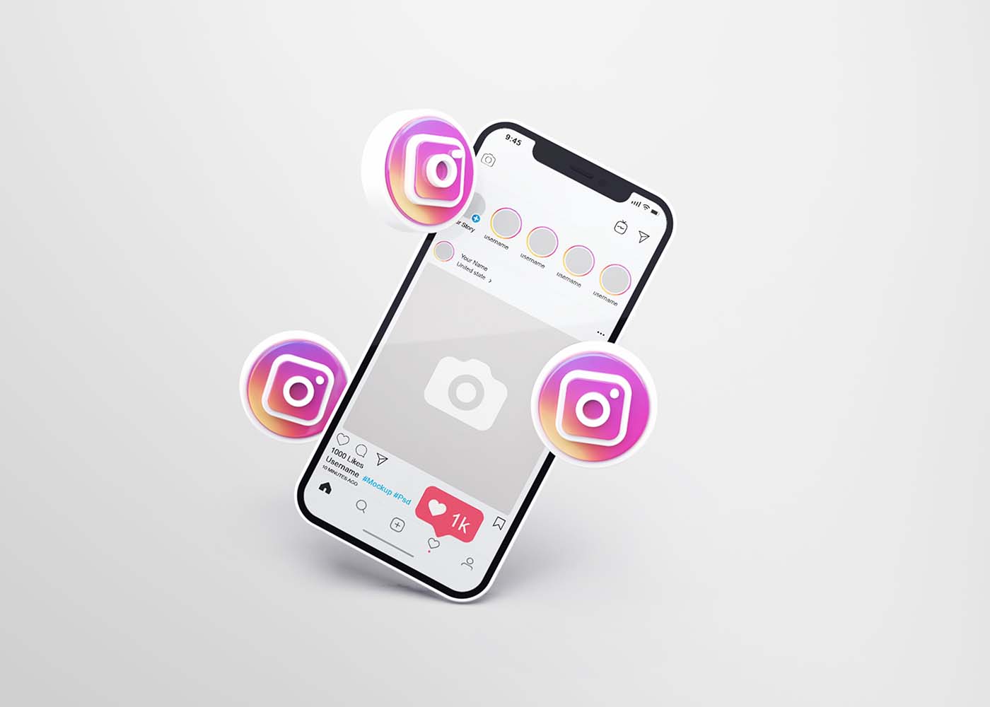
The Overview of the Instagram App Design
Instagram has become one of the most popular social media platforms, with millions of active users. The design of the app is simple and intuitive, making it easy for people to use and navigate. When you first open the app, you’ll be greeted with the Instagram feed, which displays photos and videos from people you follow. From there, you can search for content, follow other users, and engage with posts by liking and commenting. Additionally, Instagram’s various filters and editing tools make it easy to enhance and customize your photos before sharing them with your followers. By understanding the basics of Instagram app design, you’ll be able to make the most out of your experience on the platform.
The Different Colors Used by Instagram
Instagram is more than just a platform for posting pictures. It’s a visual medium that allows people to express their personalities and emotions with a simple click of a button. One of the ways that Instagram does this is through its use of colors. Each color has a specific meaning that can convey a range of emotions and associations. For example, red is often associated with passion and excitement, while blue is seen as calming and peaceful. By using these colors in various ways throughout the app, Instagram cultivates a unique and memorable experience for its users. Whether you’re scrolling through your feed or creating your own content, the colors used by Instagram can say a lot about your personality and the message you want to convey.
Effect of Instagram’s App Design on User Behavior
Instagram has gained immense popularity among users since its conception, and it’s not just because of its user-friendly nature. Instagram’s app design plays a significant role in driving users to engage actively on the platform. The app’s vibrant visuals, ease of use, and intuitive navigation make it appealing to a broad audience. With features like the explore tab, stories, and reels, Instagram incentivizes users to share content frequently and interact with others on the platform. Additionally, Instagram’s design positively impacts user behavior by fostering a sense of community and encouraging users to build connections with others. Overall, Instagram’s thoughtful app design has contributed significantly to its success and is likely to continue driving user behavior and engagement well into the future.
Psychological Impact of Instagram’s Iconography and Typography
Social media platforms like Instagram have become a ubiquitous part of our daily lives, influencing the way we perceive and interact with the world around us. But have you ever stopped to consider the impact of Instagram’s iconography and typography on our psychology? A growing body of research is exploring how the platform’s visual cues affect our emotional responses, cognitive processes, and even our sense of identity and self-worth. From the iconic camera logo to the app’s sleek sans-serif font, every design element has the potential to shape our behaviors and beliefs in subtle and profound ways. Research suggests that visuals are processed 60,000 times faster than text, so it’s no surprise that Instagram has become a place to share visual stories. It’s important to consider how the platform’s design elements can best serve your content and create a more compelling experience for users. From colors and fonts to icons and filters, there are countless ways to connect with viewers on an emotional level.For example, the right color palette can be used to convey a certain mood or emotion. Additionally, certain fonts have been proven to be more effective at conveying different messages. By using the right combination of design elements, you can ensure that your content is not only visually appealing but also informative and engaging for users.
Consequences of Instagram’s algorithm – Fear of Missing Out (FOMO)
With the Instagram algorithm changing frequently, something that most users fear is the possibility of missing out on something important. This fear of missing out, or FOMO, is a common psychological phenomenon that stems from our innate desire to feel connected and included. The algorithm is designed to show users the most engaging posts first, leaving other content that may be just as important, yet less engaging, unnoticed. This creates a sense of insecurity and worries about social acceptance, especially for those who rely on Instagram for professional or personal reasons. The consequences of Instagram algorithms are real, and they can lead users to experience anxiety, uncertainty, and a heightened sense of competition.
Conclusion
Colors, design, iconography, typography, and algorithms all play a major role in influencing the emotional experience of a user on Instagram. It’s important to be aware of how these variables are being used to manipulate behavior and possibly create feelings of FOMO. Furthermore, understanding the basics of color psychology can also help designers make better decisions when constructing their own app designs. As we can see, intricate details like these can significantly impact how people interact with digital platforms. If harnessed correctly, they could no doubt lead users to a much more enjoyable experience and produce greater engagement overall. We should continue to explore the nuances behind designing effective apps in order to ensure that both companies and users benefit from the technology we rely on every single day.
With more than 690 million people using Netflix around the world, it’s no wonder that this streaming platform has become one of the most popular sources of entertainment today. Though there are plenty of reasons why people love to watch shows on Netflix, including its massive library of films and TV series, one factor that often goes unnoticed is the clever UI/UX design behind its interface. By making every aspect of their experience as easy and effortless as possible, Netflix has created a perfect environment for binge-watching. In this blog post, we’ll uncover how smart UI & UX design plays an essential role in encouraging users to stay glued to their screens!
Understanding the Principles of UI & UX Design
Netflix has revolutionized the entertainment industry, not just with its innovative content but also with its seamless user interface and user experience design. The streaming platform’s interface is sleek, intuitive, and easy to navigate, making it effortless to discover movies and shows that interest you. Netflix’s design principles revolve around putting the user first, with a focus on relevance, personalization, and simplicity. From the home screen to the content pages, every element is geared towards making the user experience as smooth and enjoyable as possible. By understanding the principles behind Netflix’s UI and UX design, we can gain valuable insights into how to create effective digital experiences that keep users coming back for more.
Uncovering Netflix’s Binge-Watching Strategy
Netflix has revolutionized the way we consume entertainment. From classic movies to original series, the streaming giant has it all. One aspect that sets it apart is its binge-watching strategy. As opposed to traditional TV broadcasting, Netflix releases entire seasons of shows at once. This allows viewers to watch at their own pace, whether it’s one episode a night or a full weekend binge. But why is this the formula for success? By releasing full seasons, Netflix creates anticipation and increases engagement. It’s no longer a waiting game for the next episode, but rather a choice in how quickly the storyline unfolds. It’s safe to say, Netflix has mastered the art of keeping its audience hooked.
– Autoplay and endless scrolling options
The user experience of streaming services has never been more critical, and Netflix knows that better than anyone. That’s why they’ve implemented their autoplay feature and endless scrolling options to keep you hooked on one episode after another. With a few clicks, viewers can keep binge-watching without ever feeling like they’re coming up for air. The UX of Netflix’s platform is tailored to make it as easy and seamless as possible to navigate through its vast library of content. Their autoplay function gives viewers the thrill of watching something new without much effort, making it feel like the content is always fresh. Overall, Netflix’s UX design ensures that viewers never have to struggle to find something they enjoy, and its autoplay feature and endless scrolling make streaming all the more addictive.
– Recommendations tailored to individual users
Netflix has taken streaming to the next level with its personalized recommendations. By using a complex algorithm, the platform is able to suggest content that is specifically tailored to each individual user’s preferences. Gone are the days of aimlessly scrolling through countless titles, trying to find something to watch. With Netflix’s recommendations, users can easily discover new shows and movies that align with their viewing habits. From comedy to drama, and everything in between, there is something for everyone. This innovative technology not only saves time but also ensures that viewers are consistently entertained and engaged. It’s no wonder that Netflix has become the go-to streaming platform for millions of people around the world.
– Intuitive cues and visual design elements
Netflix’s success as a streaming platform is not only due to its vast selection of shows and movies but also its use of intuitive cues and visual design elements. From the moment users open the app, they are greeted with a personalized homepage that uses algorithms to suggest content based on their viewing history and preferences. The use of vertical scrolling and large images accompanied by minimal text make it easy for users to navigate and make decisions on what to watch. As users select a specific title, the platform displays additional information such as a synopsis, reviews, and a “play” button in a prominent position. The clean and cohesive design of the platform allows users to seamlessly move from one page to another, creating a frictionless experience that keeps them coming back for more.
The Role of Psychology in Netflix’s UI & UX Design
Netflix has become a powerhouse in the world of streaming platforms, not only for its extensive library of movies and TV shows but also for its user interface and experience. What many may not realize is the key role that psychology plays in Netflix’s UI and UX design. Through the use of data analytics and user research, Netflix is able to effectively tailor its platform to the needs and preferences of its audience. Whether it be recommending similar shows or adjusting the layout of the interface, Netflix is constantly shaping the user’s experience to keep them engaged and satisfied. Psychology has become an essential component in ensuring that the user’s journey on Netflix is smooth and enjoyable, making it a prime example of how research and design can work in harmony to create a top-tier digital experience.
– Playful animations, subtle sound effects, and other sensory cues
Netflix’s user interface has been designed to offer an immersive entertainment experience, complete with playful animations, subtle sound effects, and other sensory cues. These features provide a more engaging and intuitive way for users to navigate the streaming platform’s vast library of movies and TV shows. From browsing through different tiles to selecting an episode or a movie, the interface comes alive with carefully crafted animations that give the user a sense of control and interactivity. The sound effects, on the other hand, help create a sense of anticipation and excitement, making the whole experience even more enjoyable. These small details, often overlooked, show Netflix’s commitment to delivering a cohesive and delightful user experience.
– Triggering viewers’ intrinsic motivation through simple reward systems
One of the key features that make Netflix so addictive and immersive is its simple reward systems that trigger viewers’ intrinsic motivation. Whether it’s the satisfying sound of a show auto-playing the next episode or the triumphant feeling of completing a series, Netflix is designed to keep viewers hooked. By using data-driven insights and behavioral science principles, the platform offers personalized content recommendations, progress tracking, and a seamless viewing experience. These reward systems tap into the pleasure centers of our brains, creating a sense of accomplishment and satisfaction that keeps us coming back for more. With Netflix’s seamless and immersive experience, viewers can enjoy their favorite shows while feeling truly motivated and rewarded.
How User Testing Has Contributed to Netflix’s UI & UX Success
Netflix is an entertainment giant that has revolutionized the streaming industry with its user-friendly interface and unrivaled content library. User testing has played a crucial role in restructuring their UI and enhancing their UX, making it more personalized and efficient. By conducting extensive research and feedback sessions, Netflix has been able to identify user preferences and behaviors, which has helped them optimize various features of their platform such as recommendations, search filters, and navigation. With this continuous improvement process, Netflix has successfully built a loyal user base that highly values its streaming experience. Through its innovative approach to user testing, Netflix has undoubtedly secured its position as the industry leader in the streaming world.
Strategies Other Brands Can Use to Create a Binge-Watching Experience
With the rising popularity of streaming services and the ease of access they provide, binge-watching has become a common pastime for many viewers. While some brands may struggle to create a binge-worthy experience, there are several strategies that can be used to make it happen. One approach is to tell a compelling story through a series of episodes, leaving viewers eagerly anticipating the next installment. Another effective strategy is to create complex and relatable characters that viewers can connect with emotionally. Additionally, incorporating cliffhangers and plot twists at the end of each episode can keep viewers hooked and invested in the story. By utilizing these and other techniques, other brands can create a binge-watching experience that captivates viewers and keeps them coming back for more.
Conclusion
In conclusion, there is no doubt that Netflix’s UI & UX design techniques have been extremely successful in creating a desirable binge-watching experience. By understanding the principles behind UI and UX design, analyzing their recommended strategies and tactics, and implementing user testing every step of the way, any business can create an engaging interface that encourages continuous interactions. From subtle sound effects to autoplay features, Netflix has creatively incorporated aspects of psychology into its product to trigger viewers’ intrinsic motivation and inspire loyalty. It is easy to see how these insights can be used by any other brands and UI/UX design agencies to craft an immersive UI & UX design for their customers.
The minimalist design trend is becoming increasingly popular, especially among tech-savvy designers who aim to create user experiences that are easy to navigate, aesthetically pleasing, and effective. Minimalist UI/UX design delivers numerous advantages in terms of space management and usability for users; it also has a few drawbacks. In this blog post, we’ll explore how minimalism is transforming the way that businesses engage with their audiences, as well as its limitations when used on the web. We’ll look at examples of successful minimalist design implementations and discuss best practices for putting together your own designs that maximize results while mitigating potential pitfalls. Whether you’re just getting started with designing or an experienced veteran looking to hone your skills, read on to discover more about the benefits (and limitations) of minimalist web design!
What is Minimalist UI/UX Design and How Does it Relate to User Experience (UX)?
Minimalist UI/UX design focuses on simplifying user interfaces by removing unnecessary elements and emphasizing functionality. This approach follows the concept that “less is more” when it comes to UX design. By minimizing the clutter and prioritizing the most important features, the minimalist design enhances the user’s experience by making it easier for them to navigate and achieve their desired tasks. Adopting minimalist design principles can result in increased user satisfaction, engagement, and loyalty. In order to implement a successful minimalist UI/UX design, designers need to understand their target audience and carefully consider which elements are crucial to the user experience.
Benefits of Minimalist UI/UX Design
Minimalist UI/UX design has become increasingly popular in recent years due to its many benefits. With a minimalist design, clutter is reduced and functionality is prioritized. This not only creates a clean and visually appealing user interface but also makes it easier for users to navigate and find what they are looking for. A minimalist design also improves website speed and performance, which is essential for providing a seamless user experience. In addition, minimalist design allows for faster development and easier maintenance, making it a cost-effective option for businesses. Ultimately, a minimalist design prioritizes user needs and enhances the overall user experience, making it a valuable approach in today’s digital landscape.
Improved Usability
With the rise of minimalism in design, it’s easy to assume that usability might be sacrificed in the pursuit of a sleek and streamlined aesthetic. However, the truth is quite the opposite. Minimalism can actually enhance usability and make for a more intuitive user experience. By cutting down on visual clutter and unnecessary elements, users can more easily find what they need and focus on the task at hand. Plus, a simple and elegant design can be visually appealing and even calming to use. The key is to strike the right balance between minimalism and functionality, ensuring that the design remains user-friendly and not just fashionable. With this in mind, designers can create interfaces that are both beautiful and easy to use.
Enhanced Focus on Mobile-Friendly Features
To truly succeed in today’s fast-paced digital environment, it’s crucial to enhance the focus on mobile-friendly features. This means ensuring that the design is not only aesthetically pleasing and easy to navigate but also optimized for a seamless mobile experience. From intuitive touch controls to responsive layouts, a focus on mobile-friendly design features can provide users with a streamlined experience that keeps them engaged and satisfied.
Fewer Distractions for Users
A minimalist design can make a world of difference when it comes to user experience. By reducing distractions, users can focus on the essential aspects of the interface they are interacting with. A cluttered design could make it arduous for users to understand what action they should take next. On the other hand, a clean and straightforward approach to design can improve the experience and ease the user’s journey toward their goal. Fewer distractions can also mean a reduced cognitive load, allowing users to process the information effectively and without confusion. A minimalist design approach ensures that your website or application fits the user’s needs while providing them with a seamless experience.
Limitations of Minimalist UI/UX Design
Minimalist UI/UX design may have its praises, but it certainly has limitations. While the lack of clutter and sleek aesthetics may seem pleasing to the eye, it can also limit the amount of information that can be conveyed to the user. Important details might get lost in the sea of white space or overshadowed by the design itself. Another limitation of minimalist design is its tendency towards impersonality. While simplicity is key, attempting to create a completely streamlined experience can take away the human touch that many users crave. Ultimately, while there is value in minimalist design, it’s important to remember that it may not always be the best approach for every project.
Limited Customization Options
Minimalist design is all about simplicity and a clean, uncluttered look. While this design approach is visually appealing and can lead to a sleek, modern aesthetic, it can also limit the customization options available to users. With fewer design elements to work with, designers may feel constrained in their ability to create something truly unique. However, this limitation can also lead to a greater focus on the essential elements of design, resulting in a design that is both functional and visually appealing. In the end, the choice of a minimalist design should be based on the specific needs and goals of the project, and whether the trade-offs in customization are worth the benefits of a more streamlined approach.
Difficulty Accommodating Complex Interactions
Minimalist design has become increasingly popular in recent years for its clean, simplistic aesthetic. However, as sleek as it may appear, minimalist design can present challenges when dealing with more complex interactions. Accommodating these interactions can be difficult without compromising the overall minimalist feel. Finding a balance between functionality and design can be a daunting task. Nonetheless, designers are up for the challenge and are constantly exploring new ways to incorporate complex interactions into minimalist design without compromising the user experience. The goal is to create a design that not only looks great but also functions seamlessly. So, while a minimalist design may present challenges when it comes to complex interactions, it also presents an opportunity for creativity and innovation.
Tips for Overcoming the Limitations of Minimalist UI/UX Design
Minimalist UI/UX design has become increasingly popular among designers as it provides a clean and simple interface that focuses on the functionality of the product rather than the design. However, despite the benefits it offers, a minimalist approach also presents some limitations. To overcome these limitations, a UI/UX design agency needs to find ways to balance simplicity and functionality. One tip is to incorporate subtle and tasteful animations, which can add an extra level of engagement without sacrificing the minimalist aesthetic. Another tip is to use typography to create visual interest and hierarchy, providing users with a clear understanding of the content and information displayed. With these tips, designers can overcome the limitations of minimalist UI/UX design and deliver a functional and visually appealing product.UI/UX Design Creatives
Leverage Contextual Aids & Visual Cues to Help Guide Users
While minimalist designs may appear sleek and straightforward, designers often face the challenge of helping users navigate through content without overwhelming them. That’s where contextual aids and visual cues come into play. These elements provide subtle guidance to users and can make all the difference in their experience. By utilizing context-specific information and imagery, designers can help users understand the purpose and functionality of features without the need for lengthy instructions or repetitive design elements. The end result is a harmonious balance between simplicity and usability, enabling users to effortlessly achieve their goals within the minimalist design.
Use Progressive Disclosure to Simplify Complex Interactions
Simplifying complex interactions in minimalist designs can be a daunting task, but with the help of progressive disclosure, it becomes much easier. This design technique involves breaking down information into smaller, more manageable chunks that reveal themselves gradually as the user interacts with the interface. By limiting the initial display of information to only what is necessary and progressively revealing more as needed, designers can reduce clutter, streamline the user experience, and enhance the overall usability of the interface. Through using this technique, designers can create minimalist designs that not only look sleek and modern but also provide users with the information they need in a clear and digestible manner.
When Is Minimalism Not the Best Choice for Your Website Design
Minimalism has been a popular trend in website design for years. However, just because something is trendy doesn’t mean it’s always the best choice for your website. There are times when minimalism can actually be detrimental to the user experience. For example, if your website is an e-commerce site, you may need to provide users with multiple images and detailed information about your products. In this case, a minimalist design may not be suited to showcase your products or give visitors enough information to make informed purchasing decisions. Likewise, if your website is for a creative agency or portfolio, a minimalist design may not be the best way to show off your work and attract clients. Ultimately, the design of your website should be dictated by the purpose of your site and the needs of your audience.
Examples of Successful Minimalist UI/UX Designs
Minimalist UI/UX designs are all about simplicity and efficiency. They are a great way to create a user-friendly interface without overwhelming your users with too much information. That’s why it’s important to take inspiration from successful minimalist designs. For example, take a look at Dropbox or Google’s search page. Both are clean, simple, and easy to use. The purpose of minimalist UI/UX designs is to focus on the content, rather than the design. That’s why typography, whitespace, and color are so important in these designs. They should all work together seamlessly to create a finished product that is both beautiful and functional. Whether you’re designing a website or mobile app, be sure to keep these principles in mind when creating your own minimalist UI/UX design.
Conclusion
In conclusion, minimalist UI/UX design is a great choice to elevate user experience and engage users. Although it does have its limitations, following tips such as leveraging contextual aids and visual cues and using progressive disclosure, can help you work around them. Ultimately though, minimalism may not be the right choice for every web design project. By studying successful minimalist UI/UX designs, and taking notes of common elements that make up these designs, you can decide whether this is the right direction to take your own project in. Thoughtfully considering minimalism when looking toward how you can best create an enjoyable user experience will always serve you well.
Great mobile app design can make or break a user’s experience. It can be the difference between an app that keeps customers returning and one that goes straight into the bin. But there are so many aspects to consider, from user interface design to interaction details – how do you know where to focus your energy? Well, this post is here to show you what some of the best app designers in the world have done and how their innovation has resulted in ridiculously good user experiences. From understanding customer behaviors through UX research, all the way through implementation with code – it’s time to learn the secrets of successful people who have already been there and done that. Let’s take a look at what we can learn from them!
What are the Best Mobile App Designs of 2023
As technology continues to advance rapidly, app designers are consistently pushing the boundaries of what is possible. With each passing year, we see new and innovative app designs that change the way we interact with our devices. In 2023, there were several standout designs that caught the attention of industry experts and users alike. From sleek and minimalist interfaces to more complex and interactive designs, these apps represent some of the best and most forward-thinking app designs of the year. By focusing on user experience and incorporating cutting-edge technology, these designers have set the bar high for what we can expect from app design in the years to come.
1. Netflix
Netflix has become a household name when it comes to streaming services and for good reason. The way they handle their autopay system and color scheme is nothing short of impressive. It makes the payment process easy and seamless for users, and the black and red color scheme gives the whole platform a sleek and modern look. Moreover, Netflix’s auto-plays are a game-changer when it comes to choosing what to watch. With snippets of the film/show, it’s much easier to get a feel for what you’re about to embark on. Gone are the days of blindly diving into shows without any prior knowledge or recommendations. Thanks to Netflix, users can feel confident in their content choices.
2. Google Maps
Google Maps is an app that truly lives up to its promise of delivering value to its users. With its exceptional design, the app provides a convenient way to access maps of any location around the world. It is available as both a web and mobile application, which makes it highly accessible to users. I prefer using it as a native mobile app because of the offline maps functionality, which I find particularly helpful when traveling. However, what I love most about Google Maps is the integration of photos, comments, and text in targeted destinations. The core functionalities are top-notch, and the UI design is just subtle enough to deliver its purpose. Truly, this app is an example of design done well – where value and experience are the top priority.
3. Uber
Uber has become one of the most popular transportation services around the world. There are many reasons for this, but one of them is undoubtedly the app’s well-designed user interface. The Uber app is incredibly easy to use, with clear information displayed in a way that makes sense. One great feature of the app is the map view, which lets you see where your driver is and estimate the time it will take them to arrive. Additionally, splitting fares with other riders is a game-changer for anyone who wants to share the cost of a ride. Overall, Uber has made getting around town quicker and more affordable than ever before.
4. Airbnb
Airbnb has truly set the standard for amazing app design, and it’s hard to ignore its success. One specific standout feature is the app’s search function, which makes finding your next temporary home a breeze. No matter what kind of space you’re looking for, the app’s intuitive design helps you narrow down your options with ease. Whether you want a private room in a specific neighborhood or an entire home to yourself, Airbnb has you covered. The app’s responsive design makes using it a seamless experience, regardless of the device you choose to use. It’s clear that Airbnb has raised the bar when it comes to mobile app design, and we can only wait and see which company will come close to replicating its success.
5. Alto’s Odyssey
Without a doubt, Alto’s Odyssey is a front-runner in the world of gaming app design. The competition is fierce, with dozens of new game apps hitting the market every day. However, with its stunning graphics, intuitive user interface, and refined gameplay, Alto’s Odyssey stands out from the crowd. This winning combination allows players to fully immerse themselves in the game and control the central character, Alto, with ease. From the first level to the highest peak, Alto’s Odyssey motivates you to ski your way to the top, thanks to its seamless design. It’s easy to see why Alto’s Odyssey is regarded as one of the best game apps designs available on the market today.
6. Twitter
Twitter’s streamlined design and user-friendly functionality set it apart from other social media platforms. Despite years of existence, Twitter refuses to overload its app with unnecessary features. This simplicity translates into an app that is easy to use and easy to remember how to use. The best part? There is no need to reorient yourself every time you open the app – it’s just that intuitive. When comparing Twitter to its competitors, such as Facebook, the superiority of its design becomes apparent. While Facebook has continuously added features, leaving the app bloated and confusing, Twitter has persevered with its clean and minimalistic approach.
7. TripAdvisor
TripAdvisor is the ultimate travel companion, bringing the world directly to your fingertips. The app’s ease of use truly embodies the digital revolution, allowing users to plan the perfect trip with the click of a button. Perhaps the most magical aspect of TripAdvisor is its versatility. Whether you’re looking for a hotel recommendation or a new restaurant to try in a foreign city, this app has got you covered. It’s not surprising to see that TripAdvisor has been an industry leader in travel for over two decades. So why worry about travel planning when you have TripAdvisor to rely on? Let the adventure begin!
Conclusion
This year has seen a plethora of new apps created and released, with each one providing a unique benefit. It was truly eye-opening to see the amazing select few that really defined 2023 in terms of app design – Netflix, Google Maps, Uber, Airbnb, Alto’s Odyssey, Twitter, and Trip Advisor all deserve special recognition for their excellent design. Each offers something entirely original and it’s complimented by an easy-to-use interface that makes the user experience incredibly pleasant. Moving forward into 2024 hopefully these impressive designs will be carried on to continue making our lives easier through efficient and enjoyable app design choices.