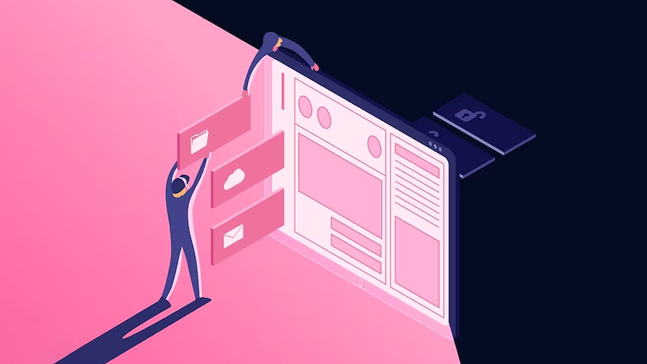
Are you aware of the importance of having a mobile-friendly website for your brand? In today’s digital age, it’s no longer enough just to have an online presence. With over half of the website traffic now coming from smartphones and other mobile devices, brands need to ensure that their websites are optimized for mobile viewing in order to maximize user satisfaction and capitalize on potential conversions. In this blog post, we’ll take a close look at why businesses should prioritize developing or updating their websites with responsive website design strategies so they can quickly adjust to any consumer device and make sure each customer has the best experience possible while browsing.
Overview of What is Mobile-Friendly Website Design and Why it’s Essential
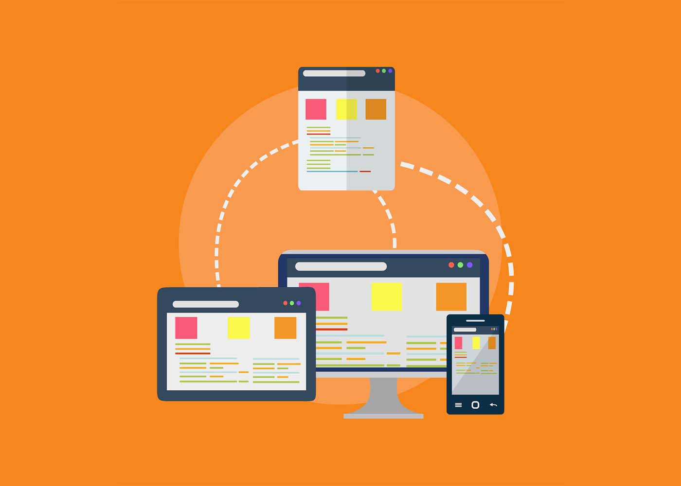
Mobile-friendly website design refers to a type of website design that ensures consistent user experience across different devices, including mobile phones, tablets, and desktops. Nowadays, more than half of all internet traffic comes from mobile devices. Thus, it is critical for businesses to adopt this design trend to cater to their mobile audience, considering the increasing number of mobile users. A mobile-friendly website design is essential because it has a direct impact on your site’s search engine optimization (SEO). Google is continuously changing its algorithms to favor mobile-friendly websites. Therefore, if you want to improve your website’s visibility on search engines, you need to ensure your site has a mobile-friendly design. Additionally, a mobile-friendly website design helps increase user engagement and ultimately boosts your site’s conversion rate. By providing a seamless user experience, customers are likely to stay longer on your website, familiarize themselves with your brand, and eventually purchase your products or services.
Advantages of a Mobile-Friendly Website Design
In today’s digital era, having a mobile-friendly website is one of the most crucial factors for businesses seeking to establish an online presence. With a significant majority of internet users browsing through their mobile devices, having a website that can adapt to various screen sizes and resolutions is of paramount importance. A mobile-friendly website design offers numerous advantages, primarily, it improves user experience, reduces bounce rates, and helps in boosting search rankings. Such a website design allows customers to access the website from anywhere and at any time, meaning businesses can gain more leads and conversions. Moreover, a mobile-friendly website is a cost-effective solution for businesses due to its ease of maintenance and fewer expenses for the development of multiple versions of the website. By adopting a mobile-friendly website design, businesses can stay ahead of the competition, attract more customers and, ultimately, grow their online presence.
Tips for Optimizing Your Website for Mobile Devices
In today’s digital age, website owners need to optimize their sites for mobile devices. With the majority of people browsing the internet on their smartphones and tablets, having a mobile-friendly website can make or break your online success. But where do you start? First, make sure your website’s responsive design adjusts to fit smaller screens. Consider simplifying your navigation menu and minimizing the amount of content per page. Additionally, optimize your images and implement a caching system to improve loading times – a crucial factor for mobile users. Don’t forget to test your website on various mobile devices and make necessary adjustments to improve user experience. By following these tips, your website will be easily accessible and enjoyable for mobile users.
Examples of Companies with Successful Mobile-Friendly Websites
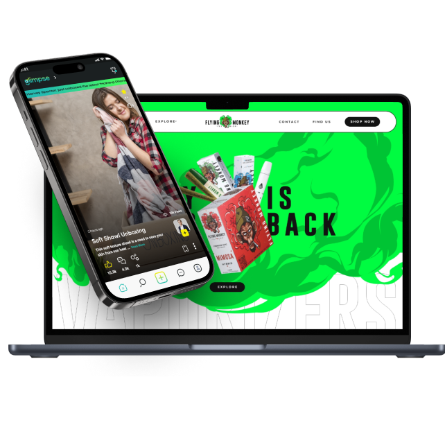
As more and more people rely on their smartphones and mobile devices for browsing the Internet, having a mobile-friendly website has become essential for any business looking to stay relevant. Many companies have taken their mobile website game to the next level, providing users with a seamless and enjoyable browsing experience. Take Airbnb for example. Their mobile site showcases stunning images of properties and allows users to easily search and book accommodations. Another great example is Starbucks, whose mobile site allows customers to easily find nearby locations and order ahead for pick-up. These companies, and many more, have realized the importance of a mobile-friendly website in today’s digital age and have made it a priority to provide their customers with an engaging and hassle-free browsing experience.
How Responsive Web Design Differs from Mobile-Friendly Web Design
As internet usage continues to shift towards mobile devices, it’s important for businesses to have a website that is not only mobile-friendly, but also responsive. While both styles of web design work to optimize a website’s appearance and functionality on mobile devices, there are key differences between the two. Mobile-friendly designs simply scale down a website to fit the smaller screen size of a mobile device, while responsive designs adjust the website’s layout and content based on the specific device it is being viewed on. This includes adjusting font sizes, image placements, and even the overall website structure. By understanding these differences, businesses can make informed decisions when designing their website and ensure a smooth user experience for their mobile audience.
Best Practices for Ensuring Your Website is Mobile-Friendly Now and in the Future
In today’s digital era, having a mobile-friendly website is no longer an option, but a necessity. With more and more people accessing the internet through their mobile devices, it is crucial to ensure your website is optimized for all screens, big or small. But it’s not just about making your website mobile-friendly now, you also need to future-proof it for evolving technologies and changing user preferences. There are several best practices to follow to achieve this, such as using responsive design, optimizing images and videos, keeping your website fast and lightweight, and regularly testing it on various devices and browsers. By implementing these practices, you can ensure that your website not only caters to current user needs but also adapts to future trends in web design and technology.
Final Thoughts on the Benefits of a Mobile-Friendly Website Design
In today’s fast-paced technological world, having a mobile-friendly website design is crucial for any business that wants to remain competitive. A mobile-friendly website provides users with ease of navigation and accessibility anytime, anywhere. Additionally, a mobile-friendly website can improve the user experience by providing quick loading time, easy-to-read content, and fitting into the smaller screen sizes of mobile devices. Not only does a mobile-friendly website enhance the user experience, but it can also improve a website’s search engine optimization (SEO) by boosting its ranking on Google search results. In conclusion, every business owner should prioritize mobile website design to stay ahead of the curve and reap the benefits of a fast and accessible website.Importance of Mobile-Friendly Website Design
Conclusion
As we’ve come to understand, developing and maintaining a mobile-friendly website is essential for any business or organization in the 21st century. Having a mobile-friendly website not only allows for easier navigation, improved user experience, and better SEO rankings but gives customers more confidence in your brand. Furthermore, it’s important to note that employing responsive web design isn’t enough – you must also make sure content is optimized for all devices as well as tested regularly on all platforms. By incorporating the tips discussed in this post, such as optimizing visual assets to ensure they load quickly and investing in dedicated solutions to increase compatibility, your website will be prepared now and into the future. With streamlined websites becoming increasingly popular amongst those who access the internet often, it’s very apparent that the benefits of having a mobile-friendly website are worth far more than one might expect.
Are you considering building a website for your business? If so, you may have heard of single page websites as an option. Single page websites are designed to funnel visitors to one specific area, providing concise information without added distraction or noise. This is great news if you want the user experience on your website to be easily digestible and focused on the main goal: helping customers learn more about what you can provide them. But while single page sites offer a modern and simplified take on web design, they might not always be right for every type of business – which is why it’s important to consider both their advantages and disadvantages before making this kind of commitment. In this blog post, we will explore the pros and cons of choosing a single page web design for your business so that you can make an informed decision about whether it meets your needs.
Overview of Single Page Websites: What are they
Single page websites, as the name suggests, are websites that only have one page. They have gained popularity due to their simple and clean design, with all content fitting on one page. These websites have become increasingly popular for businesses that want to make a statement with their website, while keeping it simple and straightforward. Single page websites allow for easy navigation, which is crucial for users who are often short on time and looking for information on-the-go. They also offer a great user experience, as everything is contained on one page, eliminating the need for multiple clicks and page loads. Ultimately, single page websites offer a unique and convenient way to present information online.
Pros of Having a Single Page Website
Having a single page website can greatly benefit both you and your visitors. One of the biggest pros of this type of website is how user-friendly it is. With all the important information in one place, visitors won’t have to navigate through multiple pages to find what they’re looking for. This simplicity can also make it easier for you to design and maintain your website. Plus, with a single page website, you can make a big impact with your visuals and content. So why not consider a single page website for your business or personal brand? It might just be the solution you’ve been looking for.
Minimalism is a design movement that has grown in popularity over the years, and it is not hard to see why – the simplicity and efficiency it offers are unmatched. In particular, single page websites using minimalism create a modern look that is both visually appealing and functional. By requiring minimal scrolling, these websites maximize the space that is available, making it easier for users to find what they are looking for quickly and efficiently. With such impressive benefits, it is no wonder that single page websites are becoming increasingly popular in the world of web design.
b. Easier to Maintain
With a single page website, you don’t have to keep track of different pages and their content. Updating and making changes to the website becomes a simpler task as everything can be done on one page. This means your website won’t suffer from outdated or irrelevant information, ensuring that your visitors are always up-to-date with the latest information. So if ease and convenience are what you’re looking for, a single page website may just be the way to go.
A single-page website is an efficient way to provide mobile users with the information they need. Rather than navigating through a complex site, users can quickly find the information they’re looking for on a single page. This not only improves user experience but also saves on data usage. With less data being used, pages can load faster, allowing users to access the site and find the information they need when they need it. Overall, having a mobile-friendly, single-page website is a win-win for both website owners and users.
Cons of Having a Single Page Website
While having a single page website can seem like a sleek and modern way to showcase your content, it’s important to consider the downsides. One of the most prominent cons of a single page website is the lack of organization. Without multiple pages, it can be challenging to label, categorize, and navigate through all of your content. This can be especially problematic for businesses with a wide range of offerings that don’t fit neatly into one main category. Additionally, if your page is image-heavy, it can lead to slow loading times and a poor user experience. Ultimately, it’s crucial to weigh the pros and cons of a single page website before making the decision to move forward with one.
a. Limited Ability to Target Different Audiences
While they are visually appealing and provide a seamless user experience, single page websites do have their limitations. One major limitation is the inability to target different audiences. With a single page website, the content is the same for all users, regardless of their interests or needs. This can make it difficult to effectively engage with different user groups and provide them with the information that is most relevant and useful to them. Nonetheless, with proper website planning and a clear understanding of your target audience, a single page website can still be a valuable tool for reaching your digital goals.
b. Difficult SEO
When it comes to single page websites, search engine optimization (SEO) can present a real challenge. With only one page to work with, you have to get creative and really think about how to make that one page count. Every element on the page, from the headlines to the images to the keywords, needs to be working in harmony to catch the attention of search engines. It can be a daunting task, but with the right strategies and a little bit of patience, it’s definitely possible to create a single page website that excels in SEO.
c. Harder to Navigate
Single page websites websites can be harder to navigate, as all the content must be loaded at once, resulting in longer loading times. This can be frustrating for visitors who might lose interest if the website takes too long to load. While single page websites have their advantages, it is important to keep in mind the potential inconvenience they can cause. As web design evolves, it will be interesting to see if solutions can be found to improve the navigation experience on single page sites.
What Kinds of Businesses Benefit from a Single Page Website
In a world where attention spans are getting shorter and people are increasingly consuming information on their mobile devices, a single page website can be a game-changer for certain types of businesses. These types of sites are perfect for businesses that offer simple services or products that do not require extensive content. For instance, if you’re a freelancer, consultant, or a small retailer selling a handful of items, a single page website can be an elegant way to showcase your work and products. It allows you to focus on the essentials, eliminate clutter, and create a streamlined user experience. Beyond that, these types of websites can be an affordable and low-maintenance solution for businesses that do not have the resources or technical skills to maintain a complex website. All in all, if you’re looking for a fuss-free and visually appealing digital presence, a single page website might be just what you need.
Tips for Optimizing Your Single Page Website
To make sure that your website is optimized for maximum results, there are several key tips to keep in mind.
First and foremost, be sure to keep your layout simple and clean, with just enough content to get your message across without overwhelming visitors.
It’s also important to pay close attention to your site’s loading speed, as slow-loading sites can deter visitors and negatively impact search engine rankings.
Additionally, make sure to use responsive design principles to ensure that your site looks great on all devices.
By following these tips and putting in the effort to ensure your website is as user-friendly and optimized as possible, you can create a single-page site that truly shines.The Pros and Cons of Single Page Websites Fleekbiz
When It’s Best to Use Single Page Websites
Single page websites are great for displaying concise information or a specific product or service. They are also ideal for mobile users who prefer scrolling over clicking to access information. However, for larger businesses or those needing a lot of content, a multipage website may be more appropriate. Ultimately, the decision to use a single page website should be made based on the specific goals and needs of the business or organization.
Examples of Successful Single Page Websites and Their Designs
Single-page websites are gaining popularity among businesses of all sizes as they offer a quick and simple approach to showcase your company’s offerings, brand, and culture. These websites tend to have a clean, minimalist design with an easy-to-navigate user interface to deliver the right message. Successful single page websites leverage a creative approach to design and user experience to achieve their goals. One such example is the “One Pager Love” website, which provides curated examples of creative single-page designs. The site features a sleek and responsive design that allows for easy navigation, making it a great source of inspiration for businesses looking for a fresh, modern design to engage their customers.
Conclusion
In conclusion, single page websites are a popular choice among businesses looking to create a modern look and efficient use of space. Although these websites are easier to maintain in comparison to multi-page websites with numerous columns and pages, there are some limitations associated with them. SEO can be difficult due to the limited number of page options, it’s harder for businesses to target different audiences with varying preferences, and end users may face longer loading times due to having all the content on the same page. Ultimately, what kind of website works best for you depends upon your specific needs and preferences; however, whatever direction you go in make sure that it’s mobile friendly and customizable inclusive of your company’s branding.
As the digital world continues to rapidly evolve, staying on top of the ever-changing web design trends is essential for any business or brand. The look and feel of a website provide customers with their first impression and can influence how they interact with your content in a major way – whether it be through e-commerce sales or conversions resulting from a lead generation form. To stay ahead of the competition, it’s important to have an understanding of where web design is going next, which includes predictions regarding user experience, quality content, visuals, and more. Let’s explore current trends that are emerging in 2023 as well as speculate future innovations heading our way to make sure businesses and web design agencies are prepared for what lies ahead!
Impact of Artificial Intelligence on Web Design in 2023 and Beyond
In 2023 and beyond, the impact of artificial intelligence on web design is set to be huge. AI is already being used to create personalized content for web users, and this trend is likely to continue as more and more businesses realize the value of tailoring their websites to the individual. Another way in which AI is set to revolutionize web design is through the use of chatbots. These intelligent assistants can help users navigate a website and answer their questions in real-time. Additionally, AI can be used to optimize website performance by analyzing user behavior and providing recommendations for improvements. As AI technology continues to evolve, we can expect to see even more exciting developments in the world of web design.Finally, machine learning algorithms can be used to develop content for websites and web apps in order to make them more engaging for users. This sort of AI-powered content creation will have a huge impact on the way web designers approach their craft. Additionally, AI can help to automate tasks like website testing and maintenance, making it possible for businesses to automate many of their high-priority tasks such as social engagement and customer support.
The 6 Key Trends in Mobile-Friendly Web Design
With the ongoing advancements in mobile technology and the increasing use of mobile devices, it has become crucial to optimize websites to ensure an exceptional user experience across all platforms. To achieve this, web designers must constantly keep themselves updated with the latest trends in mobile-friendly web design.
Here are six essential trends in mobile-optimized web design that every web designer must keep in mind:
Responsive design: A responsive design ensures that your website looks and functions great across all devices, from smartphones to tablets to desktop computers. It offers users a consistent user experience and eliminates the need for creating separate web pages for different device types. Therefore, designing a mobile-friendly website is no longer just a recommendation, it is a requirement for any firm in today’s digital domain.
Simplified navigation: Navigation menus on mobile devices must be optimized for smaller screens and made easy to use with one hand. Simplified menu structures that are intuitive even for a first-time user enhance user experience.
Interactive elements: Interactive elements like concisely worded headings, interactive buttons, sliders, and animated images can enhance user engagement, making it more enjoyable for users to navigate around your website.
Clean design: Using a minimalistic approach in design with a clean layout, simple typography, and the use of white spaces contributes to better user engagement and an easier understanding of the information presented.
Fast loading speeds: A website’s speed can make a big difference to user experience. Optimizing images and reducing page size help improve loading speeds on mobile devices, allowing users to view and interact with your website without experiencing any lag.
Accessibility: Designing for accessibility, such as by including captions for videos and audio descriptions, ensures that everyone can easily use your website.
Keeping up with these trends is essential for businesses to stay competitive and provide a seamless experience for their users.
The Rise of Voice User Interfaces and Their Impact on Web Design
The rise of voice user interfaces marks a significant shift in how humans interact with technology. The ability to speak the natural language and receive spoken responses is transforming the way we search for information, shop, and even control devices in our homes. As more and more consumers embrace technologies like Amazon Alexa, Google Assistant, and Siri, web designers are adjusting their approach to meet the changing needs of users. Websites must now be optimized not only for traditional visual interfaces but for voice interfaces as well. This means incorporating structured data, optimizing for voice search, and designing with a focus on spoken content. As voice technology continues to evolve, it’s clear that the impact on web design will not be minimal. Rather, it will be pervasive, requiring the creation of entirely new design standards and best practices.
Leveraging Machine Learning to Create Personalized Experiences
In this digital age, customers are always looking for a personalized experience that caters to their individual preferences, needs, and behaviors. That’s where machine learning comes in. By leveraging sophisticated algorithms and data analysis, businesses can gather insights and develop strategies to create personalized experiences to meet individual customer needs. Machine learning can identify patterns in customer behavior, such as frequently searched products or preferred browsing methods, and predict the customer’s future preferences. This allows businesses to tailor the customer’s experience to precisely meet their needs, resulting in a happier and more satisfied customer base. Through the power of machine learning, companies can stay one step ahead in the game by providing individually-tailored products, services, and experiences to their customers.
The Increasing Popularity of Dark Mode is Changing Web Design Trends
With the rising demand for dark mode, web designers are shifting their focus on providing this feature to users. It’s not just a trend, but a shift in the way people use technology. The popularity of dark mode is not just because it’s appealing to the eye, but also because it consumes less power and is easier on the eyes. It enhances the user experience and conveys a sense of sophistication that light-mode websites cannot. The design industry is adapting to this change by incorporating darker color palettes, implementing contrast ratios, and focusing on typography. As a result, we can expect an influx of dark-mode websites in the upcoming years.
AI-Driven Chatbots are Changing the Way We Create Content and Ultimately Changing the Web Design Trends
The rise of AI-driven chatbots has brought about a significant change not just in the way we communicate but also in the way we create content. With chatbots, businesses can have real-time conversations with their customers, providing them with the information they need with the added convenience of not having to wait for a human representative to attend to them. This has also allowed content creators to tailor their output to meet the needs of their target market. As a result, web design trends have also followed suit, with a focus on creating chatbot-friendly interfaces that are more accessible to users. The possibilities with AI-driven chatbots are endless and it is exciting to see how they will continue to shape the future of content creation and web design.
Conclusion
The rise of artificial intelligence and its integration into web design is an exciting one. We’ve only just begun to explore the possibilities it could bring in 2023 and beyond, but based on the trends we’ve seen so far, there are sure to be plenty of new innovations. From mobile-friendly designs and leveraging machine learning for personalized experiences to Dark Mode websites and voice user interfaces, AI is transforming how we build. As more businesses realize the power of artificial intelligence to improve their websites, chatbots are becoming a popular way to interact with customers and create better user experiences. It’s clear that AI-driven web designs are here to stay, and we can expect even greater changes in the near future. If you’re looking to stay updated with trending technology, hiring a professional web design is the best way to go.