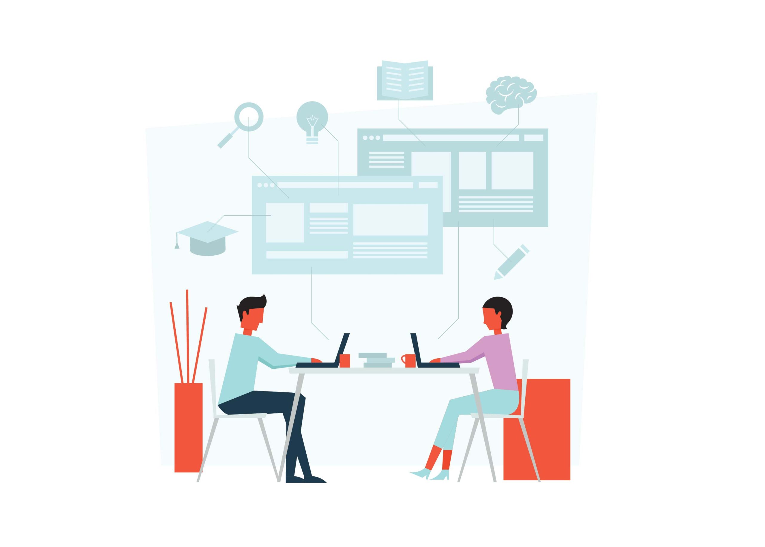
When it comes to website design and development, there are numerous options available for businesses looking to create a presence online. Of course, many decide the best choice is an experienced web design agency as they provide you with a full range of services from strategy and branding, through production right up to launch. But what if money’s tight or you need something done quickly? Then perhaps considering hiring freelancers might be your answer. In this blog post, we will discuss the differences between web design agencies and freelancers so that you can make the best decision possible for your business needs.
The Overview
Web design is a crucial aspect of running any successful website or online business. When it comes to designing a website, there are two main ways to get it done: through a freelancer or an agency. Working with a freelancer can be a great option for those who need a more personalized approach and have a tighter budget. On the other hand, an agency can offer a larger variety of services and a team of experts to tackle any project. Ultimately, both options have their pros and cons, so it’s important to do your research and determine which approach best fits your needs. Regardless of which option you choose, having a well-designed website can make a significant impact on your online presence and overall success.
Advantages of Working with a Web Design Agency
When it comes to building a powerful website, working with a web design agency can be an excellent decision.
Not only do these agencies have the expertise and experience needed to create stunning, functional websites, but they can also help you save time and effort in the process.
By working with a web design agency, you can focus on other important aspects of your business while leaving the website design and development to the experts.
Plus, you’ll have access to ongoing support and maintenance, ensuring that your website stays up-to-date and effective for years to come.
So if you’re looking to take your online presence to the next level, consider working with a web design agency and reap the benefits that come with it.
Disadvantages of Working with a Web Design Agency
Working with a web design agency can have its downsides.
First and foremost, it can be costly. While agencies offer a team of experienced designers and developers, they also charge higher rates than freelancers or in-house designers.
Another disadvantage is that agencies may have a set way of doing things, which may not align with your vision for your website. This can result in a lack of flexibility and customization.
Additionally, communication can be a challenge, especially if the agency is located in a different time zone or speaks a different language.
You may have to wait longer for responses to your questions or concerns. Therefore, before hiring an agency, consider these potential drawbacks and weigh the benefits against them.
Advantages of Working with a Freelancer
While agencies offer a variety of services, working with a freelance web designer has its own advantages.
First and foremost, a freelancer can provide you with a more personalized service since they work as individuals.
They are often more accessible and flexible than agencies, and you can communicate with them directly, making work more efficient.
Freelancers usually work on a project basis, which means you pay them only for the work they do, so you can save on costs.
Plus, their expertise, creativity, and dedication can bring a unique and fresh perspective to the project, resulting in a website that stands out from the rest.
Overall, working with a freelance web designer can be an ideal choice for those who want high-quality work at a reasonable price.
Disadvantages of Working with a Freelancer
While there are many advantages to working with a web design freelancer, such as cost-effectiveness and flexibility, there are also some disadvantages to consider.
Perhaps the biggest disadvantage is the lack of consistency and reliability. Since freelancers often work on multiple projects simultaneously, they may not be able to devote as much time and attention to your project as a dedicated team would.
Additionally, freelancers may not have access to the same resources, tools, and expertise as a larger agency, which could impact the quality of their work.
Finally, communication can be a challenge when working with a freelancer, as they may not be available at all times or may not be as responsive as you would like.
Ultimately, the decision of whether to work with a freelancer or an agency comes down to weighing the pros and cons and determining which option is best suited for your needs and budget.
Cost Comparison Between Agency and Freelancer
When it comes to creating a website for your business, one of the biggest decisions you’ll have to make is who will design it. Should you go with a web design agency or a freelance web designer? Considerations include cost, experience, and timelines. Hiring a web design agency may cost more upfront, but they often have a team of professionals with a variety of skills and resources to handle the entire process. On the other hand, a freelance web designer may be more affordable, but you’ll need to make sure they have the necessary experience as they will be working solo. Take the time to weigh the pros and cons when comparing these options, and determine which one is the best fit for your business needs.
Quality of Work Compared Between an Agency and Freelancer
When it comes to designing a website, many individuals and businesses debate whether to hire a web design agency or a freelancer. While both options have their advantages, the quality of work they produce can vary significantly. A web design agency typically has a team of professionals with various areas of expertise working together to create a website that meets their client’s specific needs. On the other hand, a freelancer may have fewer overhead costs and can dedicate more time to each project. However, working with a freelancer can also mean a potential lack of consistency or limited resources. Ultimately, the quality of work diminishes when a web design agency or freelancer lacks the necessary skills, experience, or professionalism. Therefore, it’s essential to consider all the factors and do your research before choosing between a web design agency and a freelancer.
[Bonus Tip] Questions to Ask When Hiring Agency or Freelancer
When it comes to hiring a web designer, it’s important to ask the right questions to ensure you’re getting the best quality work possible. Whether you’re considering a design agency or a freelancer, there are some key things to keep in mind.
For starters, ask about their experience and previous projects.
Look for a design aesthetic and approach that aligns with your brand and goals.
Additionally, make sure to ask about their process and communication style. You want to be confident that they’ll keep you in the loop throughout the design process and be responsive to your needs.
By asking these questions and carefully vetting potential candidates, you’ll be well on your way to a successful web design project.
Conclusion
Regardless of the choice you make, both web design agencies and freelancers will have advantages and disadvantages for your budget, quality of work, timeline, and more. It is essential to decide which services fit best with your needs when selecting between these two options. Ultimately, understanding the benefits and liabilities of your project should factor into the decision-making process. With these tips in mind, you can determine which services are worth investing in when searching for a successful web design resolution.
At first glance, it’s natural to assume that when it comes to design, minimalism would be the most effective route. After all, less is more, right? However, there are certain scenarios where elaborate and complex designs can make a bigger impact than their simpler counterparts. In this blog post, we’ll be exploring those cases in-depth – from opting for bold typography and expressive illustrations to unique color palettes and interactive elements. It may seem counterintuitive at first but by the time you’re done reading this post, you’ll see why elaborate web designs don’t need to sacrifice effectiveness or aesthetic appeal in order to create an engaging user experience with incredible results.
Defining Minimalism and Elaborate Web Design
Minimalism in web design can be defined as the art of creating simple, yet visually appealing websites that focus on usability and functionality. A minimalist web design approach emphasizes a clean layout, white space, and clear typography which reduces clutter and enhances user experience. On the other hand, elaborate web design incorporates complex visuals, graphics, and multimedia elements to create a unique and engaging website. While minimalist websites provide an effortless and straightforward experience, elaborate designs showcase creativity, innovation, and attention to detail that can make a website stand out from the crowd. Both design styles have their benefits and drawbacks, and choosing the appropriate approach depends on the purpose and target audience of the website. Ultimately, in defining minimalism and elaborate web design, it is the balance between simplicity and extravagance that creates an effective and engaging website.
Myths of Minimalism
Minimalism in web design has been a popular trend in recent years, but it’s important to understand that it doesn’t always work. While the idea of clean, simple designs that focus on functionality may seem appealing, it can sometimes result in a lack of personality or uniqueness. Additionally, some websites require more content or features to effectively communicate their message or provide necessary functions to users. It’s important to evaluate each website individually and determine the best design approach based on its specific goals and needs. Ultimately, successful web design is about creating an engaging user experience that effectively communicates the desired message, and sometimes that may require a more complex design approach.
The Benefits of Breaking the Mold and Going for Elaborate Design
In today’s fast-paced online world, having a website that stands out from the crowd is essential for businesses to thrive. By breaking the mold and opting for an elaborate web design, you can create a unique online identity that leaves a lasting impression on your visitors.
A well-designed website can boost your brand recognition, improve user experience, and ultimately increase conversions.
With elaborate design elements like interactive animations, custom graphics, and creative layouts, you can convey your message in a visually engaging way that captivates your audience.
Plus, a professionally designed website can enhance your credibility and establish you as an authority in your industry.
Why settle for a standard, cookie-cutter website when you can have a stunning online presence that sets you apart? Take the leap and break the mold with an elaborate web design today.
When Elaborate Web Design Works Better Than Minimalism?
When it comes to web design, there is an ongoing debate between minimalism and elaborate design. While minimalism often emphasizes simplicity and functionality, there are times when elaborate designs can be more effective. For instance, if you’re creating a website for an art gallery or a luxury brand, elaborate design can help to convey a sense of elegance and sophistication. Or, if your website is meant to be interactive and engaging, elaborate designs can help to draw users in and make the experience more immersive. However, it’s important to remember that overly complicated designs can be overwhelming and confusing for users. Ultimately, the key is to find a balance that works for your audience and your brand.
How to Choose the Right Balance Between Elaborate Design and Minimalism
When it comes to web design, finding the perfect balance between elaborate and minimalistic can be a daunting task. On one hand, you want your website to be visually stunning and memorable, but on the other hand, you don’t want to overwhelm your audience with too many bells and whistles. The key to choosing the right balance is to understand your audience and their preferences. A younger demographic might prefer a more flashy, elaborate design, while an older demographic might appreciate a simpler, more straightforward approach. It’s also important to consider the purpose of your website and its functionality. The design should enhance the user experience and make navigation easy, rather than hinder it. By finding the sweet spot between elaborate and minimalistic design, you can create a website that is both visually appealing and user-friendly.
Tips on Crafting an Effective Elaborate Web Design
In the modern world, web design has become an integral part of any online business. With so many websites vying for attention, it’s essential to craft an elaborate design that keeps your visitors engaged. A successful web design goes beyond simply creating a visually appealing website. It requires a keen eye for detail and an understanding of what your visitors expect from your website.
To craft an effective web design, it’s crucial to keep your design simple, clean, and easy to navigate.
Additionally, you need to ensure that your website’s loading speed is at its best, ensuring a smooth user experience.
Finally, make sure that your design is responsive, which means that it should seamlessly adapt to any screen size, from desktop to mobile.
With these tips, you can create a web design that not only looks great but also drives traffic to your website.
Creating Your Own Unique Style Using Elaborate Web Design Elements
Designing a website is no longer just about placing content and a few images on a page. With the advent of elaborate web design elements, we can now create a unique style that sets our website apart from the rest. Whether we want to use animations, 3D designs, or other innovative tools, the possibilities are endless. The key to success lies in combining these elements with your own creative touch to create a style that speaks to your audience. By taking the time to experiment with different styles and explore the latest design trends, you can surely elevate your website to the next level, making it memorable and effective. Remember, a well-designed website not only attracts new visitors but keeps them coming back for more.
Conclusion
It’s clear to see that there are many benefits to elaborate web design. From inspiring users and showing off features, to creating an efficient and user-friendly experience, detailed design can bring your website alive. However, it’s important to remember that less can be more when it comes to winning over customers—it’s all about striking the right balance between creative design elements and minimalism. By taking the time to understand BOTH approaches, you should be able to create a unique style that resonates with users while remaining true to your brand. With these tips in mind, now is the time to experiment with varying styles of elements both simple and complex until you find the perfect fit for your website – so start designing today!
As every website owner knows, a basic design won’t cut it in today’s increasingly competitive online arena. It’s critical to ensure that your site is aesthetically pleasing and can be scaled and adapted to changing market needs. Fortunately, with the rise of minimalist web design and modern techniques such as responsive web design, building a scalable and adaptable website doesn’t have to require extensive time or energy. In this blog post, we’ll take an in-depth look at how optimizing for scalability from the outset can help you create websites that are both beautiful and effective – no matter what direction technology takes over the coming years. So read on for tips on achieving elegant simplicity through scalability!
Benefits of Minimal Web Design
Minimal web design is an increasingly popular approach to website layout and design. When executed correctly, the benefits are clear. By stripping away excess elements, a minimalist design creates a sleek and seamless user experience, allowing the content to take center stage. It also makes navigation more accessible and faster, allowing users to easily find what they are looking for without being distracted by flashing graphics or overwhelming colors. Minimalism also provides a cleaner and more professional look, which can help to establish trust with visitors and potential customers. But perhaps the best advantage of a minimal design is that it loads faster, ensuring that visitors don’t have to wait and that the page is more likely to be ranked higher by search engines. All in all, minimal web design is simple but powerful and can undoubtedly improve the overall effectiveness of your website.
The Benefits of a Scalable & Adaptable Website
In today’s rapidly evolving digital landscape, having a scalable and adaptable website has become a necessity for businesses to stay competitive. A website that can expand or contract based on changing needs and can easily take on new functionalities without requiring a complete overhaul is a valuable asset. Such a website not only saves money and time but also enables businesses to keep up with the latest technologies and trends easily. Furthermore, a scalable and adaptable website enhances the user experience, as it can adjust to different devices and screen sizes, making it easier for visitors to navigate and interact with the site. The benefits of such a website are numerous and far-reaching, making it a smart investment for any business looking to succeed in the digital world.
Scalable Graphics and Coding Techniques
Utilizing scalable graphics and coding techniques is an easy way to streamline your website and make it more professional-looking, improving your users’ experience. With the ever-increasing demand for fast-loading sites, optimizing images and coding can go a long way in enhancing your website’s appeal. Providing an enjoyable and seamless user experience has become crucial in attracting and retaining visitors, especially on mobile devices. If you’re looking to give your site that extra edge, consider incorporating scalable graphics and coding techniques that can help your website run faster and smoother than ever before. Or you can just get expert services from a web design agency and they’ll get you hooked!
Develop Responsive Navigation for Different Platforms
With the majority of people accessing the internet through their mobile devices, businesses must develop responsive navigation that adjusts to different platforms. This means exploring different design techniques that cater to the needs of users, regardless of the device they are using. A website that is adaptable to different platforms not only enhances the user’s experience but also improves the website’s visibility and search engine ranking. As such, it’s important to prioritize responsive navigation when creating a website. By ensuring that your website is accessible and user-friendly on all devices, you can attract more visitors, improve engagement, and achieve your business goals.
Consider Adaptability with Changing User Needs & Trends
As technology advances, so do the needs and trends of users. This means that your website must have the flexibility to adapt and evolve alongside them. Ensuring the adaptability of your website means considering numerous factors, including changes in user behavior, updates in search engine algorithms, and advancements in web design. By continuously assessing and refining your website’s features, content, and functionality, you can stay ahead of the curve and provide users with an exceptional browsing experience, no matter how their needs and trends change over time. Don’t let an outdated website hold you back – invest in adaptability and keep pace with the ever-evolving digital landscape.
Implement Search Engine Optimization
Simply having a website is not enough for your business. You need to make sure that potential customers can find it. This is where Search Engine Optimization (SEO) comes in. By implementing SEO techniques, you can improve your website’s ranking on search engines like Google. This means that when someone searches for a product or service that your business offers, your website will appear higher in the search results. By increasing your website’s visibility through SEO, you can drive more traffic to your site and ultimately increase your business’s revenue. Don’t let your website get lost in the vastness of the internet. Implement SEO techniques and watch your website soar to the top of the search results.
Ensure Accessibility with ARIA attributes
Making a website accessible for all users can seem like a daunting task, but with the help of ARIA attributes, it’s easier than you might think! ARIA, or “Accessible Rich Internet Applications”, is a set of attributes that can be added to HTML code to help make web content more accessible for users with disabilities. By adding these attributes, you can ensure that your website is compatible with a range of assistive technologies, such as screen readers, that help users interact with your content. Whether you’re building a new website from scratch or updating an existing one, using ARIA attributes is a critical step towards ensuring that all of your users, regardless of their abilities, can access your content with ease.
Leveraging Browser-Based Automation as a Time-Saving Tool
Leveraging browser-based automation can be a great time-saving tool to achieve this goal. By automating repetitive tasks, such as form submissions and page scrolling, you can free up valuable time to focus on other aspects of your website. Additionally, automation ensures consistency across your website and reduces the possibility of human error. With a faster and more efficient website, you can provide a better user experience for your customers, increasing their engagement and ultimately, your bottom line. So why not take advantage of browser-based automation and give your website the boost it needs to succeed in an increasingly competitive online marketplace?
Employ Reusable Components & Modular Architecture
Creating a website that is visually appealing, responsive, and user-friendly can be challenging, but there are ways to make the process smoother. Employing reusable components and modular architecture is a great way to keep things organized and efficient. By breaking down the website into reusable components, you can easily create a consistent design and make updates quickly. Modular architecture allows you to build a website in a way that is easy to modify and scale. Utilizing these techniques will not only save you time and energy but also result in a better user experience. With reusable components and modular architecture, you can create a website that is both visually stunning and easy to navigate.
Conclusion
Creating a minimal, scalable, and adaptable design for your website offers many long-term benefits. Not only does it make the user experience more enjoyable, but it also allows you to quickly adjust to changing needs and trends. Additionally, by utilizing SEO tactics and embracing accessibility standards, you’re providing an inviting online presence for all users. By leveraging cross-platform compatibility for multiple devices, as well as taking advantage of browser-based automation, you can ensure your website is always up to date with the latest design trends. Finally, creating reusable components and modular architecture will help keep your website organized while streamlining maintenance in the long run. While there’s a lot that goes into designing a successful website, focusing on these key principles is the first step in building a site that looks great and works like a dream.
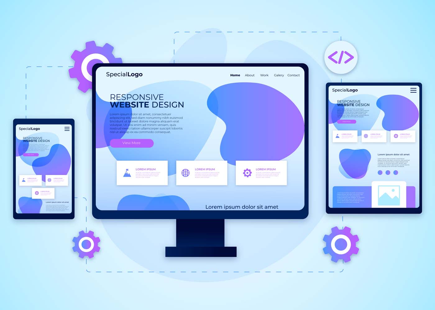
With an ever-increasing demand for responsive website design (RWD) among businesses today, it’s more important now than ever before to make sure you have a thorough understanding of the techniques, frameworks, and tools available. Understanding why RWD is such an integral part of modern website development can help you both expand your knowledge and create attractive sites that are tailored to user preferences. In this blog post, we’ll be discussing the reasons behind the high demand for RWD in 2023 and revealing some key tips to get you started on creating effective websites with the basic principles of RWD. So let’s dive right into why you should prioritize using these techniques when developing your sites!
What is Responsive Web Design (RWD)?
A responsive web design (RWD) is a design approach that allows a website’s layout and content to adjust and adapt to various screen sizes, from a desktop computer to a tablet or mobile device. This means that no matter what device your audience is using, your website will look great and be functional. RWD also provides a better user experience and improves the website’s search engine rankings. In short, a responsive website design is a smart investment for anyone looking to reach a wider online audience.
Why is RWD Important for Businesses in Today’s Digital World
RWD allows websites to be easily accessible and navigable across all devices, including smartphones, tablets, and desktops. As more and more people use their mobile devices to browse the internet, businesses need to ensure that their website is optimized for the best user experience possible. By implementing RWD, businesses can improve their website’s visibility and accessibility, ultimately increasing their online presence and revenue. With RWD, businesses can stay ahead in the game and provide customers with a seamless and enjoyable browsing experience no matter where they are.
Advantages of RWD Techniques, Frameworks, and Tools
Responsive Web Design (RWD) techniques, frameworks, and tools have revolutionized the way websites are built and used. There are many advantages to using RWD that make it a popular choice for developers. With RWD, websites can be viewed on any device, eliminating the need for multiple websites targeted at different devices. This in turn saves developers time and money, while also providing a better user experience. RWD also allows for easier maintenance and updates, as changes made to the website only need to be made once to be reflected across all devices. Additionally, RWD techniques ensure that websites are optimized for search engines, making them more likely to appear in search results. Finally, the use of frameworks and tools further allows developers to easily create responsive designs, leading to even greater efficiency and effectiveness. Overall, RWD techniques, frameworks, and tools have greatly improved the web development process and are a valuable asset to any developer.
Common RWD Techniques
With the advancement of technology, developers use various techniques to build responsive website designs. Among these techniques, flexible grids, images, media queries, and breakpoints play a significant role in making a website responsive. Flexible grids allow the web layout to adjust according to the screen size, while images and media queries help optimize image size, layout, and content based on the device. Breakpoints, on the other hand, assist in determining the layout and style changes at specific screen sizes. When developing a responsive website, mastering these techniques is essential to create an exceptional user experience. Understanding and implementing these techniques require a detailed approach, but it’s worth the effort to ensure your website looks great on every device.
Popular RWD Frameworks, and Tools Available on the Market
Popular RWD frameworks like Bootstrap, Foundation, and Semantic UI have made designing and developing responsive websites easier than ever before. These frameworks boast a variety of tools and features, such as pre-built templates, responsive navigation, and user interface components. Bootstrap is a widely used framework, favored for its extensive documentation and flexibility. Foundation offers a more modular approach, with customizable components that allow for greater flexibility. Semantic UI, while newer than the other two, offers a more modern and streamlined design. With these frameworks and the abundance of tools available on the market, designing a responsive website has never been easier or more accessible.
a) Bootstrap
Bootstrap is a widely-used Responsive Website Design (RWD) framework that has gained a large following among web developers. One of the key features that make Bootstrap so popular is its ability to create responsive and mobile-friendly websites. It provides a user-friendly grid system that allows developers to easily customize layouts and design elements to create websites that look great on any device. Additionally, Bootstrap comes with robust CSS components and JavaScript plugins that make it easy to incorporate interactive elements, such as navigation menus and forms, into websites. Overall, Bootstrap is an excellent RWD framework that offers a great balance between functionality and ease of use.
b) Foundation
Foundation is a highly popular responsive web design (RWD) framework that is extensively used by web developers for creating stunning web applications. This open-source framework is loaded with a wide range of features that make it easy to create responsive designs in real time. From customizable UI components and semantic coding to compatibility with almost all major web browsers, Foundation is packed with features that simplify the process of building responsive websites. This framework also has an intuitive grid system that makes aligning content on a webpage a breeze. With all these features and more, it’s no wonder Foundation is one of the most widely used RWD frameworks in the industry!
c) Semantic UI
Semantic UI is a highly popular responsive web design (RWD) framework that has gained traction among developers due to its excellent features. This framework is an intuitive and comprehensive toolkit that offers robust CSS and SASS components, enabling developers to create high-quality, responsive websites with ease. The framework’s naming convention and syntax are very clear and concise, making it easy for developers to comprehend and remember the code. Additionally, Semantic UI’s collection of pre-designed themes allows developers to customize their site design and focus on functionality rather than aesthetic elements. Overall, Semantic UI is a highly effective RWD framework that triumphs due to its ease of use and adaptability.
How to Implement an Effective and Engaging RWD Strategy
Implementing an effective and engaging RWD strategy can be challenging. To begin, start by analyzing your website’s current traffic and functionality. This will help you determine which devices and screen sizes your audience is using the most. From there, it’s important to create a design that is visually appealing and easily navigable on all devices. Incorporating interactive elements, such as animations or videos, can also help enhance engagement and make your website stand out. Ensuring your website loads quickly and has clean code is also crucial in maintaining an effective RWD strategy. With these tips in mind, you’ll be on your way to creating a responsive website that engages with your audience and boosts your online presence.
Tips and Best Practices for Responsive Web Design (RWD)
First and foremost, make sure your website is flexible and fluid, meaning that it can adjust to different screen sizes. Additionally, use media queries to adjust the layout, font size, and images. And don’t forget about touch-friendly buttons and navigation. By following these tips and best practices, you’ll be well on your way to creating a website that’s optimized for all devices and user-friendly for all visitors.
Conclusion
In conclusion, responsive web design (RWD) is a must-have in today’s digitally-driven world. When businesses offer an optimized user experience regardless of device or platform, they stand the greatest chance of success. Adopting RWD techniques allows you to guarantee excellent customer service and boost loyalty from customers without having to use multiple sites for different devices. Popular RWD frameworks include Bootstrap, Foundation, and Semantic UI – each offering its own set of features for developers and designers to utilize. Regardless of which framework is used, businesses should ensure their websites are fully optimized with well-thought responses for each device type and screen size for optimum performance. Implementing an effective and engaging RWD strategy is paramount for any organization — from small startups to large enterprises — who want to stay on top in their industry. Follow these tips and best practices to make sure your website is able to keep up with the swiftly changing web trends while providing an appealing and reliable service!
It’s no secret that the look and feel of a website is critically important. Not only do aesthetics influence users’ first impressions, but they also have an effect on whether or not people choose to stay on your site. But what you may not realize is there are additional factors at play that can determine how successful your website is: search engine optimization (SEO) and user experience (UX). The way in which UX and SEO intersect when it comes to website design can be complex, but when executed correctly can make all the difference in improving visibility, engagement, and overall success. In this blog post we will explore why UX and SEO matter for any website — we’ll identify some key considerations for improving performance with both techniques together — so stick around as we dive into Beyond Aesthetics: The Intersection Of UX And SEO In Website Design!
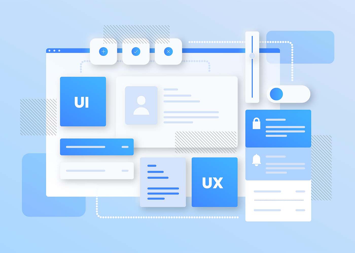
What are UX and SEO, and Why do They Matter in Website Design
There are two major factors that can make or break a website’s success: UX and SEO. UX stands for user experience, and it encompasses everything from layout and design to ease of use and accessibility. Simply put, if your website is difficult to navigate or doesn’t meet the needs of your audience, your visitors won’t stick around for long. That’s why UX is so important in website design. On the other hand, SEO stands for search engine optimization, and it refers to the process of optimizing your website’s content to rank higher in search engine results pages (SERPs). In other words, it’s all about helping your target audience find your website through search engines like Google. Both UX and SEO are critical to the success of any website, as they ensure that visitors can easily find and use your site, leading to increased engagement, conversions, and overall success. Whether you’re designing a new website or looking to improve an existing one, UX and SEO should always be top of mind.
How UX Impacts SEO – Best Practices for Optimizing User Experience
User experience (UX) is an important factor to consider when optimizing your website for search engine optimization (SEO). By ensuring that your content and design are user-friendly, you can encourage users to stay on the page longer, creating a better overall user experience. Best practices for optimizing UX include making sure all elements of the design and webpages load quickly, using intuitive navigation menus that make finding information easy, and providing quality content that is engaging and informative. Moreover, using schema markup to provide structure to your content can go a long way in helping it rank higher. Ultimately, great UX helps create a positive relationship between your visitors and website which will improve not only SEO ranking but also conversion rates and ROI.
Establishing a Clear Hierarchy of Information on Your Website
Building a website that is both user-friendly and optimized for search engines can be challenging, but it’s essential for website success. The intersection of UX and SEO involves creating a website that is easy to navigate, visually appealing, and search engine friendly. The key to achieving this is by establishing a clear hierarchy of information on your website. By prioritizing the most important content and making it easily accessible, you can direct visitors toward the most relevant pages and help search engines understand the structure of your site. Designing an intuitive and structured website takes careful planning, but it’s a crucial step toward building a site that’s both functional and user-friendly.
Designing for Mobile First – Knowing Key Strategies to Enhance the User Experience
We live in a digital world that is constantly evolving, and in today’s business climate, it’s imperative to have a website that is not only visually appealing but also user-friendly. As mobile usage continues to grow, it’s more important than ever to design websites that work well on smaller screens. This is where the concept of mobile-first design comes in. Designing for mobile-first means designing with the mobile user in mind and then scaling up to larger screens. But designing for mobile-first isn’t just about the design, it’s also about enhancing the user experience through SEO strategies. By optimizing your site for mobile, you can improve your site’s performance and ultimately drive more traffic to your site. In this article, we will discuss key strategies for enhancing the user experience and optimizing your site for mobile-first design.
Utilizing the Latest Search Engine Algorithm Updates to Maximize Visibility
Usability, or UX, and search engine optimization (SEO) are essential for online visibility, especially in the age of Google algorithms. With new developments mounting up on a regular basis, it is becoming increasingly important to stay updated with the latest changes and trends in order to keep your website from losing too much traffic due to outdated SEO practices. Fortunately, there are a plethora of tools available that can help us better understand why and how our website is performing – like keyword research tools, technical SEO audits, and analysis of competitor activity. Taking advantage of these resources can help you stay one step ahead of the competition and ensure maximum visibility for your business.
Creating an Intuitive Navigation System for Better User Experience
A website can have all the great content in the world, but if it’s difficult to navigate, users won’t stick around for long. That’s why creating an intuitive navigation system is crucial for a better user experience. By organizing your website in a logical and intuitive manner, visitors can easily find what they’re looking for and explore your site with ease. Navigation menus should be clear and concise, with relevant categories that correspond to the content on your site. Additionally, utilizing clear and descriptive labels, breadcrumbs, and search functions can enhance the overall user experience. By investing time and effort into creating a seamless navigation system, you’ll keep visitors engaged, increase the likelihood of them returning, and ultimately achieve your website’s goals.
Implementing Effective Calls-to-Action to Increase Conversion Rates
Your website can have all the bells and whistles, but without a clear and effective call-to-action, your conversion rates will continue to be lackluster. Implementing a call-to-action that resonates with your audience and encourages them to take action is essential for driving conversions. Whether it’s a button that prompts a user to sign up for a newsletter or a pop-up that encourages them to make a purchase, it’s important to make sure your call-to-action is prominently displayed and easy to find. By testing and tweaking your calls-to-action, you can increase the conversion rates of your website and ultimately drive more revenue.
Tips for Improving Overall Website Performance and Speed
In today’s fast-paced digital ecosystem, the speed and performance of your website have a significant impact on user experience, search engine rankings, and business success. Therefore, optimizing your website’s performance, SEO, and speed is crucial. One of the most effective ways to do this is by adopting a streamlined approach, starting with a fast and reliable hosting service, reducing HTTP requests, optimizing images and videos, using compression, leveraging browser caching, and implementing a content delivery network (CDN). Additionally, keeping your website’s content fresh, relevant, and engaging, using relevant keywords, and regularly auditing your site’s performance to tweak and improve as needed can help you stay ahead of the competition and attract and retain more visitors.Beyond Aesthetics The Intersection of UX and SEO in Website Design
Conclusion
Ultimately, UX and SEO must go hand in hand when creating an SEO-friendly web design. By taking a user-centric approach to the design process and applying best practices, users can be engaged through an enhanced user experience which can lead to increased visibility and higher conversation rates. By establishing a clear hierarchy of information on the site and creating intuitive navigation systems that make it easy to find information, website design can be improved in ways that facilitate better search engine discovery. Additionally developing for mobile first and utilizing the latest search engine algorithm updates are essential steps for maximizing visibility. Finally, web analytic tools should always be used to track user behavior so any changes made to improve UX impact SEO in the most positive way possible. With these tactics, any website designer is sure to create experiences that satisfy even the most discerning users while maximizing visibility at the same time.